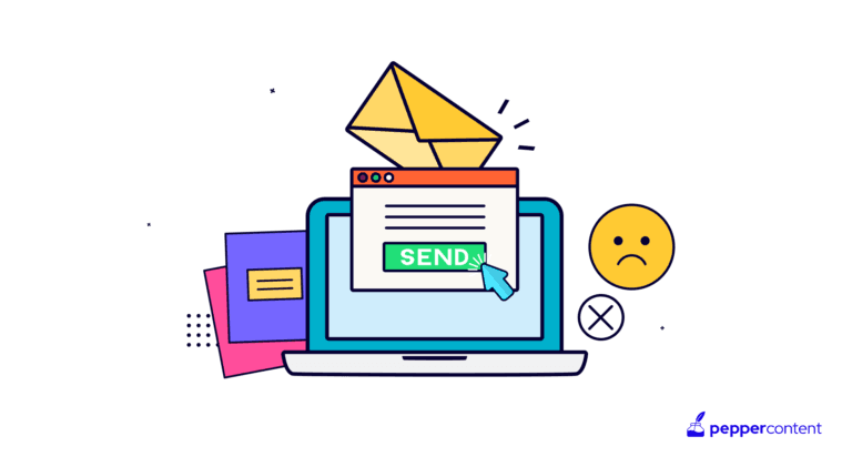
Billions of emails are sent every day. Yet, most emails are not read. They are either ignored, deleted, moved to the spam folder, or lie in oblivion, unread. That’s why email design is so important. A well-designed email does the trick of capturing a user’s attention, even for a fleeting second. Attractive emails drive conversions and engagement. The email should keep the user hooked from the moment it arrives in their inbox to the time they take action.
7 Email Design Best Practices of 2022
The following are some email design best practices that have proved to be successful.
1. Get the basics right
First impressions are the last impressions in the world of email marketing. Any imbalance can deny the other aspect of the email its due. At the basic level, an email should contain the following:
● Sender name

Although it might not seem too important, focusing on the sender’s name is one of the crucial email design tips. When users see their inbox and see the sender name, they wonder, “Is this a legitimate email ID?” One of the ways to reinforce trust in the mind of the email reader is to incorporate elements of branding into the sender’s name. You can include the company you’re working with, next to your name.
● Subject line
The subject line of the email should be short and simple. A long subject line is often truncated. The subject line should convey the most relevant information first. It should be catchy, less wordy, and not obscure. Using puns, metaphorical language, and expressions of speech is mostly discouraged. The subject line should be 50 words or less.
● Preheader
The text that follows the subject line is the preheader text. The subject line and preheader should work in harmony. There should not be any mismatch in the intent behind the message. Customizing the preheader text is also an excellent strategy.
● Header design

The header has more than one meaning in email marketing. But here, we are referring to the topmost banner of an email. An email’s header is like a product’s package. If the package is good and makes sense for the buyer, it is opened. Similarly, the header has to convey the message appropriately. An unappealing and meaningless header may not win the reader’s attention. The header can be a mix of text and images.
● Email copy
Copywriting for emails is an art and science. Even with a pool of visual content, if the copy is not great, the whole message dims away. An email writing tip is to never make the text long-winded. At max, a word count of 200 should be maintained. Using slang words and expressions of speech that are not relevant to your targeted audience may cause reduced open rates.
● Footer

The footer is situated at the bottom of the email, and contains information about your company, your contact details, social media handles, downloadable PDFs, the option to unsubscribe, etc. Depending on your strategy, the call to action (CTA) can be part of the footer too.
There can also be an additional CTA in the footer to reinforce the idea to act. A mistake that marketers make is to overlook the footer. In reality, the footer completes the email message. It presents to the reader a compact, well-thought-out, and well-presented message.
2. Ensure visual hierarchy
Readers often use visual cues to scan your content quickly. So, using visual hierarchy guides their eyes throughout the design. Readers can quickly identify important aspects of an email through visual hierarchy.
● The Z-pattern

This pattern is a good way for readers to go through all of the email content in one go. The strategy is designed based on eye movement patterns. The normal pattern is to read from left to right. But when interacting with content, the tendency is to skip over and jump ahead. In the Z pattern, the user’s eye moves from the top-left to the top-right, and to the bottom-left from there, to the bottom-right.
● The inverted pyramid
The inverted pyramid approach is a great way to capture the readers’ attention at the start itself. The top of the email is where the most important information is presented—the information often cascades into a call to action. In the middle, supplementary information is provided. The call to action can be a subscription link, a clickable button, etc. The CTA should never be too far or too close. It should be just at the right juncture.

CTAs are often the crux of the inverted pyramid approach. There is no fixed location where CTA buttons should be. It depends on the flow of the email.
3. Add meaningful visuals
Email campaigns with too many images may not always work favorably. Although it is tempting to use the latest photos of your offering in an email, it has a disadvantage. Emails with lots of images take time to load. Plus, images may not be optimized for all types of network connections. Remember that not all parts of the world have high-speed internet. So, use images only if they add value.
Also, don’t use too many images and too few of them. A majority of readers prefer emails with images. A well-structured infographic can convey information effectively. Visuals also allow the reader to build a mental image of a product, its usages, applications, and several other characteristics. Images help in rand recall.

Use stock images sparingly. Original images are always ideal, as they help in branding and an enhanced customer experience. So, get a graphics team to design some brand-specific images. Across the email campaign, maintain the image quality, style, and visual semantics.
Another mistake is using vague and ambiguous images. These don’t add any value, and are a waste of space. Instead, use images that are relevant to your message. Use white space to separate sections. Too much white space can disorient the person. Too little white space can cause clutter and confusion. So be sure to strike a balance between the two.
4. Opt for interactive content

Enabling readers to interact with your content is a powerful way to retain their attention. This type of email is not one that simply urges users to follow links and click buttons. Using interactive elements in your emailer design can help engage users better.
An example of interactive content is a well-designed questionnaire. Another example is hamburger menus that can hide or display content. Then there are add-to-cart features, rollover features, carousels, countdowns, and more. All of these are types of interactive content. Even polls and surveys are interactive content. Using interactive content will surely get you a huge bang for your buck.
5. Keep the font simple
One of the most critical aspects of an email is typography. In many ways, the font of the email decides its fate. Using fancy web fonts is not recommended, because not all users’ systems may support them. Instead, system fonts can be used because they are generally bundled with the operating system. An email-friendly font is 14 to 16 points in size for the body copy and 22 to 24 points for headings. Serif, Sans Serif, and Times New Roman are the commonly acceptable fonts.

6. It’s alright to use email templates
Not everyone is an expert in graphic design. An email template design is one of the fastest ways to start an email marketing campaign. Email templates are thoughtfully built–all you need to do is use them. But there is more to email templates–they are responsive as well. Built for various handheld and stationary devices, email templates help you deliver your message consistently.
Email templates do not bind you to a design scheme. You are free to edit or modify the design as you see fit. This means increased flexibility to include brand-specific details, such as logos and colors. But once fixed, the email template design should stay the same across all emails.
7. Personalize your emails
In email marketing, personalization means that emails are no more one-to-many; rather, they are one-to-one. Personalizing emails based on the reader’s behavior and profile is known as H2H marketing.
Now the next question that might arise is, “Is this a lot of work?” No – there is software to automate this task too. Lead scoring, email automation, and segmentation are ways to generate personalized content. The content is dynamically generated based on the reader’s current profile. It ensures that the reader is consuming content that is relevant to them.

Basic email personalization is simply changing the reader’s name in the salutation or greeting. But advanced email personalization can change the email content and design within a day. Email personalization systems can provide product recommendations, surveys, and relevant offers.
Marketers are increasingly turning to personalization, as readers are becoming aware that they are only of the thousands of subscribers who are being marketed to. Hence, personalization makes the reader feel that they’re special.
Email design is an evolving process. It is a vast area, but the basics must be mastered first. After getting the basics right, you can move on to advanced techniques, such as maintaining spatial balance, white balance, and text-to-image ratio. Given that email design is a constantly improving process, you should be on your toes to act as per the changing market and customer sentiments.
Key Takeaways
● Billions of emails are sent every day. And the one thing that can distinguish your email is its design.
● Email design comprises many factors, including visual hierarchy, white space, fonts, and personalization, among others.
● If you don’t have the resources to hire a design agency, you can use customizable email template designs.
● It is highly essential to get the basics right, before moving on to advanced features.
FAQs
Scores of brands are vying for people’s attention via emails. In such a competitive climate, it is crucial to make your emails stand out. And the easiest way to do so is through emailer design. It not only helps you get your audience’s attention, but it also cements your brand identity further in the minds of your target audience.
The preheader text, subject line, header, body copy, fonts, and footer are some of the basic elements of an email.
There is no set-in-stone rule about the number of images you can use; it all depends on the nature of your brand and message. However, when choosing imagery, make sure it is meaningful (it should add some value to your email) and relevant to the content.
Latest Blogs
Explore how Google’s 2025 AI search updates triggered ranking chaos. Learn actionable strategies to adapt your SEO for AI Overviews, zero-click searches, and SERP volatility. Stay ahead now.
Learn how to rank on AI search engines like ChatGPT, Perplexity, and Gemini by optimizing your content for authority, structure, and relevance. Stay ahead in AI-driven search with this strategic guide.
Explore the best healthcare SEO services for your medical practice. Improve online visibility and effectively reach more patients in need of your services.
Get your hands on the latest news!
Similar Posts

Demand Generation
8 mins read
Mastering the Art of Building an Effective Content Marketing Funnel in 2024

Demand Generation
6 mins read
Fueling Demand Generation: How Buyer Personas Catapult Your Content Marketing Strategy

Demand Generation
8 mins read