40 Click-Worthy Call-to-Action Examples to Check Out Now

Table of Contents
- Common Terms Used in Calls-to-Action
- How to Write the Best Call-to-Action Phrases
- 40 CTA Examples You Need to See Right Away
- Key Takeaways
- Conclusion
- FAQs
How many times have you seen an advertisement for a new app or product and bought it just because it “seemed” useful? We’re guessing the number is uncountable. There are so many random products, food items, app subscriptions, etc., that you must have paid for but never used. That is the magic of a call to action (CTA). A CTA is a tiny piece of content that effortlessly plays with your mind. “Buy now,” “shop till you drop,” and “offer ending soon,” are some call-to-action examples that you may have come across.
Call-to-action phrases make a small part of a web page, social media post, or advertisement. They are cleverly framed to entice and lure a viewer or grab a potential customer’s attention. A strong CTA has the power to convert a customer for your business. Depending on your end goal, it can drive your consumer to perform various kinds of actions.

Common Terms Used in Calls-to-Action
Every marketer understands the importance of framing the best call-to-action phrases for their marketing material. Following are a few examples of calls to action.
1. Learn more
This is used when you want the viewer to gather more information and become more aware of your product. It is one of the most common CTA examples.
2. Subscribe
The best example of the usage of this CTA example is a YouTube channel. You must have noticed that a YouTuber always ends their videos with three calls to action: like, share, and subscribe.
3. Shop now
This is one of the most widely used call-to-action phrases. It instills a sense of urgency in the viewer and prompts them to make a purchase.
4. Sign up
Through this call to action, you may be invited to sign up for a free trial of a class or join an event, etc. It is helpful in guiding the viewer further down the marketing funnel.
5. Download the app
This CTA example is self-explanatory. It is one of the biggest reasons most of us run out of space on our mobile phones. It explains that the team of those apps clearly did a good job marketing their product.
How to Write the Best Call-to-Action Phrases
Thousands of ads are being rolled out every day on the internet. What can you, as a brand or marketer, do to ensure yours stands out? There are several challenges that a marketer faces in this regard. Nowadays, many people get annoyed by looking at ads while surfing the web, so they install ad blockers.
As a marketer, your job is not just to create content that entices your potential customer, but also to keep the message so subtle that you don’t get blocked. Whenever you are sending out a marketing message, remember that it can have repercussions.
With the entire world on the internet, it’s extremely easy to defame a brand. Sending emails and automated calls at the wrong time are two things that can irritate your customers. So, be extremely careful! Following are a few things to keep in mind for framing the best call-to-action phrases.
1. Use strong action words
This is the basic rule of framing the best CTA phrases. Sometimes, your potential customers get lost in your marketing material. Therefore, it’s important to remind them about what you want them to do. Writing short call-to-action phrases is a good idea, but always make them persuasive. A mark of a good CTA is the usage of strong action words, such as “buy now,” “view now,” and more. You can also offer a giveaway, freebie, or free trial.
2. Always add value
Every piece of content that goes into the marketing material is supposed to add value. When you are a brand, you should know that every single word the potential customer reads is of immense importance. That is the time they are devoting to you. Make it worthwhile.
3. Incite curiosity
For a CTA to be effective, the most important box to tick is that of emotions. Whenever you are framing call-to-action phrases, ask yourself, “Is this CTA such that it will strike a chord with the audience?”
The days of direct selling are gone. Now, like every other social media post, people enjoy conversational ads. If you directly ask them to shop, chances are, they will not. Instead, as a marketer, your job is to make them realize that they need your product. That’s why you’re never selling your product. You are selling the feeling they will get once they buy your product.
Surf Excel’s Daag Acche Hain campaign won hearts all over the country. It is one of the best examples of inciting emotions among the audience. Also, when you are trying to draft a message that provokes emotions, don’t shy away from making it slightly longer.
4. Design it with care
The most effective CTA messaging is always beautifully designed. Some basic things to ensure when designing them are that your CTA button stands out. Its color should always be in contrast with the background colors.
A lot of marketers underestimate white spaces, when, in fact, they should be utilized effectively to highlight the CTA. Optimize it for mobile, because nowadays, most potential consumers view ads on mobile phones. Also, make sure the button is large enough to get noticed, but not overwhelmingly so.
5. Test it
Every person thinks differently. A CTA that may seem effective to you may not seem that impactful to somebody else. Hence, to analyze its impact, always run an A/B test on your ad. It will give you a fair idea of whether you are successfully being able to convert the customers. Running these tests will also gradually help you know your target audience better. You will be able to understand what works with them and what doesn’t.
40 CTA Examples You Need to See Right Away
Now that you know the theory bit of creating impactful Call-to-Action phrases, it’s time to see those theoretical recommendations in action. Following are some of the best Call-to-Action examples picked up from the marketing material of real brands.
1. Crossrope
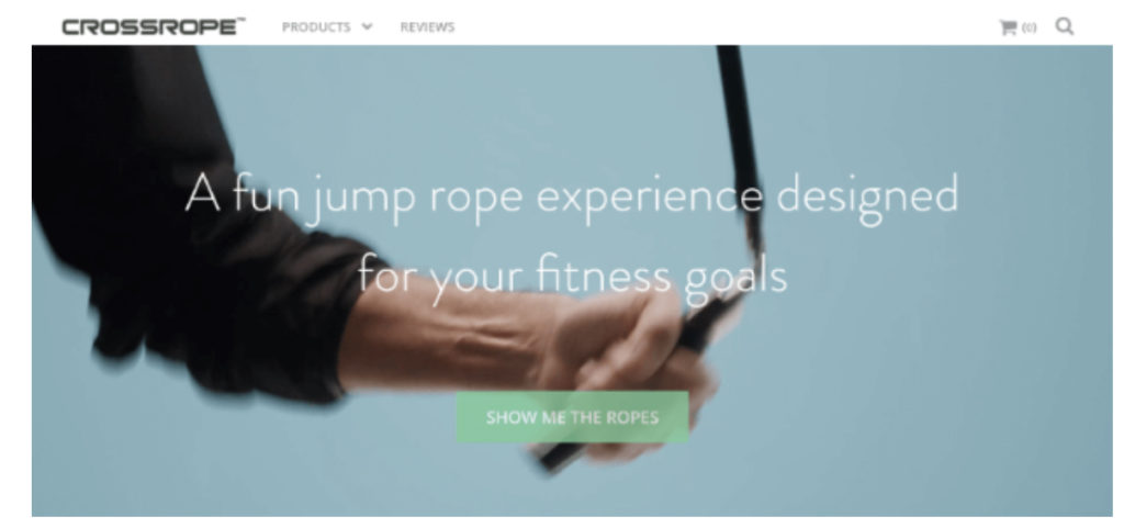
Clever call-to-action phrases always take the cake. Crossrope is a company that uses its jump rope program to get people back in shape. They smartly added their USP to this CTA (we all love a good pun, don’t we?) A lot of customers find this interesting and end up clicking only because of that. As a matter of fact, this one CTA led to a 900% increase in Crossrope’s email subscriptions. That is the impact a strong CTA can have.
2. EarthHero
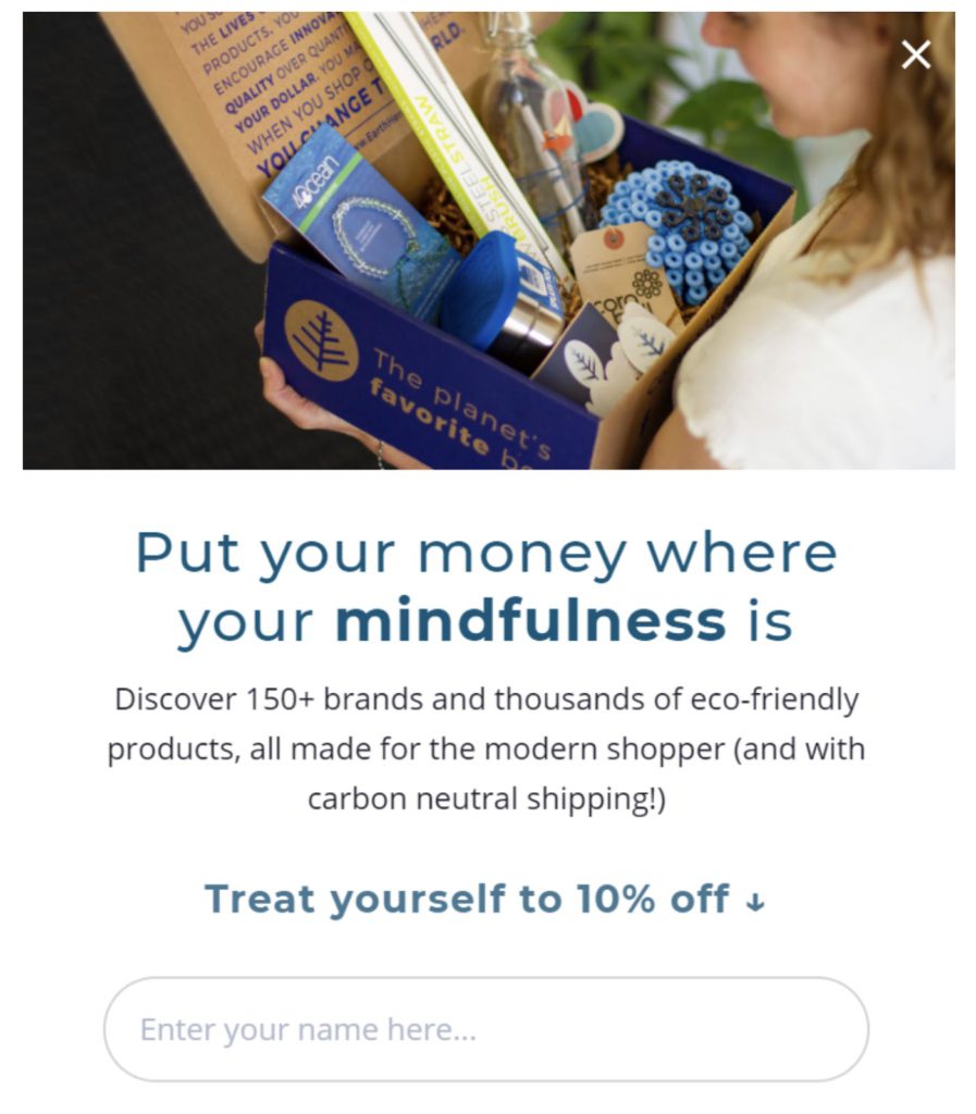
EarthHero’s is a fantastic CTA example. It is an online store selling products that are mindfully manufactured. It’s awe-inspiring to watch how they provoke the emotions of their potential customers. This ad is a perfect melange of value as well as emotions.
This CTA message started off by mentioning a little detail about the environment-friendly brand so that the customer can spend money guilt-free. Once that was achieved, it added another benefit by providing a discount.
3. 4ocean
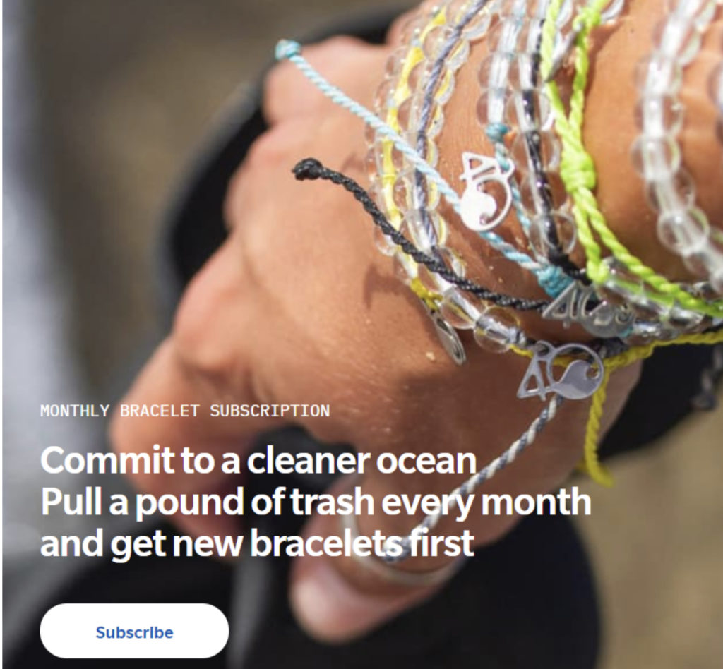
This ad may seem direct to you at first glance, when, in fact, it’s one of the most indirect ads we’ve come across. 4ocean sells responsibly sourced apparel and accessories. In this CTA example, they have shown the product clearly. However, it is not salesy at all. Instead, it asks people to join forces with the brand to further an important cause.
4. Headspace
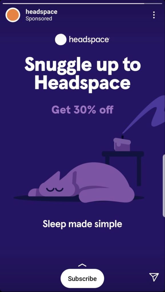
Headspace is an app that specializes in meditation. This entire Instagram ad screams peace, calm, and serenity. The colors and graphics that have been used are light on the eyes. Using words and phrases like “snuggle” and “sleep made simple” is also doing the trick by invoking a longing for coziness among readers.
In such a simple ad, it was critical to add a CTA that was crisp and non-monetary at the outset. Hence, the word “subscribe” fits in perfectly.
5. Myntra

Myntra is an e-commerce app. This app notification has perfectly used value-based call-to-action phrases. Everything from the title of the message to the text underneath is catchy. And the CTA clearly guides the user to take the next step to avail of the irresistible offer described above.
6. Zomato
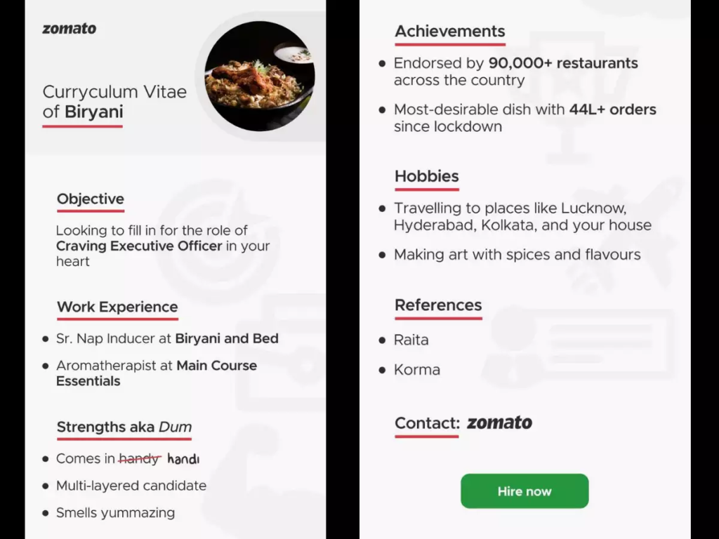
Zomato absolutely hit the ball out of the park with this marketing message. It is a food ordering app that is known for its witty and humorous content. As part of its email marketing strategy, Zomato sent out a resume highlighting the qualities of biryani, one of its most-ordered dishes. Its CTA steers away from the usual “order now” messaging, and makes use of a smart yet succinct message instead.
7. Lifestraw
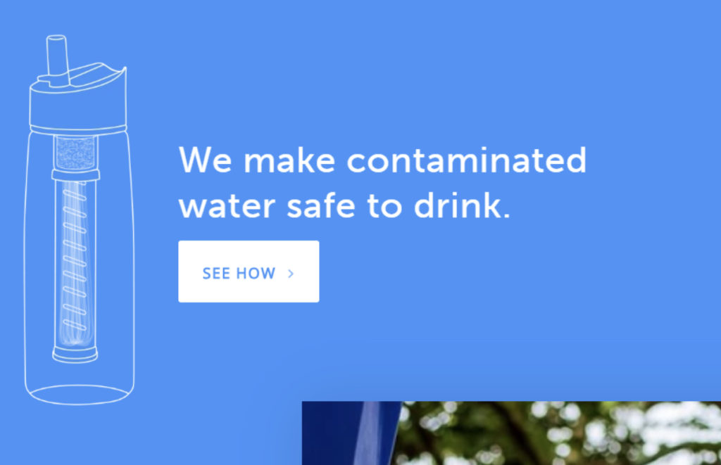
This straightforward messaging combined with a strong assertion quickly grabs your eye, leaving the potential customer thinking about how it might actually function.
Then, they advantageously add a CTA button that addresses that very inquiry. However, this CTA doesn’t prompt a buy. It drives the customer further into the site, letting them know more about the product, which will eventually lead to a purchase. This makes it a subtle yet strong CTA.
8. WordStream
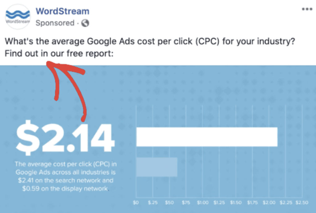
All the best CTA examples provoke emotions. This is exactly what the team at WordStream has done. When anybody sees an ad like this, they’ll be intrigued to find out more. Clever use of words, we must say! The first line makes you curious. It may even make you wonder why you haven’t been aware of this important piece of information. The second line gives you the solution, i.e., accessing the report by clicking on the CTA.
9. Dropbox

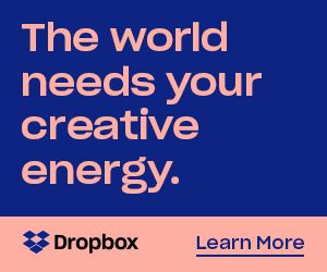
Dropbox has always been known for making waves through marketing. They always make ads that are minimal, but their words are what make a long-lasting impact. The first ad banner sends out a strong message, coupled with a CTA that is sure to lure the viewers. Both the ads make the customers curious. And their call-to-action phrases satiates this curiosity. While the first one gives you an option to take the journey yourself, the second one provides you with more information.
10. Nike

Nike has always been creating strong ads. Focus on the way this one gives ample importance to three crucial elements of any marketing copy: the product, description, and call-to-action phrase. It attracts the potential customer’s attention by displaying the product in multiple colors.
What’s great is that Nike smartly utilized the caption part of this social media post. The CTA is not selling the product directly but is providing additional information for an eventual purchase.
11. Womanizer
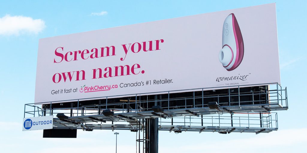
It’s safe to say that this product will attract enough attention by itself. Nevertheless, the tagline and CTA complement it very well. The CTA here is relatively longer, and incites urgency by using the word “fast.” This cheeky ad must’ve definitely increased the sales of Womanizer. If not that, it surely grabbed some eyeballs.
12. Cracku
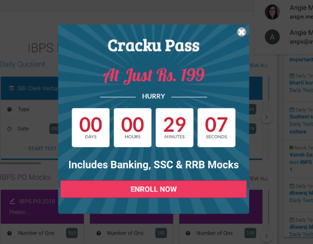
Cracku helps students crack competitive examinations. Hence, the CTA is relevant and direct. But adding the timer prods potential customers to act fast. Many times, such offers stay for much longer than what is shown in the timer. However, this ad itself improved the conversions for Cracku by 300%.
13. Netflix

Netflix used minimal colors in the background image and faded them out in the corners to throw more light on the CTA. Out of all the CTA button examples, Netflix’s one that ticks all the right boxes. It adds value, has trigger words like “free,”, and uses the brightest color, which also happens to be the brand color. The ad also adds a line, assuring the potential customers that they can cancel the subscription at any time. This is a big plus!
14. Full Bundle
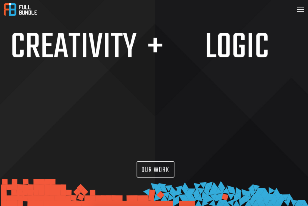
The white CTA button that says “Our Work” is in contrast with the dim gray in the background. The brand has chosen the CTA strategically. Given that their primary motive is to improve their clients’ online presence, it’s imperative for them to exhibit their online presence first. The ad, in itself, is designed beautifully to show that their work is a blend of creativity and logic.
15. Epic
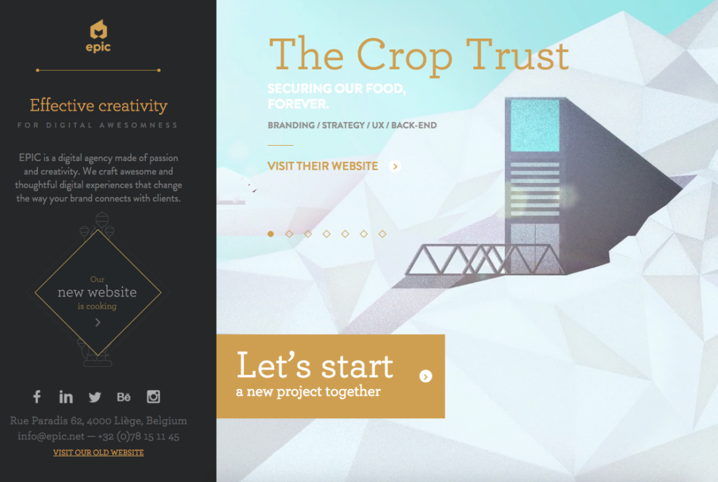
The team at EPIC utilizes their landing page to exhibit their work. When you visit it, you’ll see exciting videos of the work they’ve done for their clients. While there are a lot of elements the potential customers could tap on their web page, the CTA always steals the show and consistently stands out.
It’s great how they’ve said, “Let’s start a new project together.” It tells the clients that through this, they will get the partner they’ve been searching for. It enforces a sense of teamwork and portrays inclusivity. Thus, this is one of the most sentimental CTA examples.
16. Biome

This call-to-action button example gives members a sense of exclusivity. The message is essential that members of the brand enjoy special perks. Therefore, Biome uses them as an incentive to get people to join the club. This club has a strong referral program as well as has a load of advantages, like free delivery, easier checkout, discounts, and more.
17. Koala

Rather than directly requesting their customers to refer the brand to their friends, Koala prods the users to promote the brand by offering a host of advantages in return. This call-to-action example works especially well in referral marketing campaigns. Through this CTA example, they tell customers how they’ll benefit from using the product as well as promoting it to friends in a subtle and smart way.
18. International Rescue Committee
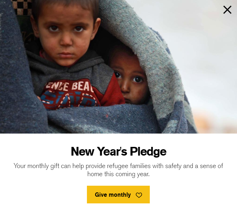
Like the ads of every welfare organization, this one is also designed with utmost care and simplicity. It is powered by emotional copy that can convert even the not-so-interested parties to pay. The ad clearly mentions what the customer will be paying for. The CTA is wisely written, as, in just two words, they stated the fact that it is going to be a monthly subscription.
19. Bulk.ly
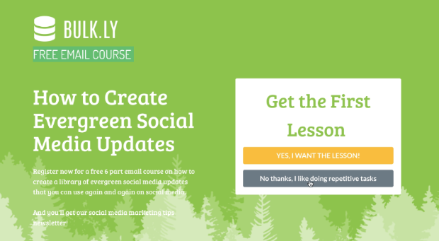
Bulk.ly is a social media automation tool that helps you automate all your social media posts. In the CTA example above, the company wants to send out a free email course. However, the strategy to provide two CTAs was game-changing for two reasons: one being, people like having more control over what they choose to consume. And the text on the second CTA button makes it sound like missing out on this course will not be a great idea after all.
20. Quickbooks
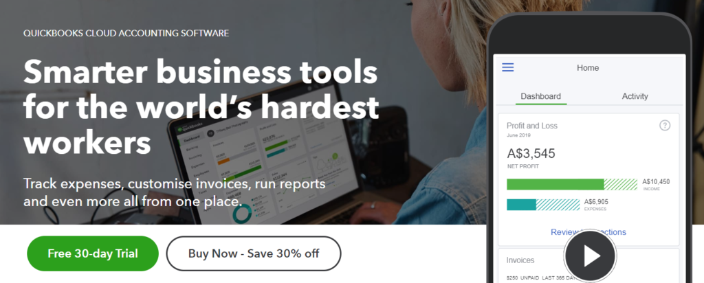
In a single ad, Quickbooks has managed to give a good idea of their product to the potential customer. They have mentioned in brief what their product (smarter business tools) is, and have also given additional details right above the two call-to-action phrases. Providing a free trial as well as a discounted price increases a brand’s chances to get more leads and conversions.
21. Thinx
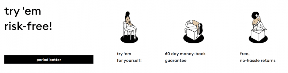
Thinx is a manufacturer of period panties. The website and ads have been made by women, and it’s evident. The call-to-action phrase they’ve used (“period better”) will immediately grab the attention of every girl, so much so that they would want to give it a shot. After all, why wouldn’t any woman try to make those days of the month a tad better?
22. ALO Yoga
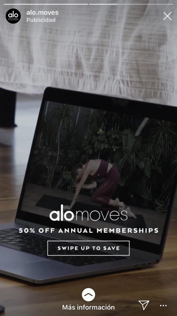
This is a crisp and to-the-point ad, which uses a picture to depict what the CTA is about. All the other details have been clearly mentioned. The copy mentions values that are sure to grab the attention, and the CTA uses trigger words like “save.”
Pro tip: The kind of copy you incorporate in your ad is entirely dependent on your brand’s image. For instance, the ad of ALO is plain and basic, whereas the ad we saw of Womanizer was cheeky and clever. Generally, brands that use such copy don’t restrict themselves to using it in any one marketing collateral. All the information that goes out from their brand follows a similar tone.
23. Nature Conservancy
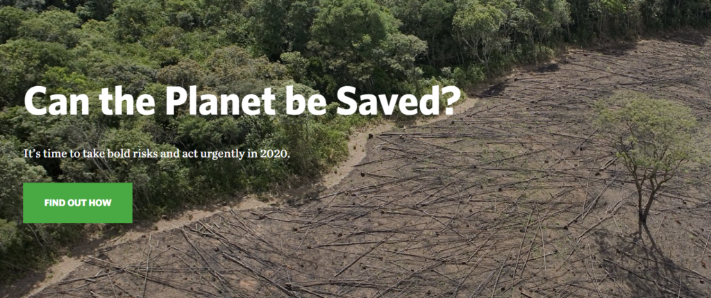
Inquiring whether the planet can be saved is a strong move. And beneath that, The Nature Conservancy utilizes two power words—“bold” and “urgently”—to propose that the planet can, without a doubt, be saved. It leaves the viewer contemplating whether they can contribute.
And at that very opportune moment, the CTA emerges at the bottom, answering the potential customer’s last query. Remember that whenever you start such an engaging conversation like this, you must always have a response ready.
24. QuickSprout
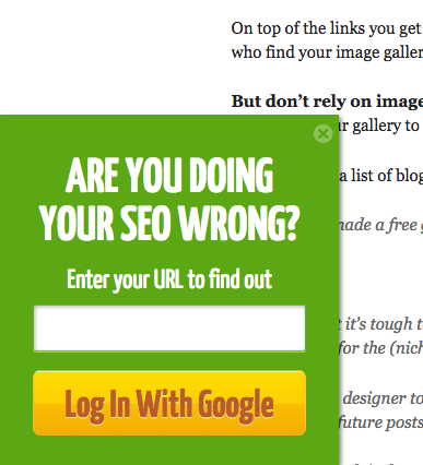
This ad sells nothing, yet it is one of the strongest, with the best CTA. The language used is simple, and the fact that the CTA emerges when the reader is in the middle of reading the blog helps keep them hooked. You won’t even think twice before entering your details. The moment you do that, you will be on their list and inside their funnel.
25. Grey Goose
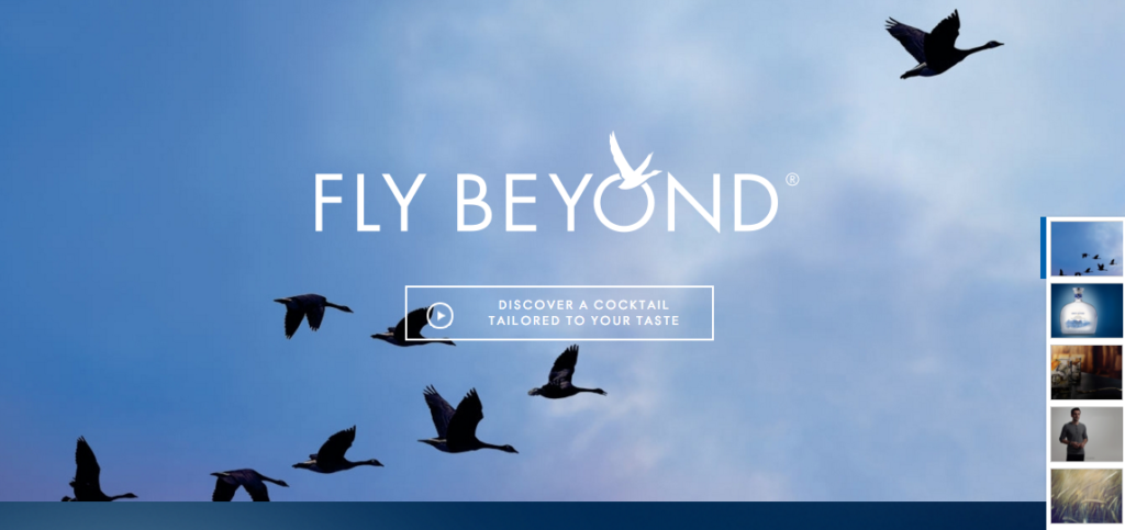
Out of all the call-to-action button examples, this is the most unique. A potential customer would’ve expected a review or a product page, but this is out of the world. To top it, people love it when something is tailor-made for them.
26. Birchbox

Self-love tips: check! Monthly subscription awareness: check! This ad checks all the right boxes, and the CTA is easy to act on.
27. Inika Organic
This is one of the lesser-seen call-to-action examples. One may or may not click to buy something, but clicking to take a quiz is something you can easily convince readers of. Such CTA examples boost conversion rates by a huge margin.
28. Leaf Shave
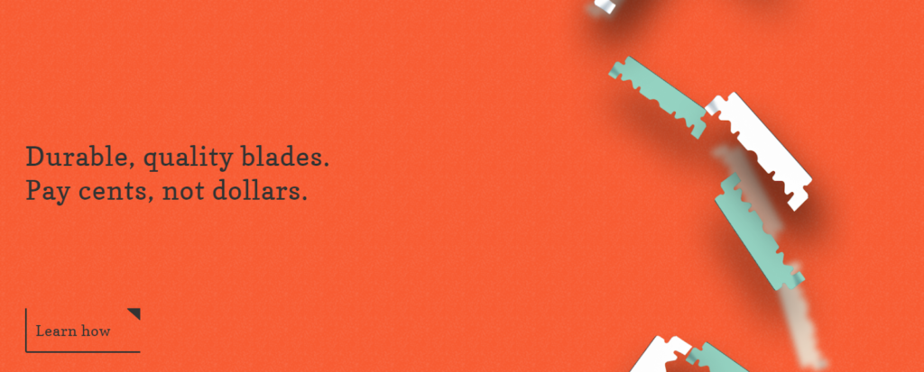
This is a plain and minimal ad that will certainly sell you the product in the next step. Users tend to click more when they see they’re being given more details to make them aware.
29. Spotify
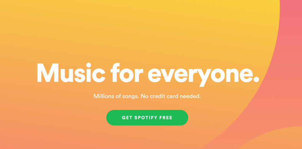
Spotify is yet another brand that has always won hearts with its marketing strategies and ads. This one may be clean and crisp and has a strong incentive, i.e., millions of songs for free. It convinces the customer that all they need to do is simply sign up.
30. OKCupid
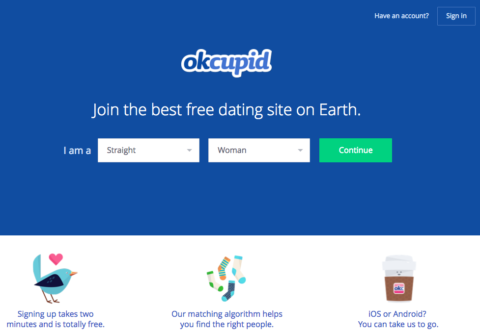
This is yet another ad that seems like you’re doing a fun activity. The small details are brilliantly designed. Generally, dating may feel nerve-wracking for a lot of people. But this copy takes away that anxiety and brings the fun back.
31. Huemor
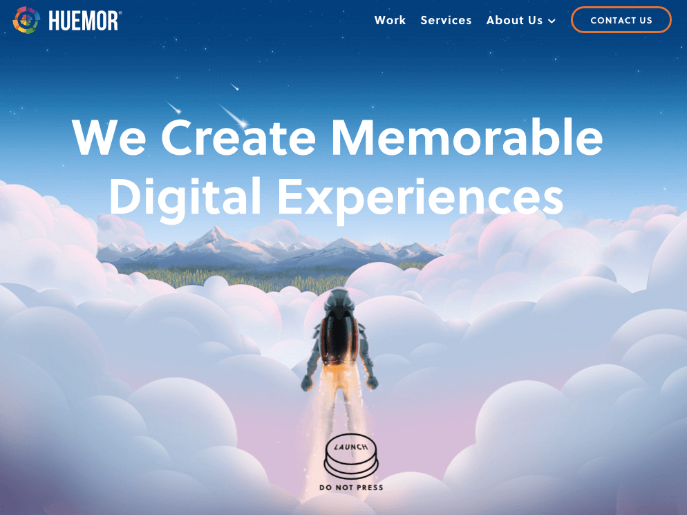
The call to action of this ad is literally out of this world and is ready to take you there too. The CTA has been designed keeping in mind that when you are asked not to do something, your mind keeps poking you to give it a shot. What a brilliant move!
32. Humboldt County
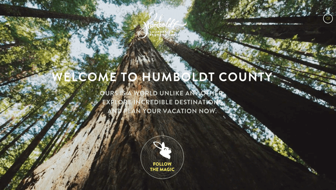
The CTA of this ad is just as engaging as the image that greets you. It’s soothing and extremely welcoming, to say the least.
33. Uber

This CTA gives you the hope and motivation that you look for on a Monday morning. Using full-size images provides readers with an experience that makes you feel like you’re living it.
34. charity: water
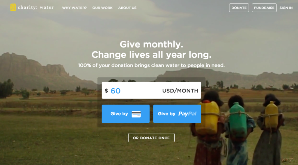
The CTA of this ad helps incite emotions. What’s especially unique about it is that it gives the viewer a choice to pay via credit card or PayPal, or donate just once. This makes the process easy for the viewer, who’s always looking for convenience online.
35. TeuxDeux
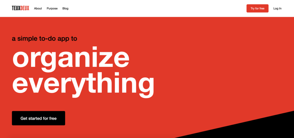
An app that sells organizational skills was bound to have an ad that is so clean, with a crisp call to action. This CTA example has made good use of color contrast, wherein the CTA and the rest of the copy stand out against the red.
36. Ashley Stewart

Zero lines to describe the product, and let you know what it’s about. Based on the looks depicted, many people will click too. The colors have been strategically used, and the fact that the CTA button is slightly tilted makes it even more noticeable in the middle of all those clothes.
37. T.C. Pharma
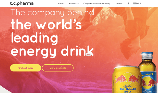
There are two CTA buttons on this page, which helps make the copy more elaborate and detailed. The headline, which is used in the superlative degree, is also quite impactful.
38. Touchland
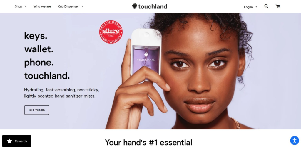
This CTA works for many reasons. The landing page is really well-designed, and the copy clearly describes all the striking features of the mist. Also, using the words “get yours” implies that many have already bought it, generating social proof for the brand.
39. Ugmonk
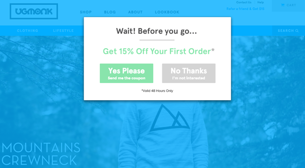
This is an exit CTA. It appears on Ugmonk’s site just when the user is about to leave it. Hence, the discount seems to be there for the sole reason to win them back.
40. IMPACT Branding & Design

This CTA example gets people to click on a button without using any action or trigger words. Now that’s different! A marketer must always keep experimenting with copy and approaches. That’s the only way to discover what works. Something that you may never even have liked much might work better with your audience. The only way to find out is by trying.
Key Takeaways
- A call to action is an integral part of any ad. It’s essential that proper attention is paid when drafting the same.
- All good call-to-action examples are crisp, precise, and to-the-point.
- Always use strong action words in your CTA to point the user towards the next step.
- Call-to-action phrases must provoke potential customers. A lot of customers who buy products based on ads they see online are known to buy them impulsively. This behavior is the result of strong CTA and marketing.
- It’s also crucial to pay attention to the way a CTA is designed: the colors and fonts influence the decision-making abilities of potential customers.
Conclusion
Creating ads and using different call-to-action phrases requires effort. There is no right or wrong in this area. You can put on your thinking caps and use a different idea every time and lookup creative call-to-action examples for inspiration. But, human psychology works in a set way. The idea of your ad can be different every time; however, the function of your CTA will always remain the same.
FAQs
All the ads that you come across on social media are filled with CTA examples. In fact, television commercials also have them. Some examples of call-to-action phrases are as follows:
Join the webinar today
Unlock your bonus offer
Claim your discount code
Click to get your first lesson
A CTA hashtag is a term that prompts the viewers to take a specific step. These exist only on social media. Another difference between a normal CTA and a CTA hashtag is that the latter may not always be accompanied by a full-fledged advertisement. For instance, hashtags trend on Twitter.
While Tweeting, you will be able to see trending hashtags but may not be able to check out the ad behind them. The purpose of a CTA hashtag is exactly the same as that of a normal one, i.e., to prompt the reader to take some action.
A call to action is what tells potential users what to do. It could be shopping for a product or subscribing to a channel. Some marketing material is framed in a manner that does not redirect the viewers to the next step. That’s an example of a failed ad. You need to handhold your customer till the very end of their buying journey. And a CTA is a significant part of this process.
The “play” button is the most clicked button on the internet. Studies have proven that web surfers prefer video content over static posts or images. For example, Facebook video ads receive up to 30% more conversions than the other content formats.
There is no specific color suggested for an engaging CTA button. However, as a general rule of thumb, choosing bright colors that attract attention, such as red, is a good idea. You must also give enough attention to white space, as it helps highlight the CTA even more.
Words are a powerful element of your ads. Your design may be extremely attractive, but if your language lacks weight, you won’t be able to convert customers. Some trigger words that impact the audience are as follows.
Unlimited
Guaranteed
Proven
Free
Improved
Shocking
Save
Latest Blogs
Explore how Google’s 2025 AI search updates triggered ranking chaos. Learn actionable strategies to adapt your SEO for AI Overviews, zero-click searches, and SERP volatility. Stay ahead now.
Learn how to rank on AI search engines like ChatGPT, Perplexity, and Gemini by optimizing your content for authority, structure, and relevance. Stay ahead in AI-driven search with this strategic guide.
Explore the best healthcare SEO services for your medical practice. Improve online visibility and effectively reach more patients in need of your services.
Get your hands on the latest news!

Similar Posts

Content Marketing
4 mins read
11 Best B2B Content Marketing Agencies for B2B Companies in 2024

Content Marketing
5 mins read
Top ecommerce Marketing Agencies with Proven Strategies for 2024
Content Marketing
5 mins read