6 Email Design Showcase Examples for Your Next Campaign
Email marketing is one of the oldest digital marketing strategies. According to The Radicati Group, there are about 4.258 billion email users in the world. This makes email marketing a strategy that 93% of digital marketers rely on. Furthermore, 99% of consumers check their emails once a day. It gives marketers all over the world a unique opportunity they can exploit, i.e., attracting readers through email design showcases.
Most marketers understand the importance of email marketing. As a result, they focus on the email content they create to hook their reader. Unfortunately, the content you add in an email is not the first thing a reader sees. Instead, it’s the design you use.
The content you add informs the reader about your services. But the design you choose depicts how easy or difficult it is to understand this information. Given how important email design is, we have found the top six email design showcase examples currently used.
6 Best Email Design Showcases for Inspiration
We have put together a list of some of the best email design showcases you can refer to for your next campaign.
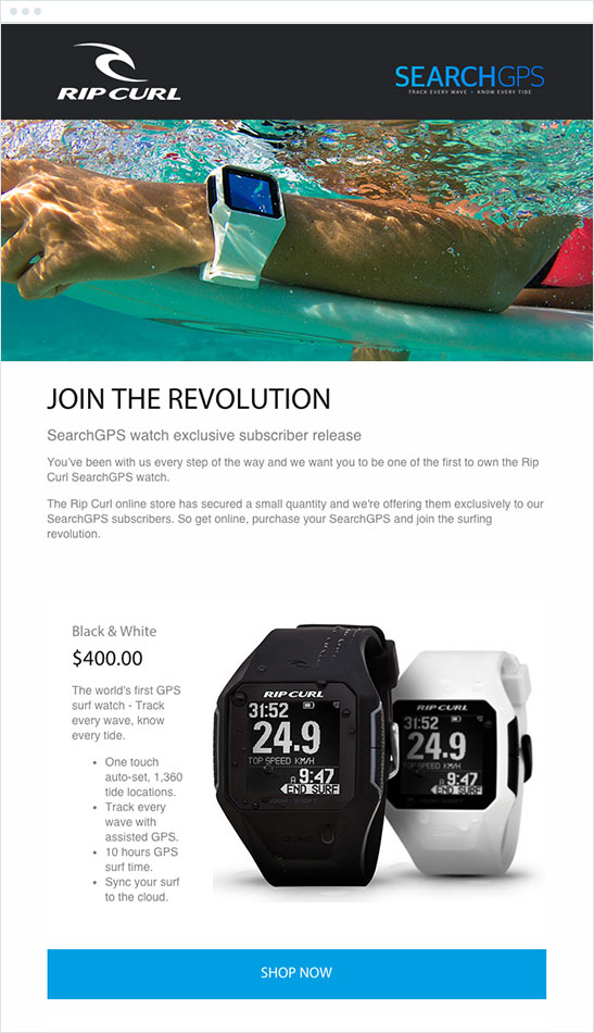
1. Rip Curl’s SearchGPS Watch

Rip Curl is an Australian surf brand. The company specializes in creating products for surfers and divers, including clothing, watches, and other electronics. Let us break down the email to understand why Rip Curl’s email design showcase worked so well.
● Tagline
The tagline of Rip Curl’s email is quite simple: Join The Revolution. However, the tagline has a psychological impact on the reader.
The word “revolution” puts forth two ideas. The first is that this is important and urgent. This puts the reader in the mindset that they have to make a decision now. It is unlikely that the company will run out of products. However, the urgency the email design showcase creates encourages the reader to take action immediately.
Second, the tagline hints that the launch is something bigger. It promises the reader that when they purchase the watch, they will be part of something bigger.
● Relevance
In an interview, James Taylor, the Global Creative Director at Rip Curl, said they created relevant email designs. Subscribers to any company sign up only because they want specific information. Most users do not want generic updates on the company or information about the change in management.

The email design showcase is quite minimal as well as relevant. By reading the small section at the end (see above image), the reader will know everything they need to know about the product.
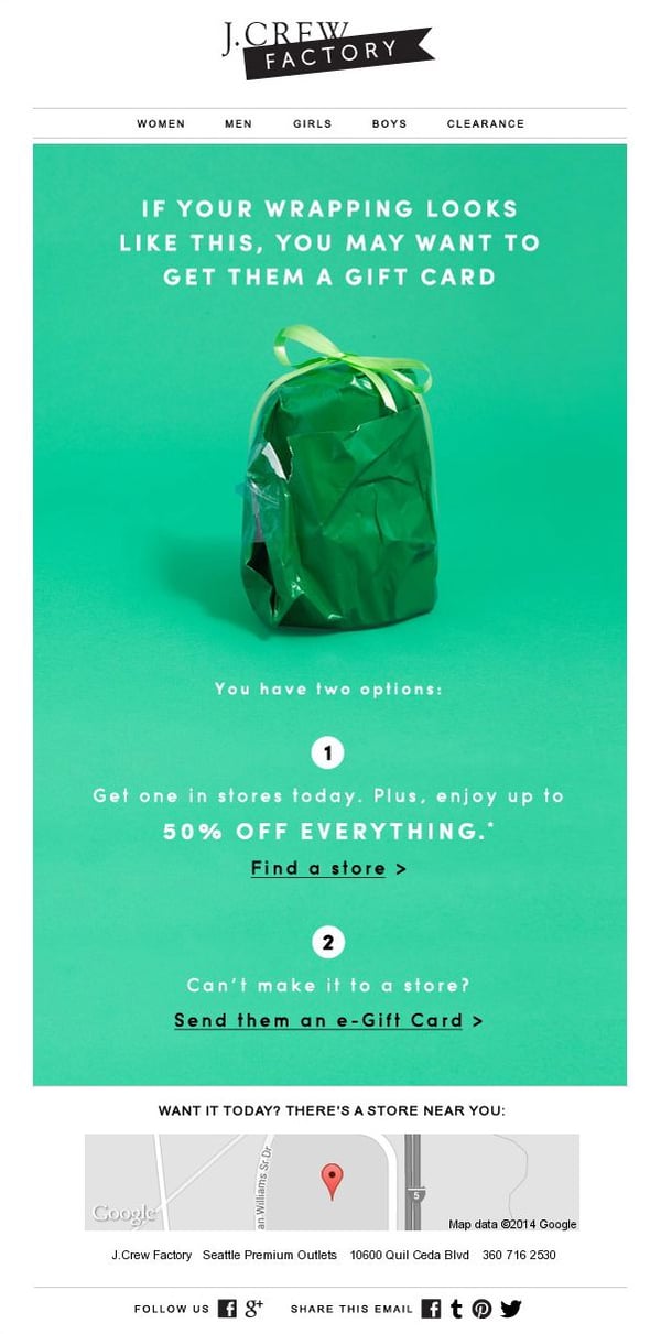
2. J.Crew Factory’s gift card

J.Crew Factory is a multi-brand retailer. It offers women’s, men’s, and children’s apparel and accessories across America. Let us look at why the company’s email design showcase is a winner.
● Content
The tagline and the content included in the email are quite straightforward. Everyone faces difficulty while wrapping gift boxes. By pointing this out, the email brings out the humor in the situation. It identifies the problem (the poor wrapping) without making the reader feel bad.
Once the problem is pointed out, the email also gives the solution. They could either opt to visit a store or purchase an e-gift card. Both options encourage action. By visiting the store, readers can get 50% off. But, if they cannot visit, they can use the e-store to save time.
● Geolocation integration
The unique and excellent integration of the geolocation is what makes this email design showcase exceptional. During the holiday season, people receive hundreds of promotional emails with discounts. But the geolocation in this email stands out.

The location tells the reader where the store is. All they need to do to get the 50% discount is visit the store. The geolocation is calibrated according to each customer’s location, making it highly personalized.
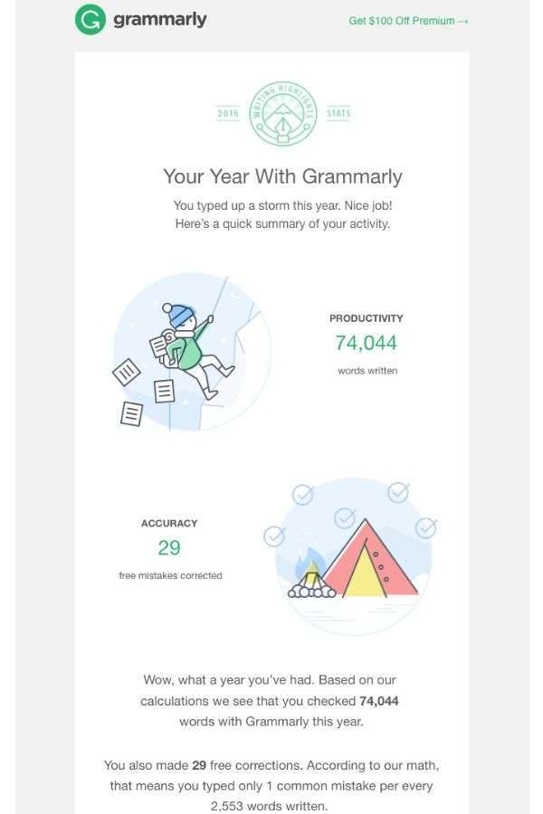
3. Grammarly’s yearly update

Grammarly is a premium tool that offers English grammar checking services to all users. There is one major reason why this email design showcase encourages the reader to renew their subscription: personalization.
You can instantly see that the email does not include the reader’s name. However, it targets the reader’s information directly. Grammarly gives the reader their statistics. The email shows how many words they have written, how many corrections they did, and how many mistakes they made.
This gives the reader an idea of how much they depend on this service. The structure points to the reader’s success and achievements with the app.
The minimalistic design is in line with the brand’s style guidelines. Much like their app, the email shows white spaces, pastel colors, and simple fonts. All of these put the focus on the content and user’s achievements.
The simple CTA given at the top invites users to upgrade their experience. The nudge is simple and gentle like the brand’s style, instead of a large CTA button at the bottom.
4. Charity: Water

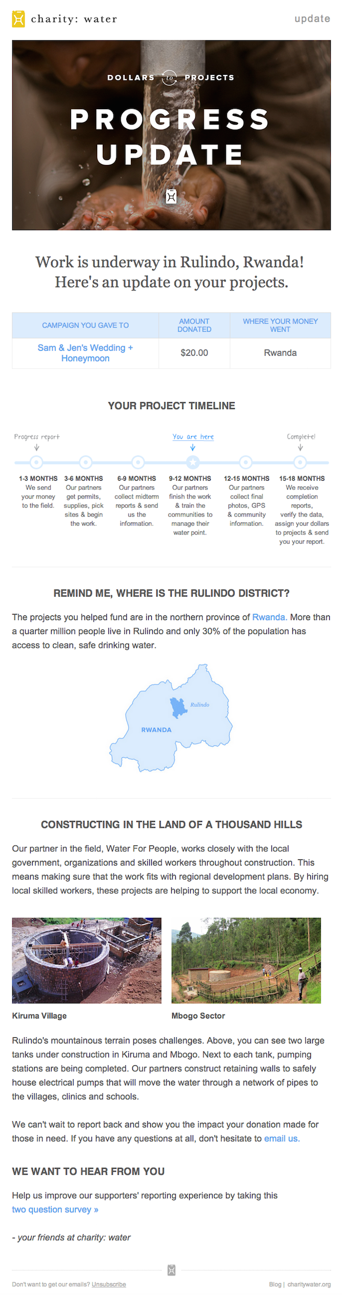
This is one of the longest email design showcases. However, it works to keep the audience engaged by showing the impact of the organization. Multiple elements hold the reader’s attention.
● Table
The tagline of the email is short and might discourage a second look, but the table below won’t. The table shows you just how much you donated to the charity. It is short, but it makes a huge psychological impact. It shows the reader just how much they have contributed to the campaign, making them feel good about themselves. This encourages them to read on.
● Project timeline
For most people, their work with the charity ends once they have donated the money. However, by including the project timeline, you will get an idea of everything that is happening in the project. The simple “you are here” shows where your money is and how you have helped.
● Project information
The final section is just as important. This is especially impactful because it incites an emotional response. By including statistics, images, and relevant content, the charity redefines what they stand for.
If you have donated to the charity a few weeks ago, you might already know the information. However, for someone who donated months or weeks prior, this can serve as a refresher. It gently nudges them to donate again without directly demanding money.
5. Redbubble’s promotional email

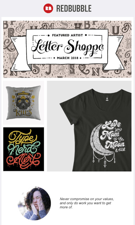
Redbubble’s promotional email design showcase speaks for itself. This email has virtually no content. Instead, it has three large images that speak directly for the brand. The email puts the artwork in the front and center.
The title of the email gives the reader an exact idea of what the email is about: the featured artist and their work. This has a twofold impact.
First, the viewer can see the images and understand what the company stands for. There is no need to add content to explain the services, who the winner is, or why. Instead, the artwork and the lettering do the talking. Second, it encourages the viewer to try getting their work featured in the top spot.
6. Hunter’s new product

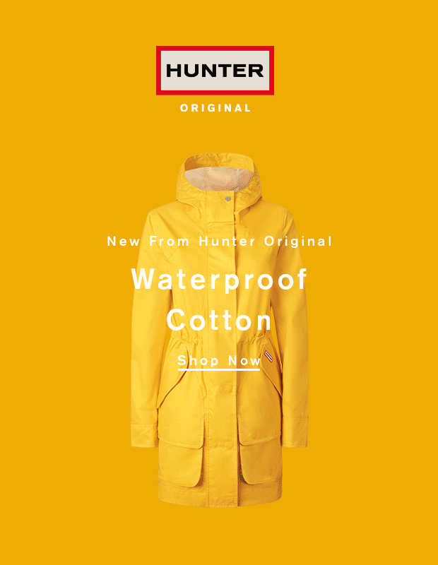
Hunter’s email includes a fun, interactive element. The GIF does most of the talking for the brand. Within twenty seconds, the readers gain all the information they need to know about the product. The tagline is direct. It tells the reader Hunter has a new product: a waterproof cotton jacket.
At the same time, the GIF shows the reader the various color options available to them. This means if you like the jacket, you do not need to visit the website to see which color options they have. You can find it right here.
Adding GIFs to the email design will not affect your open rate. However, it will include a fun element that gently nudges the reader to learn more about the product. GIFs in all forms are eye-catching. And if they are centered around the brand, such as the one included by Hunter, you need not include any other content. You can read our tips on responsive email design to learn more.
Key Takeaways
● Each brand has a unique email design showcase and they all work for the same reason. They stay true to their brands. When designing an email, you should remember your brand style and vision.
● An email has two purposes: to give information and make the reader take action. However, this does not mean you have to include a lot of information. Your email design should include information that is relevant to the user. Cluttered emails discourage action.
● Most email design showcases given here work because they are personalized or simple. Therefore, when you create your email, remember to include something the reader can relate to.
These are some of the best email design showcases you can use as inspiration for your next campaign. While there are many unique ideas that you can implement, you must remember to keep your email true to the brand.
FAQs
The key to a good email is both the content and design. An email writing tip is to focus on content quality. Each word included in the email should have some meaning. Fluff, unnecessary words, and long CTAs discourage action
Both pastel colors and bright colors can be included in an email. The colors you choose depend on your branding. For example, Grammarly’s email aligned well with its brand colors.
GIFs, images, and memes don’t have a direct impact on the email open rate. If you want to get your readers to open your email, focus on the subject. The subject of the email should pull in the reader. Your email design may not make a difference if the email is never opened.
Yes, email marketing is still relevant. 29% of marketers rate email marketing as the most efficient channel. In contrast, only 25% say it is social media.
Email testing is crucial before you send an email. A broken link or an ill-placed CTA can discourage conversion. A/B testing helps you identify any problems before you send out the emai
Latest Blogs
Explore how Google’s 2025 AI search updates triggered ranking chaos. Learn actionable strategies to adapt your SEO for AI Overviews, zero-click searches, and SERP volatility. Stay ahead now.
Learn how to rank on AI search engines like ChatGPT, Perplexity, and Gemini by optimizing your content for authority, structure, and relevance. Stay ahead in AI-driven search with this strategic guide.
Explore the best healthcare SEO services for your medical practice. Improve online visibility and effectively reach more patients in need of your services.
Get your hands on the latest news!

Similar Posts

Design
7 mins read
15 Best Firms Offering Design Services in India

Design
5 mins read
All You Need to Know About Data-Driven Design

Design
6 mins read