
Your marketing strategy remains incomplete without email marketing. With an ROI of 4200% (you earn $42 for every $1 spent), it is one of the most effective strategies ever.
It has a powerful reach, and when done well, it can help you enhance your brand’s visibility as well.
As Campaign Monitor reports, marketers who used segmented email marketing campaigns saw a 760% increase in their revenue. For an email to be effective, you should not just focus on the copy, but also on the design. Your user’s experience while reading the email should be seamless across devices. In this blog, we bring you responsive email design tips that will help you improve engagement and increase conversions.
What Are the Benefits of Responsive Design?
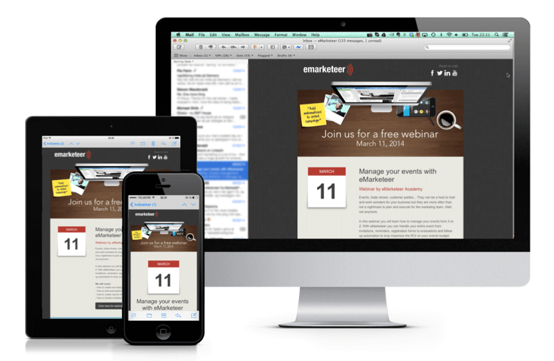
Responsive design is when you create a single layout design that fits all devices and form factors seamlessly. It fits into any bucket of size and resolution, which means your user doesn’t experience friction when browsing your website. Here are a few of its benefits.
1. Compatibility with multiple screens
An email with a responsive design is fit for any screen and size. So, if your customer receives an email on the go, they will read and respond to it. They will have the same viewing experience as on the desktop or tablet.
2. Greater conversion rates
Customers generally like clicking on the action button when they see the email. This is when you are more likely to see a conversion. However, if the design is not responsive, the customer won’t get to see the entire email.
3. Smooth user experience
Responsive emails render perfectly on all screen types. As a result, it creates a far better impression on the customers as they can view it correctly. When the email opens on the screen properly, it also facilitates ease of access, which allows the user to click on the action button with ease.
4. Higher open rates
Click-to-open rates are higher when you send out responsive emails to your customer. It makes accessing the email, navigating screens, and moving to a different landing page easier.
How to Design Responsive Emails: 6 Top Tips
You are now aware of the need for responsive email design. Let’s look at a few responsive email design best practices now.
1. Use a single-column layout
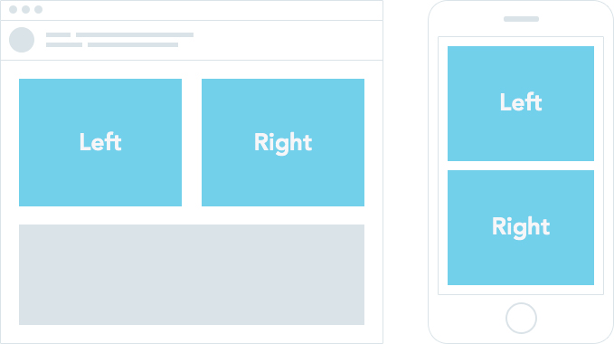
When designing the application for handheld devices, it is essential to keep the end-user in mind. The content should be legible and interactive. It should be accessible too. For this purpose alone, you should use a single-column layout in your design. The width should be somewhere around 600 and 640 pixels. With a single column, customers won’t need to scroll through the content or shift the device to read it. It is the most inclusive model of designing emails.
2. Optimize your CTA
The call to action (CTA) holds an important place in your email design. Your conversions depend on the CTA you include in the content. However, along with the copy, you should place some importance on the button’s placement as well.
It is suggested to have it in the first fold so that customers who are ready to convert can directly click on the button and land on the page. This is the most critical piece of your email, and you don’t want your customers to keep looking. Also, make sure you don’t use terms like “click here,” as that could put the reader off. While the CTA needs to be precise and concise, it should also be relevant and meaningful. Come up with engaging terms, such as “Get your free copy,” “Move to cart,” etc.
3. Include clickable links
Adding links to an email is pretty standard. However, the most crucial part is to add links that reach the right places. You should also ensure that these links are clickable. Often, when users try to click on a link, it leads them nowhere. Your emails should avoid such issues so that the experience is smooth and seamless. To make sure your email links work, you should export the emails to HTML and upload them to the apt email delivery service.
4. Use interactive images
A lot of emails use images to connect with the customers. You might use GIFs or other image formats, too, to attract attention. However, it would help to keep mobile devices in mind when designing your emails.
All content formats should open quickly and be accessible across devices. The images should also resize to suit the device specifications. As a result, when designing the email, include responsive photos too.
5. Place the key message above the fold
The email is divided into two segments, above-the-fold and below-the-fold. Everything that is visible as soon as the reader opens the email is considered above the fold. For this, the user doesn’t need to scroll. However, some contents would require the user to scroll, which is considered below the fold.
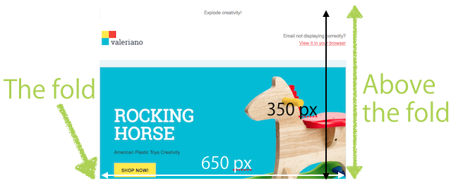
You should include key messages about the email in the first half. For example, you should mention an offer or a new launch in a way that is conveyed in the first scroll itself. If the customer is interested in the product, they will scroll and view the remaining contents.
6. Test your emails
It is essential to test every email for design and content effectively before sending it to your customers via email delivery services. It is not just about testing whether the email works; it is also about testing two different variants to check which works better with your customers.
A/B testing is an integral part of designing responsive emails. It helps know which email works best to get maximum results from your design and ad copy. Lastly, you should keep a record of the key metrics to monitor and measure your email marketing campaign’s effectiveness. You should also check how many viewed the email on their mobile devices. It will help you build a more compelling email design for the upcoming campaign.
Learning how to design responsive emails is a must, as your users should be able to seamlessly read emails on all devices. When you opt for a responsive design, you offer a seamless user experience, drive more sales for your business, and improve click-through rates.
There are umpteen benefits of designing responsive emails. If you follow the above-mentioned responsive email design tips, you will surely enjoy the benefits associated with them.

FAQs
Responsive design entails designing collateral in a way that users can seamlessly view and consume it on all screen types and sizes.
Responsive emails are scannable, lead to a better user experience, and have high conversion rates.
The ROI of email marketing is 4200% (you earn $42 for every $1 spent).
Latest Blogs
Explore how Google’s 2025 AI search updates triggered ranking chaos. Learn actionable strategies to adapt your SEO for AI Overviews, zero-click searches, and SERP volatility. Stay ahead now.
Learn how to rank on AI search engines like ChatGPT, Perplexity, and Gemini by optimizing your content for authority, structure, and relevance. Stay ahead in AI-driven search with this strategic guide.
Explore the best healthcare SEO services for your medical practice. Improve online visibility and effectively reach more patients in need of your services.
Get your hands on the latest news!

Similar Posts

Design
7 mins read
15 Best Firms Offering Design Services in India

Design
5 mins read
All You Need to Know About Data-Driven Design

Design
6 mins read