10 PowerPoint Design Ideas That Are Anything But Boring

Table of Contents
- 10 PowerPoint Slide Design Ideas
- Key Takeaways
- Conclusion
- FAQs
Since you’re here, you probably know what sitting through a boring presentation is like. And if you’ve ever been the one presenting what feels like a sermon to the wall, well, it’s definitely not fun. Nobody likes to partake in a mundane presentation that seems to plod on forever. But what makes a PowerPoint presentation (PPT) boring or attractive? In this blog, we’ll discuss some things that can make or break your presentation, along with helpful PowerPoint design ideas.

10 PowerPoint Slide Design Ideas
Just because it’s PowerPoint, it doesn’t have to be mundane. Here, we list some of the best PPT design ideas that you can borrow for your next presentation.
1. Avoid too much text
Slides aren’t meant to present walls of text, as if you’re writing a thesis. They’re meant to capture points and ideas. Don’t use slides to write out whole thoughts and explanations. As a speaker, you should be delivering most of the content and information. Your audiences are there to listen to you, not spend half the time reading paragraphs. The elements on the screen are to aid your presentation. Besides, most will probably ignore the chunks of text in your PPT slides. To avoid getting carried away with text (for when you’ve got lots to say), here are a few presentation design tips.
- Use only the crucial words for pointers.
- Don’t use lengthy sentences to explain points; put up only the key points and use them as cues for your explanation.
- Carve out a distinct space for quotes; one quote per slide is a good idea.
- Highlight important words or phrases.
2. Keep your layout uniform
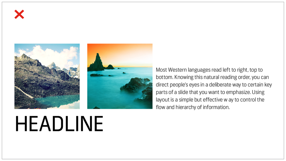
Uniformity in layouts is a top PPT design idea. We naturally tend to start scanning a page from the left and move to the right, from top towards the bottom. The way you place elements on a slide should lead people to look a certain way, and guide the flow of information in the right manner. Here are some PowerPoint design ideas for your slide layouts.
- Do not club different elements in one place..
- You can place pictures on the left side and text on the right, or vice versa.
- Maintain the same layout through most of the slides.
If you think your presentation is getting monotonous, you can include a different slide layout (but one that goes with your existing theme). Although uniformity is crucial to a presentation, it could be boring to see the exact same slide every single time.
3. Create a visual hierarchy

In addition to the above points regarding layout, hierarchy is something you must incorporate into your PPT. Visual hierarchy means arranging elements in order of their importance. Here are some PowerPoint slide design ideas to make your PPT neat and structured.
- Pick a prominent font style and color for your headline, which is different from that of the body text.
- Place elements in a way that the flow and order of significance can be easily grasped.
- Follow the same font style and color for your text throughout the presentation.
- Keep only one topic/approach per slide.
4. Take cues from the 6×6 rule
A common mistake most people usually make in PPTs is putting too many elements and ideas on a single slide. The clutter hampers people’s ability to focus, which takes the power of retaining certain information away from the listeners. The 6×6 rule is all about conciseness.
- Six points and six words: the 6×6 rule says you should have not more than six bullet points on a slide, and not more than six words per bullet point.
- Some suggest keeping no more than six words on a slide.
- Some go by the 5×5 rule, which means five lines per slide, and five words per line.
- The idea here is to keep ample white space on your slide.
- Why white space, you ask? Because it directs the focus towards key points.
- Avoid “orphans,” which are the last words in a sentence that continue on to the next line.
- For a clutterless presentation, try fitting a sentence in just one line.
5. Simple colors look better
You can get creative with colors, but simplicity rules when it comes to ensuring a clean look for your PPT. Here are some color tips you can consider.
- Avoid using fonts in too bright a color. Extremely bright colors are hard to read.
- Use basic contrast—light on dark or dark on light—when it comes to using text on the background.
- Intense gradients are also best avoided, if you want to make the fonts easy on the eye.
- Check color wheels, mixing charts, etc., to know more about color combinations.
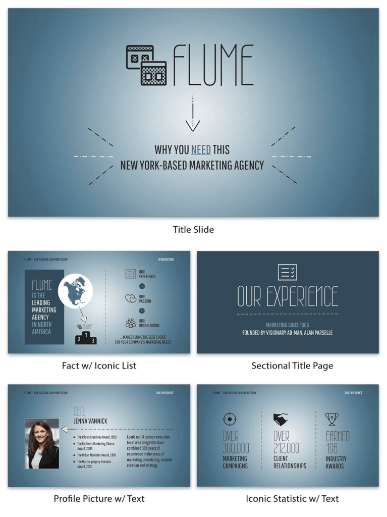
Below is a PPT example that follows color consistency with simple fonts

6. Use brand guidelines to your advantage
Companies often have brand colors and style guides. And if you are presenting at work or for work, it’s good to use them in your presentation. This way, you won’t have to ponder upon which color to go for (deciding on color could be such a fuss for some of us), besides incorporating the brand’s visual identity in your PPT.
7. Too many fonts spoil the look
Sans serif fonts like Tahoma, Verdana, Helvetica look neat on screens. You can experiment with other simple or sophisticated fonts, but keep legibility a priority. Here are a few presentation design tips as far as fonts are concerned.
- It is advisable to have a maximum of two fonts in your PPT. Using a single font type is great, too, but it might get a little boring. So, two is the magic number for font combinations.
- Match fonts with the theme of the presentation. By theme, we mean the topic and content of the PPT.
- Over-styling isn’t a good idea; even if you go for stylish or flashy fonts, make sure they are easy to comprehend.
8. Use relevant images
Images in your slides are going to take up most of the attention. So, make sure they fit the concept of the PPT. There’s no such thing as “the right image,” but here are some image selection tips for presentation slides.
- The images you choose must support and elevate the text.
- The image should be relevant to the topic.
- Use authentic images. Sure, you can use stock images all you want (as long as they fit the subject of the PPT). However, original pictures give your PPT a boost. For example, a presentation about a field project with pictures from the actual project would look way better than one with stock images.
9. Use visual aids

Besides pictures and images, using other visual elements will help in two ways.
- Replacing text with visuals prevents slides from getting cluttered.
- They make the content engaging.
Here are a few creative PowerPoint design ideas to incorporate visual aids.
- Use infographics, charts, tables, and graphs to present information.
- Use a map to visualize geographic information.
- Use icons along with headers/points.
- Use recurring icons, motifs, or shapes to bring uniformity to your presentation.
- Opt for a timeline to visualize the process or journey. Some examples include timelines, roadmaps, milestones, etc.
10. Let all your elements breathe
Visuals can be great replacements for words, but make sure to not overuse them. Remember, white space holds a lot of visual power in your slide (or any other design for that matter).
Key Takeaways
- Avoid adding too much text in your PPT. An important presentation design tip is that the lesser the text, the happier the audience.
- Use simple fonts and colors.
- It is advisable to let your images speak in favor of the content.
- Maintaining visual hierarchy is another important PowerPoint design idea.
- Use visual aids; a PPT design idea is to transform text into visual elements, such as graphs, maps, pie charts, etc.
Conclusion
Designing a presentation doesn’t require a professional designer, as long as you know the basic elements that go into creating a good PPT. In the case of a solid presentation design, it all comes down to only a few key things you need to follow: a neat and tidy layout, uniformity and consistency in the design choice; ample relevant visuals and less text; and legibility and visibility.
The ultimate gem lies in knowing how to deliver with what you’ve got. For that, you’ll need to be thorough with the content in your PPT. In short, prepare well. One last PowerPoint design idea: body language and confidence is key. So, speak as though you’re the master of your content (which you are). All the best for your next presentation!
FAQs
The ideal font size in PPTs is 24 and above.
Stylish fonts are okay as long as they are easily legible.
Any image that supports your point and is relevant to the subject would do.
A presentation design tip is to avoid too much text, too many images on one slide, too many colors, and multiple fonts.
Yes, you need basic design knowledge to make a powerful PPT. However, you don’t need to be a designer. You can refer to a plethora of PowerPoint design ideas online.
Not at all. Just contrast them with the light ones.
Latest Blogs
Explore how Google’s 2025 AI search updates triggered ranking chaos. Learn actionable strategies to adapt your SEO for AI Overviews, zero-click searches, and SERP volatility. Stay ahead now.
Learn how to rank on AI search engines like ChatGPT, Perplexity, and Gemini by optimizing your content for authority, structure, and relevance. Stay ahead in AI-driven search with this strategic guide.
Explore the best healthcare SEO services for your medical practice. Improve online visibility and effectively reach more patients in need of your services.
Get your hands on the latest news!

Similar Posts

Design
7 mins read
15 Best Firms Offering Design Services in India

Design
5 mins read
All You Need to Know About Data-Driven Design

Design
6 mins read