
Table of Contents
- 5 Tips to Design Compelling Presentations
- Key Takeaways
- Conclusion
- FAQs
In today’s corporate world, being able to give good presentations is a must. Authentic facts, detailed information, professional design, and oratory skills are just a few of the many things that you must possess before taking the floor. Keep reading for some killer presentation design tips that’ll help you impress your audience.
5 Tips to Design Compelling Presentations
Follow along as we bring to you six essential tips to enhance your presentations.
1. Choose your topic carefully
First things first, pick a topic that you are well-versed with. Sometimes, however, you may have to go with a topic that you may not know much about. In such a scenario, find an angle you want to be the underlying theme of your presentation. For instance, if your topic is pet care, you can talk about dog health and nutrition, if that’s something you know much about.
Once you’ve decided the topic, make sure to conduct in-depth research about it. It’s always advisable to throw the floor open for questions in the end. You need to be confident enough to be able to do so. And that will come only with a thorough research of the topic. You can read as many design tips for presentations as you want, but if you don’t know enough about the topic, it won’t help your case.
2. Refrain from adding too much text
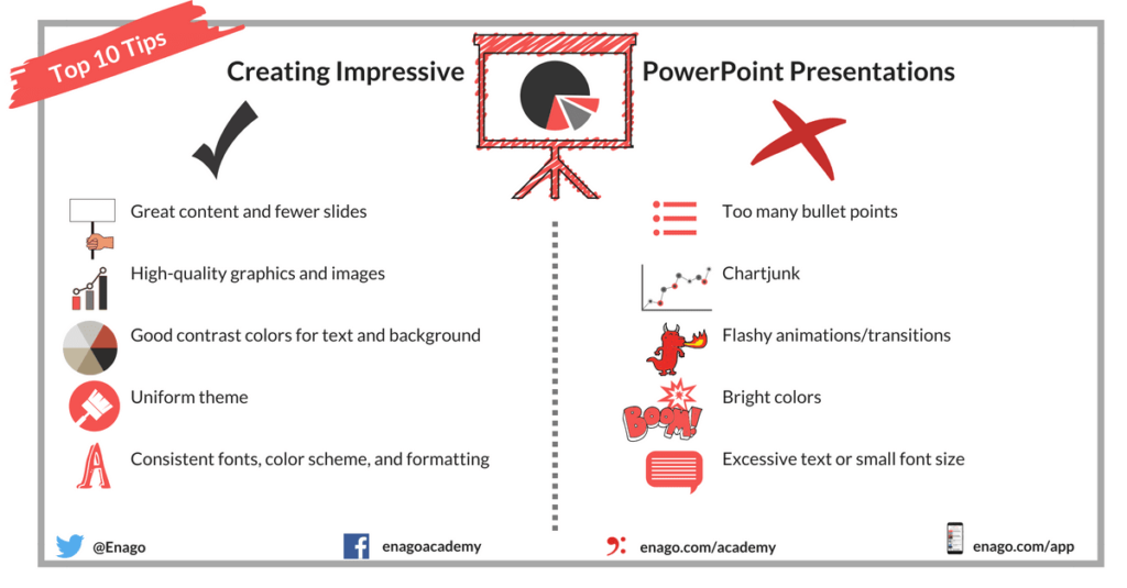
One of the most basic presentation design tips is that the text should be bare minimum, i.e., only as much as required. Prevent yourself from writing down all the details in the presentation itself. Instead, write them in the presenter’s notes and discuss them verbally.
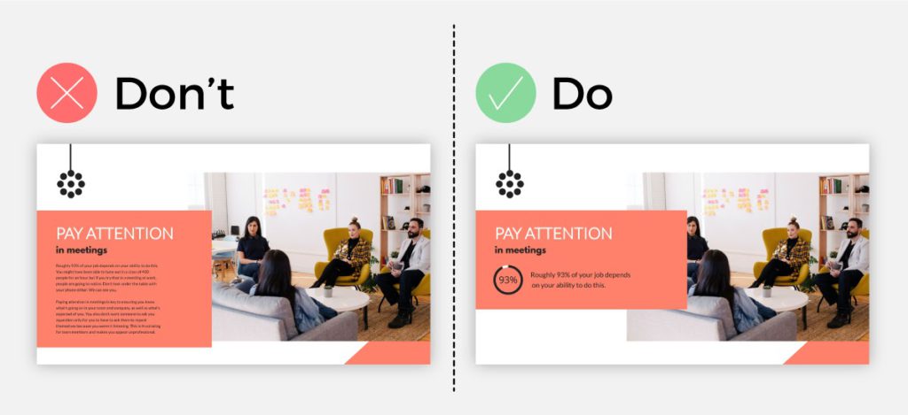
Never overwhelm your audience. Don’t crowd your slides with paragraphs. It’s akin to typical graphic designing: add content that is enough to throw the attention on your main point. Overcrowding your slides is not a part of good slide design practices.
If you have a lot of points to discuss, consider mentioning just the major pointers. It’ll avoid your presentation from getting cluttered. Some of the best designed PowerPoint presentations follow the 7×7 rule, which means: a maximum of seven bullet points per slide, with seven or fewer words in each point.
3. Let statistics do their job
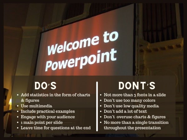
Adding numbers, facts, and data to your presentation is a good idea. They’ll make your presentation more authentic and credible. When you have to limit the text in your slides, how will you ensure that your point gets communicated? Use charts and figures. Graphs and data widgets make your presentation more engaging and professional. But as a part of imparting good presentation design tips, we must also remind you to not overdo it.
4. Be a storyteller
People always enjoy listening to a story. Even if your presentation is not too long, putting your point across in the form of a story will engage your viewers more. Plus, stories are easier to remember. You obviously have to add statistics where necessary, but building a narrative will help provide context.
5. Add multimedia for engagement
Once you have spent enough time developing compelling content, look for visuals that are captivating. Imagine if somebody gives a presentation to you, which has only text: you’ll lose interest pretty quickly. That’s why adding different kinds of visuals, such as GIFs, videos, charts, images, etc., will make the presentation exciting for your audience.
Key Takeaways
- Everybody knows how to make PowerPoint presentations. But, if you want to stand out, then making a presentation that is inclusive of authentic facts and in-depth detail on the topic is important.
- In addition to that, following good presentation design tips is essential. Don’t add too much text to your slides. It will bore your audience.
- Pick your fonts and colors carefully. Don’t add more than three fonts to a slide. Follow a color scheme that relates well to your brand.
- Always add multimedia to make your presentation more engaging and exciting.
- Including numbers and statistics is also critical. You can showcase them in the form of charts and graphs.
- Well-designed presentations don’t focus on too many points in each slide. This gives your audience enough time to digest one point at a time.

Conclusion
We are taught to make PowerPoint presentations in school itself. But creating and delivering a compelling presentation is nothing short of an art. That’s why the internet is filled with presentation design tips to help young corporate professionals create impactful presentations. In a nutshell, in addition to following useful presentation design tips, it’s critical for every presenter to know the psyche of their audience—as well as their topic— inside out.
FAQs
Guy Kawasaki, a Silicon Valley-based author, speaker, and entrepreneur, came up with the 10-20-30 rule of PowerPoint presentations. It states that no PowerPoint presentation should be longer than 10 slides and 20 minutes, with the font not being smaller than 30 points. He coined this rule to put an end to long and hectic PowerPoint pitches.
There’s a long list of effective presentation tips. Find some of them below.
1. Plan your presentation properly.
2. Conduct thorough research.
3. Understand the audience.
4. Present clearly in a language that the audience knows well.
5. Start and end the presentation strongly.
The basic PowerPoint presentation design tips state that each slide of your presentation must have a maximum of six bullet points.
If you don’t wish to start your presentation by greeting your audience with “good morning”, there are several other options for you to choose from. You can share a shocking statistic or fact. You can also tell an anecdote to personalize your presentation. Asking a question to engage your audience is another great idea. Always remember that the first impression is the last impression, so try to start and end your presentations on a great note.
Here are some tips to avoid ruining your presentation.
1. Don’t overcrowd the slides with text.
2. Don’t use more than three fonts in a slide.
3. Don’t use a multicolored palette.
4. Don’t use more than a single slide transition throughout the presentation.
5. Don’t use low-quality images and videos.
Latest Blogs
Explore how Google’s 2025 AI search updates triggered ranking chaos. Learn actionable strategies to adapt your SEO for AI Overviews, zero-click searches, and SERP volatility. Stay ahead now.
Learn how to rank on AI search engines like ChatGPT, Perplexity, and Gemini by optimizing your content for authority, structure, and relevance. Stay ahead in AI-driven search with this strategic guide.
Explore the best healthcare SEO services for your medical practice. Improve online visibility and effectively reach more patients in need of your services.
Get your hands on the latest news!

Similar Posts

Design
7 mins read
15 Best Firms Offering Design Services in India

Design
5 mins read
All You Need to Know About Data-Driven Design

Design
6 mins read