
Table of Contents
- 5 Infographic Design Rules
- Key Takeaways
- Conclusion
- FAQs
Infographics have become a marketing mainstay, and you can see them almost everywhere these days. Today’s infographics are far more appealing, compelling, and easily consumable.
They have evolved with design trends and received some creative facelifts. Infographics now combine a variety of data visualizations into a unified visual feast.
Infographics are a fantastic way for brands to deliver content engagingly, and they have been used by marketers all over the world. However, too many marketers or designers believe that smacking words and images together can make a great infographic. If you ask them how to design infographics, many would answer, “Place some decent images, highlight data, add charts and shapes…”
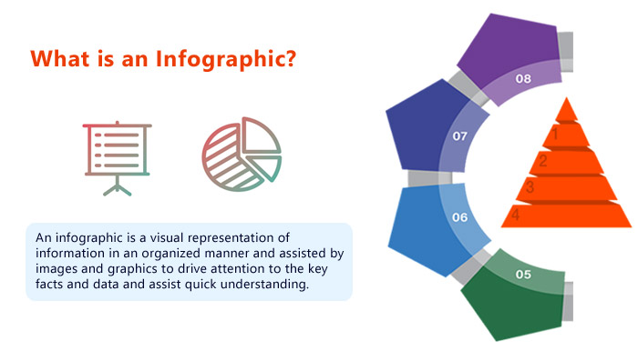
As a result, the internet is filled with lengthy, tedious, and poorly designed pieces with no plotline. A good infographic is not all charts and graphs scattered randomly, content copy, a few illustrations, a logo, and a call-to-action. A visually enticing infographic design is much more than that.

5 Infographic Design Rules
It is easy to identify which one is a good infographic from a collection. But when you sit down to create one, you need some guidelines for effective execution. Here’s a shortlist of infographic design rules to follow for your content marketing projects.
1. Classify the data
Divide and arrange the data you need for an infographic into major heads, subheads, sections, bullets, and other bits. Keep simplifying it and breaking it down until it appears elementary. At any point, if you feel a deficiency, you can add more data, because it is the hero of your infographic.
This step lays the foundation for your intention behind designing any infographic. It allows you to filter out all the noise and refine it until you find what you want to say to your target audience. It’s also advantageous to structure (and design) content in blocks. Furthermore, it helps you organize your thoughts.
2. Visualize the focal point
Picture the final takeaway of the infographic that you want your reader to stick with and contemplate. After classifying data, you need to find the focal point or the hook. A hook is a crucial piece of information your reader must-see.
Further, segment your data into should-see and can-see categories. Then present all the associated relevant data connecting the dots in the overall infographic. Place the hook either at the center or the end of the infographic.
3. Weave a story
You will not leave a mark on the intellect and psyche of the reader unless your data is beautifully entwined with a story. To create an interactive infographic, every data point, the fragments of copy, and design element must support the main story. Theatrics, closeness, simplicity, engrossment, believability, agency, and sentiments are characteristics of a good story. They make the data memorable and easy to digest.
The initial two things that catch the interest of the reader are the title and subtitles that fit the story. An infographic should begin with the necessary background information that can provide context for the content, then proceed intuitively through the story. When making an infographic, your goal is to convey a clear and specific narrative rather than a more exploratory experience. The tone of the story should be analytical rather than opinionated.
4. Lay a wireframe
Once you have collected all the relevant information, organized it, and woven a story around it, sketch the wireframe of the conceptualized infographic. Label every section, subsection, and data set.
Wireframing allows you to analyze the presentation and arrangement of your data from the reader’s point of view. Every element of your design must make sense, and converge towards the focal point.
5. Design the composition
Focus on the design elements once each fragment of information in the infographic makes sense. The purpose of adding colors, typography, images, and illustrations to an infographic is to align the content with the focal point of the story in an interactive way.
A clear, legible, and impactful font will not be enough if it does not align with the tone of the infographic. Also, too much text is not advisable in an infographic design.
It must be limited to headlines, subheads, sections, and writing the digits. An intelligent designer would pick a typeface that aligns well with the mood and theme of the information.
For instance, to create an infographic for a food company, use sans serif or rounded typefaces like Avenir, Univers, Comfortaa, Chewy, etc. And for presenting any data on economics or governance, use Helvetica, Futura, Garamond, and the like.
You can pick the color scheme of the brand you’re designing for or choose any trending color palette. Remember, your goal is to not just make the infographic visually appealing, but also highlight the important things. Despite how easy it is to read the text on the infographic, a color scheme can either bring forward or obscure the information. It is wise to preserve maximum readability using not more than three colors.
Besides this, you must use vectors, shapes, icons, images, and graphs to make your presentation visually tempting. Smartly added or left-out negative space is mandatory for smooth eye movement. Otherwise, your design will look crammed up.
Key Takeaways
- Keep simplifying and breaking the data into major heads, subheads, sections, bullets, and bits until it appears elementary.
- A hook is a crucial piece of information your reader must see. Place the focal point either at the center or the end of the infographic.
- Incorporate storytelling. An infographic should begin with the necessary background information to provide context for the content, then proceed intuitively through the story.
- Sketch the wireframe of the conceptualized infographic and label every section, subsection, and data set.
- Add colors, typography, images, and illustrations in an infographic such that they are aligned with the focal point of the story.
Conclusion
If you want to learn how to design infographics, simply creating one and publishing it is no longer enough. It used to work earlier, but there is too much competition now. We all recognize a beautiful infographic design when we see one, and your clients do as well. Use these infographic design rules to help you get started with infographics, but develop your own techniques and standards once you’ve gained some experience.
FAQs
It is the white space or distance kept between any two design elements.
Data is the hero of an infographic.
Modern, simple, and legible fonts like Futura, Avenir, and Garamond are the most common fonts used in infographic design.
When it tells a great story, every element in the infographic’s design aligns with the tone and mode of the narrative.
Latest Blogs
Explore how Google’s 2025 AI search updates triggered ranking chaos. Learn actionable strategies to adapt your SEO for AI Overviews, zero-click searches, and SERP volatility. Stay ahead now.
Learn how to rank on AI search engines like ChatGPT, Perplexity, and Gemini by optimizing your content for authority, structure, and relevance. Stay ahead in AI-driven search with this strategic guide.
Explore the best healthcare SEO services for your medical practice. Improve online visibility and effectively reach more patients in need of your services.
Get your hands on the latest news!

Similar Posts

Design
7 mins read
15 Best Firms Offering Design Services in India

Design
5 mins read
All You Need to Know About Data-Driven Design

Design
6 mins read