Font Psychology 101: How To Choose The Best Fonts For Your Brand
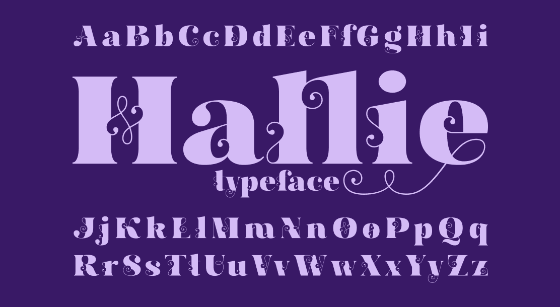
Table of Contents
- Different Font Types
- Fonts for Your Brand
- Choosing the Right Font for Your Brand
- Other Points to Consider
- Key Takeaways
- Conclusion
- FAQs
Fonts help establish a brand image for your business. Most popular businesses use a distinct font across their publications and texts. Font psychology is an area of study that focuses on the impact different types of the font have on people. A study found that text written in red ink is more memorable than other colors. Similarly, other studies have proven that colors, sizes, stylization, and other aspects of fonts affect the unconscious mind of potential buyers or clients. Due to this, choosing a font for a brand is a crucial step in creating your brand image.
Different Font Types
While numerous fonts exist, they can be clubbed mainly into four categories. According to font psychology, these types also play a role in evoking a brand image.
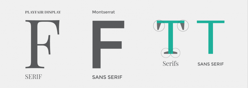
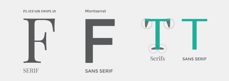
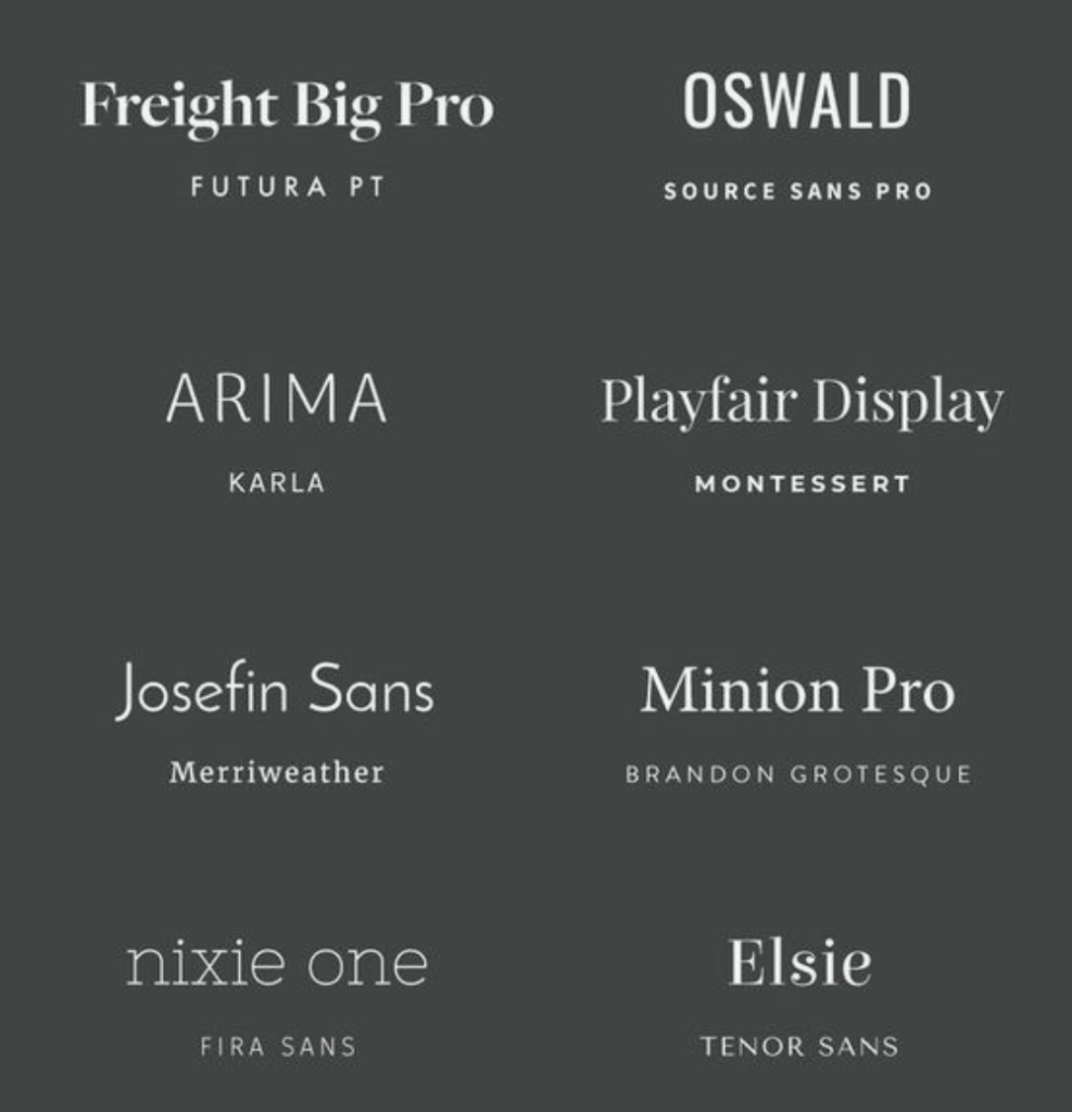
1. Serif fonts and Sans Serif fonts
Serif fonts have “feet” in their letters, while sans serif letters do not. Serif fonts have a more traditional appearance as compared to sans serif. An example of serif font could be “Times New Roman.” There is a variety of fonts available under either of these categories.
2. Script fonts
Script fonts are more stylized. There are two main categories under this font type – formal and modern. Formal script fonts resemble traditional calligraphy, while modern script fonts are more easy-going and resemble regular handwriting. Yellowtail is an example of script font.
3. Display fonts
Display fonts include a broad category of fonts ranging from symbols to highly stylized letters. They are usually used for logos and headers instead of body text. These fonts complement businesses that follow a fashionable theme. Rock Salt is an example of a display font.

Fonts for Your Brand
Depending on the target audience, theme, colors, products, or services, you may opt for a specific font for a brand according to font psychology. You can start by categorizing your brand as one of the following:
- Formal or Informal
- Classic or Modern
- Light or Dramatic
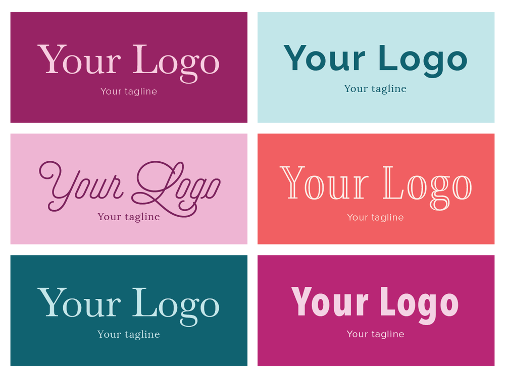
If your brand is more formal or classic with a light presence, you can go for more traditional serif fonts along with sans serif. The more formal and classic you want your font to appear, the thicker serif font you should opt for, and vice versa. If you want your brand to seem more modern, you can opt for simple serif fonts or slim sans serif fonts. For dramatic and informal brands, you can experiment with quirky display fonts or script fonts.
- Serif is a formal style that evokes a classic feel. It can be used for dramatic or light marketing for headers and as a body font.
- Sans Serif is a modern style that can be used for body fonts as well. It is quite popular because it is easy to understand due to its minimalistic feel.
- Script fonts can be used to evoke a sense of femininity or luxury. They can be used with both modern and traditional themes. These are more suited for header text than body text.
- Display fonts are considered modern and suit dramatic branding the best. This style has a lot of variations which allows for diverse usage. It is best suited as a header font and is not recommended for body fonts.
Choosing the Right Font for Your Brand
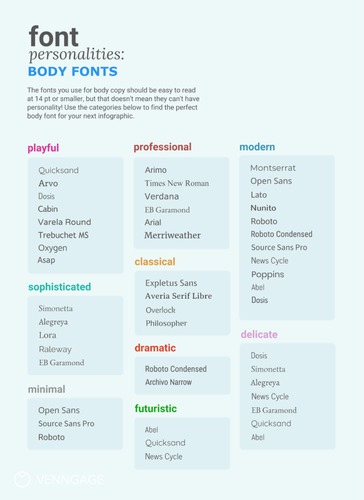
You should stick to two or three fonts for brand image and your own convenience. Just be mindful of font psychology while choosing a font for a brand.
- Start by selecting the primary font for the brand. You can refer to the pointers above and choose one from the plethora of fonts available online. Your main font should be impactful while emitting a general aura of your brand image.
- Select one or two supporting fonts that complement your main font and brand image. If your main font is highly stylized as a header font in publications, you can choose another font for the brand to be used as a subfont.
- Confirm that all your fonts complement each other by using them together. Experiment with different sizes and stylization options.
- Bold your header font for emphasis. Italicize for smaller details written in thinner fonts. Capitalize for short headings, tag lines, or titles. Try not to capitalize large text areas since it will give an aggressive impression.
Other Points to Consider
If you pick a thicker font for either the main font or subfont, you should balance it by choosing a thinner font for the other. In other words, if your main font is thick, choose a thinner sub font and vice versa.
Specific fonts have a bad reputation; using these can be detrimental to your brand image based on font psychology. These include Comic Sans, Papyrus, Hobo, Bush Script, and Stencil.
Key Takeaways
- According to font psychology, fonts help establish a brand image and affect the clientele.
- There are various types of fonts. These can be categorized into Serif, Sans Serif, Script, and Display fonts. Each type evokes a distinct impression.
- You should choose a font based on the desired brand image for your services.
- Formal brand styles can opt for Serif, semi-formal brand styles can go for Sans Serif and Script, whereas After choosing two or three fonts, you can experiment with further stylization and colors.
Conclusion
There is no dearth of fonts. Fonts can be roughly categorized as display, script, serif, and sans serif fonts. Among these, you can opt for styles that compliment your brand image while being legible and professional.

FAQs
Font psychology studies the impact of fonts on people’s feelings, thoughts, and behavior. Often, people are not aware of such effects, but they play a significant role in successful marketing and brand image creation.
Different types of fonts evoke different kinds of feelings. Serif fonts give a traditional and sophisticated impression, while Sans Serif fonts give a modern yet neutral sense. Script fonts have a luxurious aura, while display fonts have a quirky feel.
According to readability studies, Serif fonts are easier to read because of the uniqueness of each character, compared to Sans Serif fonts. However, this does not mean that Sans Serif has no merit. Sans Serif gives a neutral impression and can be used for any kind of brand successfully.
Display fonts are convenient to use for large sizes or headings, as compared to long body texts. This typeface style is more eccentric and diverse, allowing more options to choose from.
Fonts such as Comic Sans, Papyrus, Curlz, and Hobo are outdated and overused. While there is nothing wrong with them per se, you should consider looking for more unique font styles.
Gilroy, Febre, Margret, Asthetik, Playfair Display are some examples of display fonts.
Latest Blogs
Explore how Google’s 2025 AI search updates triggered ranking chaos. Learn actionable strategies to adapt your SEO for AI Overviews, zero-click searches, and SERP volatility. Stay ahead now.
Learn how to rank on AI search engines like ChatGPT, Perplexity, and Gemini by optimizing your content for authority, structure, and relevance. Stay ahead in AI-driven search with this strategic guide.
Explore the best healthcare SEO services for your medical practice. Improve online visibility and effectively reach more patients in need of your services.
Get your hands on the latest news!

Similar Posts

Content Marketing
4 mins read
11 Best B2B Content Marketing Agencies for B2B Companies in 2024

Content Marketing
5 mins read
Top ecommerce Marketing Agencies with Proven Strategies for 2024

Content Marketing
5 mins read