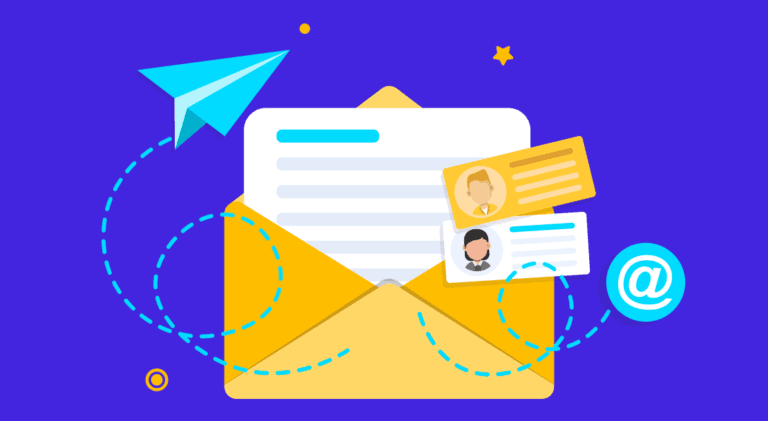
10 Ways to Create a Responsive Email Template
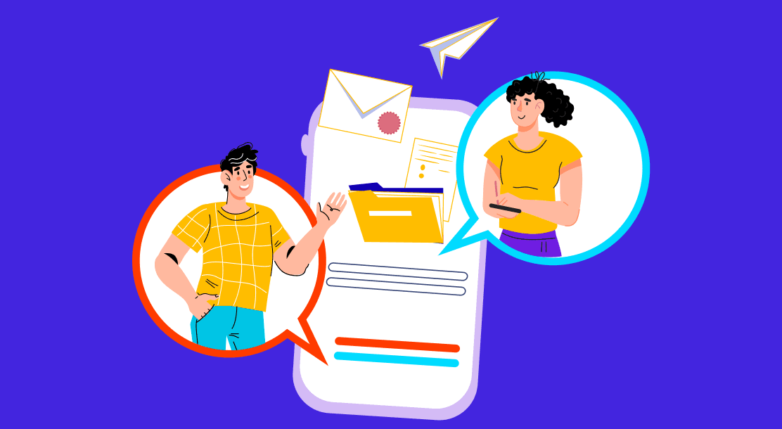
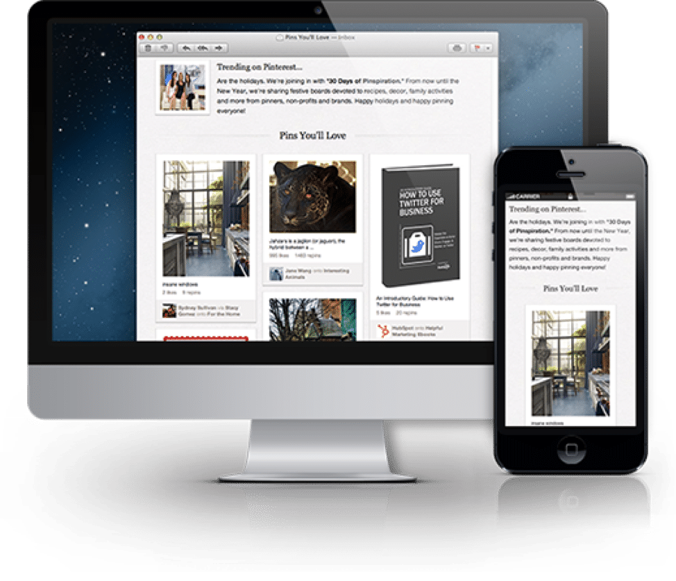
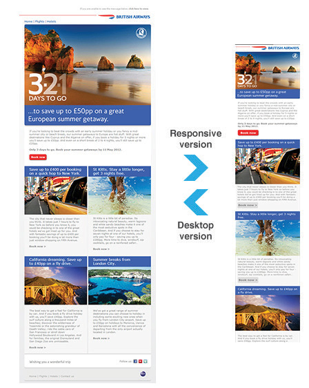
A responsive email is one that displays nicely on all devices. A non-responsive email may look great on a PC, but may seem chaotic and unprofessional on a mobile device. A responsive email template adjusts to the device’s screen size. Your email’s elements are automatically scaled or reorganized to fit smaller displays.
What Is a Responsive Email Template?
A responsive email template works well on any device. It will instantly adjust to any screen size so that the email looks excellent on a smartphone, tablet, or PC.

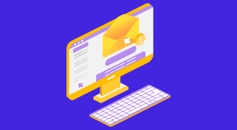
Why is a mobile-responsive email template so critical for everyone doing email marketing? People hate zooming in on smartphones to read the content. It shows the sender doesn’t care about the recipient’s time or the quality of the display. As a result, people abandon such content altogether.
Smart CSS media queries fixed-width tables and graphics to ensure content flows and scales well. If it seems confusing, don’t worry—your responsive email template builder should handle it for you. Your photos, text blocks, videos, and other elements will effortlessly adjust to multiple screen widths through a responsive design. Readers don’t need to zoom in on tiny screens to view buttons and content. The complete will be presented accurately, ensuring a smooth user experience.
Why Is Responsive Email Design Vital?
If you want to know why responsive emails are better than non-responsive ones, here are some hard facts:
● People access their emails on a smartphone 51% of the time, and that percentage is steadily increasing.
● Apple’s iPhone is the most popular email client, with a market share of 28%.
● Mailchimp’s responsive email campaigns saw a 15% increase in unique mobile user clicks, from 2.7% to 3.1%.
● Email marketing yields a 48% return on investment for every dollar invested.
These facts mean that your customers use a smartphone or tablets to read your emails. It is now achievable (by changing the layout and techniques of your mobile-focused communications) to reach 15% more prospective or current users while doubling your email investment by 48X. Take a moment to process that. Here are some rock-solid reasons why you need to create responsive email templates.
1. Mobile devices rule

Upland Adestra showed that 61.9% of emails are now viewable on mobile. If your emails don’t fit these screen widths or are not made in a mobile-responsive email template, you’re undoubtedly alienating a lot of your readers.
2. Unresponsive emails are deleted
Adestra also discovered that when an email isn’t presented correctly on a smartphone, it’s deleted 70% of the time. If it happens frequently, the user may unsubscribe.
3. Happy subscribers are the result of responsive emails
An adaptable email indicates that you care about your readers’ overall experience, which increases response rates. Preventing low-quality encounters with your subscribers starts with an ultra-responsive email. Even if a responsive email template builder takes care of this, you should follow some design best practices to improve the reader’s experience.
10 Tips for Creating the Best Responsive Email Templates
Following are the top ten responsive email design tips you can follow.
1. Use a teaser in your email
That forthcoming event, new product, large sale, or corporate announcement are all the things you want to tell your subscribers. But your email isn’t the place for details. Consider your email as a teaser for the main message, which they can access on your website once the readers click on your call to action.
2. Build a structure within your email

Using a hierarchy to communicate your narrative can help you organize your email. Consider how an inverted pyramid model may frame your message. Each section starts with a captivating graphic, strong headline, and body copy that leads to a clear CTA button. It’s a great approach to communicating fast and grabbing readers’ attention.
3. Use a compelling CTA
Don’t waste space instructing readers where to click, especially when they tap, not click, on mobile devices. “Click here” isn’t a legitimate call. Skip it and tell readers what to do. Use a brief action verb. Pronouns like “my” and “your” make your message more pleasant and engaging. “Reserve my position now” or “Get my free ticket” are a few such examples. Less is more when it comes to fine-tuning CTA buttons in the email.
4. Never use huge pictures
Avoid the image-only email trap. Using only one huge picture in your email will raise your spam score, preventing it from reaching readers. Users will only see the alt text if your image fails to load. Always have the right proportion of text and visuals.
5. Work with a grid
Responsive grid-based designs are easy because HTML emails consist of tables with rows and columns. A responsive email template builder that uses a modular template design automatically helps you organize material in a grid while allowing for flexibility.
6. Keep alt text handy
A message without visuals is understood through alt text. Alt-text is the text that is shown when the picture is loading slowly or fails to load at al. Remember to keep your alt text brief. Some email clients won’t display it if it splits into two lines.
7. Simplify the email
If you adhere to the first and second suggestions, you should be OK. A targeted, short email should include a single call to action—no need to clutter the email or header with unnecessary links, options, and messages.

Go for simplicity. Remember to customize using the data you have. You don’t know much about a visitor to your company’s website. But your mailing list is a different matter. You have subscriber data. Use it to create customized campaigns for specific segments of your audience to boost conversion rates.
8. Choose custom fonts carefully
Custom fonts can enhance the appearance of your email. Custom fonts are essentially typefaces that are unique to a brand. However, not all email clients may support these. So use them sparingly, such as in the email’s primary header, and then use email-safe fonts for the content.
9. Remember the preheader text
The preheader is the text that appears after the subject line in the inbox.
It is used as a screening technique by subscribers to determine whether or not to open an email. Preheader text is the initial plain text in your email. It is imperative to keep it brief yet catchy (40-50 characters).
10. Make it interactive
In most email clients, animated GIFs operate perfectly as visual tools. GIFs may be big files, depending on the number of frames and quality. Large GIFs take a long time to animate and use a lot of data. Reduce the file size of your GIF before inserting it into the email.

Best Practices for Responsive Email Design
Here are a few responsive email design best practices you must follow.
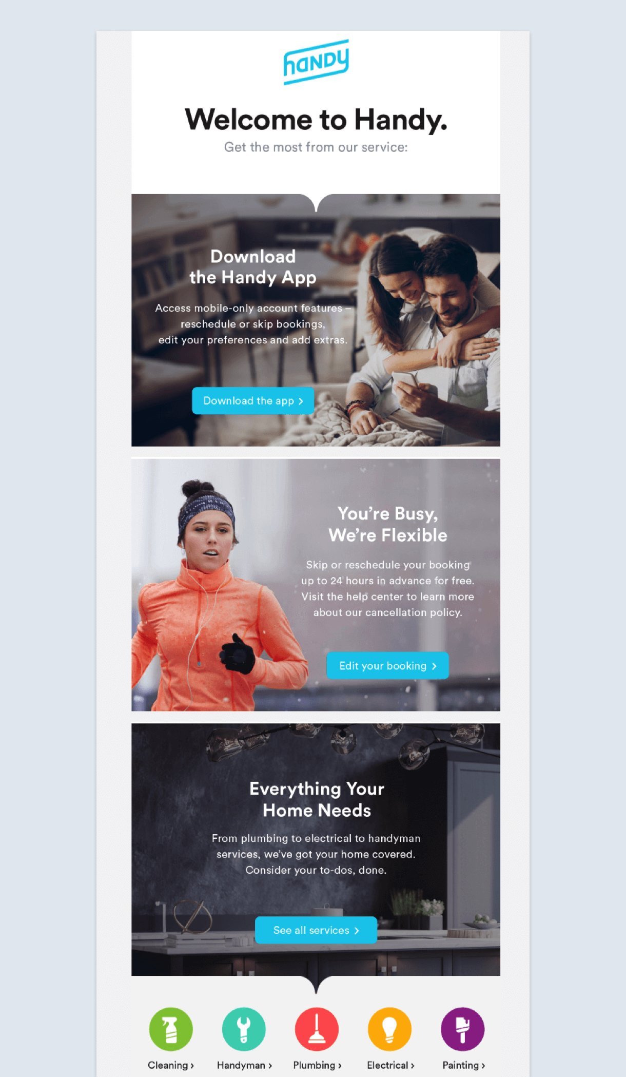
● Maintain a one-column layout. Minor shifting and movement allow your readers to read your material more quickly.
● Use a font size of 13 or 14 points for body content, and no less than 20 points for titles. The font size significantly improves the readability of your email on a small screen.
● Keep your most critical call to action or information “above the fold.” This term is an expression adopted from print journalism that refers to the need for your most significant material to be easily accessible without requiring your audience to scroll.

● Avoid using hyperlinks and, more specifically, avoid grouping many URLs together. We’ve all attempted to touch a link in an email and selected another that was quite close to the original. Instead, use a large, tappable button.
● Utilize smaller, responsive pictures and include alt tags, in case your images don’t load. Additionally, this is an excellent practice for accessibility.
● Utilize a tool such as Litmus or Email on Acid to determine the appearance of your email in your audience’s inboxes. The evaluation of emails is a simple and effective method of avoiding an embarrassing misstep.
● Now, test, test, and then test some more. A/B testing is included in most email automation software (such as Mailchimp, Drip, and Constant Contact). Additionally, they provide responsive templates that you may customize to your heart’s delight. Once you’ve established a framework that generates interest, all that remains is for you to continue providing excellent material.
Your content will appear fluidly across many mobile devices, from tablets to iPhones, when you use responsive email templates. By using responsive email designs, your emails will be displayed crisply, regardless of whether your recipients open them on a PC or a smartphone. So follow the tips mentioned above and get cracking!

FAQs
Yes, emails should unquestionably be responsive. There is a reasonable probability that your target audience checks their emails on numerous devices. You don’t want them to discard or unsubscribe, simply because your emails don’t load correctly on their mobile device. You can hire an experienced design service to create mobile-responsive emails.
An email template is a pre-designed email that includes content (graphics, icons, drawings, and text) that you may modify to make it uniquely yours. It enables you to quickly compose emails, which is especially beneficial if you lack expertise in generating emails from scratch.
An adaptive email scales down proportionally to the screen size. The email style will remain the same across devices, but the content or image will climb up or down to correspond to the screen. One disadvantage is that the font may become too tiny when the arrangement remains constant, making it difficult to read for mobile users.
By contrast, a responsive email adapts to the screen size by identifying the width. It implies that the email style may change—for example, from a two-column layout on a laptop to a single-column format on a mobile device—to ensure that the content fits the device while staying legible.
Your email layout should indicate which sections the reader should review first and how they might proceed from there. They should be able to swiftly peruse the email, with prominent headlines and visuals drawing the reader’s attention.
Latest Blogs
Explore how Google’s 2025 AI search updates triggered ranking chaos. Learn actionable strategies to adapt your SEO for AI Overviews, zero-click searches, and SERP volatility. Stay ahead now.
Learn how to rank on AI search engines like ChatGPT, Perplexity, and Gemini by optimizing your content for authority, structure, and relevance. Stay ahead in AI-driven search with this strategic guide.
Explore the best healthcare SEO services for your medical practice. Improve online visibility and effectively reach more patients in need of your services.
Get your hands on the latest news!

Similar Posts
Email Marketing
6 mins read
11 Tips to Design Impactful Email Banners
Design
9 mins read
7 Benefits of a Simple Mailer Design
Email Marketing
7 mins read