
Table of Contents
● What is an Email Banner?
● 11 Tips to Design Impactful Email Banners
● 3 Effective Email Banner Examples
An email banner is the most effective method of communication, allowing businesses to create custom campaigns based on their subscribers’ interests. However, getting individuals to open your emails might be difficult. An eye-catching email banner design that draws attention can be beneficial in this regard.
Banners may emphasize a particular promotion or increase brand recognition by including your logo and color in every promotional email. A good email banner design is important, and designing a reusable template is essential. You may create a look and feel for your emails without re-creating them for each email in your email marketing campaign.

What is an Email Banner?
An email banner is a graphic with marketing material that appears at the top of your email and establishes the tone for the content. It should not be mistaken for an email signature banner, which appears at the bottom of the message.
The email banner might even be a marketing banner that you regularly utilize to advertise your company using only your brand name and logo. Email banners can also be one-time events (almost like a mini-ad) that highlight an offer, such as a discount, loyalty program, or a welcome message for new subscribers.
11 Tips to Design Impactful Email Banners
1. Use a neat and well-organized layout.
Keep everything clean and uncomplicated to prevent additional distractions and retain your readers’ attention from beginning to end. Start with a quick sketch of the general structure of the email using a template, and then insert the appropriate content sections as you develop your design.
There are themes for newsletters and specific components such as your email header, a call-to-action section, and email signatures.
2. Keep your text brief and to the point.
With people’s attention spans dwindling, it’s critical to plan the proper material carefully and how many distinct subjects you’ll cover. Many people now receive email banners practically every day of the week. Consider your own inbox: how many sources do you no longer read from or unsubscribe from?
Do you remember the reason? There could be many: you did not find the material beneficial constantly, the email was too challenging to skim and read rapidly, or it was delivered too frequently.
3. Make a visual hierarchy.
Visual hierarchy calls for using location, size, color, contrast, and forms to convey to the reader what is essential to them. The most significant components and what you want the reader to focus on should be evident at a glance. The simplest and most prevalent way for designers to establish a feeling of significance inside an email body is through the effective use of font sizes and color.

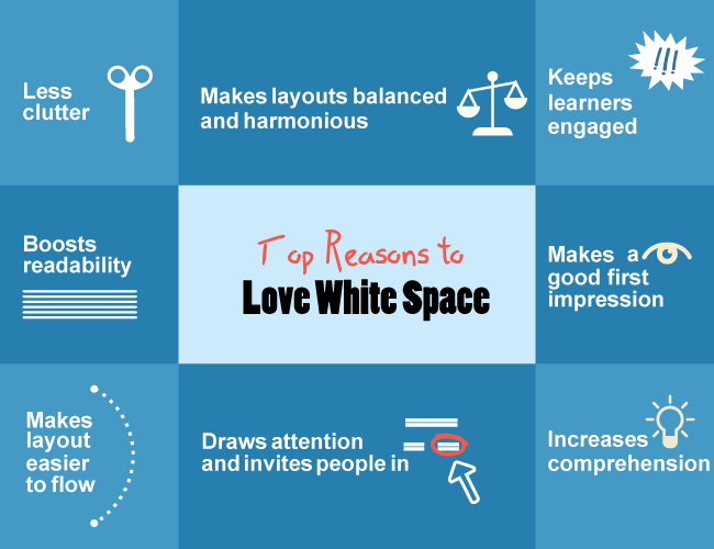
4. Accept white space
Using white space effectively helps the brain scan, evaluate, and break down the material into edible chunks.

When it comes to efficient use of white space and a clean layout, many companies have established the benchmark by making such creative email banners. Less is more: allow your text to breathe and leave an impression on the reader. Every excellent design cleverly uses negative space to highlight specific aspects of your text.
5. Headers/footers are used to frame content.
The first two to three inches of an email are the most important real estate you have to capture the reader’s attention. The header, in particular, is your first chance to create an excellent first impression.

Footers may not be the first thing a reader notices, but they should create a solid visual bookend to the newsletter’s header and define the overall appearance and feel of the email.
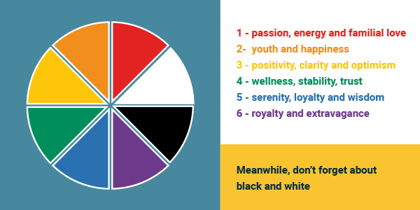
6. Use color to create a mood.
Considerable research has shown how various colors stimulate different moods and emotions. To develop a message that connects with your audience, be extremely purposeful with your color schemes.

So, what do different colors in marketing mean? What colors entice buyers to buy?
For example, Black has long been linked with richness and refinement, whereas Blue is frequently associated with the concepts of integrity and tranquillity. You must choose a color palette that compliments and enhances your business identity.
7. Simplify font selections
There are so many typefaces to choose from but so little time. When searching for the appropriate font among the many available online, it’s easy to become overwhelmed by choice.
8. Use eye-catching images
A well-chosen image may have a significant impact when you just have a limited area to convey your message. It puts the product in the spotlight, supported by a background image that conveys an outdoorsy, adventurous vibe that will likely appeal to the target group.

Be cautious not to overuse photographs or select huge images since they might cause your email to be marked as spam. Allow photos no more than 30% of the available space. A basic text email may be the most straightforward approach to convey an important message in some circumstances.
9. Insert videos/gifs
GIFs and videos in emails are becoming increasingly popular, and when utilized correctly, they may have a tremendous impact. However, don’t overdo it: use GIFs related to your product or service and avoid being too “in your face.”
10. Use infographics to educate
With one main highlight for each month of the year, infographics provide a pretty substantial amount of information to the reader immaculately, directing them to a call to action button at the conclusion.

11. Make a solid call to action.
Email marketing may help raise and maintain brand recognition, but you want the reader to take action at the end of the day.

If you’ve used the principles we’ve already discussed to create a fundamentally sound design, your reader should be able to recognize your call to action readily.
3 Effective Email Banner Examples
● Fenty Beauty
If you’re creating a product introduction or marketing email, it’s a common practice to begin with an image of the item. But what if you present that object in an unusual manner? This fantastic email from Fenty Beauty, with its eye-catching email header design, compelled us to scroll down.

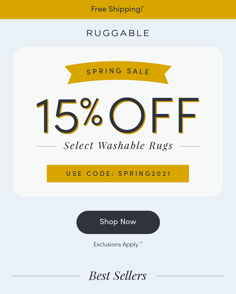
● Ruggable
When you’re holding a sale, including precise percentages is an excellent method to attract your reader’s attention. Ruggable does precisely that: When you open the company’s spring sale email, you’re met with a large “15 percent off” sign, so there’s no mistaking what’s going on.

● Anna Sheffield
According to Anna Sheffield, GIFs in an email may go a long way. They can demonstrate how a product works, cycle through numerous things from frame to frame, or delight! They are ideal for practically any occasion or email type. Check out Anna Sheffield Jewelry’s newsletter banner design and scroll down for the GIF.

Parting Words
Email banners are an excellent method to promote your campaigns, improve brand awareness, and set the tone for the rest of your email. To make this technique work, you must have a few customizable email banner templates on hand that all match the appearance and feel of your business.
Email banners may be used in various ways, including abandoned cart emails, welcome emails, newsletters, and promotions. Don’t forget that a streamlined menu on a banner is a terrific chance for product placement and assisting your readers in finding the things they’re looking for.
Key Takeaways
● Email marketing banners are an excellent way to bring your brand to life. Use your most incredible pictures to offer potential customers the confidence they need to buy or learn more about your company.
● Use an email banner to remind your recipients that you are the only one who can provide them with what they value the most and why they should select you over your competition.
● You can build unique email marketing banners with centralized control while keeping overall brand integrity.
● Provide readers with the comfort they want by including a customer quotation in your email banner design and a call-to-action button that directs them to the complete testimonial or a 5-star review.
● An email marketing banner that links to your primary social media networks may be a clear and clickable invitation to begin a new ‘social’ discussion.
● “Free trial,” “Black Friday Sale,” “20% off on your first order,” and other banners like this ensure that the most appropriate promotional banner reaches the intended receiver, increasing the likelihood of conversion.
● Use banners in order-confirmation emails to advertise possible upsell possibilities, luring your consumers with low-cost upgrades and extra services.
FAQs
Email banners should be between 70px and 200px in height; however, going square or rectangular is entirely up to you and the email aesthetic you’re looking for.
Yes! An email banner is ideal for highlighting what you wish to offer or what you know your readers would want to purchase. It’s also an opportunity to demonstrate genuine consumers utilizing your items or inspirational photographs that represent the essence of your brand. Just make sure they aren’t stock images!
Email banners are an excellent method to promote your campaigns, improve brand awareness, and set the tone for the rest of your email.
An email signature banner is a picture that you use in your email signature and a brief message to your subscribers. Signature banners typically provide discounts, assistance, or a means to contact your company. There is no “correct” size for signature banners.
Latest Blogs
Explore how Google’s 2025 AI search updates triggered ranking chaos. Learn actionable strategies to adapt your SEO for AI Overviews, zero-click searches, and SERP volatility. Stay ahead now.
Learn how to rank on AI search engines like ChatGPT, Perplexity, and Gemini by optimizing your content for authority, structure, and relevance. Stay ahead in AI-driven search with this strategic guide.
Explore the best healthcare SEO services for your medical practice. Improve online visibility and effectively reach more patients in need of your services.
Get your hands on the latest news!

Similar Posts

Design
9 mins read
7 Benefits of a Simple Mailer Design

Email Marketing
7 mins read
10 Ways to Create a Responsive Email Template
Email Marketing
7 mins read