
Table of Contents
- What is Retro Logo Design?
- Tips To Create A Retro Logo Design
- Dos and Don’ts of Retro Logo Design
- 5 Examples of Retro Logo Designs
Logos are more than just an assembly of symbols, shapes, letters, and colors. It is the most important component of a brand’s identity. It is, in fact, one of the first things that pop into the customers’ minds when thinking about a particular brand. No wonder 75% of people recognize a brand by its logo.
Retro logo design is whimsical and creative and imparts a timeless feel to your brand. Thanks to their symmetrical designs and opulent color variations, it brings back the nostalgic vibe that helps your brand stand out from the crowd.
If you are struggling with an effective and innovative concept for your logo, you must consider a retro or vintage logo design. Read on to find out how these intriguing designs can add value to your brand.
What is Retro Logo Design?
Essentially, the word “retro” is used to signify something deemed trendy or culturally significant in the past but faded over time. Modern designers describe retro as a period from the 1920s to the 1970s.
The period was often referred to as the “golden era.” And now, these logo makers are trying to use retro and vintage techniques to depict this era through their art and create a feeling of nostalgia.
A retro logo design is typically characterized by linear or symmetrical designs and a rich color palette. A well-designed retro logo is often a blend of old-school styling and modern design sensibilities. This modern touch to retro graphic design is essential to ensure your logo still feels relevant.
One of the top reasons retro or vintage logos perform well is that they yield a romantic touch to the world of web design. Such logos are reminiscent of simpler and less stressful times, often becoming the primary selling point for most potential customers.
Tips to Create a Retro Logo Design
Before you start creating your graphic design logo, you must understand that a logo is something that will stick around for a very long time. So, make sure you create something you want to see for years.
Here are some important tips to keep in mind while designing a retro logo for your brand.
1. Choose a specific decade and industry
When it comes to creative logo design, conducting exhaustive research is often the starting point to success. And for a retro logo, the most crucial research component is identifying a specific decade you wish to focus on.
Look at the classic designs on a decade-by-decade basis to find a time in the past that best matches your particular aesthetic. If you like a specific logo, you can study it to identify which decade it belongs to. It is also advisable to create something special and unique by merging the aesthetics of different periods.

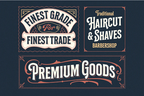
2. Pay attention to typography
After you have explored design by the decade, the next step is to select suitable typography. A vital part of your overall retro logo design is your font’s shape, size, and choice, determining how attractive your logo will turn out.
Avoid using fonts such as Century Gothic, Helvetica, or even Baskerville Old Face, however classic they may seem. Generally, stylized fonts work best. But make sure not to opt for a highly stylized one as it will make it difficult to read the brand name. It is best to mix a cursive font with cleaner retro typefaces for a complementary design choice like the ones below:
3. Use a stripped-down color palette
It is important to remember that back in the day, people did not have access to a wide range of color options as they do now. Call it expense constraints, tech limitations, or simply aesthetic differences; most vintage designs relied on a reduced color palette. This is what made these retro designs so appealing and allusive.
So, make sure to stick to a handful of colors. Take ideas from the most successful logos of the decade you are targeting. Platforms like Logogenie offer user-friendly tools to help designers experiment with vintage palettes and modern gradients effortlessly, Additionally, you can fuse newer color gradients with your chosen color options to make your graphic design stand out.
4. Consider using borders and badges
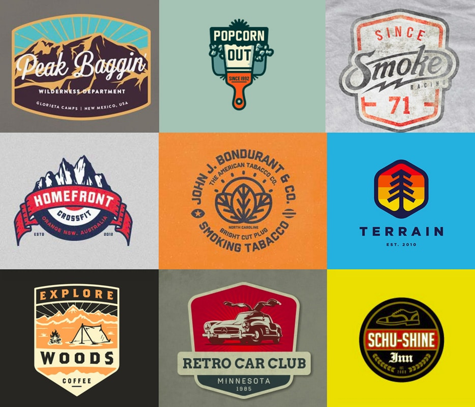
One thing that genuinely lends retro design its unique and distinctive characteristics is the use of thick, defined borders and badge-style iconography. In many ways, badges are the essence of retro logo design.
Typically, they are simple shapes such as shields, circles, hexagons, and diamonds that help create eye-catching designs without too much space. Similarly, while less stylish, thick borders are also a staple of retro designs. They can also help your brand logo pop amidst the competition.
5. Play with texture and add noise

Adding a noisy gradient to make your logo appear old and shabby is one of the best ways to add a vintage feel to your design. At the same time, you can play around with gradients, textures, and layers to enhance the logo.
For instance, adding additional effects such as sheen, flares, etc., in your design can make it stand out and look a little less formal. But make sure not to overdo it. Whatever visual effect you choose must align with your retro icon and font.
Dos and Don’ts of Retro Logo Design
Designing a retro logo can be overwhelming, especially for those without much experience in vintage work. The need to add superfluities can quickly get out of hand and make the design too complex to comprehend.
Similarly, the font can be unreadable, the texture can feel too much, and the decades may simply mix. To help you out, here are some dos and don’ts of retro logo design that you must remember.
Dos
1. Identify your retro design style
What looks retro or vintage varies from one person to another. For instance, someone born during the 1950s will have a very different idea of old-fashioned than someone born in the 1990s.
You must categorize your target market to decide on your retro design style. For instance, if your target customers are millennials, you must focus on recreating styles and designs of the 90s to capture millennial nostalgia. It will remind them of their childhood days and treasured experiences, which will ultimately be your selling point.
2. Keep the typography elaborate
Retro logo design is all about the drama of elaborate typography. By this, we mean that you must utilize every nook of the logo and experiment with multiple pairings. Depending on the decade you are targeting, you can search for fonts that were most popular then.
Also, try to add your distinctive touch to the typography by adding pixel strokes or other similar effects. This will give your graphic logo a truly unique appeal.
3. Keep it simple
Coming up with a vintage logo is certainly a fun activity. But make sure not to overdo it. You need a professional logo design that stands out, but don’t use it as an excuse to overdesign the entire graphic.
Create a logo that is easy to comprehend and recall. Try to strike a balance between staying true to the retro style and accommodating the needs of the commercial logo.
Don’ts
1. Don’t forget the industry specifics
While the retro design era has a matchless appeal that transcends markets and industries, there are still a few elements specific to different industries. And as an excellent graphic designer, you must never forget those elements.
For instance, if you are designing a logo for an automobile company or a car repair shop, using a bannered shield is a good idea. However, your vintage logo must be more polished and refined if you design for a posh restaurant.
2. Don’t compromise on quality
Do not compromise the clarity of the logo by using complicated illustrations. Remember that your audience is still modern and expects to have a certain level of ease while comprehending your brand’s identity.
So focus on creating a balance in design. Don’t make it overly complicated and take away the essence of the design.
3. Don’t add too much noise and texture
Regarding retro logo design, it’s obvious that you must include some kind of texture. After all, wear and tear, fuzzy ink or even misprinting were common occurrences in the past. So now, adding such details and noise is crucial to impart the authentic retro feel.
But sadly, these details can sometimes adversely impact the readability of the logo. So evaluate your options carefully and just add the right amount of texturing and noise to make your design adequately vintage.
5 Examples of Retro Logo Designs
The following retro logo designs have stayed in the public consciousness since they were first designed. Not only have they stood the test of time, but they have also influenced several other brands to lend a vintage appeal to their logos. Let’s look at the top 5 retro logos.
1. Jack Daniel’s
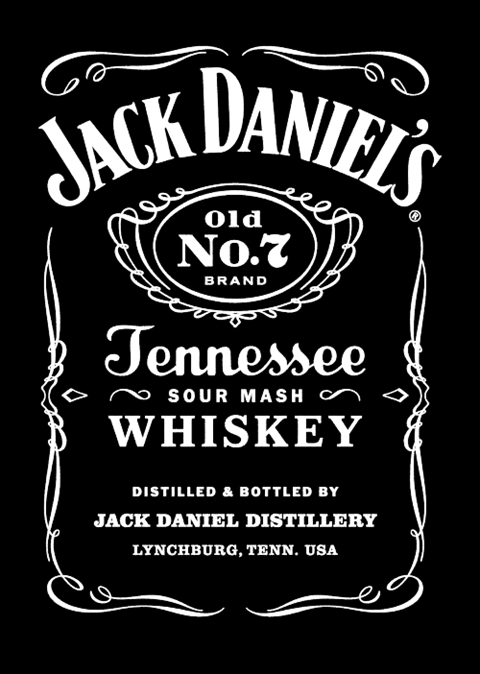
Jack Daniel’s is a premium whiskey brand with a beautifully crafted retro logo design. Using this retro design is a brilliant marketing strategy because alcohol is deemed better when it’s older. And the simple and clean typography and soft lining appropriately complete the vintage look.
2. Harris Brewing Company
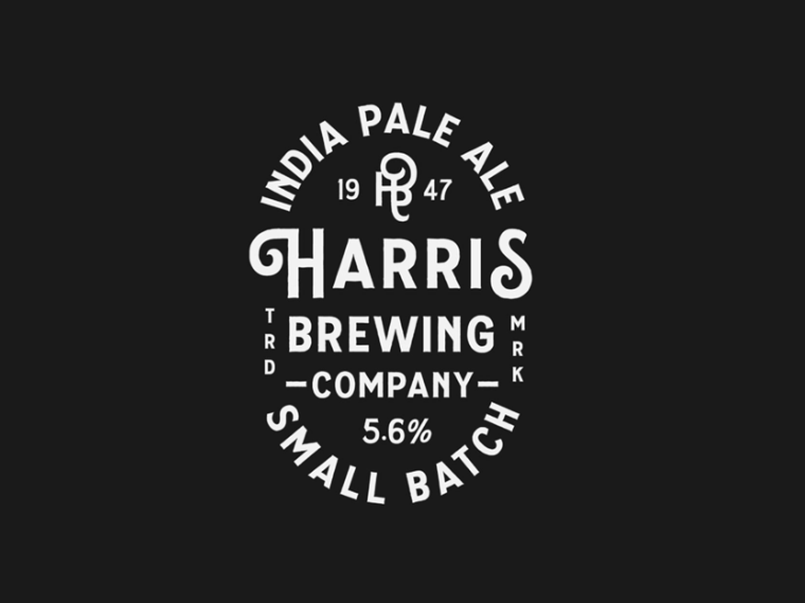
This is another classic vintage logo example. The dark background goes perfectly with this badge-style logo’s white typography. The text is nicely wrapped around a central point, and the variety of font sizes creates a sense of contrast and diversity in the image, despite the lack of color.
3. Mama Fried
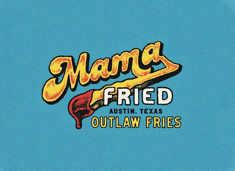
Mama Fried’s logo is the best example of a modern-retro logo. The bold colors, heavy typeface, and striking design all seamlessly come together to deliver an eye-grabbing vintage logo. The vibrant blue color is bright but not too much. Also, every font is different in type and color. Yet the elements merge very well to create a perfectly cohesive look.
4. Still Pretty Goods
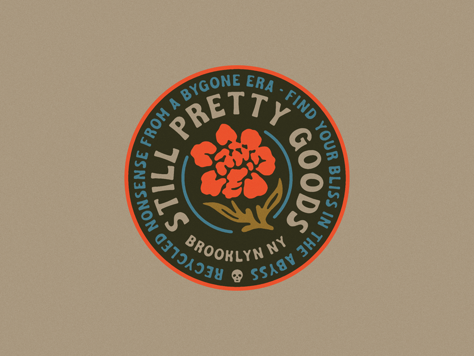
If you want a strong retro color scheme for your logo, Still Pretty Goods is a great example to look at. The logo displays muted vintage colors on the sides, but eye-catching neon hints in the center look genuinely fascinating. Also, the text is all shaped around a central image that further imparts a retro feel.
5. Viking Ship
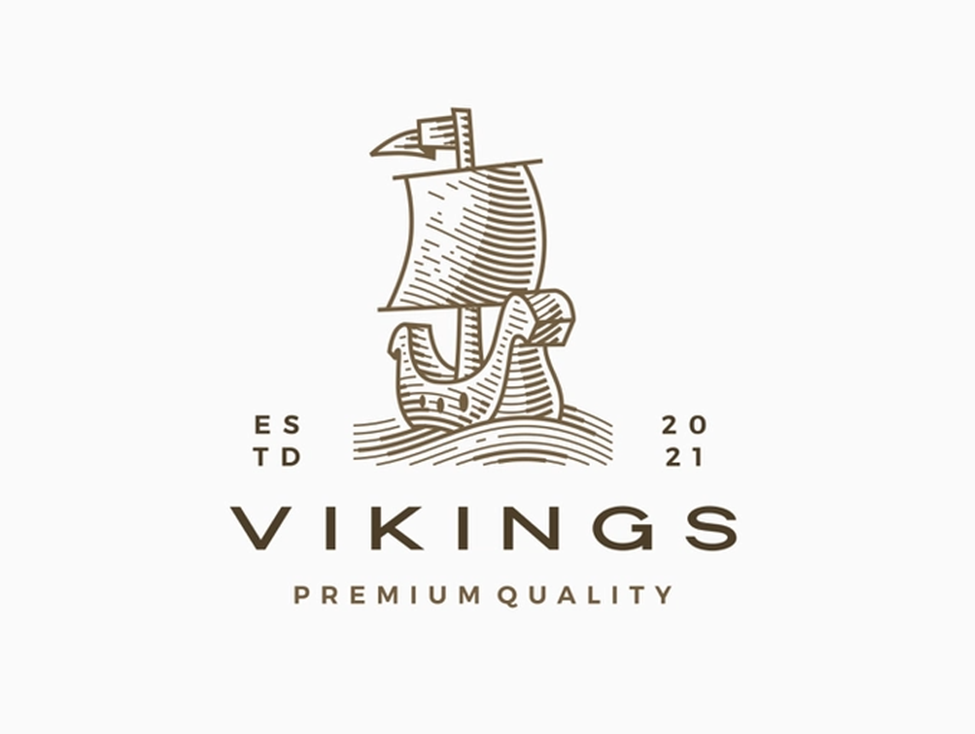
This is quite an antique logo that looks like it is from another time. The ship’s gorgeous illustration perfectly syncs with the muted color palette. Overall, the image looks just out of a vintage novel.
A Quick Summary
In essence, retro is a style that narrates a story, and a retro logo design is a great way to start that story. So, if you want to capture a feel of adventure and nostalgia of the bygone days, using a vintage look for your brand is the best way to do that.
Key Takeaways
- Retro or vintage logos are a nostalgic departure from the present to some faraway time.
- Proper research on the specific decade you wish to target is important as it will help you capture the real feel of that era.
- There are several interesting and unique fonts available out there that give a feel of different eras or subcultures.
- Keep the typeface clean and slightly bold for a more retro effect.
- Badges in the form of a circle, diamond, hexagon, etc., are the essence of retro design. You can also add banners to your design. Noise and texture can help to add an aged and rugged look.
- Most retro-style logos use a relatively limited set of colors. Additionally, dull or nude tones are often associated with the retro look.
- Make sure your retro logo includes all details and necessary elements that convey a story.
FAQs
A vintage logo is a graphical design that is inspired by ancient days. Such logos have a weathered or grunge appearance that often includes a small palette of two to three colors in dull tones.
1. Choose your specific decade.
2. Shortlist the color palette
3. Work with suitable shapes and patterns
4. Give your design some texture
5. Use the era-appropriate font, imagery, and technology.
Retro colors come in several hues but are typically dull or muted. Some of the most popularly used retro colors are neutrals such as creams, peaches, pale pink, yellowed browns, teal, sage green, and blues.
1. Nostalgia
2. Rural
3. Rustic
4. Homegrown
5. Adventure
Adobe Illustrator remains the standard tool for vector editing. Many agencies and freelancers are using it to design illustrations, posters, logos, and icons.
Latest Blogs
Explore how Google’s 2025 AI search updates triggered ranking chaos. Learn actionable strategies to adapt your SEO for AI Overviews, zero-click searches, and SERP volatility. Stay ahead now.
Learn how to rank on AI search engines like ChatGPT, Perplexity, and Gemini by optimizing your content for authority, structure, and relevance. Stay ahead in AI-driven search with this strategic guide.
Explore the best healthcare SEO services for your medical practice. Improve online visibility and effectively reach more patients in need of your services.
Get your hands on the latest news!

Similar Posts

Design
7 mins read
15 Best Firms Offering Design Services in India

Design
5 mins read
All You Need to Know About Data-Driven Design

Design
6 mins read