
Table of Contents
- The Role of Text in Design
- 10 Basic Rules of Graphic Design: How to Incorporate Text in Your Designs
- Key Takeaways
- Conclusion
- FAQs
Typography is an indispensable element of any graphic design rule. The usage, alignment, and designing of text is something graphic designers need to master. Using text in graphic design not only helps build a brand identity, but it also helps effectively communicate a message and arrest the reader’s attention where it’s required the most. More often than not, typography can either make or break a design project.
Using text is especially significant if the project is text-heavy. Good typography helps bring relief to the work by breaking it down into numerous, consumable fragments. Moreover, adding the right amount of text enhances the overall appeal of the project. Join on as we discuss some basic rules of graphic design for using text in design when it comes to using text.
The Role of Text in Design
There’s more to graphic designing than just creating attractive visuals. Text has played an important role in graphic design, ever since its inception. While there may not be a set guidebook for adding text to a graphic, some graphic design rules can help you make all the difference. These graphic design guidelines are dynamic in nature. Hence, it’s crucial for every graphic designer to stay updated. The following list is not exhaustive, but will surely help you elevate the level of your graphics through text.
10 Basic Rules of Graphic Design: How to Incorporate Text in Your Designs
The following are the ten most essential textual rules graphic designers swear by.
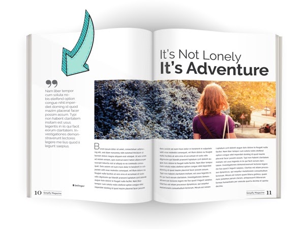
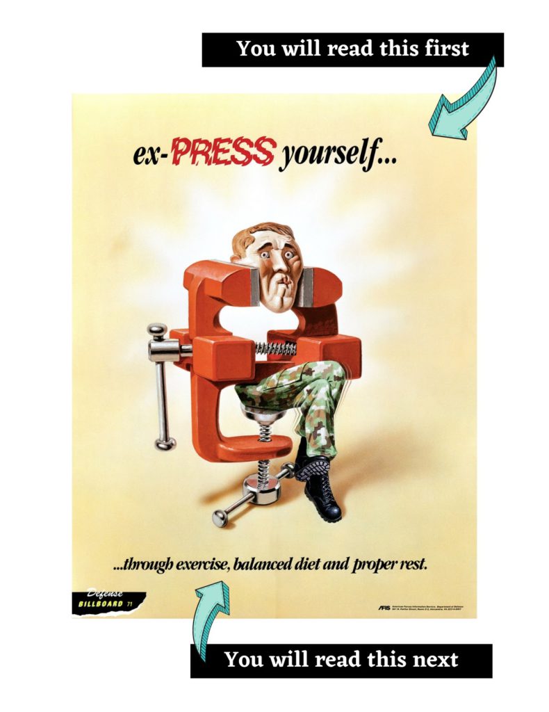
1. Establish clear entry points
If you are designing an editorial piece, it’s essential you give a proper indication to your reader at the beginning of the text. There are multiple ways of achieving this. You can add headings, icons, words/characters in uppercase, or even insert other graphic elements such as blurbs or snippets. How you design your layout will help determine the pathway your reader takes, i.e., what they should read first and what they shouldn’t pay much attention to.
2. Choose and pair fonts wisely
Did you know that every font is designed keeping the reader’s psychology in mind? There’s a certain impression each font can have on you. Therefore, understand the purpose of your design and pick fonts accordingly.
Another significant point in the book of graphic design guidelines says that you should refrain from using more than two to three fonts in a single graphic. You want the piece to look cohesive and not chaotic. When pairing fonts, ensure you don’t use fonts that overpower each other. Additionally, you shouldn’t use fonts that look too alike, as that’ll defeat the purpose of using different fonts.
3. Practice correct alignment and kerning
You may already be aware of alignment, but kerning is not something every designer pays attention to. Kerning refers to the setting of space between different characters to frame a word. The space between each letter varies from font to font. When no proper kerning is maintained, some words seem too cluttered, whereas others seem too distant.
Practicing proper kerning can make a world of difference to your graphic. Likewise, basic rules of graphic design include proper text alignment that pleases the eye. This will differ based on your design template. There’s no hard-and-fast rule to determine which alignment works best.
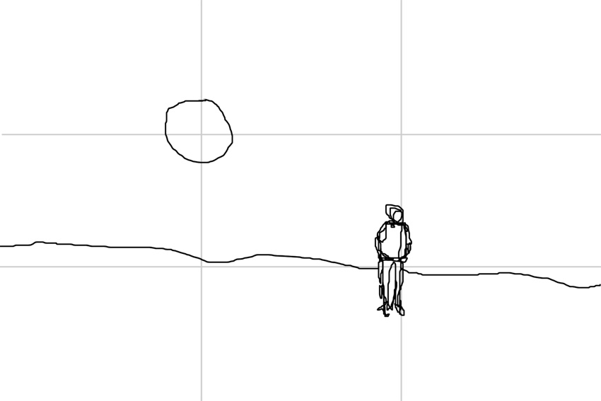
4. Establish a visual hierarchy
In a graphic, you can’t keep adding arrows to guide the viewer. That’s where visual hierarchy comes into play. The way in which you design your graphic is what helps guide your viewer through it. What you want them to read first and which piece of information needs more focus—all these concerns can be solved by setting a proper hierarchy in your design.
As per general graphic design rules, readers mostly follow the “F” eye movement pattern for graphics that involve text. Reading in other directions is simply uncomfortable. Hence, when following graphic design rules, it’s critical for you to line up your content accordingly.
5. Always use grids
When you’re trying to put together a graphic with all elements in perfect harmony, grids are the way to go. These simple lines help you develop pieces that have cohesiveness. When we talk about working with grids, the rule of thirds comes into the picture. This is one of the most significant graphic design rules.
When you’re using a grid, divide it into three equal horizontal and vertical sections. The resultant grid will help you understand what should go where. The points where the lines intersect are prime focus areas. When you insert an element around them, it gets the maximum attention of your viewer. The designer who understands and works according to the rule of thirds is sure to make a lot of difference in their work.
6. Pay attention to typographical measuring
To create a graphic that sings, it’s essential that you understand the perfect positioning of each element. There’s no way to do this without analyzing the most favorable measurement of each font, image, icon, etc. In fact, if you are designing an editorial graphic, measuring each text line is also of immense importance.
For instance, if the number of characters in a line exceeds 90, it becomes harder to read. On the other hand, if the characters are too few, the readers will keep jumping from one line to the next, thereby losing focus. Similarly, each font’s length, width, and height also hold importance in effective designing.
7. White space is essential
The white space that you see in some graphics is not free space waiting to be used up. It also holds significance in design. In addition to giving breathing space to your graphic, it throws the focus towards the one element that you wish to highlight.
The basic rules of graphic design say that it’s essential to leave some empty space in a graphic. This helps the viewer pay attention to what’s essential. Overcrowded graphics never work. If your reader has to search for information in your graphic, you’re not doing a good job. Such simple things are what graphic design rules are made of.
8. Consistency is key
Consistency is the reason why brands come up with brand kits. These include fonts and colors the brand associates itself with the most. Your online marketing graphics, brochures, flyers, magazines, etc., are all extensions of your brand. Therefore, it’s critical to maintain consistency.
Zomato is the easiest example here. Everything, from their social media creatives to their billboards, are well-aligned with their brand identity. The fonts, typographical alignment, and colors are the same throughout their marketing collateral. In fact, they have set the bar so high that if another brand even so much as creates their text like Zomato, viewers will immediately identify it.
9. Focus on readability
To ensure your graphics are easy for your viewer to understand, you need to follow some basic graphic design rules. For instance, both font and background colors must not be dark. If one is dark, the other must be light to increase legibility.
Color rules in graphic design are just as important as rules for placing text. If you are designing printing material, make sure to be well-versed with the font size, which should neither be too small, nor too big. Readability is key. Without it, your designs will fail.
10. Practice regularly
The last graphic design rule is to just practice. Graphic designing is much like riding a bike. The more you do it, the better you will get at it. It’s also a little like fashion. It’s a dynamic market, where what works and what doesn’t keeps on changing.
If you are a graphic designer, it’s essential for you to keep yourself updated about the ever-changing trends. You need not always hop on to it, but keeping yourself aware is a good idea. That and practicing consistently will help you gain more confidence.

Key Takeaways
- Graphics are an infusion of text, images, and corresponding design elements. Just copy-pasting text to your graphic is not called designing. The process is guided by several graphic design rules for typography.
- The basic rules of graphic designing, such as choosing the font wisely and not using more than three fonts in the same graphic, are just some guidelines that every graphic designer must follow.
- In addition to the above, practicing correct alignment and kerning are also part of graphic design rules.
- Myths are no good for your morale. Empower yourself with the correct information on graphic design.
- You must always use grids and follow the rule of thirds to create graphics that work.
- Graphic designers are expected to know that measuring each element is important. That’s the only way you’ll be able to highlight your significant elements. Otherwise, your viewers won’t know what to read.
- It’s critical for all brands to follow a set tone in all their marketing material. These include fonts, colors, alignment, etc.
- Ensuring readability is your ultimate goal. Practice, practice, and then practice some more, to become a graphic designer of the highest stature.
Conclusion
Text is one of the most significant elements of any graphic. If you understand the logic behind graphic design rules, it’ll be super easy for you to implement them. In addition to these graphic design guidelines, just remember to find inspiration in your immediate surroundings. It could be a graphic on your phone, a television commercial (TVC), or a billboard you spot on the highway. If something inspires you, it’ll push you to analyze why you engaged with it. Such case studies from your daily life will help you become a better-informed graphic designer.
FAQs
There are some fixed principles of graphic design: emphasis, white space, movement, balance, alignment, contrast, repetition, and proportion. If you follow these basic rules of graphic design, you’ll be able to create graphics that clearly convey the desired message to viewers. Design is about creativity, but that’s not it. There’s a science behind which graphics work and which don’t. If you are able to understand your target audience, your work will become easier.
While designing with text, your work can get more technical. Every small detail, such as the introduction to your text, fonts, font color, font size, alignment, etc., is pivotal. With thousands of fonts and uncountable colors at your disposal, your work becomes that much more difficult.
You may think of going creative, but always remember that when you’re trying to focus on your text, going minimal is a better idea. Think of it from a logical perspective. The lesser the elements, the more limelight your text gets. Thus, it gets easier for you to convey your message clearly.
Keeping all the graphic design rules aside, just remember that you need to understand your brand clearly. This is the only thing that’ll help you choose fonts and colors wisely, and align them in a way that matches your brand identity.
There are different font sizes that go well with different kinds of graphics. As per the basic rules of graphic designing, 16px font size works well for mobiles websites. Keeping the visual hierarchy in mind, your font size should only increase for headings. Never brush the font size aside as a detail that doesn’t matter much. Graphic design rules state that it is one of the most significant skills to master.
A picture is worth a thousand words. But, when text is the hero in your graphic, you need to focus on several aspects such as font pairing, font sizes, background colors, and more. Your headline must always stand out. This can be done by increasing its size and decluttering around it.
Another thing to remember is that while pairing fonts, make sure to never choose similar fonts. This will defeat the purpose of highlighting one more than the other. Also, understand the purpose of your graphic. This will help you pick fonts wisely. Furthermore, visual hierarchy is critical.
If you are new to designing graphics, you may find it difficult to arrange images along with text and other creative elements. Don’t let your creative genius out in a manner that your graphic begins looking cluttered. Add only as many elements as are absolutely necessary. If you feel it’s impossible to be creative and effectively convey your message at the same time, remember that going minimal is always a good idea.
Use grids! This will make it easy for you to finalize what goes where. Never use more than three fonts in a graphic. If you are adding different shapes, try going transparent. That will help you give your project an uncluttered look. Remember, the end-goal is to make your graphic look cohesive and clean.
This is highly subjective. Usually, a line of text in a graphic should be of a size that is easily legible. But that’s not the only detail to consider. As per graphic design rules, the optimal length of your text should not be more than 60 characters per line.
You may add more or subtract, depending on the design. Some may argue that if we increase the font size, the text will be legible anyway. But there’s more to it. Your text should not only be easy to read, but also appeal to the visual senses of the viewer.
Latest Blogs
Explore how Google’s 2025 AI search updates triggered ranking chaos. Learn actionable strategies to adapt your SEO for AI Overviews, zero-click searches, and SERP volatility. Stay ahead now.
Learn how to rank on AI search engines like ChatGPT, Perplexity, and Gemini by optimizing your content for authority, structure, and relevance. Stay ahead in AI-driven search with this strategic guide.
Explore the best healthcare SEO services for your medical practice. Improve online visibility and effectively reach more patients in need of your services.
Get your hands on the latest news!

Similar Posts

Design
7 mins read
15 Best Firms Offering Design Services in India

Design
5 mins read
All You Need to Know About Data-Driven Design

Design
6 mins read