10 Tips on How to Choose Brand Colors To Define Your Business

Table of Contents
- Defining Branding
- The Significance of Colors in Branding
- How to Choose Brand Colors
- Key Takeaways
- Conclusion
- FAQs
Colors speak more about the identity of a brand than you can imagine. Therefore, picking colors that convey the right message for your brand is crucial.
But, when it comes to deciding colors that will become a part of the brand’s identity, one seemingly nondescript question that plagues every brand is “how to choose the right brand colors.” And understandably so, for as nominal as it may seem, choosing a brand color can be one of the most thought-provoking processes for a brand.
In this article, we will try to alleviate some of the complexities associated with the “color-picking” process and suggest some tips that will aid you in choosing the right color for your brand.
Defining Branding
Every brand out there has an image that consumers associate it with. Think of Red Bull, for instance. You immediately picture people riding stunt bikes, skydiving, and doing many adventurous things. In short, you are associating Red Bull with adrenaline-packed adventure.
This is an example of a brand image. And branding is all about crafting such an image for a brand. Branding is a broad topic, and arriving at a definite description is difficult. However, if pressed, then branding, according to us, will refer to the collection of processes that businesses undertake to create a personality for themselves that helps them to stand out in the market.
From a brand’s logo, color scheme, quality of product and services to their customer support, anything can be an aspect of branding.

The Significance of Colors in Branding
What color comes to your mind when you think of Coca-Cola? Red, we presume. But why so? Why didn’t the dark caramel color of the actual drink strike your imagination? The answer is simple. It’s because we, the consumers, tend to associate colors with brands.
And this aspect of the human psyche is one that brands and marketers use copiously in their endeavors. According to the principles of color psychology, colors significantly impact the behavior and emotions of consumers, both consciously and unconsciously, towards a particular brand or product. As per a report by Kissmetrics, when people judge a product, a major portion of their judgment – 90 percent to be precise – is based on color alone.
Hence, when it comes to choosing a color palette for your brand, going along with your favorite color is not the right approach. You need to conduct extensive research and come up with a color that not only appeals to people’s senses but also signifies your brand’s personality.
How to Choose Brand Colors
Now that we know how significant colors are for a brand, it is time to address the elephant in the room. How to choose the right colors for your brand?
Here we have compiled a list of 10 tips that you can leverage to decide on a color palette that will fit your brand’s identity like a glove. (Note: this list is by no means exhaustive, and you can certainly include more points).
1. Understand the psychology of colors
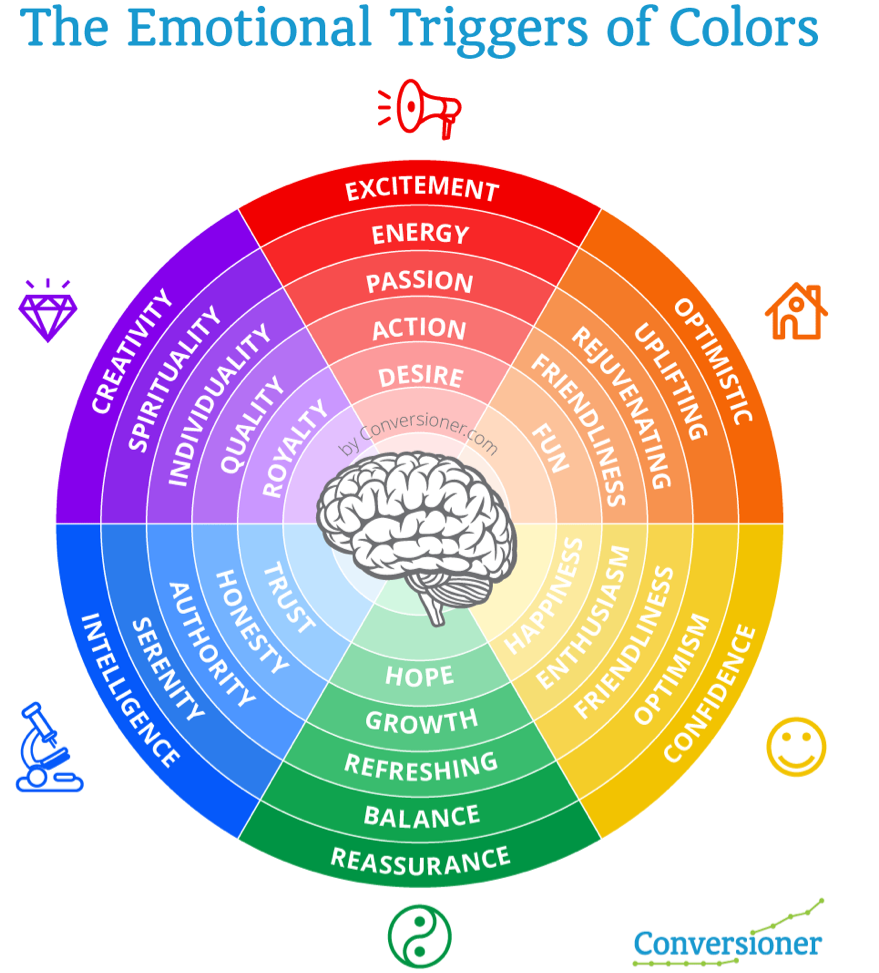
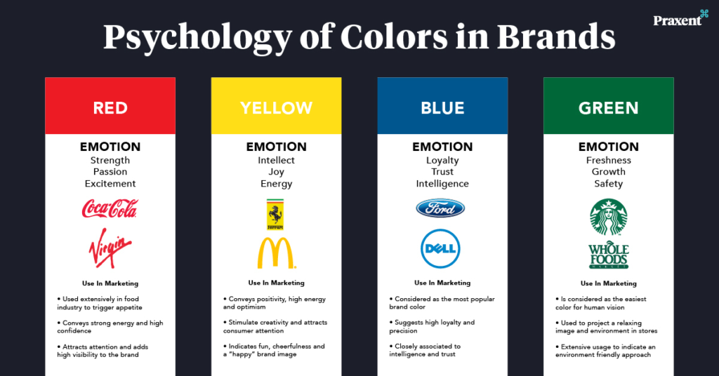
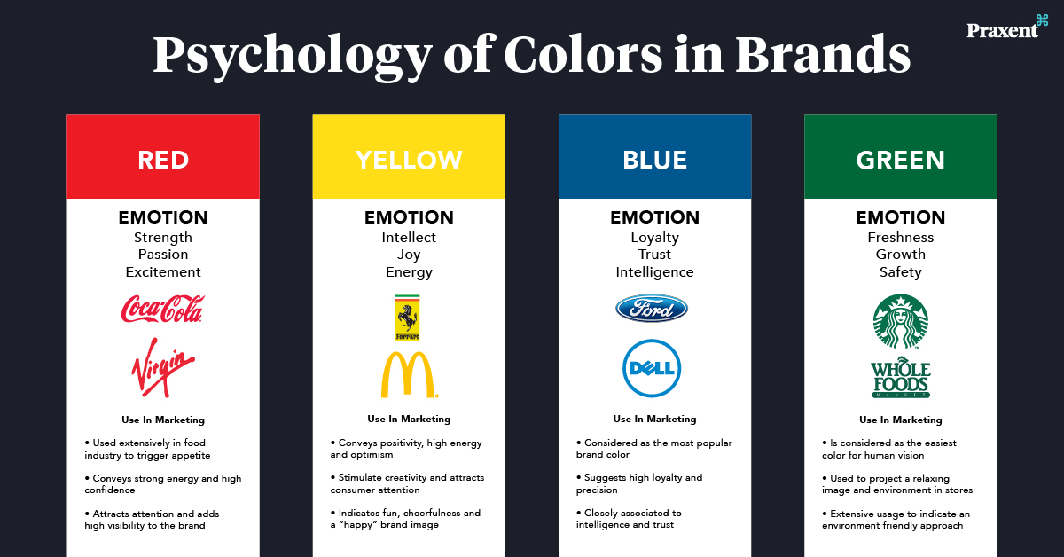
Humans are visual beings. This means that when we see a color, a range of emotions and recollections of past events flood our minds. We also tend to interpret a color symbolically. For example, red is associated with danger; pink is considered a feminine color; green is the color of nature.
Knowing how humans react to different colors is the key to fixating on a color for your brand. After all, you will most probably use the same color for your logo and other branding elements. And you don’t want to elicit a wrong response from your target audience due to an incorrect color choice.
2. List all the values that your brand possesses.
Now that you know how different colors evoke different responses in humans, the next step is to use this knowledge to reflect your brand’s essence. In short, you need to choose a color that you would want in your brand’s image.
But before that, you want to list down all the adjectives that define your brand. And for this, you need to create an in-depth analysis of your brand’s product and service offerings and your business goals.
Once you know what values your brand exudes, choosing a color that reflects them will become more feasible.
3. Conduct a competitor analysis
When researching what color you want your brand to be associated with, look at the colors your competitors incorporate in their brand image.
Competitor analysis is one of the most viable and obvious sources of understanding what colors are popular among consumers in your industry. Doing so can also help you to depart from the norm by choosing a color that not many of your competitors are using.
For example, if you manufacture beauty products, using a shade of green can help relay the message that your products are skin-friendly and environment-friendly.
4. Examine your target audience demographics
The colors you choose for your brand are ultimately directed at the consumers. And if a majority of your target audience is younger than 35, choosing unconventional, bold, and chic colors such as purple, orange, red, etc., can work in your favor more than warm colors such as yellow.
Conversely, if your product is targeted at senior citizens, using colors that are easy on the eyes and not too intervening can work wonders for your brand.
The bottom line is that you need to choose colors according to whom you are targeting.
5. Choose the primary color and its related accents.
When you pick a color for your brand, you are not picking just one color but a range of colors derived from a common source. This range of colors, called shades or hues, is the one that will go into various aspects of your brand’s identity.
But why a whole range of colors and not just one? Get this. You have chosen red as your primary color. You will use it in your logo, your website, your employees’ dress code, your business cards, etc. Now, for your logo, you might go with a bright shade of red. Will you use the same shade in your website’s design? No right? You don’t want your website to be harsh on the eyes.
That is why choosing a primary color and using its variants will help your brand stick with one color without losing out on variety.
6. Compose a color palette for your brand
Earlier, we mentioned that your brand’s color scheme reflects its personality. Now, several brands like to utilize just one color and its shades, adopting a monochromatic approach and restricting their personalities to a few domains. However, some brands use a host of different colors in their branding.
If your brand belongs to the latter type, then what you need to do is to create a color palette for it. A color palette generally includes a selection of different colors and their shades. While a brand might use one color for its logo, it might use the other out of its palette for its website or social media posts. Whatever the purpose be, you need to make sure that your palette doesn’t contain randomly selected colors.
All colors in a brand palette should complement each other and work in harmony.
7. Place your finger on a neutral color.
In Coca-Cola’s logo, the dominant color is red. But the characters that spell the brand’s name are in white. The white color here is the neutral one.
When choosing colors for your brand, you might get so engrossed in selecting all the right shades and creating a color palette that you might not pay much attention to the neutral color. But, neutrals colors are essential as they provide a much-needed supporting role to your primary selection of colors.
Neutral colors are more often than not limited to white, black, or a shade of either of them. However, you can definitely rev your creative engines and see what colors can be neutral for your brand.
8. Decide what colors will go on which platform.
So finally, you have chosen your colors. You have selected a primary color, drafted a color palette, and chosen your neutral colors. The next step is to decide what colors will be dominant on your brand platforms.
You can pick a color from your palette that’s not too distracting, flashy, and harsh on your website. For your logo and business, you can take the liberty of using bright colors that grab attention. Similarly, you can decide what colors and shades will fit a particular platform.
We know it’s easier said than done, and it will take a few tries before you figure out the appropriate colors, but hey, nothing comes cheap, does it?
9. Put the colors into action.
Now that you have your arsenal of colors ready, it’s time to run some real-world tests to ensure that what you have decided is worthy for your brand.
You can use the A/B testing method or run a locally targeted ad campaign to see how people react to your color choice. You can also conduct small-scale or large-scale surveys, depending on your budget, to figure out the public’s sentiments towards your brand’s colors.
If you receive a favorable response, you are good to go. If not, you can always make some tweaks and rerun tests until you arrive at a positive result.
10. Stay consistent with your color scheme.
Once you have arrived at your prized selection of colors, you must keep its usage consistent to create an identity. That’s how branding works. Look at McDonald’s. Their two most prominent colors, red and yellow, are present throughout their brand assets. Even their food products try to incorporate the red and yellow color scheme. This is one of the major reasons McDonald’s is so recognizable as a brand.
And you want the same for your brand, don’t you? Hence, make it a strict rule to highlight your brand’s color scheme whenever, wherever, and however possible. You might not get any immediate results, but you’ll be happy you decided to put in the efforts in the long term.
Key Takeaways
- Colors have a significant effect on the mood and emotions of humans.
- More than 90 percent of consumers decide to buy a product based on color.
- Knowing how colors affect the human psyche is pivotal to choosing brand colors.
- Brands can either have a monochromatic color scheme or one with multiple colors.
- A brand’s colors reflect its ideals and should be chosen as such.
Conclusion
Purple might be your favorite color, but that doesn’t mean it’ll be favourable for your brand too. A brand’s color can result in its success or downfall.
Hence, when you pick a color, try to resonate more with the market’s demands and the human psyche rather than your choice. And don’t forget to follow these ten tips to choose the most appropriate colors for your brand.

FAQs
According to Marketo, the most prominent color for brands is blue, followed by red and black.
The number of colors in a brand’s color palette should be based on how many facets the brand has. Citing this, a brand can have a monochromatic color scheme (Virgin) or a multi-colored one (Master Card).
Branding refers to the image that a brand portrays through ad campaigns, product and service offerings, etc., in order to stand apart from its competitors.
In order to know how to choose brand colors, you need to first define your brand, define your target audience and analyse your competitors. After this, you need to learn the science of colors and utilise it to match your brand’s values.
Latest Blogs
Explore how Google’s 2025 AI search updates triggered ranking chaos. Learn actionable strategies to adapt your SEO for AI Overviews, zero-click searches, and SERP volatility. Stay ahead now.
Learn how to rank on AI search engines like ChatGPT, Perplexity, and Gemini by optimizing your content for authority, structure, and relevance. Stay ahead in AI-driven search with this strategic guide.
Explore the best healthcare SEO services for your medical practice. Improve online visibility and effectively reach more patients in need of your services.
Get your hands on the latest news!

Similar Posts

Design
7 mins read
15 Best Firms Offering Design Services in India

Design
5 mins read
All You Need to Know About Data-Driven Design

Design
6 mins read