
Table of Contents
- What is Visual Hierarchy?
- Importance of Visual Hierarchy in Design
- 10 Principles of Visual Hierarchy in Design
Visual communication forms the crux of an effective and powerful marketing strategy for any designer, marketer, or advertising agency. The design doesn’t just have to be eye-catching but should also ensure that it communicates the brand’s or a campaign’s core message as effectively as possible.
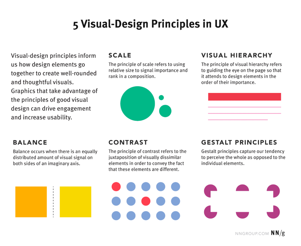
To help create and structure visual designs with the proper hierarchy in place, designers use the basic principles of visual hierarchy. These principles provide a framework that includes color, contrast, typography elements, spacing, prioritization, and other essential tips to help designers create beautiful, impactful, and structured designs.
Visual hierarchy is becoming essential for brands and designers to know, as it can help them stand out from the competition. Today, innumerable tools have simplified the overall design process, enabling multiple marketers and content creators to create visually-appealing designs without too much effort. With this rising competition, having responsive and relevant design can help your brand stand out.
Statistics, too, confirm this view.
- 85% of online shoppers say product information and pictures are important to them when determining which brand or retailer to buy from
- 50% of consumers believe that website design is crucial to a business’s overall brand.
- 39% of consumers care about color more than any other component of a brand’s design.
This guide will explain what visual hierarchy in design is all about and the ten principles of visual hierarchy that every designer should be aware of. Since there is a lot of ground to cover, let’s get started on the basics.
What is Visual Hierarchy?
By definition, visual hierarchy is a design principle that talks about how a design should arrange elements in the order of preference. It helps designers and developers to layout every element as per prominence, ensuring the key message resonates with the audience.
In design, a visual hierarchy helps us define what design elements need to stand out, which message or text should have the largest font, and how each element should be sized in proportion to other elements and their importance. This helps the design flow logically and creates an ideal visual hierarchy.
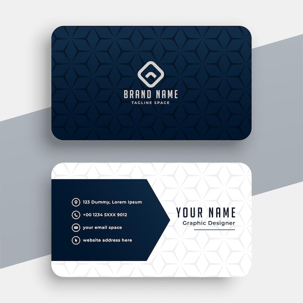
A simple example of visual hierarchy in action could be a business card design. Here, the organization’s name and logo are the key elements and will feature in fonts, colors, and sizes that help them stand out most prominently.
The following important element will be the card holder’s name, job title, and contact details. These will be in a font style and size that is easily readable and pretty standard, but one size lower than the company logo and name. As per preference, additional details about the company’s locations, address, or services can be in a lower order of prominence and placed at the bottom of the card or the back.

Importance of Visual Hierarchy in Design
Visual hierarchy is not a recent trend in design but a concept that has been evolving and in use for millennia. Ever since humans began to use written forms of communication, visual hierarchy has been used in one form or the other.
Be it the inscriptions on stone tablets, papyrus scrolls, or modern printing paper where the design and layout of the newspaper or magazine had elements designed based on prominence. Today, in a world where design is a key aspect for both print and digital, visual hierarchy is important for communicating effectively to the viewer.
It is more important today than ever before as today’s average human attention span is shorter than a goldfish. This means that the average human attention span has fallen to just 8 seconds today, while the goldfish has an attention span of 9 seconds.
In such a short time frame, and with massive competition in the digital space, any design has to be eye-catching and effective in delivering its messaging to the audience. Any design that fails to grab the user’s attention in the first few seconds will be lost in the barrage of online posts and stories, thus never making the impact it should!
10 Principles of Visual Hierarchy in Design
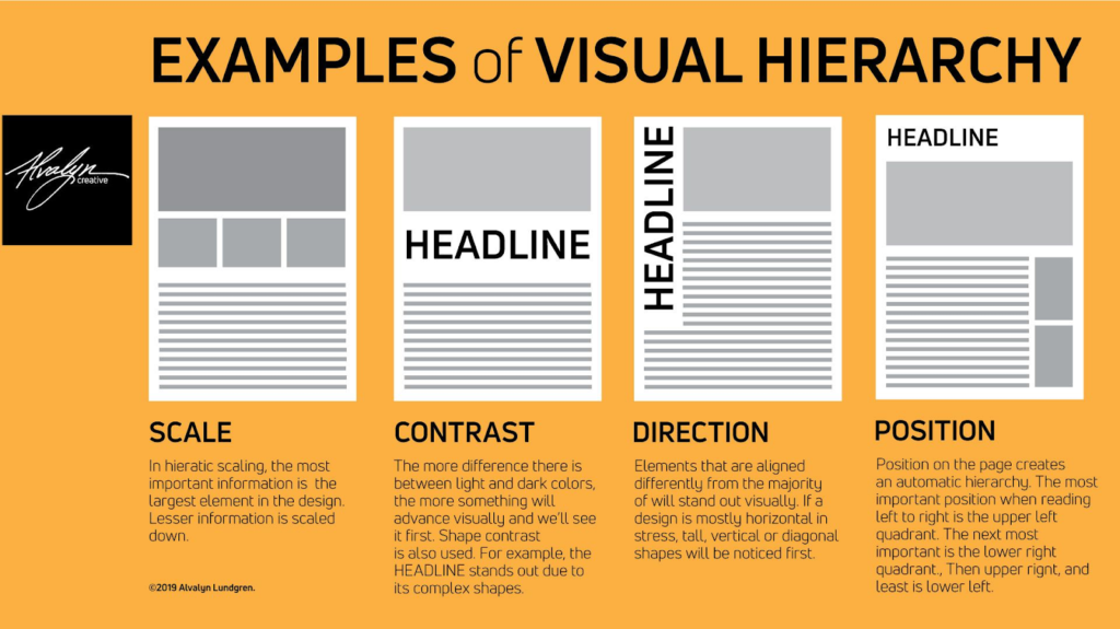
1. Size matters
The first rule of visual hierarchy talks about how big or small each element should be. The usual argument is that larger is always better when it comes to size, but the question is, how big can things actually be?
The largest element or font in the design should need maximum emphasis. This can be an element that is key to the design, like the product or message being showcased or the name or logo of the company being talked about. The other aspects will be smaller but in sizes based on the larger element. The viewer can thus see all the information presented in the design or infographic while the strongest message resonates loudly.
2. Perspective creates an impact.
In addition to the size, perspective also helps create the right impact using design. In the second principle of visual hierarchy, we can see how designers can use perspective to easily communicate the larger message by placing the main object next to the smaller object.

The above picture shows how scale and proportion are used to accurately communicate how the right hand with more coins is more appealing than the left with just a few coins. This design principle is mainly used in advertising and marketing to showcase to the audience how much more or how important their product is as opposed to what is available in the market.
3. Use color and contrast to draw attention
Color contrast is crucial to help your key element stand out, like size and perspective. Just as the larger element will get more emphasis, bringing colors or contrasting colors will grab the viewer’s attention, even with every element of the same size.

Consider the above design. Each light bulb is the same size, and there is no noticeable difference. However, the bulb that is lit stands out and instantly grabs attention. Also, note how the bulb that is lit is positioned away from the ones that are not, showcasing importance. By using colors and contrast to perfection, designers can define what message or element should get prominence and ensure it resonates in the design.
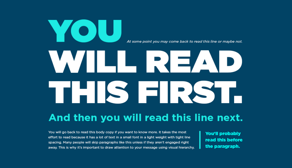
4. Fonts organize design
When it comes to design, the kind of font used is also a big indication of the kind of communication the design wants to deliver. Generally, each design follows a font size and typeface that emphasizes what’s important and helps organize the overall design in a structured manner.
However, when it comes to visual hierarchy, choosing the right font is all about the following:
- Which message should grab maximum attention? This message will be showcased in the biggest font size and ideally with the brightest color in the palette.
- Is the message readable? After prominence, a designer should look at readability when creating any design that includes text. If the overall composition of the elements and colors take attention away from the text and the font is not easily readable, it must be changed.
- Understand the variations in the messaging. In most instances, the design should have the same font type, or if there is a need to use a different font, it should ideally blend in well with the overall design. Remember that too many fonts or typeface attributes in the same design can often confuse the viewer. Designers may define a hierarchy and font for each element like heading font, copy font, subtitle font, footer font, etc.
Here is an example of one of our recent designs that uses a simple and plain font but delivers the message:
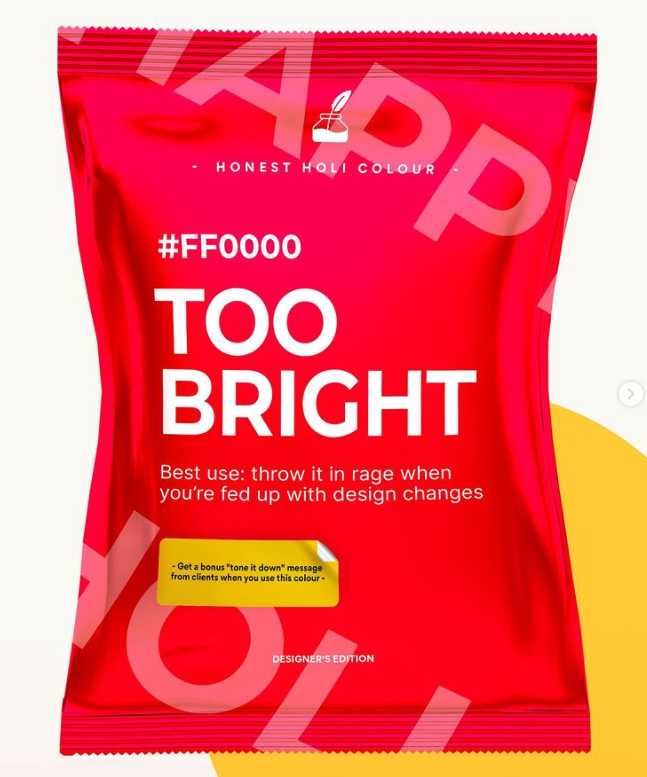
We have used multiple fonts in this design shared on our social media channels. However, every typeface used blends in with the rest and thus resonates well with the key message of this post.
5. Space provides emphasis and movement.
Spacing is a key element of any design’s overall aesthetic and messaging. Just by placing elements in the correct order, designers can significantly improve the look of the design and add prominence.
Also, the rule of space helps designers understand which area is best for an element. For example, the center is reserved for the USP of the design, which can be the product, brand name, or the key message. This is the first thing that a viewer will look at in most cases, followed by the elements directly around this key element.
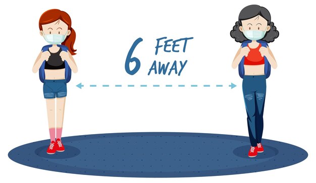
6. Proximity suggests relationships
Proximity, or how each element should be placed in relation to the other, is an important element of visual hierarchy. Related elements, objects, or messages must be placed close to each other.
Take the example of this image below. The key message here is to tell viewers to maintain a 6-feet distance, which was crucial to stop the spread of COVID-19 at the peak of the pandemic.
7. Negative space emphasizes
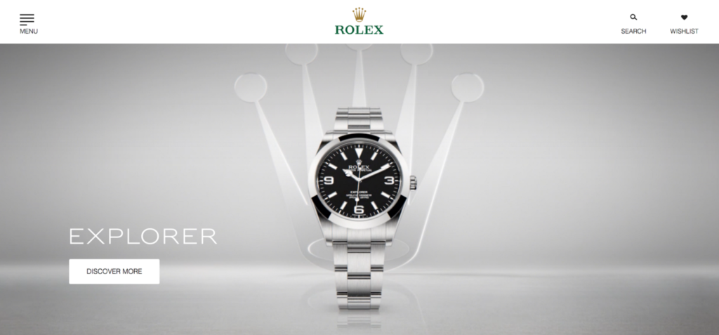
For most, white space or negative space is often considered a neglected space, and designers usually try to fill out whitespace for optimal utilization. However, be it in print or digital, whitespace is crucial for making the design look classy and adding importance to the graphic or message in it.
Minimal design has always been key to premium brands. This was also true in the days of print, as any advertising space had to be bought and often incurred a large budget. Thus, designers and marketers would try to fit in as much information as possible to get an equivalent return on investment. Here, premium brands used white space to showcase their luxury and focus on selling the product prominently.
Take an example of Rolex’s designs, which are always simple and use white space to direct the viewer’s attention to the product, which is their USP. Fonts or other styles are at a bare minimum and only to emphasize the brand value.
8. Alignment directs the gaze.
In visual hierarchy, alignment is a principle that defines how objects should be placed and the ideal alignment for the design. Many visual designs are centered or justified, meaning they are spaced so that the space of the design is utilized evenly, without too much white space in the corners.
However, there are other types of alignments in design, too. For example, the page-scanning alignment focuses on placing objects in areas where the user is more likely to look at them. Native English speakers are used to reading from left to right, so keep the design spaces similar. It is the opposite for Arabic readers, so designers need to understand the type of audience they are creating the design for.
Other key patterns in design include the Z pattern (which implies that users will navigate in a Z-pattern to scan a page or design) or the F pattern (where users are more likely to scan the top and center with a low emphasis on the bottom side of the design).
9. Repetition unifies a composition.
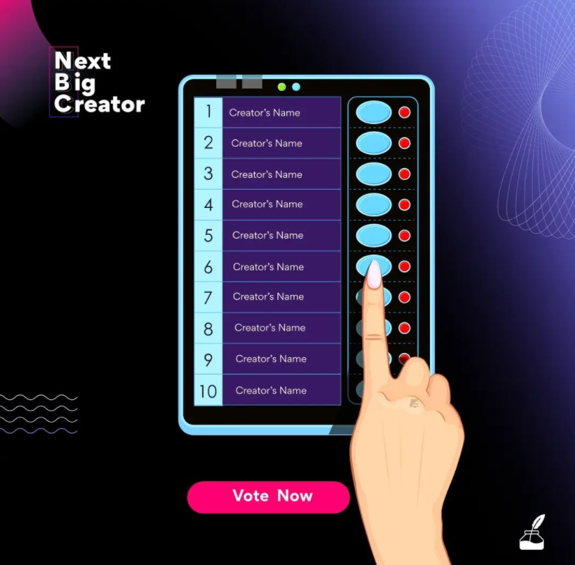
Just as contrast, colors, and size emphasize the core element of a design, repetition helps boost the key message of any design. In the example below, although the crux of the design is voting, the designer has used repetition to symbolize that the vote will be one from multiple options. So, although the elements are repeated, it adds value to the design in this scenario.
10. Grids organize a design
Gridlines or the rule of thirds is an important element in photography, and the same can be replicated in design to define how the element should be placed. Using hypothetical grid lines, designers can understand the placement of an object and ensure that it is placed in the central box to get maximum attention so that the overall design looks structured. Important visual elements are placed along the lines, emphasizing the four points where the lines meet.
In Summary
This detailed guide should help you understand visual hierarchy principles better to be implemented in your designs. An effective visual hierarchy is key to giving your design the right aesthetics and providing a more engaging and clear user experience.
Using this superpower, you can weave magic with your design, and it is always recommended to not think too deeply about the concepts and just go with the flow. Remember, any design that you create always has room for improvement, and keeping in mind the customer’s perspective will give you an edge in your design arsenal.
Key Takeaways
- Visual hierarchy is a design principle that talks about how a design should arrange elements in the order of preference.
- Visual hierarchy helps designers and developers to layout every element as per prominence, ensuring the key message or element resonates with the audience.
- It is more important today than ever before as today’s average human attention span is shorter than that of a goldfish.
- The elements of visual hierarchy focus on teaching designers how to create designs based on size, color combination, font type, use of whitespace, and other key elements.
FAQs
In UX design specifically, visual hierarchy determines the order of influence that each element will have by understanding how users interact with the design. This can be either in print or digital, with the design focusing on elements such as user navigation, areas of attention, and others using visual hierarchy principles to help users focus on key aspects of the page and guide them to consume the design in the order of its intended importance.
1. Size matters
2. Perspective creates an impact
3. Use color and contrast to draw attention
4. Fonts organize design
5. Space provides emphasis and movement
6. Proximity suggests relationships
7. Negative space emphasizes
8. Alignment directs eyes
9. Repetition unifies a composition
10. Grids organize a design
Similar to how it is used in designing, visual hierarchy in photography refers to each element’s arrangement in a photograph. This helps photographers understand the depth of field to be used, the color contrast, arrangement of the elements, and centering or focus on taking eye-catching pictures and clearly capturing the key component of the image.
1. Size: Design each element based on its prominence in the overall design.
2. Color: Use bright colors for grabbing attention and muted colors for the other elements to blend in with the design.
3. Contrast: Use eye-catching colors for the important elements and contrasting colors for elements in the lower priority.
4. Alignment: Determine how all elements should be sorted and designed to ensure they look uniform.
5. Repetition: Key elements should be repeated or mimicked in the design.
6. Proximity: Related elements should be placed close to each other.
7. Whitespace: Ensure elements are spaced out so that there is natural whitespace and looks neat.
Latest Blogs
Explore how Google’s 2025 AI search updates triggered ranking chaos. Learn actionable strategies to adapt your SEO for AI Overviews, zero-click searches, and SERP volatility. Stay ahead now.
Learn how to rank on AI search engines like ChatGPT, Perplexity, and Gemini by optimizing your content for authority, structure, and relevance. Stay ahead in AI-driven search with this strategic guide.
Explore the best healthcare SEO services for your medical practice. Improve online visibility and effectively reach more patients in need of your services.
Get your hands on the latest news!

Similar Posts

Design
7 mins read
15 Best Firms Offering Design Services in India

Design
5 mins read
All You Need to Know About Data-Driven Design

Design
6 mins read