What Does a Mobile-Friendly Website Really Mean?

Surfing the internet and exploring websites on computers is a thing of the past now. We are living in the age of technology that is increasingly improving, and it’s only onwards and upwards from here. In such a fast-paced world, people want convenience, and they want it now. That’s why basic phones have been replaced by smartphones.
These smartphones have literally brought information from throughout the world at the click of a button. And so, it was only logical for people to switch from bulky laptops to handy smartphones for most tasks. That’s exactly why search engines have started promoting mobile-friendly websites.

4 Features of a Mobile-Friendly Website
Let’s come to the point now. There are several terminologies associated with websites being mobile-friendly. We’ll address them in a manner that’ll give you clarity on the intricacies of this feature.
1. Information that fits a small screen
The mobile-friendly definition states that a website meant to be viewed on a desktop is decreased in size, so much that it fits the screen of a mobile phone or a tablet. The elements of the desktop site are shrunk so that nothing gets cut out. The viewer may have to zoom in on certain textual designs, but hey, at least you get all the information you need.
2. Intuitive design
This is a key element in the mobile-friendly website arena. Every web developer knows that in order to make a mobile site, it needs to have a design that will adapt itself to fit mobile screens. However, it is to be noted that mobile-friendly sites only roughly adapt themselves to other screens. These designs are like water: they take the shape of the screen that you’re viewing it on. The functions and appearance of all the elements will remain the same.
3. A separate mobile site
There are chances, albeit less, that your desktop website may not get properly converted into a mobile website. In such a scenario, the web developer can create a new website altogether. This website will have elements big enough to fit the size of a mobile phone’s screen. Generally, they are hosted on a subdomain and have them(Dot) feature added right before your original website’s domain name. So, if your website is called http://content.com, your mobile website will be called http://m.content.com.
4. Convenient positioning of links and calls to action
In its multiple definitions of mobile-friendly websites, Google shares one that states the correct positioning of links and call-to-action (CTA) buttons. It’s easy to choose an option when you’re exploring a desktop site. However, there are much fewer options on mobile websites. For instance, there’s only a single type of click, and no left or right-click. You can’t even hover the cursor on a hyperlinked tab to generate a drop-down. Plus, if two CTA buttons are close to each other, you might end up clicking on the wrong one. Hence, it’s crucial to have enough space between them.

What Is the Significance of Mobile-Friendly Websites?
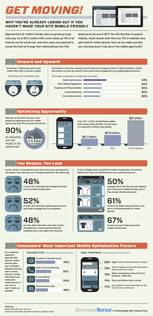
Mobile-friendly websites are the future of web design. The new tech-friendly generations look for quick convenience. Do you know where they find it? On smartphones. As a matter of fact, 63% of the world’s Google searches are conducted on smartphones. When the entire world is heading towards mobile-friendliness, why are you thinking so much before hopping onto the bandwagon? If you’re still pondering about why to make your website mobile-friendly, the following are some reasons that’ll give you a clearer picture.
1. Accessibility
Your laptop can’t accompany you everywhere, but your phone can. That speaks volumes about the importance of having a mobile-friendly website.
2. The trust-building factor
Having a website that is easily reachable tells your customers that you are flexible and ready to innovate your product in order to meet their expectations. And the fact that you have the ability to do so gives them a sense of faith in your brand.
3. Improved SEO
Because more than 50% of Google’s traffic comes from mobile phones, Google and all the other search engines have started prioritizing mobile-friendliness. So, if your website is mobile-friendly, it will show up in Google search results much above those sites that aren’t. Thus, you will get better visibility.
Internet surfers now have a much shorter concentration span than before. So, you need to make your product convenient and accessible. The moment your website begins giving them issues, you’ll become old news for them. To top it, there’s no dearth of replacements. Thus, it’s imperative to have a mobile-friendly website with great ad copy and a responsive design.
FAQs
A mobile-friendly website allows your potential customers to reach you with ease, and to engage with your content on the go. This automatically boosts your sales and helps you convert more leads.
Google has a list of guidelines to help you create a mobile-friendly website. Some basics that you can follow without any external help are as follows:
1. Have a responsive website design.
2. Compress high-resolution images.
3. Space out the links and CTA buttons.
4. Don’t use Flash.
5. Ensure your text is easily readable.
Yes, it’s been a few years since Google, along with other search engines, started prioritizing the mobile-friendliness of websites. Websites that are optimized for mobile phones will show up higher in search results, as compared to those that are not.
To put it plainly, mobile-friendly is when you “see” the same information on both desktop and mobile websites. On the other hand, a site is responsive when you “experience” the same information on both versions.
Yes, mobile-friendliness affects the SEO of your website. This feature is a ranking signal on most search engines, including Google and Bing. Thus, websites that are optimized for mobile phones will show up higher in search results as compared to those that are not.
Latest Blogs
Explore how Google’s 2025 AI search updates triggered ranking chaos. Learn actionable strategies to adapt your SEO for AI Overviews, zero-click searches, and SERP volatility. Stay ahead now.
Learn how to rank on AI search engines like ChatGPT, Perplexity, and Gemini by optimizing your content for authority, structure, and relevance. Stay ahead in AI-driven search with this strategic guide.
Explore the best healthcare SEO services for your medical practice. Improve online visibility and effectively reach more patients in need of your services.
Get your hands on the latest news!

Similar Posts

App and Website Translation
4 mins read
27 Tips For App Translation and Localization

App and Website Translation
5 mins read
7 Best Practices Of Translating Apps

App and Website Translation
4 mins read