Table of Contents
- Why is good web design important?
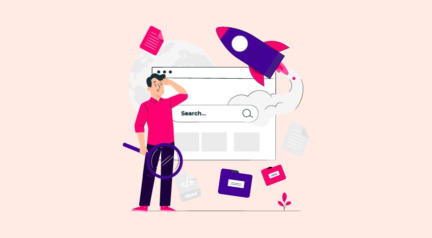
- Eight tricks to crack the code for best web design
- Design useful components
- Use different typefaces for numbers and text
- Use single color backgrounds
- Colour code categories
- Use Hovering
- Incorporate Grids
- Put captions to images
- Experiment with asymmetry
- Key Takeaways
- Conclusion
- FAQs
Web design advice is in abundance on the internet. Many people have different ideas on what the ideal website should look like. This is because the design is subjective to some extent. What one person finds appealing, another may find repulsive.
At the same time, web design is one of the most critical aspects of a website’s success. In fact, over half of individuals feel that a website’s design is the most important aspect in determining a company’s legitimacy. As a result, it impacts conversions, bounce rates, and other metrics.
If only there was a way to get some objective web design tricks on designing a good website, right?
You’re at the right place. In this blog, we have gathered eight amazing web design tips and tricks to improve your website design. Before we get to that, let’s understand why good website design is so important.

Why is Good Website Design SO Important?
Have you ever planned on buying something from an online store but found the website user interface (UI) so bad that you just couldn’t make the purchase?
This is precisely why website design is so important. It can repel or attract customers.
An unappealing or outdated website creates a terrible first impression of your company. It deters potential clients and redirects them to your competitor’s website. However, a good website design keeps visitors on your page longer, enhancing lead conversion.
Here are a few statistics to put things in perspective:
- Judgments on a company’s credibility are 75% based on the company’s website design. (Stanford’s Web Credibility Research)
- It just takes 50 milliseconds for a visitor to establish an opinion about your website design. (Google Report)
- 38% of people will stop engaging with your website if your content and layout are unattractive. (Adobe)
- 88% of online visitors/consumers are less likely to return to a site after a bad experience. (The Gomez Report)
These figures don’t exist in a vacuum. They all contribute to the success of your website based on user experience.
Your brand’s website is a vital representation. What visitors feel about your company will be reflected in their experience on your site.
Eight Website Development Tricks
Now that we know how important it is to have a good website design, here are some website design tricks that we’d like to share with you:
1. Design useful components
People think that websites that are easy to use are more enjoyable. So, create everything the user requires and make each task quick.
Put your fancy aesthetics aside and incorporate some helpful components if you’re developing a website that people will use frequently.
A simple example of a usable website component is adding various filters to the shop. Have a look at the example below:

From the web design standpoint, navigation menus are quite significant and require special attention. The navigation menus are the only way for your user to learn more about what your website offers. Without this feature, people would just keep scrolling among a pool of products and might not end up finding what they need.
2. Use different typefaces for numbers and text
Who made the rule that the same typeface should be used for numbers and text? Pushing yourself to do this is a typical mistake.
While this is frequently effective, some typefaces were not designed for numbers or were even developed without them!
If you’re going to utilize a third typeface for numbers, don’t be afraid to use it in your design. Most likely, the two typefaces you’re employing looked terrible when used on the website you’re working on.
That said, choose typefaces that complement each other.
Take a look at the combinations shown below.
Georgia (left) and Verdana (right) share comparable values, resulting in a pleasant pairing. Compare this to the combo of Baskerville and Impact (right), when Impact’s massive presence completely eclipses Baskerville.

3. Use single color backgrounds
Using monochrome photos as backgrounds instead of flat hues is a simple yet effective strategy. This technique allows you to add texture and reinforce themes while still allowing breathing space.
The absence of color does not always imply a lack of vitality and personality. Drawing attention to a website with bright white text on a sleek black backdrop (or vice versa) is always effective. It doesn’t really matter if the red from ‘Pinterest’ or the blue from ‘Twitter’ is substituted with monochrome colors when it comes to well-known social media icons.
When you use monotone hues, you’re aiming for minimalism. A quiet, sober, and basic background works wonders when highlighting something significant in the front.
4. Color code categories
This strategy uses a different color for each category on a website. This is a fantastic approach to color-code a design to make it more organized and navigable.
The same technique can be used to highlight popular posts, for example, roles (authors have one color, editors have another); authors (assign colors based on posts, tags, and so on) (highlight posts that have 150 to 200 page views with one color, and then 75 to 150 with another, and so on).
Depending on your application, you will have a different experience. You can help navigation and usability by color-coding categories, for example.
5. Use hovering
As we get lost in complicated effects and intricate animations, we often forget or overlook some of CSS’s simplest features.
Take, for example, hovering: Take note of how powerful a simple CSS option can be when used in a theoretically relevant way.
This effect is particularly dynamic because it includes a hover effect for both content and images.
It’s a fun trick with some practical applications. The designer can emphasize vital information using the hover effect, making the website more user-friendly.

6. Use grids
You’ve probably heard of the 960-Grid System or Twitter’s Bootstrap, and you’ve probably used a 12-column grid layout before.
But have you ever attempted to make those grids visible?
Grids are frequently used to emphasize notions such as minimalism, precision, and expertise. The grid system aids in aligning page items based on sequential columns and rows in the web design process.

The only thing to watch out for is contrast. Too many contrasted lines will draw the reader’s attention away from the more important sections of the layout.
Standard grids are available for you to use, which can help you design your website while also reducing the time it takes to create your own. The 960 Grid System is maybe one of the most popular grids available. Nathan Smith created the system, which allows you to choose between a 12, 16, or 24-column grid.
7. Put captions to images
Image captions are a crucial part of web design. They’re frequently talked of in terms of use rather than aesthetics. They aren’t mentioned unless the image requires some additional information or credits.
On the other hand, image captions are a terrific spot to add a little more style to your website or provide some unique insight into the image’s subject. Whether the descriptions are for images on a news website or design samples in a portfolio, they offer a way to reinforce the website’s overall aesthetic. If done correctly, they can even provide extra visual intrigue and create a distinctive characteristic of a company or website.
Photo captions can be divided into two categories. There’s the straightforward, simplistic approach. A plain sans-serif font in white, black, or shades of grey is typically used.
The other primary style is more graphic in nature. Effects like the caption only appearing on mouse-over or a “Details” button that leads to the full caption are common examples.
8. Experiment with asymmetry
Break the rules once you’ve learned them. Asymmetry is frequently used in modern aesthetic design. Try rearranging items and deviating from typical grid patterns. This is, however, one of the trickier techniques, as producing an unbalanced composition is rather simple.

When web designers use the phrase “dynamic,” they refer to a design that allows the viewer’s eye to move around and within it. Asymmetrical patterns can make you feel like you’re moving. That’s why so many sports brands use asymmetrical layouts and asymmetry in individual parts (such as the logo).
Those are some of the best website design tips and tricks that we would like to share with you. We are sure they will help you crack the code for excellent web design.
Key Takeaways
- Web design is one of the most critical aspects of a website’s success. Over half of individuals feel that a website’s design is the most important aspect in determining a company’s legitimacy.
- Your company’s and brand’s website is a vital representation. The thoughts a visitor feels about your company will be reflected in their experience on your site.
- Design useful components on websites to make it user-friendly and intuitive.
- When it looks natural and is required, you can use different typefaces for numbers and texts, but make sure they look good together.
- Monochrome backgrounds are a great idea and can help you make your website look minimalist and professional.
- Color-coding categories on websites will improve user experience.
- Hovering, a simple yet effective technique can make websites look less content-heavy.
- Using grids aids in aligning page items based on sequential columns and rows in the web design process.
- Image captions add a lot of depth to your website. They are terrific spots to add a little more style to your website or to provide some unique insight into the image’s subject.
- Finally, you should experiment with asymmetry on websites. Asymmetrical patterns can make you feel like you’re moving.
Conclusion
Beauty is something that everyone appreciates. New design features are always popular. However, website visitors or prospective customers require more than just beauty. They need information. And website owners need results.
Websites should be appealing to the eye. They should leave an impression on visitors, either visually or emotionally. However, your website’s performance is measured in more ways than one. It’s all about assisting visitors in locating the information they require. Every tip in this post revolves around this concept. And this is what web design is all about.
In addition to these tips, we recommend always keeping an eye out for inspiration. Website designing is so dynamic, and there is no stop to learning.
A good web design will only be effective if it is accompanied by equally good content. Pepper Content is one of the best companies that provide excellent web content writing services.
FAQs
The process of building websites is known as web design. It includes various elements such as webpage layout, content creation, and visual design. Even though the phrases web design and web development are sometimes used interchangeably, web design is a subset of web development
A website must be user-friendly, seamless, and attractive. A few examples of terrible website design are a cluttered layout, a buried navigation menu, a lack of color contrast, a non-responsive design, and uneven typefaces. The lack of user-centricity is the defining feature of a terrible website design.
A good website is well-designed and intuitive. It has fresh, quality content that is useful to the visitor. It has clear calls to action and is optimized for mobile and web use. And finally, it is in line with the brand voice and image.
The most important elements of a good website are:
Navigation
Content
Design
Branding
Support
The three major types of web developments are:
Front-end web development
Back-end web development
Full-stack web development
Web development has a great degree of job satisfaction. Most web developers are usually happy with their work due to many reasons like good pay, better work-life balance, flexibility, and more.
Latest Blogs
Explore how Google’s 2025 AI search updates triggered ranking chaos. Learn actionable strategies to adapt your SEO for AI Overviews, zero-click searches, and SERP volatility. Stay ahead now.
Learn how to rank on AI search engines like ChatGPT, Perplexity, and Gemini by optimizing your content for authority, structure, and relevance. Stay ahead in AI-driven search with this strategic guide.
Explore the best healthcare SEO services for your medical practice. Improve online visibility and effectively reach more patients in need of your services.
Get your hands on the latest news!

Similar Posts

Design
7 mins read
15 Best Firms Offering Design Services in India

Design
5 mins read
All You Need to Know About Data-Driven Design

Design
6 mins read