
Table of Contents
- 10 UI Techniques For Good Web Design
- Pick how people will interact first
- Keep essential items on the front
- Make an interactive interface
- Use recognition rather than recall
- Maintain consistency in the design
- Clarity is the key
- Adhere to design guidelines
- Ensure hierarchy in element placement
- Keep things simple
- Create a forgiving interface
- Key Takeaways
- Conclusion
- FAQs
User Interface Design is about creating an interactive experience through an interface with clear and simple choices for the user. It revolves around the proper placement of a text field, radio buttons, sliders, icons, tags, notifications, menu bar, message boxes, modal windows, search field, toggles, footer, lists, etc. All these elements directly impact the user’s interaction and overall experience.
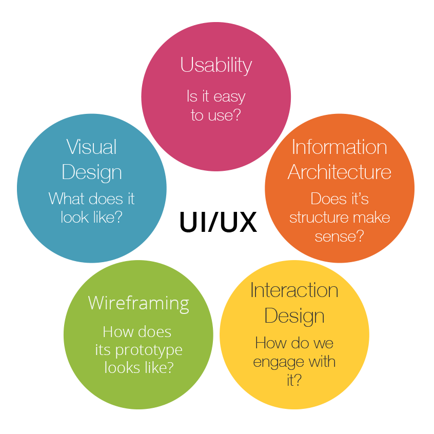
A good user interface makes its users feel more at ease, learn faster, and gain mastery over the product quickly. As a UI designer, you investigate all possible interactions and behaviors of the user with a product to create a prototype that best adapts to their needs.
It is tough to figure out UI functionalities without a guideline. You may cripple with the decision-making of the order of elements on the interface. Enlist the number of forms you need to create. You will have to decide on feature placement, size of buttons, typography, color, and progression bars.
The design and development of any UI prototype is not an easy ordeal. You need to understand UI design techniques to create a product that is easy to comprehend, access, and operate.

10 UI Techniques for a Good Web Design
Let’s understand how the following UI design tips and tricks can enhance your web design.
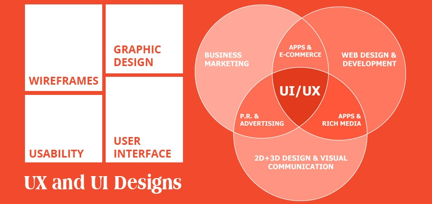
1. Keep essential items on the front
Whether you are designing a UI for a mobile app, a web app, a WordPress site design, or something else, your clients will always look for the Help button (or the Contact Support button). They will find a way to get to you sooner or later. As a result, you should always place the assist buttons somewhere easily visible.
The user will abandon your product if they cannot see what they need, whether it’s a sequential list of file uploading/downloading, a list of their articles written online, items in a cart, or anything else. Things must be made available through the use of tabs.
For example, if you are designing an online note-taking website and app, make sure all the tabs about creating a document, arranging it in a folder, writing, and editing tools are easily accessible.
Make an assistance window spring upon hovering an icon or the sidebar with a chatbot or an instructional help video on the relevant topic.
2. Make an interactive interface
The users feel in command when they know what is happening. One way of doing it is by adding a progress bar indicating the time remaining for uploading or downloading a file. You can also provide a visual sign as a progress bar using color grading. Or else add this feature to CTA buttons that display color change when pressed. You can merge the button into the page by animating it as well.
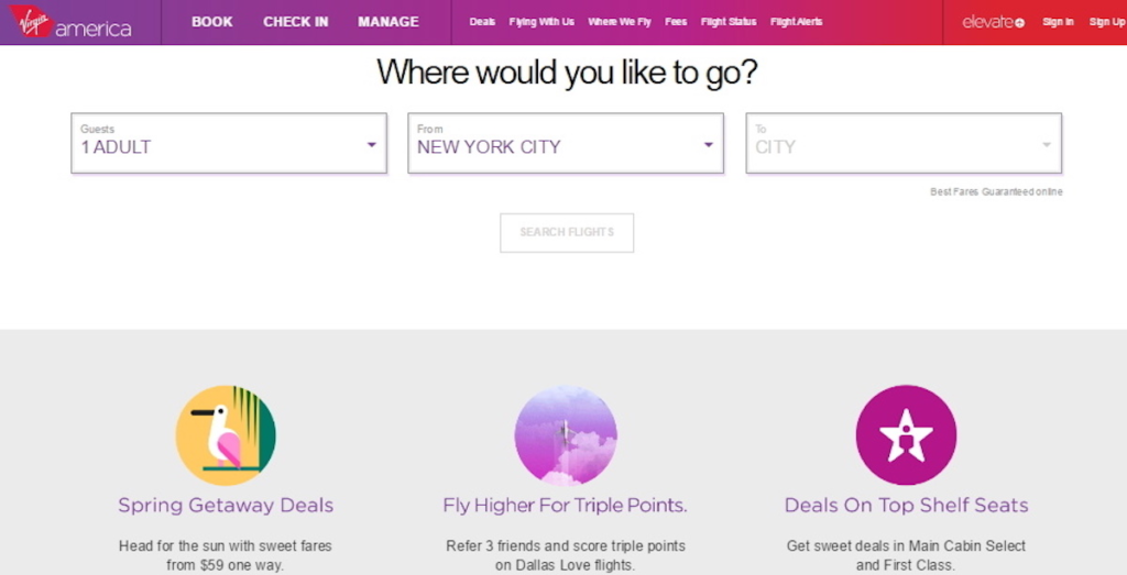
Due to the lack of feedback, users need to double-check to ensure that the action was performed. As in the example above, highlighting a button or a tab successfully alleviates frustration and confusion.
A small acknowledgment of the actions taken within your interface can mark the difference between an amazing and a dull experience.
3. Pick how people will interact first
What about pressing something that appears like a button but is not, yet you are still waiting for a response? That’s because designers fail to evaluate how their users interact with their products. So, when creating your UI, pick one (or two) movements and stick to them.
Take a look at Spotify. Scrolling and tapping are applied to complete almost every function,
including accessing popular playlists, your personalized playlists, and liked songs.
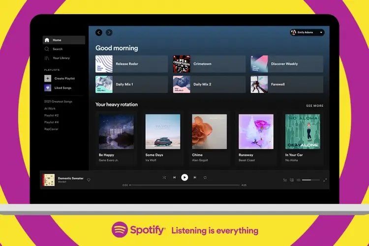
They decided how they wanted their customers to interact with their product and created their user interface to support that.
You have to decide if you want to utilize menus and taps, swipes and gestures, or something else while developing your UI.
Alexa and Siri primarily interact with the user through voice input. The way they deliver information and carry out their jobs is bespoke to that specific input. So the user intuitively knows what to do because that instruction was laid out at the start.
4. Use recognition rather than recall
People will avoid exploring your website if they don’t recognize the elements or their purpose. You should use popular design elements like shopping cart icons, notification bells, and the hamburger button that indicates a menu. Always place these elements at familiar locations, for instance, in this case, either on the top left or right corner of the web page.
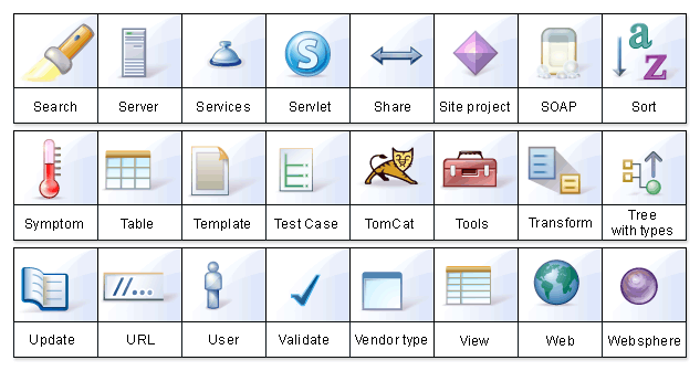
Your audience will feel more comfortable navigating your site when they see familiar design elements.
It is also possible to add virtual tours to guide the user through the UI process, even if it is not their first time. They will not have to expend energy remembering how to perform those actions.
You may also achieve this through strategically placed messaging that reminds your users of what your site does. If someone forgets what the icon does, add a feature that takes them to hover tooltips. They should then be able to recognize the icon.
5. Maintain consistency in the design
Your UI should work and appear reliable across the whole item.
Try not to have the menu at the top of one page and the bottom of another. Keep the menu items unchanged every time it loads. Ensure that your customers understand where everything is on your website in one glance.
Your text styles and color configuration should incorporate consistency such that when your user moves from one page to another, there is nothing too surprising or different. Nowadays, making your design intuitive and predictable is a conventional UI design technique.
Consistency indicates that you do not let your customers down by making them figure out what to do on your website.
6. Clarity is the key
It may appear to be a repetition of the preceding paragraph, but clarity and consistency are not the same things. Clarity implies that you want your users always to know what to do. A good web design tip is to find a way to let clarity bleed into UX design. Because it reduces user frustration, increases retention, and decreases bounce rate.
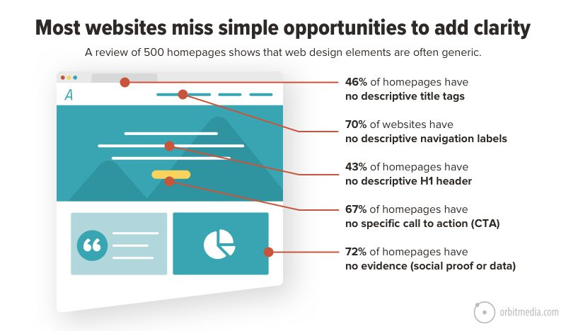
The popularity of minimalist web design can be attributed to its clarity. Since there is no clutter, people are not perplexed about the purpose of any site or page.
Letting them move from one step to the next on different pages is one way to achieve clarity. Do not place a checkout process that scrolls down the page or opens up like a popup. Instead, design a separate checkout page. For example, allow your users to navigate from a Product Page to an Order Confirmation page in sequential pages. Users should see where they are in the interface through page titles, highlighted currently selected navigation options, and other visual cues. They will know what they are doing or moving towards on the page.
7. Adhere to design guidelines
A simple rule is to follow the rules when they serve you best. If the standard design format works, there is no reason to recreate it. It includes everything from icons to the typical positioning of items. Do not swerve from what your users expect unless you wish to disappoint them. People understand that question marks (?) signify a query, help, or assistance. Do not replace a question mark with an exclamation mark (!). Similarly, use the hamburger icon (three stacked lines) rather than any other icon to help users identify your mobile menu.
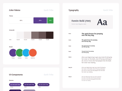
Likewise, consider the search bar placement. They are placed either at the top of the sidebar or at the end of the header menu of most web pages. If it is not there, it’ll be in the center of the top section of the page. People will be confused if you place the search form towards the bottom of your sidebar, page footers, or beneath the body of your blog entries, even if it is made identifiable through a conventional magnifying glass icon.
There is nothing wrong with thinking outside the box and opting for a new and original design, but this should not mean that the web design is tough to use. The bottom line is, do not complicate simple things.
8. Ensure hierarchy in element placement
It implies that the elements on your page must have a clear hierarchy for utility and how the user perceives the page. Essentially, you want to place the most critical functions at the top of their respective pages. Furthermore, this type of hierarchy can organically bring the user down the page, guiding the customer through your web page.
Large items that shrink or increase in size as you progress up or down the page indicate importance and order. Color and text contrast are also important.
A valuable UI design tip is the effective utilization of negative space. It is vital because a cluttered page design increases cognitive load. It hinders user progress and takes their eye away from the web page. So, use clean lines, lots of space, and well-defined pieces to visually suggest to your users how to move around your UI.
A good rule of thumb is to keep everything flowing from left to right and top to bottom.
9. Keep things simple
Design every element with simplicity. Take a signup form, for instance, which is critical for your web page to collect user information. Create a form that asks for no more than 3-4 pieces of information. Those forms that make the user fill in too many details drive them away from the website. Suppose you want to design a contact form, consider a box for the name, email, and a box for posting a query would be simple enough that any user will not hesitate to fill up. Do not ask for unnecessary details.
10. Create a forgiving interface
This UI design or website design tip states that the users must have the power to reverse their actions. It allows customers to explore the product without fear of failure. Knowing that errors can be easily undone encourages the consumers to investigate novel choices. On the contrary, requiring a user to be cautious with each step leads to a slower exploration and imposes a restraint on them. You want to empower them, and your user interface should allow them to do so.
Text and graphics editors are two of the most frequent GUIs that provide users with the ‘Undo/Redo’ option. Similarly, on an address fillup window, allow the user to return. This design feature allows the users to feel free if they change their minds.
Key Takeaways
- User Interface Design is about creating an interactive experience through an interface with clear and simple choices for the user.
- A successful user interface design contributes to a positive user experience and can attract new customers.
- A good UI design tip is, unless necessary, to utilize the basic design standards That include anything from the use of icons to the typical positioning of items.
- Decide if you want to utilize menus and taps, swipes & gestures, or something else while developing your UI and stick to it throughout your project.
- Incorporate consistency in designing UI such that when your user moves from one page to another, there is nothing too surprising or different.
- Another UI design tip is to maintain clarity throughout the design. Because there is no clutter, a user knows what to do.
- Add a progress bar indicating the time remaining for uploading or downloading a file or a visual sign as a progress bar using color grading.
- Follow all the UI design techniques to enhance your web designs.
Conclusion
UI designers of the present times strive to create user-friendly interfaces that stimulate discovery without fear of unwanted consequences. The best UI design achieves an unmatched blend of attractive visuals and simple interaction. It’s like an invisible hand leading your users through the experience at their own pace. Your design concepts will outshine when equipped with these tried-and-tested UI design techniques.
A good UI design should also be accompanied by great website content writing. Please ensure that both the UI/UX design and content are done in tandem for a great user experience.
FAQs
It refers to the input, navigational, informational, and stylistic decisions that a designer makes when creating a product. Interaction design, visual design, and information architecture are all combined in UI design.
The interface design of your software or hardware product and its ease of use can make or break your business.
The ten UI Techniques to design a decent website are as follows:
Pick how people will interact first
Keep essential items on the front
Maintain consistency in the design
Clarity is the key
Make an interactive interface
Use recognition rather than recall
Adhere to design guidelines
Ensure hierarchy in element placement
Keep things simple
Create a forgiving interface
Tools from Adobe’s Creative Cloud (Adobe XD, Illustrator, and Photoshop) are considered industry standards. Platforms like InVision and Figma are also some popular UX design tools.
An efficiently designed user interface saves user’s time, reduces confusion, improves customer experience and satisfaction. It makes the software efficient, functional, aesthetic, accessible, and stylish.
Latest Blogs
Explore how Google’s 2025 AI search updates triggered ranking chaos. Learn actionable strategies to adapt your SEO for AI Overviews, zero-click searches, and SERP volatility. Stay ahead now.
Learn how to rank on AI search engines like ChatGPT, Perplexity, and Gemini by optimizing your content for authority, structure, and relevance. Stay ahead in AI-driven search with this strategic guide.
Explore the best healthcare SEO services for your medical practice. Improve online visibility and effectively reach more patients in need of your services.
Get your hands on the latest news!
Similar Posts

Design
7 mins read
15 Best Firms Offering Design Services in India

Design
5 mins read
All You Need to Know About Data-Driven Design

Design
6 mins read