Table of Contents
- Why Is Designing Infographics Crucial?
- 10 Best Infographic Design Tips
- Key Takeaways
- Conclusion
- FAQs
In today’s fast-paced, modern age, people are constantly bombarded with complex information, and their abilities to focus are shrinking by the second. Unimaginable amounts of data are stored, shared, and structured online for daily analysis and reporting. And navigating endless lines of figures and statistics, whether online or on an Excel sheet, makes it difficult for people to read and understand all this information.

Infographics are a tastefully satisfying method for summing up complex information into visual data, charts, and statistics to help people digest it readily. In this blog, we give you some useful tips for designing infographics that will convince as well as convert.

Why Is Designing Infographics Crucial?
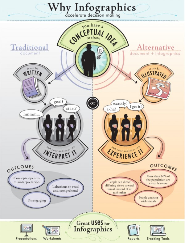
Infographics have grown in popularity, and are now frequently used in both digital and print media by marketers and businesses. They are a compelling, reasonable, and creative way of communicating information without losing the audience’s attention. Some key advantages of designing infographics for your business are as follows:
- Infographics naturally draw the audience’s attention.
- They are easily shareable, and have a better chance of becoming viral.
- A well-designed infographic can help strengthen SEO.
- Infographics are a fun and engaging way to connect with the audience.
10 Best Infographic Design Tips
Now, let’s dive into the ten key infographic design tips that will help you create a head-turning infographic.
1. Identify your goals
Before you begin designing your infographic, outline your goals for creating them. Adding infographics to your content marketing strategy isn’t simply about aesthetics: it’s about the engagement you’re creating with your target audience. At its core, every successful infographic solves the burning problem of its target audience.
So, think of the specific message or story you’re trying to convey to your target audience; how would you want them to react to your infographics? How will your infographics solve their problems? Once you identify the problems of your target audience, you can use the SMART (which stands for specific, measurable, achievable, relevant, and time-bound) goals approach to set attainable goals for designing infographics.
2. Choose the right infographic type
Another important tip for designing infographics is to choose the right type of infographic. As infographics allow for limited space for content, the purpose of your infographic creation should be short and focused.
Depending on the purpose of your infographics, select a suitable type of layout, theme, and aspect ratio. There are three most suitable aspect ratios: vertical, square, and horizontal. For example, if it’s for blog posts, printed posters, or Facebook or Instagram Stories, you can opt for vertical infographics. Likewise, if it’s for Instagram posts or any other social media posts, you can choose square infographics. For videos, billboards, or presentations, a horizontal aspect ratio is most recommended.

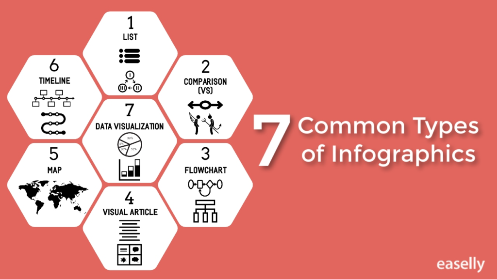
There are many types of infographic content, such as informational, statistical, list, timeline, comparison, how-to, flowchart, geographical, and more. Depending on the theme of your infographic data, pick the right type of infographic style and align your content with the overall layout for effective infographic marketing.
3. Write a compelling title
Be it for ad copy, marketing material, or news reports, a headline is the most crucial element. Come up with catchy and descriptive infographic titles and headlines. They are the first thing your audience sees and can dictate if they decide to engage with your content or not. So, writing an engaging title and headline is crucial to improving your audience’s engagement.
Mixing and matching numbers, keywords, calls to action (CTA), nouns, verbs, and phrases are some of the tricks to create unique, compelling titles. Likewise, using bold fonts and highlighting subheaders can help instantly grab your audience’s attention. If you don’t think your headline is good enough, you can use an online tool for ideas to generate catchy headlines for your infographics.
4. Use images in your infographic
The use of images can be tricky if there is not a professional photographer available to take the shots of what you require. Fortunately, there are many free stock images available on the internet, such as those on Pexels, Pixabay, PikWizard, and Unsplash. Make sure you choose images that are relevant to your goals, are of high quality, and have a consistent style.
Before using free images in your infographic, ensure they’re approved for commercial use, and understand the legal requirements to prevent licensing issues down the road. Additionally, for infographics, select images with the same backdrop, lighting effects, size ratio, etc. Avoid stuffing images into your infographic that have little to do with your business. However, for a more authentic and personal touch, it is highly recommended to use custom images over stock images.
5. Pick contrasting colors
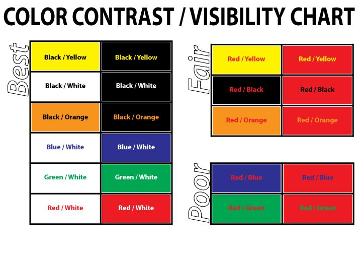
Choosing the perfect infographic color combination can feel a little daunting at first. However, it’s an important activity, as using a color contrast in your infographic can make your visual stand out, reinforce your point, and evoke your audience’s right sentiments. Whether or not you’re a professional designer, if you keep a few important designing principles in mind, creating eye-catching infographic color schemes won’t be that difficult.

When designing infographics, place two complementary colors beside each other. For example, if you pick a darker infographic background, opt for bolder and brighter colors for your headlines, subheaders, and body copy to create a good contrast. Plus, for the background, pick a color that’s relevant to the content of your infographic; keep in mind the topic and theme of your infographic. Even better, you can familiarize yourself with color psychology to strategically create a color combination that evokes your audience’s emotions.
6. Let there be consistency
In order to make your infographic design look consistent from start to finish, use a consistent font style, color palette, and style of images and icons. This will prevent your infographic from looking jumbled, and will, in fact, make it easier for your audience to grasp the information.
Moreover, use no more than two to three font styles, colors, graphics, or icons. For instance, if you throw in multiple colors that don’t go well, it can break your infographic consistency and reduce its impact. Visual consistency is key to creating a successful infographic design that communicates and engages effectively with the audience. It is also one of the best infographic design tips anyone can ever give you.
7. Leave plenty of white space
When designing infographics, use ample white space, or negative space, to make them look cleaner. Avoid cramming your infographics with too many text chunks, images, or graphics. White space could be margins and padding, or the blank area between text, objects, and columns.

You can also add section dividers, such as lines and shapes, to create some breathing space in between different sections of content. Effectively using white space in your infographic design can make it look less cluttered. However, avoid using too much white space, as it can make your infographic look incomplete.
8. Keep your infographic on-brand
If the purpose of creating your infographic is for business marketing or internal communication, it’s important to make sure your brand is the focal point. Branding your infographic can help you build recognition and loyalty among your audience. Hence, when designing infographics, include your brand’s elements such as brand logo, website URL in the footer, brand color scheme, font style, icons, graphics, and the brand voice and tone. Additionally, make sure your infographic is backed by a good CTA to motivate your audience to take action. Lastly, ensure your infographic content translates well on all types of devices.
9. Add animation to your infographic
Adding animated content to your infographic is the perfect way to stand out and grab your audience’s attention right off the bat. Most brands forget to include animated illustrations in their infographics. But if you want to make the most of your infographic marketing capabilities, you should consider implementing animated infographic designs.
Apart from grabbing the audience’s attention, the other key benefit of using animation in your infographics is that they are more likely to go viral than still infographic images. Google loves animated infographics. They are more interactive, and can help you successfully build your brand (they are also great for your link building efforts!) Therefore, using animation in your infographic designs is one of the best tips for designing infographics.
10. Double-check facts
When presenting data in your infographics, make sure that the statistics you’re including are accurate and true and the data is collected from a reliable source, and lastly, your graphical representation of data lines up with numbers. Frame your data using charts, illustrations, engaging design, and informative text to make it easier for your audience to read and understand the data. If your infographic relies heavily on big data and numbers, make sure you double-check all the facts and figures before using them in your infographic.
Key Takeaways
- Infographics are a visual representation of a brand’s information that includes images, text, charts, diagrams, and more.
- It’s important to choose the right layout for an infographic design.
- Setting attainable goals is crucial for creating a successful infographic.
- Keeping infographic designs consistent from start to finish is necessary to prevent clutter.
- Use eye-catching colors, graphics, animation, font styles, etc., to design your infographic.
Conclusion
Infographics can help grow brand awareness, boost sales and traffic, and increase conversion rates. However, designing infographics can be a little tricky if you’re not aware of the key principles. Utilize the above-mentioned tips for designing infographics to ensure business success and stay ahead of your competition.
FAQs
To create a stunning infographic that’s easy to read and understand, you can follow four main principles: emphasis, hierarchy, balance, and unity.
The five key elements of a successful infographic are the business goal, accurate data, succinct copy, compelling design, and graphs and charts.
The different types of infographics are as follows:
1. Interactive
2. Comparison
3. List
4. Timeline
5. Statistical
6. Hierarchical
7. Geographic
8. Process/flow chart
A statistical infographic is a visual representation of complex data. It includes bar graphs or pie charts and minimal text.
The most popular infographic designing tools are Canva, Visme, Venngage, easel.ly, Infogram, Piktochart, and Snappa, among many others.
Latest Blogs
In this blog, explore the golden rules of using AI marketing tools so you can leverage the benefits to their maximum potential.
In this blog, you’ll learn how to avoid the pitfalls of SEO over-optimization while enhancing your site’s performance.
In this article, we’ll take a look at what AMP is, its advantages and disadvantages, and how it affects SEO.
Get your hands on the latest news!
Similar Posts

Design
7 mins read
15 Best Firms Offering Design Services in India

Design
5 mins read
All You Need to Know About Data-Driven Design

Design
6 mins read