Table of Contents
- Tips to Declutter Your Designs
- Key Takeaways
- Conclusion
- FAQs
Cluttered or busy designs lead to a high cognitive load among viewers even if you use popular designing tips. This can drastically affect user experience and make users unwilling to use your designs or open your websites. Decluttering can improve readability by letting the viewer’s eyes focus on the elements you want to emphasize. Furthermore, it can improve the overall user experience. This article offers some great tips to help you declutter your designs.
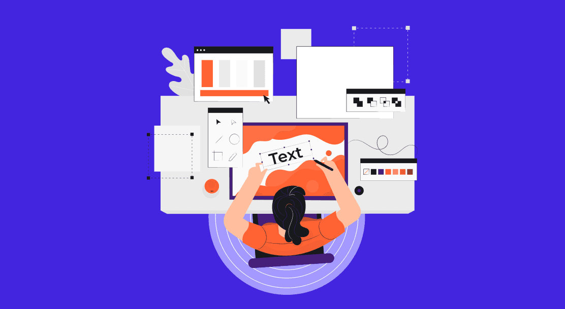
Tips to Declutter Your Designs
1. Repeat design elements
Repeating design elements whenever possible to maintain a sense of uniformity across the project is a well-used method from the graphic design tips and tricks arsenal. Features such as accent colors, fonts, and basic form can be reused to create a stable overall structure. A uniform design looks visually appealing compared to a design made up of random design elements; needless to say, it is one of the most commonly used declutter ideas.
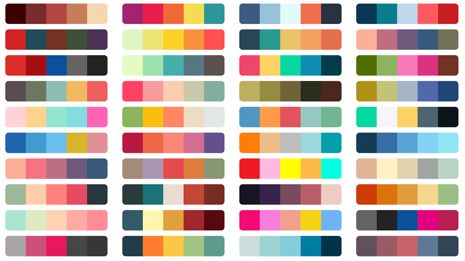
2. Color palette
Selecting a color palette is an essential step of designing naturally. A fail-safe option is to go for a simple palette that includes 2 or at most 3 accent colors. These do not include the neutral colors used in grey, black, or white backgrounds.
The frequency with which these colors are used can also add to cluttered visual design. Additionally, the proximity of different accent colors with relation to each other can add to the clutter. By opting for accent colors and their shades that complement each other, we can make the content easier on the eyes. Furthermore, fixing a purpose for each accent color in advance is one of the most common graphic design tips and tricks.

3. Borders and lines
Many designers box their content using lines and borders to demarcate the content. However, this can add to cluttered content. Consider removing unnecessary horizontal lines and borders or replacing them with light, neutral colors. Removing borders and lines can help bring out the whitespace and give your content a minimalistic look.
4. Required and extraneous elements
Reducing extra visible content can help you create more minimalistic websites. Although this requires additional work on the frontend aspect, it can significantly reduce how visually busy a website appears. This can be done using elements such as drop-down menus, collapse panels, tabs, sub-navigation, and content metadata allowing a user to “opt for” more information. Furthermore, you can consider Progressive Disclosure to make your website more user-friendly and decluttered.
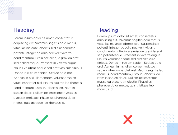
5. Make use of whitespace.
According to the popular graphic design tips and tricks, minimal design places a lot of emphasis on whitespace. Whitespace refers to the unused space on a page or document around the text or other objects. Better used whitespace gives a sophisticated yet simple aura.
The horizontal whitespace on the sides of a document or page helps give an organized or decluttered impression. It will emphasize your content more by reducing possible distractions—couple this with a center alignment to guide the reader’s or viewer’s eyes towards your content. Horizontal whitespace between objects on the document or page can further enhance the clean appearance of the entire page. An excellent example of this is web design. Many web designs use horizontal whitespace to include additional elements.
Vertical whitespace is often ignored, although it can be brought to good use. If you increase the line heights and the margins, your layout will become less cluttered and easier to read. Such whitespace adjustments can help you achieve a sleek and easier-on-the-eye layout.

6. Adjust scaling & sizing
Size and scale are considered broad design concepts and play a significant role in the overall visual appeal of a document or page. It is important to know the size of screens or monitors on which the content is likely to be viewed to deal with relative values such as these.
In general, the monitors today are larger than before. However, smaller screens such as mobile phones continue to be in use. A good way of striking a balance among the diverse screens available is to use responsive design to scale and declutter your website. Text size, among other graphic design tips and tricks, is most likely to change based on the scale. A good practice is to use 2 or 3 different sizes instead of following one size uniformly throughout the content. You can change the font size appropriately at headings, subheadings, and the body.
Limit the fonts you use for the content; try not to exceed two. Different font styles that do not complement each other only add to visual clutter. Similarly, reevaluate the stylization of the text. Stick to either boldface or italicize for emphasis.
Emphasize the important parts of your design, such as headings, while letting the extra details such as metadata and sidebars stay smaller.
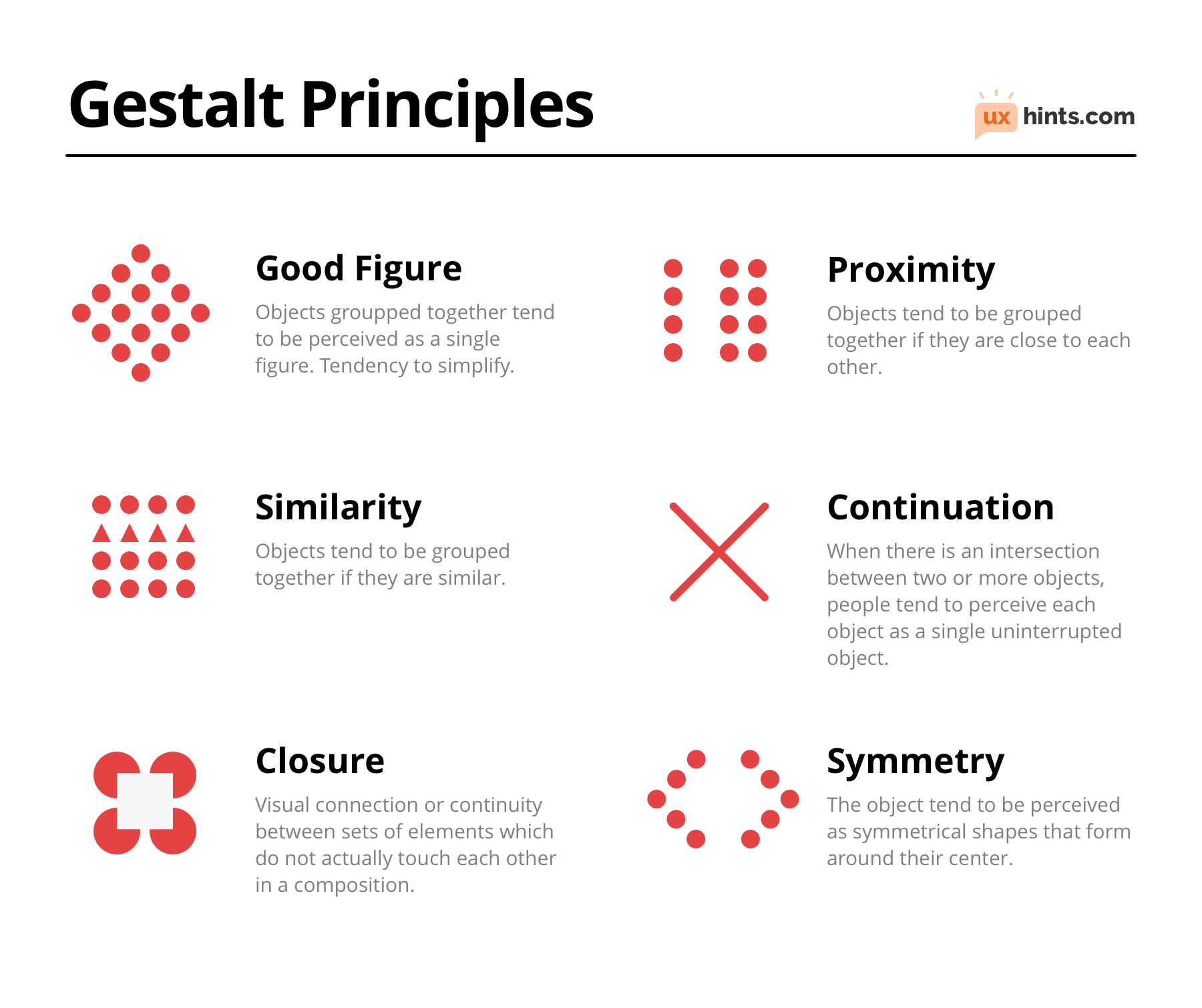
7. Use Gestalt principles
Gestalt principles refer to certain rules the human visual system follows, such as looking for symmetry or patterns in vague stimuli. You can use these principles as declutter ideas and designing tips to make visually stimulating yet efficient and sleek designs. Continuation, symmetry, similarity, proximity are some relevant principles.

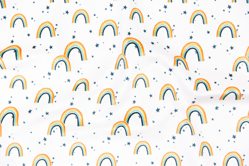
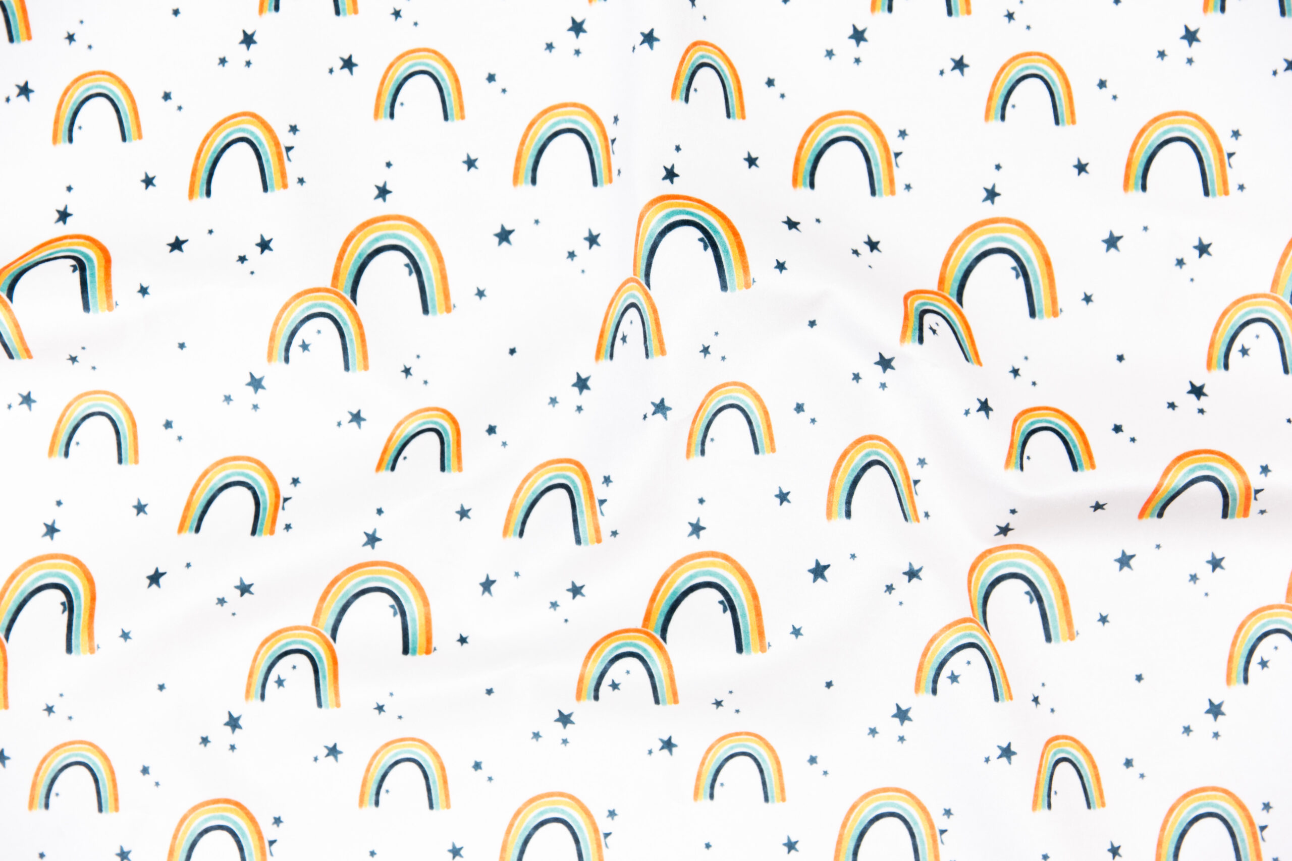
8. Remove the unnecessary decoration.
While various decorative elements might appeal to you, try to limit their use. Unnecessary images, shapes, background prints, and other elements that clash with the content might add to the visual clutter. Good graphic designing tips and tricks talk about maintaining a balance.
An excellent way to understand whether your embellishments are interfering with the design is to create a copy of the basic design without the decorations and compare them side by side. Since these decorations do not affect user experience, removing them would not be detrimental to your work.
9. Embrace efficiency
Try to remove as many unnecessary elements from the design as you can. Irrelevant visuals and images that don’t let the user focus on the necessary content can be taken out. Efficient designs are a part of effective graphic design tips and tricks.
10. Think from the user’s perspective
If you understand why and for whom you are doing a particular project, the process of designing will become easier. Consider the perspective of a user or a viewer while maximizing efficiency. Although the very act of designing suggests a focus on aesthetics, prioritizing legibility and user experience will be more rewarding.
Key Takeaways
- Busy design is inconvenient and confusing, whereas good design is efficient and aesthetically pleasing.
- Repeat design elements to create a sense of uniformity in the content.
- Choose a simple color palette. Use these colors uniformly to create harmony.
- Do not stack borders and lines more than necessary.
- Prioritize required elements being visible over extraneous elements.
- Use Gestalt principles to make content more visually appealing.
- Remove unnecessary decorative elements.
- Embrace efficiency as a central theme.
- Thinking from the user experience perspective will make it easier to come up with declutter ideas.
Conclusion
Decluttering your design can help make your content more eye-catching and user-friendly. Removing unnecessary objects and repeating basic design elements can make a project more appealing. Using whitespaces, gestalt principles, and relative scaling, among other graphic design tips and tricks, can help you embrace efficiency.
FAQs
Decluttering can help your work look more visually appealing. This will improve user experience and impression.
A simple color palette should include 2 or 3 colors that complement each other along with neutral colors. Using too many colors makes a design confusing.
Whitespace is the blank area not used by the content or any object. This area also helps attract attention to the content.
Using the bare essentials to create a visually appealing yet uncluttered design is considered minimalistic.
A design that is easy on the eyes while being efficient is ideal. Using colors, lines, sizes, fonts, and design elements in a balanced way allows for a strong first impression and a memorable design.
Latest Blogs
Explore how Google’s 2025 AI search updates triggered ranking chaos. Learn actionable strategies to adapt your SEO for AI Overviews, zero-click searches, and SERP volatility. Stay ahead now.
Learn how to rank on AI search engines like ChatGPT, Perplexity, and Gemini by optimizing your content for authority, structure, and relevance. Stay ahead in AI-driven search with this strategic guide.
Explore the best healthcare SEO services for your medical practice. Improve online visibility and effectively reach more patients in need of your services.
Get your hands on the latest news!

Similar Posts

Design
7 mins read
15 Best Firms Offering Design Services in India

Design
5 mins read
All You Need to Know About Data-Driven Design

Design
6 mins read