A Beginner’s Guide To Presentation Design [+15 Stunning Templates]
![A Beginner’s Guide To Presentation Design [+15 Stunning Templates]](/_next/image/?url=https%3A%2F%2Fwordpress.peppercontent.io%2Fwp-content%2Fuploads%2F2022%2F02%2FThe-beginners-guide-to-presentation-design.png&w=1536&q=75)
Table of Contents
- What Is Presentation Design?
- What Is the Significance of Presentation Design?
- Understanding Various Forms of Presentations
- 10 Tips to Create a Compelling Presentation Design
- 5 Inspirational Presentation Design Trends
- 15 Best Presentation Design Templates to Consider
- Key Takeaways
- Conclusion
- FAQs
Once you’ve mapped out your presentation, it’s time to tackle the intimidating task of creating a visually stunning presentation design. Creating an excellent presentation design becomes simpler by learning and adhering to fundamental presentation design standards. Here is a presentation design guide to creating an engaging and well-designed presentation, regardless of the kind of project you are putting together.
What Is Presentation Design?
Presentation design focuses on the visual facet of your presentation to captivate your audience. An outstanding presentation design may significantly impact your target audience, whether it is investors, employees, collaborators, or potential customers. The design must ideally complement the material of your presentation to help get your views across and convince your audience.
Creating a presentation for the first time to present in a professional setting or to a large audience might feel challenging. This guide to presentation design will walk you through the elements required for building a visually appealing presentation.

What Is the Significance of Presentation Design?
A presentation is much more than just a layout of slides with text and graphics on them. You need to make sure it’s visually appealing too. It is mainly because visuals are much more engaging than written words in your presentation slides. Presentation design is crucial because it allows you to combine your ideas, narrative, graphics, facts, and statistics into one cohesive tale that drives your audience to the decision you desire.
A robust presentation design may unlock doors you never imagined could be opened. An effective design is much simpler to understand and earns a lot of credibility for your brand. You can communicate your message effectively, encourage your audience to take subsequent actions, and get them to engage with what you’re saying with excellent presentation design.
You have the potential to communicate your point of view, create a brand identity, and get your audience to see and hear you loud and clear when you build a presentation with impeccable design. The material of your presentation is crucial to your project’s success, but a poor design may divert the listener’s attention (and not for a good reason). Don’t let a lousy presentation design force you to lose out on a huge business opportunity.
Creating a winning presentation design involves combining design components to produce slides that will neither bore nor exhaust your audience. Instead, it will engage and inspire them effectively. So, instead of creating a lousy presentation using shoddy designs, it is significant to master the fundamentals of creating the best presentation design.
Understanding Various Forms of Presentations
Presentations may be used for several purposes and can come in different forms. A quarterly sales presentation with your team will not be the same as a presentation focused on employee training.
In the first scenario, you’ll strive to advance your team to achieve targeted sales growth. In the second, you’ll focus on imparting essential knowledge and skills to your employees. Looking at some of the most prevalent presentation types can give you a better idea about presentation design and when to begin constructing your own.
1. Investor pitch presentation
Using facts to convince rather than enlighten is the primary goal of this presentation style, as indicated by the name. If you’re a startup or a small firm looking for investment, you’ll need to use this form of presentation to your advantage. An investor pitch presentation will be required when you’re explaining your company’s user acquisition growth rate to prospective investors. Such presentations are created using the classic pitch deck concept to make the perfect, thoroughly professional pitch.
2. Educational presentations
Educational presentations are sometimes misunderstood as informative presentations since they are designed to teach viewers new skills and educate them on a new subject. You may need to produce a presentation for a school for various reasons, such as presenting an idea or providing an academic report.
Academic and corporate training programs often employ this presentation format. A video tutorial with comments and suitable themes may be added to the slides to improve them. Educators are always looking for new and unique methods to provide engaging and enthralling presentations for their students. Using an educational presentation template may guarantee that your presentation is visually appealing as well as easily comprehensible.
3. Webinar presentations
Webinar presentations are the newest craze, and they’re a win-win for presenters and the audience alike. A webinar refers to an online presentation, but unlike a video posted elsewhere, the webinar takes place in real-time and with the active participation of the audience. There are several themes and settings for which webinar presentations might be utilized.
Short surveys, quizzes, and Q&A sessions let participants feel more involved in the webinar. Most commonly, a webinar is meant to disseminate information, but it may also act as a marketing tool, a source of leads, or a way to generate new sales and sign-ups.
4. Report presentations
A report presentation is intended to offer the necessary information to those engaged in a process or project. Report presentations are critical in ensuring these stakeholders that the procedures that must be followed for the project’s completion are effectively planned and executed. Sample reports are also accessible to these stakeholders.
A report presentation may take numerous forms, such as a business report or an infographic. Reports on sales and marketing performance, website statistics, income, or any other data that your team or supervisors wish to know about can be presented during the report presentation.
5. Sales presentations
Sales presentations are often the initial phase in the sales cycle, and are, therefore, critical. A sales presentation, often known as a sales pitch deck, is a form of presentation you would need to provide a prospective customer or client with when pitching a product or service.
Not every sales presentation is designed to close a deal right away. The goal might be to pique the curiosity of the people concerned. Sales presentations often include your company’s unique selling proposition (USP), product price points, and testimonials. Your sales presentation must be engaging and successful in influencing potential customers, using a well-thought-out approach.
6. Inspirational presentations
An inspiring presentation is a standard tool used by managers, team leaders, motivational speakers, and business owners to stimulate and encourage their audience. Inspirational presentations are essential to influencing others and achieving your individual and business goals.
To get a desirable result from this kind of presentation, elicit an emotional response from the audience and motivate them to act. Using a presentation template that has been professionally developed provides you with an advantage over others.
7. Keynote presentations
Keynote presentations are given in front of a larger audience. A good example can be those shown at TED Talks and other conferences. While the presenter gives the entire speech, there are advantages to using slides, such as keeping an audience engaged and on track.
10 Tips to Create a Compelling Presentation Design
If your presentation is lousy, you might come across as unprepared, uninterested, and lacking any credibility. A well-designed presentation makes you appear reliable and competent. Here are some fantastic points to help you develop the best presentation design.
1. Outline your content and fine-tune the message
It’s crucial to prepare your content and fine-tune your main message before you begin developing your presentation. Try to figure out what your target audience wants to know, what they may already know, and what will keep them engaged. Then, when you create your presentation’s content, keep those things in mind and furnish designs accordingly. It is vital to remember the key takeaway of each deck you create.
Too much information shown on a single slide is difficult for most viewers to comprehend. Make sure you don’t overwhelm your viewers; each presentation slide should include no more than one key point. Make your information as brief as possible, yet make it detailed enough and valuable.
2. Use more visuals and less text in your decks
Your audience recalls information considerably better when images complement it because they can better understand visual features than simple text. Presenters that employ images instead of words get more favorable feedback from their audience than those who rely only on text.
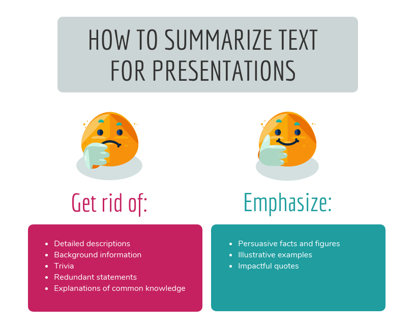
Using visual examples in slide decks increases audience engagement, encourages more questions, and registers your message in the minds of your audience. Remove any unnecessary text from your slides and replace it with visuals that will engage your audience.
You may use various methods for adding images, but the most common is using your data’s visual representation. It’s important to note that adding visuals does not mean sprinkling fancy images and symbols across your slides. Relevant images and iconography are a must.
3. Limit the use of fonts and colors
It is vital to pay attention to color schemes and other design components, such as fonts, to ensure your presentation succeeds. Although it may be thrilling to employ as many fonts and colors as possible, the best presentation design practices imply that you should only use two or three colors overall. Also, make sure the content in your slides is of a different font than the headers.
When it comes to color schemes, certain combinations work better than others. When choosing colors, keep in mind that they should not detract from the message you want to convey. Add an accent color to one or two of your primary hues for a cohesive look. It’s critical that the colors you choose complement one another and communicate your purpose effectively. Headers should be in one typeface, while body content should be in another. Add a third font for the accents, if you’d like.
4. Create a visual hierarchy
Visual hierarchy is an important consideration when including text in a presentation. Visual hierarchy is one of the most significant but underappreciated presentation design principles. Color, size, contrast, alignment, and other aspects of your slide’s elements should all depend on their value.
When creating a visual hierarchy, you must clearly understand the story and its structure. Your audience’s attention should be drawn to the most critical components first, then to the second-most essential aspects, and so on. When creating your presentation, think about the story you want to tell and the visual hierarchy you need to support it. If you do this, the essential ideas you wish to convey will not be lost on your audience.
5. Incorporate powerful visuals
It is important to use visual aids to make a compelling presentation: think images, icons, graphics, films, graphs, and charts. You should also ensure your slides’ aesthetics accurately portray the text they contain. Alternatively, if you don’t have words on the slide, make sure the visuals mirror the words you’re saying in your speech.
Visual aids should enhance your presentation. In addition, you’ll want to ensure that your slide has some form of visual representation so that you’re not just dumping a bunch of text onto a slide.
6. Avoid using bullet points
These days, any excellent presentation design instruction would encourage you to avoid bullet points as much as possible. They’re dull and old-fashioned, and there are more effective methods to display your material.
A slide consisting of icons, images, and infographics is more exciting and conversational than one written in list form. Using bullet points for each slide’s primary theme is a standard PowerPoint design recommendation that you should refrain from while designing your presentation.
7. In group presentations, segregate slides by theme
While making a group presentation, finding an appropriate balance of who should be demonstrating which presentation segment is often challenging. Arranging a group presentation by topic is the most natural technique to ensure that everyone has an opportunity to speak, without the presentation becoming incoherent. Your group presentation should be divided into sections based on the subject.
Prepare your presentation ahead of time so that everyone understands when it’s their turn to talk. It’s up to each person in the group to pick one thing to talk about when they give this presentation to investors or potential customers. For instance, the business model slide may be addressed by one person, while another can discuss the marketing approach.
8. Maintain consistency
Consistency is essential when you work on the design of your presentation. Your presentation is still one presentation, no matter how many slides it has. Design elements, color schemes, and similar illustrations can all be used to achieve design consistency.
Although some of the slides in your presentation may appear to be styled differently than the others, the overall presentation must be held together by a single color scheme. To ensure that your viewers don’t lose track of what you’re saying, make sure each of your slides is visually connected.
9. Emphasize important points
It is pertinent to use shapes, colorful fonts, and figures pointing to your material. They help emphasize vital information to make it stand out. This not only keeps the reader’s attention on the page but also makes your design more streamlined. Emphasizing the point you’re trying to put across with visual elements makes it easier for your audience to grasp what you’re saying.
10. Integrate data visualization
Consider utilizing a chart or data visualization to drive your argument home, especially if you have vital figures or trends you want your audience to remember. This might be a bar graph or a pie chart that displays various data points, a percentage indication, or an essential value pictogram.
Confident public speaking mixed with good visuals may greatly influence your audience, inspiring them to take action. The use of design features makes it simpler for your audience to grasp and recall both complex and fundamental data and statistics, and the presentation becomes much more enjoyable too.
5 Inspirational Presentation Design Trends
Even though trends come and go, effective presentation design paired with some inspiration to get you started will always be in style. Think about what’s current in the world of graphic design before you create a staggering presentation deck for a creative proposal or a business report. To help you better, we’ve come up with a list of the most popular presentation design concepts.
1. Dark backdrops with neon colors
While white backgrounds have long dominated web design, the advent of “dark mode” is gradually altering that. Designers may use dark mode to play with contrast and make creative things stand out.
This is a great way to get your audience’s attention and keep them interested in what you have to say. The key is to pick one or two bright colors and utilize them as highlights against a dark backdrop, rather than using an abundance of them.
2. Monochromatic color schemes
In recent years, color schemes originating from one base hue, such as monochromatic color schemes, have been given a subdued pastel makeover. The usage of monochromatic color schemes in presentation design is always seen as clean and professional. It’s ideal for pitch decks and presentations since monochrome is generally utilized to assist people in concentrating on the text and message, rather than the colors inside a design.
3. Easy-to-understand data analysis
The fundamentals of data visualization should be restored. In other words, even the most complicated measurements may be made easy to grasp via effective design. Designers, marketers, and presenters are generating snackable stats in the same way infographics have found a place on visual-first social networks.
Create a dynamic proposal or presentation with the help of an infographic template that is easy to use. You can create distinctive slides with animations and transitions to explain your point more effectively. With the help of templates, you can convert your data into bar graphs, bar charts, and bubbles that represent your idea simply, guaranteeing that every data point is simple to comprehend.
4. Straightforward minimalism
Minimalism is a design trend that will probably never go out of style. It has always been a show-stopper. Each slide should offer just enough information to let the reader comprehend what’s going on. You should use a color palette that isn’t distracting. Your simple presentation will enthrall your audience if you boldly highlight your most significant points and use trendy fonts.
5. Geometric structures
There’s a good reason why designers are so fond of geometric patterns, 3D objects, and asymmetrical layouts. They’re basic yet stunning, making them perfect for times you want to make a lasting impression with the information you’re sharing.
More cutting-edge components, such as 3D shapes and floating objects, are used in presentation graphics these days. Go for a presentation template that contains editable slides that enable you to easily add your visuals and material to brighten your presentation.
15 Best Presentation Design Templates to Consider
In the case of presentation designs, you should never sacrifice quality. Ideally, you should have a design that improves your brand’s image, amplifies your message, and enables you to deliver various content forms efficiently.
The problem is, it’s pretty challenging to locate premade themes and templates of this merit. We’ve made it easy for you by putting together a list of the best 15 presentation design templates out there. These presentation design suggestions are a great place to start.
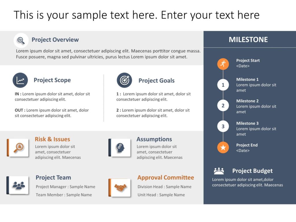
1. Business plan presentation template
This is a crucial business presentation template with a significant emphasis on visualizations and graphics. To create a business strategy, you need this presentation template. It consists of several crucial elements, such as a mind map, infographics, and bar graphics. Replace the placeholder text with your own to complete the presentation.

2. Pitch deck template
Startups seeking financing require a clean and eye-catching pitch deck design to impress investors. You may use it to present significant aspects and achievements of your company to investors. You can include slides for mockups, testimonials, business data like statistics, and case studies.
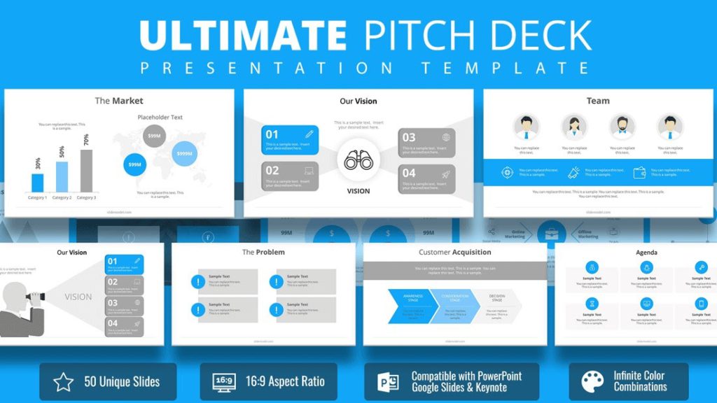
The pitch deck presentation template is excellent for your next client pitch, as it allows you to pick from a range of different startup tales to showcase the most crucial features of your firm.
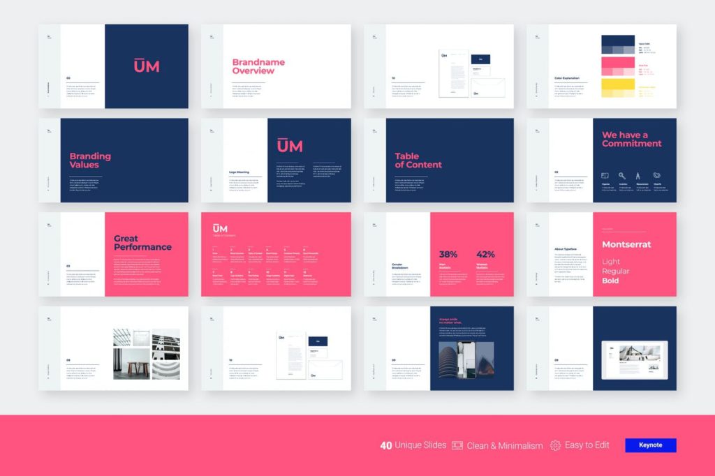
3. Brand guidelines presentation template
Creating a bespoke presentation talking about the company dos and don’ts may be a terrific approach to discuss your brand rules with your team and stakeholders. You can easily show off your brand’s typeface and color schemes using this presentation template.
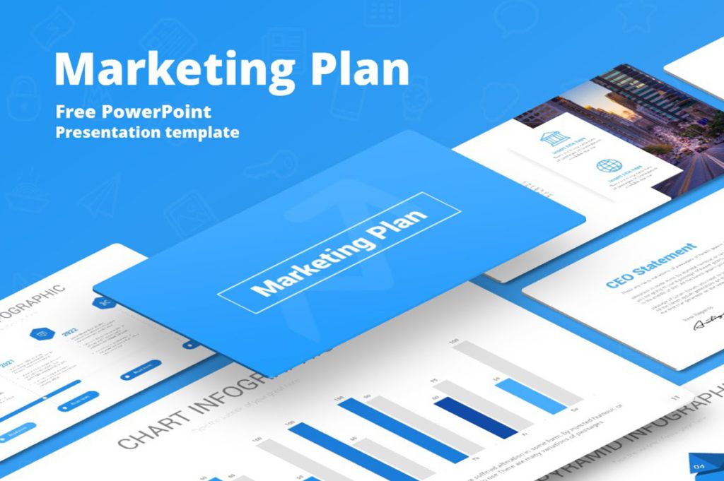
4. Marketing plan presentation template
Marketing is a vast concept, and the slides included in this design stock set reflect that broadness. A well-executed marketing strategy is essential to the success of any team. A marketing plan presentation template should ideally include slides for charts, timelines, and competition research. You can create executive summaries or mission statements with the below-mentioned presentation’s elegant and minimalistic slides.
5. Keynote presentation template
This keynote template has a lovely color scheme that is equal parts captivating and professional. You can employ a keynote presentation template if you’re going to be a keynote speaker at an upcoming event and want to ensure that your design stands out.
In addition to several slides, the template comes with various predefined color schemes. This template is perfect for any business presentation requiring a well-designed layout.
6. Training manual presentation template
A training manual presentation template may be used to convey new hire training to your workforce. It is essential for the design to be as clean and straightforward as possible.
These training material decks created with a predesigned template make it easy for new employees to learn the ins and outs of their jobs.
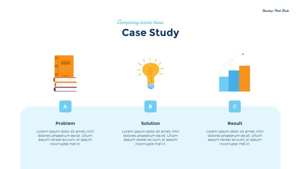
7. Case study presentation template
A case study is an excellent way to illustrate a point in your presentation. The best way to attract new consumers using a case study presentation is to show them how your existing customers are using your product or service. Make sure to highlight how your product solved their pain points.
8. Interactive brief presentation template
It’s common to provide a creative brief when working with a contractor, freelancer, or designer to ensure everyone involved understands what the final product should look like.
An interactive presentation template like a creative brief is a terrific concept for absorbing and memorizing that information.
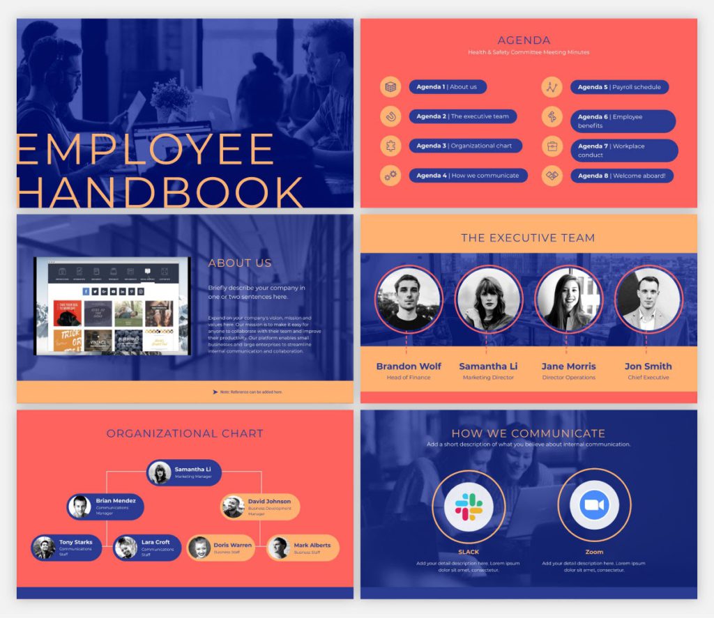
9. Workforce handbook presentation template
When hiring a new employee, your company needs to create an employee handbook to ensure they know the company’s objective and general working norms. You may connect this presentation to your intranet or website, or just distribute the digital version through a password-protected or private link.
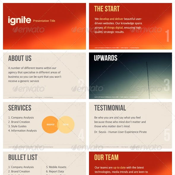
10. Ignite presentation template
Using this template as a starting point for an Ignite presentation would be ideal. An Ignite presentation is a five-minute presentation consisting of 20 slides, compelling the speaker to speak fast and concisely. As a result, an Ignite presentation template prevents you from using too much text on any slide.
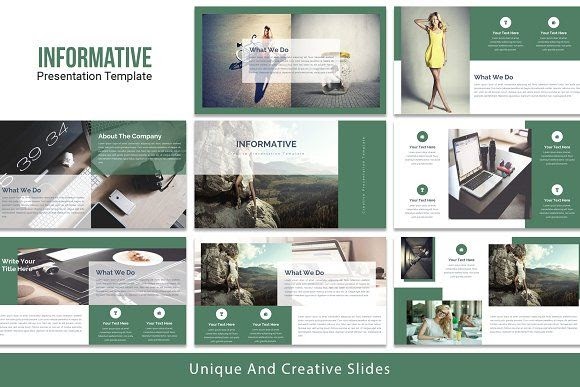
11. Informative presentation template
The need to create an educational presentation may arise due to several reasons, such as onboarding new hires, explaining a concept to students, and more. An informative presentation template is a suitable solution in all cases.
Regardless of who they are meant for, presentations are the optimal format for sharing information with any audience. Create an educational presentation that you can embed in a blog post or publish on several platforms online. Make presentations to provide knowledge at conferences and other meetings.
12. SWOT analysis presentation template
A strength, weakness, opportunities, and threats (SWOT) analysis is a valuable tool for gauging where your business stands, and how your strategic planning measures are paying off. This presentation template is an excellent tool for SWOT analysis or refining your marketing strategy.
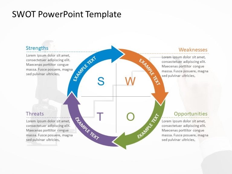
It comes in several formats; circular design and hexagonal shapes being two of them. You may modify the colors as desired.
13. Competitor analysis presentation template
Knowing your competition and what they offer is essential for a successful business. Competitor analysis means researching your competitors’ key strengths and weaknesses, which can, eventually, help you define your goals and USPs more clearly.
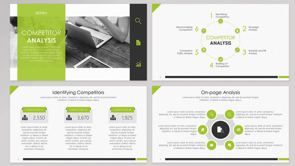
There are built-in interactive elements in this competitor analysis presentation template, which can help hook your audience.
14. Bold presentation template
Ideal for non-corporate sales presentations, a bold and daring presentation template includes slides with a vibrant, attention-grabbing theme that is neither overbearing nor distracting. The color combination is striking without being oppressive.
15. Company overview template
Creative presentation templates are all the rage today. Using a lot of negative space will allow your audience to take a breath and direct their attention to the most crucial parts of your presentation. It is suitable for corporate presentations, since it doesn’t stick out more than is necessary.
Key Takeaways
- Audiences tend to forget a large percentage of what was addressed before the presentation is through. This is why it is important to create a presentation design that is memorable.
- A presentation is much more than just a layout of slides with text and graphics on them. You need to make sure it’s visually appealing too.
- Use a wide range of best presentation design tools, components, and styles until you discover the one that resonates with your target audience.
- Consider the most recent trends and best practices, and dedicate time to thoroughly crafting every presentation.
- Fine-tuning your message, avoiding the use of bullet points, incorporating visual hierarchy, and incorporating data visualization are a few design tips to create a winning presentation.
Conclusion
Both your presentation style and design are crucial. You can deliver more dynamic, memorable presentations by creating visually pleasing decks. It’s advisable to create a resourceful presentation design if you want to elevate your personal as well as professional credibility.
Take cues from some popular presentation templates, and enhance one little aspect at a time. Now is the time to practice everything you’ve learned in this presentation design guide. As with any other visual communication, creating the best presentation design requires time, effort, and patience. Never be afraid to try something new; you’ll quickly see the benefits a strong presentation can have on your project.
FAQs
A presentation design puts ideas, tales, words, and pictures into a series of slides that convey a narrative and engage your audience.
A presentation design template is used to achieve a uniform look for your slides. Templates are pre-made presentations into which you may insert your data.
People remember images and words better than just words. The design of your slides should be simple and consistent. This way, your audience will focus on the most important points.
Use high-quality images to back your message, but don’t use too many special effects. Make sure you don’t read from your slides.
A well-presented, memorable introduction and conclusion are two essential parts of a presentation. Don’t forget them when you write your outline.
Presentation design is essential, because it helps you weave your ideas, narrative, images, facts, and statistics into a unified story that leads your audience to the choice you want them to make.
Latest Blogs
Explore how Google’s 2025 AI search updates triggered ranking chaos. Learn actionable strategies to adapt your SEO for AI Overviews, zero-click searches, and SERP volatility. Stay ahead now.
Learn how to rank on AI search engines like ChatGPT, Perplexity, and Gemini by optimizing your content for authority, structure, and relevance. Stay ahead in AI-driven search with this strategic guide.
Explore the best healthcare SEO services for your medical practice. Improve online visibility and effectively reach more patients in need of your services.
Get your hands on the latest news!

Similar Posts

Design
7 mins read
15 Best Firms Offering Design Services in India

Design
5 mins read
All You Need to Know About Data-Driven Design

Design
6 mins read