10 Mobile-Friendly Web Design Features to Know About

Table of Contents
- What Are Web Design Features?
- 10 Web Design Features for Mobile
- Conclusion
- FAQs
According to Statista, mobile devices account for approximately half of the web traffic worldwide. Given how indispensable mobile devices have become for our everyday online activities, it is a must to make your website mobile-friendly. Today, we will talk about crucial mobile-friendly web design features that every web designer must use in 2022.
Gone are the days when websites were only meant for desktops and laptops. Now, more than ever, users engage with brands via mobile devices. Thus, your website should be responsive and should offer a seamless experience even on mobile phones. It should shine across devices, be it an iPhone or an Android tablet, without compromising on user experience.

What Are Web Design Features?
Website design is an ever-evolving field. While some web design features remain constant, others change continually. They can be understood as usability features of a website that help boost its mobile friendliness and user experience. Some web design features help tell stories and demonstrate the essence of your company. Alternatively, other features work to instantly seize user interest or enhance the viewing experience on different devices.
To help you understand this better, we have listed a few web design features that you must implement to improve your site’s performance. Read on below.
10 Web Design Features for Mobile
Here are ten incredible mobile-friendly web design features that each designer must take note of.
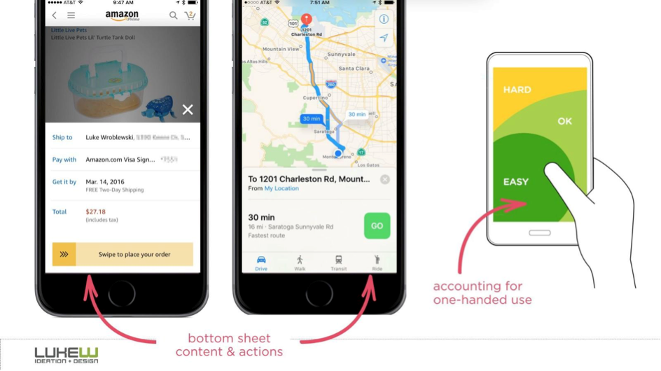
1. Intuitive navigation and control
This is the most significant feature to make your website mobile-friendly and ensure a convenient user experience. For most mobile devices, a simple scrolling design works best. If the user can easily browse your web pages with simple swipes and gestures, you are on the right track.
For interactive web elements, such as a map or images with contact details, you can offer intuitive controls, such as an instruction to pinch to zoom in and out. Additionally, include a menu icon on top to enable users to easily find specific sections of your website.
2. Subtle background
Often, web designers use bright and vivid backgrounds when developing their websites. This is because such backgrounds instantly grab the user’s attention and develop a sense of familiarity. However, such intense backgrounds do not work too well on a mobile device.
However, instead of removing them, you can make them subtle or slightly blurred. This will ensure seamless navigation, decrease load time, and boost engagement.
3. Toned-down color palette
Good mobile-friendly websites focus on a “less is more” approach when it comes to color palettes. However, this does not imply that you need to change the color scheme of your brand. Instead, when building a mobile-friendly website, use white space along with toned-down colors from your brand style guide.
Too many bright pops-ups can confuse the users and interrupt them from consuming information. Tactically place the colors where users can find the maximum amount of relevant information. This helps boost the usability features of a website and improve the user experience.
4. Intuitive search feature
Your mobile website’s search feature is a critical element to have. Ensure you make it effortless for the users to find specific items on your website. And the best way to do it is by placing the search feature front-and-center. Several mobile-friendly websites also offer a great filter function that further enables users to find specific types of products. Lastly, you can also make use of voice search to further boost the user experience.
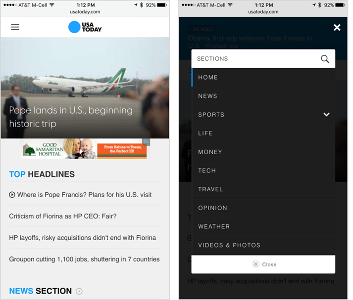
5. Simplified menus
Unlike desktop websites, mobile websites cannot take up a lot of space for their menus. Owing to limited screen space, mobile websites must present an overview of the website. They can use filters, categories, or optimized search functionalities to help users find what they are searching for easily. A great practice is to use the hamburger symbol that comprises three or four horizontal lines to show the menu option.
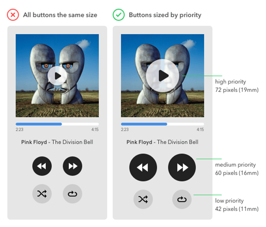
6. Large buttons
Large buttons are another important web design feature of a mobile-friendly website. The buttons should be big enough for the users to tap on them without the need for zooming in. Also, ensure adequate space between two hyperlinks. If you place the links too close to each other, users might accidentally click on the wrong link. So keep spacing in mind and ensure that it is easy to click on each hyperlink separately.
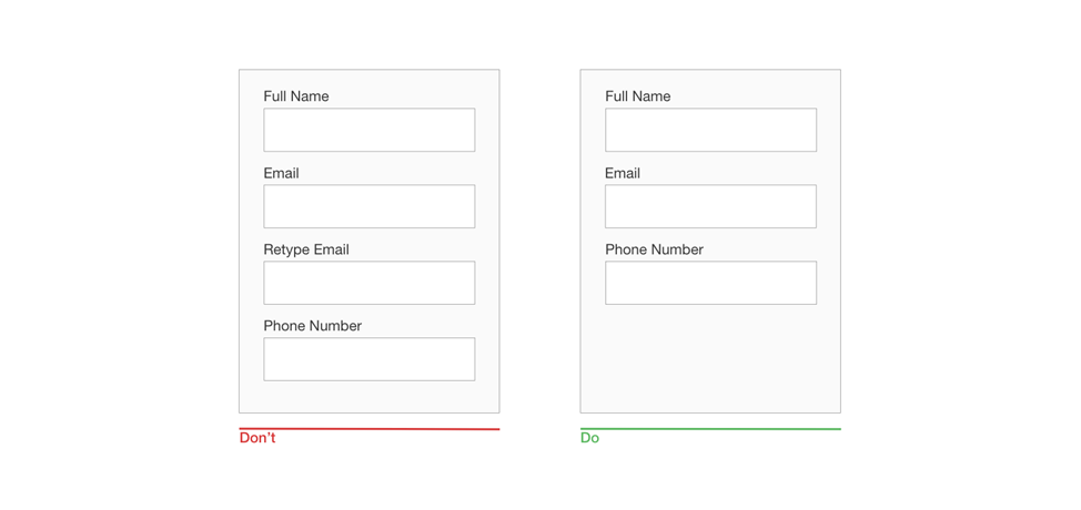
7. Simple and shorter forms
Users are much more inclined to fill forms on a desktop, as the screen is bigger and it’s easier to type with a keyboard. On mobile phones, therefore, forms need to be shorter, with spacious text fields and buttons. For instance, if you are requesting your users to sign up for your mailing list, you should not ask for details other than their first name and email address. If you really need to ask more questions, try using multiple-choice questions (MCQ) or a similar format.
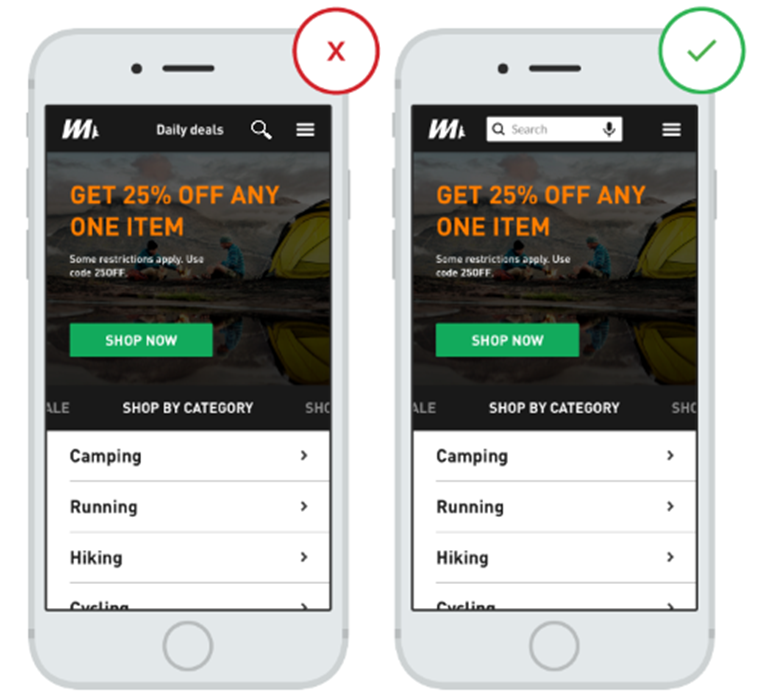
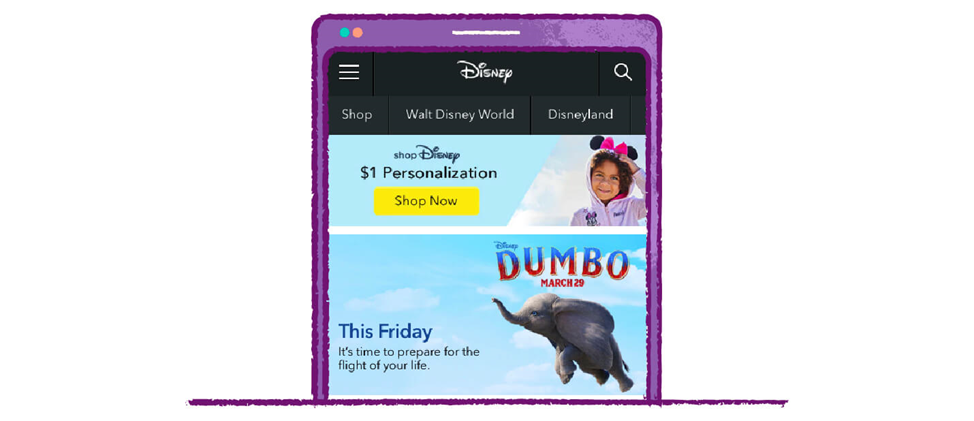
8. Attention-grabbing calls to action
This is another one of the crucial mobile-friendly web design features to implement. A call to action (CTA) can be an image, piece of text, or banner that persuades users to take action. However, creating compelling CTAs in limited screen space is often a challenge.
To make sure your website is mobile-friendly, make CTAs that stand out. Below is an example of an effective CTA by Disney. The “Shop Now” button is preceded by a banner showcasing Disney services for only $1, thus encouraging users to click.
9. Catchy card design
This is one of the best mobile-friendly web design features. In web design, cards are nothing but squares or rectangles, which have content grouped under them. Essentially, individual
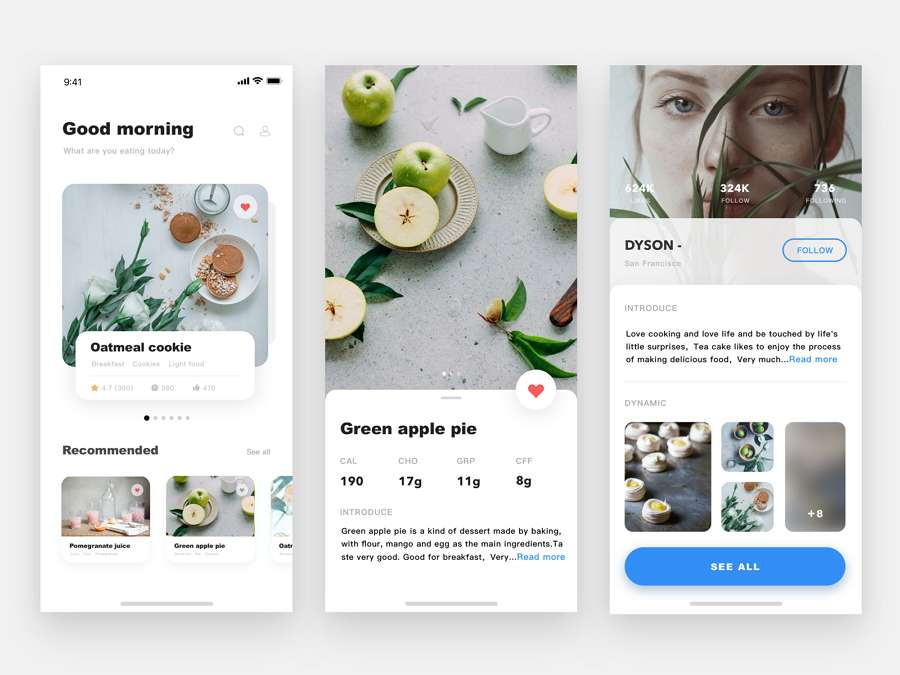
cards distribute information in a visual format that users can consume in bite-sized pieces. By breaking all the content into different cards, users can choose what images or articles they want to expand. Thus, it is a great way of streamlining information, especially on a mobile website.
10. Click-to-call functionality
For B2B websites, it is important to have a functionality where visitors can contact you quickly. Click-to-call buttons on your mobile website allow visitors to phone your company with a single tap. This is often a great alternative to filing forms, an activity that may become difficult on a mobile screen.
Conclusion
These are some of the leading web design features for mobile-friendly websites that every designer must know. Integrating these features will bring you one step closer to accomplishing your business goals. Also, when developing your website for mobile, make sure to have a stringent process for testing your website for mobile use.
FAQs
A mobile-friendly website is designed and optimized for hand-held devices, such as a mobile phone or a tablet.
Simple forms, attractive CTAs, click-to-call options, simplified menus, and intuitive navigation, are some of the most important usability features of a website for mobile:
There are many online tools you can use to check if your website is mobile-responsive. These include Google’s Mobile-Friendly Test, mobiReady, W3C’s mobileOK Checker, and more.
To be fair, there are some similarities between both. For mobile, however, the focus is on interactive design. And for desktops, the focus is on information architecture.
Some quick tips to optimize websites for mobile include the following.
1. Follow responsive design principles.
2. Focus on the website’s speed.
3. Keep your website’s design simple.
4. Make it easier for visitors to find information.
5. Make use of large-sized text and buttons.
5. No web design is complete without good content. To scale your conversions, try out Pepper Content’s website content writing services today.
Latest Blogs
Explore how Google’s 2025 AI search updates triggered ranking chaos. Learn actionable strategies to adapt your SEO for AI Overviews, zero-click searches, and SERP volatility. Stay ahead now.
Learn how to rank on AI search engines like ChatGPT, Perplexity, and Gemini by optimizing your content for authority, structure, and relevance. Stay ahead in AI-driven search with this strategic guide.
Explore the best healthcare SEO services for your medical practice. Improve online visibility and effectively reach more patients in need of your services.
Get your hands on the latest news!

Similar Posts

Design
7 mins read
15 Best Firms Offering Design Services in India

Design
5 mins read
All You Need to Know About Data-Driven Design

Design
6 mins read