What Is the Difference Between a Mobile-Friendly, Mobile-Optimized, and Mobile-Responsive Website?

Table of Contents
- The Importance of a Mobile-First Strategy in Website Design
- What Is a Mobile-Friendly Website?
- What Is a Mobile-Optimized Website?
- What Is a Mobile-Responsive Website?
- Mobile-Friendly vs. Mobile-Optimized vs. Mobile-Responsive: Which One to Use?
- Key Takeaways
- Conclusion
- FAQs
According to Statista, the first half of 2021 alone saw more than 54.8% of the global internet traffic being generated by mobile devices. There are several such statistics and true-blue facts that would coax businesses into developing mobile-friendly websites. However, with the blowup of such facts and statistics, you are often left to wonder, “ Mobile-friendly, mobile-optimized, or mobile-responsive: what is the ideal design suited for my business website?”
Let’s take a step back and try to understand what is what. Before choosing the right kind of website that serves your brand’s purpose, let’s have a closer look at a mobile-friendly, mobile-responsive, and mobile-optimized website.
Once we understand the fundamentals, we can set priorities right and go ahead with the design processes. What brought us here in the first place? Weren’t websites with their desktop versions enough? Let’s take a look.
The Importance of a Mobile-First Strategy in Website Design
Here’s why a mobile-first strategy commands so much importance in the web design world today.
1. The early stages
Traditionally, website designs were created because the site traffic would primarily come from desktop browsers. However, the innovation of mobile devices like smartphones changed the web design scene radically.
2. The outbreak of mobile internet
With people constantly browsing the internet on the go, most businesses started getting their direct traffic from users of mobile devices. It started picking up pace in the last couple of decades, so much so that the share of mobile website traffic exploded between 2015 to 2021. Today, mobile traffic accounts for over 50% of web traffic worldwide.
Another key reason why mobile internet revolutionized digital interaction was the lack of infrastructure and financial restraints that stunted the growth of the desktop internet phase in emerging economies like India and others in Southeast Asia and Africa.
3. Mobile websites start commanding the crème de la crème of customers
These people jumped onto the mobile internet phase via smartphones, tablets, and other mobile devices, and India took center stage for birthing a mobile-first online population. The most popular mobile internet activities worldwide include browsing various brands and businesses via apps and websites. Since these are performed by more than 50% of the global populace, it is essential to have a mobile-first strategy for your business as the world advances.
According to the data presented by Google/Ipsos, 2019, 50% of smartphone users are more likely to shop or browse products using a brand’s mobile site rather than downloading its app. All these reasons compel your business—small or big—to move forward with a mobile-first strategy.
But even with the mobile-first business strategy, there is a lot of jargon related to web design that complicates and confuses business owners and developers. This blog seeks to deconstruct three such terms.

What Is a Mobile-Friendly Website?
Google dished out a significant update in 2018. It searched websites based on a ranking algorithm called mobile-first indexing, apart from the usual search criteria of indexing, crawling, and ranking systems that Google typically employed for desktop versions of websites.
Mobile-friendly websites are expected to function the same way and display the exact same content as a regular website on a desktop browser. Since Google search rankings evolved, websites with a mobile-friendly design would appear in searches performed on mobile devices, such as smartphones and tablets. Thus, a mobile-friendly website is just a shrunk-down version of a full-blown desktop site that has been designed for ranking high on Google.
Moving forward, having a website with a mobile-friendly design became the latest parameter to cater to Google’s search criteria. You can enter your mobile website’s URL in Google Search Console and check if it is indeed a mobile-friendly one.
Although a mobile-friendly website contains similar design elements as those of a site on a desktop browser, it is just a shrunk version of the desktop site and does not contain mobile-responsive elements. Hence, a mobile-friendly website lacks any remodeled design, user experience (UX), or the expected functionality on a smartphone. For example, the clickable content on a mobile-friendly website will not adhere to Google’s minimum requirements, as a mobile-optimized or mobile-responsive website.
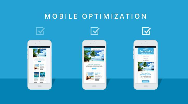
What Is a Mobile-Optimized Website?
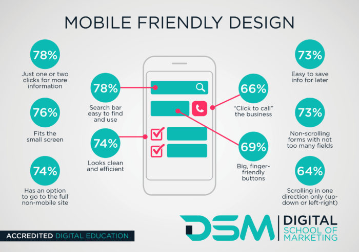
Although all mobile-optimized websites are mobile-friendly, all mobile-friendly websites are not mobile-optimized. Built using a mobile-first approach, a mobile-optimized website is ideal for smaller screens and reformats itself for mobile users to deliver a seamless user experience. With more than 80% of smartphone users willing to purchase products or browse from business websites that are easy to navigate, having a mobile-optimized site amplifies business growth and ensures high ROI.
You can use various online speed optimization to check the level of frictionlessness of your mobile-optimized website, and how to considerably improve multiple site parameters. Having the following design elements will ensure your platform qualifies as a mobile-optimized website for major search engines, such as Google.
- Ensure a single-column layout for your website that is thumb-friendly.
- Ensure mobile-friendly touchpoints and make clickable call-to-action (CTA) buttons.
- The CTA buttons should be simple, and the website design should be uncluttered.
- More straightforward navigation ensures a better customer experience.
- Most mobile-optimized websites use a hamburger-style menu to organize the website layout and improve website navigation.
- The spacing and formatting of all the content on a mobile-optimized website should be ideal for maximum UX and a high degree of readability.
- Images should not fall off pages or be too close to any critical information present. Visuals should be optimized for all screen sizes: Android phones, iPhones, and tablets.
What Is a Mobile-Responsive Website?
A mobile-responsive website employs responsive design elements that are far more advanced than optimization elements. In a mobile-responsive website, the site elements will reformat and restructure themselves for the type of mobile device used, along with the exact dimensions, resolutions, and other display parameters.
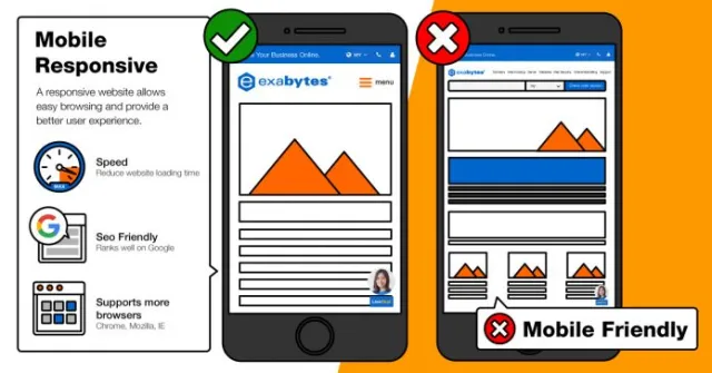
By employing responsive design, the mobile website layout can scale from small screens of smartphones to medium screens of an iPad or tablet to larger desktop screens. Employing responsive design when developing a website ensures maximum user compatibility and an incredible surfing experience for all. A mobile-responsive website enables optimum usability, irrespective of the device used. Using a cutting-edge mobile-responsive website will ensure great navigation, scale, and readability for the particular screen size and device variant on which it is viewed.
Mobile-Friendly vs. Mobile-Optimized vs. Mobile-Responsive: Which One to Use?
If you are a business owner and on your way to developing your business website for the mobile device, you might be wondering which one among the three would cater to your business’s unique needs.
You can find out the perfect one among the above by rethinking the purpose of your website, how it should interact with visitors, and what devices those users primarily utilize while interacting with your site.
Keeping in mind that more than half of the internet traffic is constantly browsing a mobile device, the ulterior motive is to provide the users with a smooth, easy, and frictionless experience. Let’s suppose you can optimize every design element considering your user profile, their preferred devices, and the level of user experience they expect. In that case, you will always gain maximum conversions and experience a better ROI.
When considering the various price points of website development, mobile-optimized and mobile-responsive websites are pricier to build than mobile-friendly ones. However, building from scratch would be wiser than restructuring an existing static site and making it mobile-optimized or mobile-responsive.
Key Takeaways
- A mobile-friendly website is one that caters to mobile devices, and is just a slimmed-down version of desktop websites.
- A mobile-optimized website is definitely mobile-friendly, but a notch above the earlier version. It not only functions like its desktop counterpart, but it also adjusts itself to the screen size of the mobile device.
- There are several tools and tests to check the mobile friendliness of a website. You can even follow a few thumb rules to improve the mobile optimization of your website.
- A mobile-responsive website takes the experience a notch further and restructures, reformats, and resizes itself for multiple screen sizes: whether it is a desktop, tablet, or smartphone. It contains design elements and features that respond intuitively to the kind of device the user interacts through.
- You need to consider the unique requirements of your business to understand which type of website design is ideal for your users. The device through which the maximum users interact also plays a role in deciding the website design. The price points vary across website design projects.
Conclusion
Mobile websites definitely impact your customers, which, in turn, affects your business. In this century, with people performing tasks on the internet using mobile devices, the business owner and the developer have their work cut out. When choosing from mobile-friendly, mobile-optimized, and mobile-responsive websites, consider the complexity and cost involved, and the user experience you wish to provide in this ever-evolving, mobile-first world.
FAQs
A mobile-friendly website has the minimum design attributes adequate to lure mobile users into landing on the website and engaging with it. It could be just a trimmed-down version of its desktop variant. On the other hand, a mobile-optimized website is built with a mobile-first strategy in mind, and the web design will reformat itself for mobile users.
Optimizing your mobile-friendly website will encourage dedicated mobile users to engage and interact with your site more. It can be achieved through the following steps.
1. Employ multiple testing tools to check your site’s mobile optimization.
2. Use a credible web host for your website.
3. A responsive WordPress theme goes a long way in terms of mobile optimization.
4. Improve your website loading time by using page load insights tools.
5. Using Accelerated Mobile Pages (AMP) for your website is ideal.
6. Redesign website pop-ups to suit mobile devices.
The ultimate motive of mobile optimization is to elevate customer experience (CX) and customer satisfaction. If the users are highly satisfied while navigating your website and interacting with it via a mobile device, it is likely that they will purchase or take the respective action your business expects them to.
Optimizing your mobile-friendly website layout should be performed to guarantee better conversion rates. You can employ the following tactics.
1. Your contact information should be concise, clear, and easy to find for everyone.
2. Use succinct messaging on behalf of your brand.
Include strong CTAs.
3. Employ the perfect design aesthetics that drive click-through rates (CTR) and minimize bounce and churn rates.
Android optimization means the operating system is creating optimized versions of mobile applications that are intended to improve the performance, speed, and other parameters on Android phones.
Latest Blogs
Explore how Google’s 2025 AI search updates triggered ranking chaos. Learn actionable strategies to adapt your SEO for AI Overviews, zero-click searches, and SERP volatility. Stay ahead now.
Learn how to rank on AI search engines like ChatGPT, Perplexity, and Gemini by optimizing your content for authority, structure, and relevance. Stay ahead in AI-driven search with this strategic guide.
Explore the best healthcare SEO services for your medical practice. Improve online visibility and effectively reach more patients in need of your services.
Get your hands on the latest news!

Similar Posts

Design
7 mins read
15 Best Firms Offering Design Services in India

Design
5 mins read
All You Need to Know About Data-Driven Design

Design
6 mins read