Infographic Design – The Ultimate Guide with 11 Easy Tips

Infographics are the graphic representations of information using graphs, charts, diagrams, images, etc. They work around the human visual ability to identify patterns and trends. We may take some time to read through a text, but it takes hardly a few seconds to study images.
Infographic designs make the data visually digestible so the information can be concise and quick to register.

Let’s look at how to use infographics designs effectively.
The Importance of Infographic Designs
A picture is worth a thousand words. That is why infographics are essential. The audience has the memory of a goldfish, and they certainly do not have the time to read through pages of facts and figures. The visual representation of data through infographics relays information quickly and efficiently.
Since it holds such importance, creating an infographic design must also involve a lot of care. The process can be more complex than it appears to be. The infographic layout must be able to grab the clients’ attention and convey information in a proper format. This is why we have created this guide that will lead you through the key steps of Infographic design.

Key Steps of Infographic Design
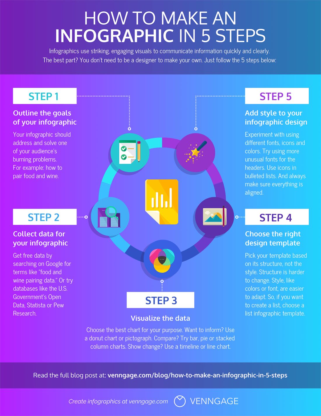
1. Define a purpose
Any infographic poster template must have a clearly defined purpose before the process of designing it can begin. The purpose should be what the company wants to convey to its audience—an educational post to impart information or an infographic representing company statistics.

Only when the purpose is defined can the success of the post be measured in terms of whether the audience was able to receive the intended message or not.
2. Study the target audience
The next decisive factor in selecting an infographic layout is determining the target audience. This can include studying the audience profile–age, gender, social status, interests, etc.

These factors heavily influence the infographic’s tone, writing, and layout. For example, recent pop-culture references might not be suitable for an infographic directed toward an older audience.
3. Collect information
The purpose of an infographic is to relay information; therefore, pay attention to the accuracy and collection of data. It would be wise to contact an expert who is familiar with the nitty-gritty of the subject.
They would be able to remove the unwanted information so that the infographic mentions only what is important. Always mention the source at the bottom of the infographic if the information has been cited from somewhere else.
4. Design
Let the creative juices flow and think of ways to best communicate the information that has been collected. Grab a pencil and notepad and play around with layouts.

Remember to design the infographic layout according to the information. Remember, less is more regarding data representation in the infographic. Don’t overwhelm the audience with too much data. Infographics can have timelines, numberings, images, polls, etc.
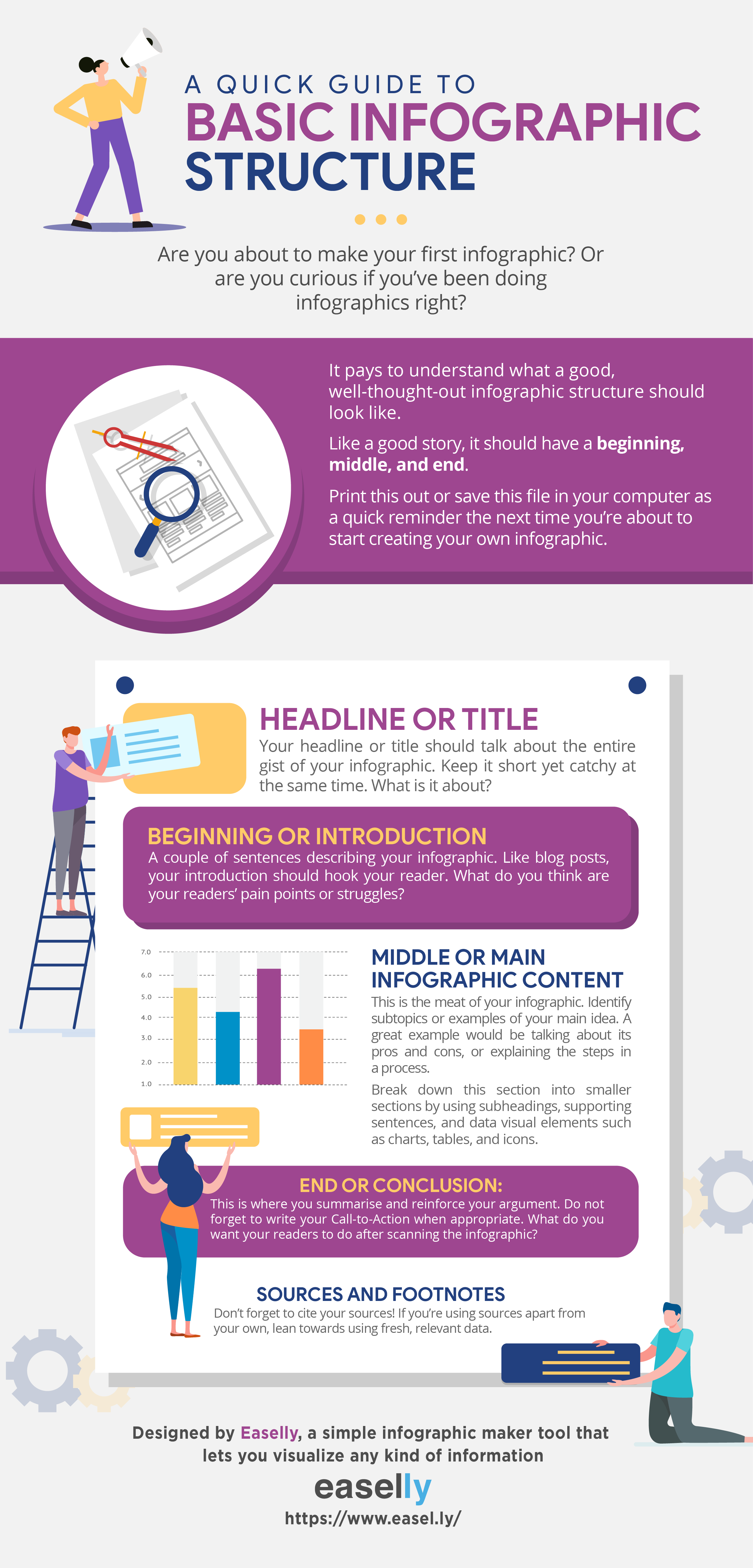
5. Wireframe
Once the layout has been finalized, it’s time to see how it will look with the help of wireframing. A wireframe is a rough infographic layout but with the exact dimensions. It helps determine the text’s position over the infographic design and the relative size and positioning of elements.

There should be ample space between the elements so that the infographic does not seem overcrowded and is easy on the eye.
6. Select a color palette
The color palette of the infographic is as important as the layout; it can make or break the template. Colors play a huge role in how the audience will perceive the information.

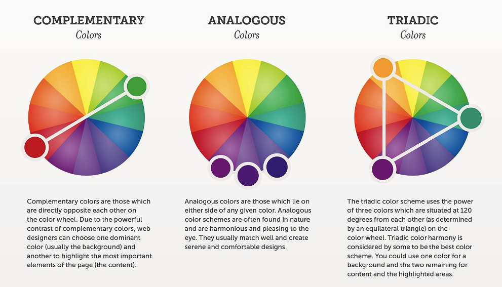
Study the psychology of colors to understand what emotions different colors convey. If the infographic poster template is meant for a business, the color of its logo can be incorporated into the design so that the audience can instantly establish a connection.
7. Pick graphs and charts.
For presenting numerical and statistical data, think of what charts or graphs would be ideal Considerhs would be suitable for comparative analysis, while pie charts are used for composition. Besides graphs, information can also be displayed through icons, arrows, timelines, etc.

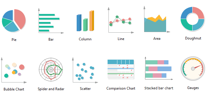
Many applications have pre-designed elements that can be easily molded according to the data entered, or one can easily create new infographic design elements.
8. Select the correct font
Infographics will be useless if the data in them is not readable. Therefore, fonts are not something that can be neglected. Fonts are an aesthetic element of the layout, but they should not be so fancy that it gets distracting or reduces readability.

Maybe the title can have a fancy font, but the body must have a specific font. One can use two to three fonts that suit the overall layout.
The font color must align with the color scheme of the infographic. For example, avoid bright-on-bright colors as they can strain the eye. The font size should also be relative. For example, the title should be larger than the rest of the text.
9. Put images to use
In addition to graphs and charts, images can also be used to illustrate information in an infographic. These can be icons that are small graphics that fit into the larger designs and add another design element. It can also be illustrations that convey information while minimizing the use of text.
Similarly, photographs can be used as a design element and even as backgrounds. Ensure these elements fall in the same color scheme as the other layout.
10. Try and improvise
Once the first draft of the layout is ready, test out different layouts and even color schemes to check if something else looks better. Remember to keep the attention drawn to the critical information pieces in the template.
Try to test it on a smaller audience to get feedback. Incorporate these suggestions into the final draft till it looks like what you had imagined.
11. Promote it
Infographics are meant for the audience. Once the layout has been designed, share the infographic on social media platforms and websites.
Use ad tools to ensure that the infographic reaches the correct audience. The success of the infographic will depend on the number of people it can reach.
The Final Word
Infographics are an excellent tool for digital marketing and conveying information. Several applications have predesigned templates for newcomers in the field of infographics. Use these resources and our guide to design the most creative infographic layout.
Key Takeaways
● Set a purpose for the infographic before working on the design.
● Study your target audience and design a suitable infographic.
● Understand that colors have a meaning and message, and use them correctly.
● Supplement the infographic with images, graphs, charts, etc.
● Keep improvising to see what looks best.
FAQs
The infographic layout refers to the arrangement of the visual design elements that make up the infographic content.
The primary purpose of infographics is to relay information quickly through visual elements to reduce the time it takes to read text. Therefore, infographics should not be wordy. They should use a pictorial representation of data more.
A good infographic is well designed, brief, and easy to understand. It should be eye-catching and have an aesthetic appeal.
The infographic should look well-put and cohesive. Use attractive color schemes and fonts that go well together. Don’t clutter the design by stuffing it with images and charts. Keep only those graphics that complement the data.
Poor color scheme, low readability, inaccurate information, and graphs can make an infographic look bad.
Latest Blogs
Explore how Google’s 2025 AI search updates triggered ranking chaos. Learn actionable strategies to adapt your SEO for AI Overviews, zero-click searches, and SERP volatility. Stay ahead now.
Learn how to rank on AI search engines like ChatGPT, Perplexity, and Gemini by optimizing your content for authority, structure, and relevance. Stay ahead in AI-driven search with this strategic guide.
Explore the best healthcare SEO services for your medical practice. Improve online visibility and effectively reach more patients in need of your services.
Get your hands on the latest news!

Similar Posts

Design
7 mins read
15 Best Firms Offering Design Services in India

Design
5 mins read
All You Need to Know About Data-Driven Design

Design
6 mins read