
American art director and graphic designer Paul Rand once said, “Design is the silent ambassador of your brand.” Design offers a comprehensible personality to your brand with which your consumers can connect. One of the key aspects of designing is the right font. Every font is unique and narrates a different story. Therefore, when selecting brand fonts, it is essential that you pick ones that reflect the persona of your brand most perfectly.
Are you wondering where to start and how to understand which font is best suitable for your brand? In this blog, we bring some tips related to the best brand fonts that will elevate the brand’s identity.
Know the Font Groups and Their Characteristics
Before you dip your toes into the vast world of typography, it is crucial to understand which fonts work best for your brand. Choosing from the countless number of fonts can be overwhelming. There are numerous of them available at the click of your mouse. Read ahead to explore the five main types of fonts and their characteristics. It can help you opt for the appropriate one that matches your brand’s identity.
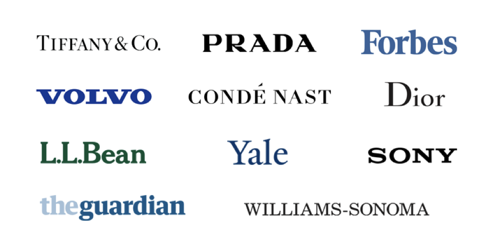
1. Serif fonts
Serif fonts came into existence in the 15th century. These are classic fonts that represent qualities, such as tradition, history, integrity, and authority. Fonts, such as Times New Roman, Verona, Cambria, Baskerville belong to the Serif family. These are more popular among high-end brands, such as Cartier, Vogue, Dior, and others.
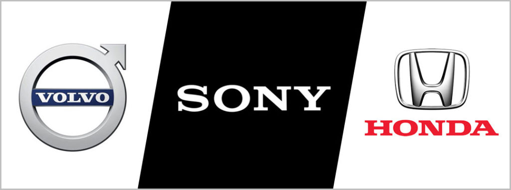
2. Sans-serif fonts
Use a sans-serif font as your brand font style if you want your brand to be synonymous with the modern-day look. These fonts emerged in the 19th century and are known to portray characteristics, such as chic, clean, elegant, and stylish. Verdana, Arial, Helvetica, and Franklin Gothic are a few famous brand fonts from the sans-serif font group. L’Oréal, Netflix, Google, and Levi’s are some of the top names that use such fonts.

3. Slab serif fonts
Slab serif fonts are a category of serif fonts. Generally, traditional, well-established companies with a proven track record of producing quality products prefer to use these fonts. Courier New, Rockwell, Roboto Slab are some slab serif fonts.
4. Script fonts
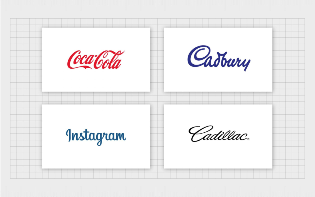
Cadbury, Pampers, Instagram, Carlsberg, Coca-Cola. What do you notice in these names? It is a mix of contemporary and long-established brands. It is because script fonts can be graceful, flamboyant, playful, classical, and contemporary. Brush Script, Mistral, Allura, and Lucida Handwriting are some script fonts.
5. Decorative fonts
Diverse, distinctive, and dramatic are the qualities of these fonts. Certain companies, such as Disney, IBM, and Lego, feature decorative fonts, and they are especially eye-catching and memorable. Among the many decorative fonts are Fredericka, Bangers, Cherie Bomb, Lobster Two, and Fredoka One.

The Ultimate Guide to Picking the Best Brand Fonts
Now that you are familiar with the different brand font styles, let us move on to the tips that will help you select them.
1. Understand your brand image
The first and most important part is understanding the message you want to convey to your target audience. Define your brand’s identity before you start with the font selection process. Then you can start brainstorming words that best describe your company.
2. Find your brand’s personality traits
Classic, cutting-edge, energetic, sophisticated, playful, trustworthy: find more such words that you think are your brand’s personality traits. With these in mind, it becomes easier to finalize the best brand fonts.
3. Keep your target audience in mind
When used aptly, brand fonts have the power to communicate with your target audience. They also help build trust and brand personality. Consecutively, it is also important to conduct adequate research on your target audience before deciding on a font.
4. Research about fonts
Spend time researching the anatomy of various fonts. Before deciding on fonts, it is essential that you are well-informed about the trending fonts and other font-related updates.
5. Take notes from other brands
Find out more about the brands you have always admired and study how they use typography. Analyze the way they use specific fonts and how engaging they look. Visit their websites, or if it is in print format, get a copy to notice the impact.
6. Avoid following other brands blindly
Remember that simply because a particular font works for a brand you look up to, it may not align with your brand. A traditional serif might not fit a hip, youth-centric fashion label. And a delicate typeface might not suit an engineering company.
7. Start with a few fonts
It can be challenging to shortlist fonts. But try to narrow down your choices to three or four 3-4 fonts. Once shortlisted, put your brand text in each of the fonts and observe them one by one. Then, place them next to each other and compare them.
8. Ensure versatility
While selecting the fonts for branding purposes, maintain versatility. It can be for advertisements, logos, web pages, and banners. For example, if your logo consists of a phrase, choose a brand font style that is legible. If you need something for billboards, go for a font that is bold but easily readable in bigger formats.
9. Ask for feedback
Take feedback from your family members and friends. Prepare a draft with the prospective fonts and request honest feedback from them. Additionally, you can also take the opinion of industry experts.
10. Be cautious about free fonts
You will find many fonts that are freely available online. However, most of them might not have a commercial license. Always check the end-user license agreement before you use any of these fonts. You can try Google Fonts. It is a safe resource because most of the fonts are covered by the SIL Open Font License, and hence, are free for commercial use.
To sum up, redesigning your logo, revamping your website, or building your brand from scratch, the right brand font style can make a huge difference. While you may know the nuances of building a brand, honing all of its aspects always helps. It is crucial to stay updated about the latest brand fonts and tricks to use them correctly to ensure consistency. Furthermore, the tips mentioned above can set your brand apart from the crowd, and even set an example for others.
Key Takeaways
- Fonts play a huge role in brand awareness. They give a voice to your brand.
- Do not rush. Making an impulsive decision while choosing a brand font can hamper the visual appeal of your brand.
- Research a lot before you delve into font selection. The wrong font will fail to create the desired magic on your target audience. But the right one can work as the glue that will keep your audience attached to your brand.
- Every font evokes varied emotions. So, be cautious about the brand fonts you select.
- Avoid using too many fonts. It can make your brand look clumsy and cluttered.
- Always take feedback.
FAQs
Selecting the wrong font styles can have a negative impact on your brand’s image. It can lead to the following:
– The brand’s message may not reach your target market.
– Improper and illegible fonts may drive consumers away.
– It also affects the way a consumer perceives your brand.
It is quite possible that the brand font style you select may become passé in the coming years. Keep yourself updated about the trending fonts. Also, know when it is the right time to refurbish the fonts that represent your brand.
Ask yourself the following questions before deciding whether to use one font or separate fonts:
– Is the font equally legible on small screens (mobile devices) and bigger screens (desktops and laptops)?
– Is the font equally impactful on both print and digital platforms?
– Is it a good idea to use the same font for the website, newsletters, emailers, and other marketing collateral?
A contemporary or contrasting color can give an aesthetically pleasing look to your brand. At the same time, flashy colors can be repulsive to the eyes. For example, pairing using dark fonts against light backgrounds always works, whereas using bright backgrounds with light fonts can be distracting.
When selecting brand fonts for a café or restaurant, you need fonts for your logo, menu, food jars, and takeaway boxes. Remember, the fonts need to reflect the ambiance and presentation style of your restaurant. At the same time, they must be legible to capture the attention of food lovers. Giaza Pro, Rigatoni, Didot, and Baskerville are a few fonts that can match a restaurant’s vibe.
You can certainly use more than one font, but avoid using too many. It can create a negative impact on the consumer. You do not want to confuse the consumer or make your brand look unprofessional.
Latest Blogs
Explore how Google’s 2025 AI search updates triggered ranking chaos. Learn actionable strategies to adapt your SEO for AI Overviews, zero-click searches, and SERP volatility. Stay ahead now.
Learn how to rank on AI search engines like ChatGPT, Perplexity, and Gemini by optimizing your content for authority, structure, and relevance. Stay ahead in AI-driven search with this strategic guide.
Explore the best healthcare SEO services for your medical practice. Improve online visibility and effectively reach more patients in need of your services.
Get your hands on the latest news!

Similar Posts

Branding
10 mins read
What Are Brand Guidelines, and How Do They Work?

Branding
8 mins read
Decoding the Branding Strategy of Patanjali

Branding
7 mins read