A Detailed Guide on Responsive Emails in 2022

Table of Contents
- What is a Responsive Email?
- Importance of Optimizing Emails for Mobile Devices: Quick Facts
- Importance of Responsive Emails
- Why Should You Opt for Responsive Email Design?
- How To Make Emails Look Responsive?
- Different Types of Responsive Email Templates
- Responsive Email Design Best Practices
You are already late to the game if you are not responsively utilizing the emails—especially when more than 80% of emails are opened by people on their smartphone or tablet devices.
This pretty much shows that we’ve been living in the mobile era for quite some time now. The above stats clearly prove how convenient it has become to access emails while traveling. In addition, mobiles and tablet devices have changed emails and redefined the inbox experience.
The biggest question right now is—“Are responsive emails the need of the hour?” The answer to this question is a big YES. However, before we delve further into the responsive nature of mailing and how you can be more responsive on email, let us first discuss what a responsive email is and its importance in today’s time.
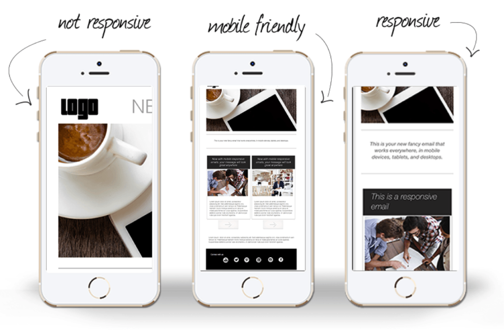
What is a Responsive Email?
Responsive emails are those email messages that look good on any device type—whether it’s a PC, smartphone, or tablet. The email automatically adapts to the device’s screen resolution, allowing readers to read emails while traveling.
In addition, the unique coding in the responsive emails allows the message to display perfectly without distortion on the device. For example, the same newsletter showing perfectly on the laptop might look distorted, misaligned, poorly crafted, and garbled on the smartphone device if it is not responsive.
Every two individuals out of three check emails on their mobile while on the go. If the email newsletter doesn’t look good on the device, 80% of people are likely to delete the message. So, a responsive email design goes a long way in the email marketing program and improves the overall business.
This detailed guide will discuss the importance of responsive emails and their relevance to modern business in 2022. At the same time, we will also discuss responsive email design and how to make the email newsletter look mobile responsive. So, let’s get started.
Importance of Optimizing Emails for Mobile Devices: Quick Facts
Do you know how many people interact with emails on their smartphone devices? More than 50% of people unsubscribe from promotional emails just because they don’t open properly on their mobile. So, it clearly shows that a non-responsive email can cost you half your business. At the same time, a responsive email design can increase the click-through rate by more than 30%.
Here are some quick facts about optimizing emails for smartphone devices:
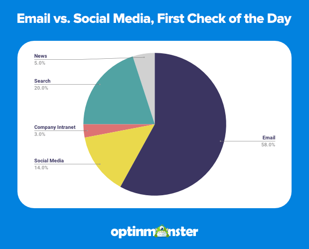
- 33.66% of people use the desktop to open emails.
- 49.53% of people open their mobiles to check emails.
- 16.81% of people access emails on their tablet devices.
- 75% of people use their smartphones to check emails daily.
- 66.7% of emails are opened on smartphone and tablet devices.
- 70% of people immediately delete emails if not displayed correctly.
- 15% increase in click-through rates for responsive email design.
- 30% higher click rate for responsive emails than non-responsive ones.
- 51% of people unsubscribe from a brand’s email if not displayed correctly.
- 43% of people mark promotional emails as spam if not displayed correctly.
Importance of Responsive Emails
Email marketing is not dead yet; it helps webmasters and marketers generate traffic and improve their business. Responsive emails are crucial when talking about email marketing, and it goes a long way in making the email marketing campaign a successful one.
People look at their smartphones more than 150 times in a day and, during that time, access emails. If the email doesn’t look good on their device, they are likely to delete it. If you don’t want your users to delete the messages, it’s time to start getting responsive.
Here are some reasons (beyond what is already provided) responsive emails are crucial today.
1. Better user experience
The responsive mailing feature in your newsletter makes it easier for people to access mail while traveling. One can easily navigate the message and not have to zoom or pinch the screen to read the email contents properly.
In addition, if your email looks perfect on the smartphone with better and bigger-spaced CTAs, subscribers are likely to read the rest of your email.
2. Increasing click-through rate
Email marketers are always trying to figure out the best way to increase the click-through rate of emails. And responsive email design is the answer. If the recipient cannot view the email, they will not read the entire message, let alone click on it.
While using a perfect responsive email template, you don’t have to worry about anything else. It will automatically increase the click-through rates.
3. Better conversions
If emails are perfectly designed for mobile and tablet viewing, you don’t have to think about the low conversion rates. When the responsive email design is good without faults, the conversion rates will always be higher.
Responsive emails will undoubtedly match your services/products with the consumer’s requirements. This, in turn, can lead to unlimited orders and increased sales.
4. Higher sales figures
Once you can capture and retain the readers’ interests, there is a big possibility they would make a purchase right from their smartphone instead of using a laptop or PC later on. A responsive email can render perfectly no matter what device the person is using.
This provides a perfect first impression in their minds. Imagine if your customers are purchasing products while on the go; aren’t you more likely to sell more?
5. Money-saving
If you invest a handsome amount in an email marketing campaign, the end result is just 10% open email rates? Sounds disappointing, isn’t it? It is a complete waste of time and money at the same time.
Having a responsive email design will improve the click-through rates and better sales figures in due course of time. Ultimately, you will start getting results and don’t have to invest your hard-earned money in frivolous email marketing campaigns.
6. Email users outnumber social media users.
When comparing the number of users for social media sites like Facebook and Twitter with email users, it’s crucial to look beyond numbers and see the active users.
For example, there are 3.9 billion active email users compared to 2.9 billion Facebook users and 3.3 billion Twitter users. So, it’s pretty clear that email serves as a better way to reach maximum people. With an adaptive and responsive email, you are likely to engage many people.
7. One size fits all
There is no need to create separate email templates for different devices like mobile, tablets, and desktops. When you have a responsive email template, the same email adjusts automatically on multiple devices without any distortion.
So, you save a lot of energy and effort, which can be efficiently utilized in focussing on the subject line and contents of the email newsletter.
Why Should You Opt for Responsive Email Design?
Responsive emails provide an opportunity for improving customer engagement. With the steady growth of mobile internet, many email subscribers will read your messages on their mobiles, tablets, and desktop PCs.
A recent study states that a responsive email design positively impacts email engagement. So it comes with little surprise that more and more brands are switching over to responsive emails for better growth opportunities.
Here are some of the examples of different popular brands that have taken an extra step for better user engagement by becoming responsive to emails:
- Dominos: Compared to the desktop version of their email messages, their “Like” and “Follow” links on social media platforms are correctly positioned and sized prominently on mobile devices. This makes perfect sense as most people access Facebook and Twitter on their smartphone devices all the time.
- Expedia: This American online travel shopping company has smartly added the app store banner on their email’s topmost part when viewed on the smartphone. This compels the user to click on the deals available on the banner, further increasing company sales.
- PlayStation: This is another excellent example of a perfect responsive email design. The company’s email layout is quite enticing for the eyes when viewed on a smartphone, tablet, or desktop PC.
The bottom line is that a poor user experience will lead to little or no response from the people. This further means no return on investment. So, it’s crucial to opt for a responsive email design, as it improves customer engagement and drives sales in due course of time.
How To Make Emails Look Responsive
If you have a Bachelor’s degree in Computer Science with a coding background, you can easily make emails look responsive using proper codes. However, if you don’t have technical experience and are looking for a more straightforward method, several online email marketing tools are available with in-built responsive templates. The responsive email template is free or paid and offers drag and drop templates.
While coding a responsive email template, some of the best practices are making the email flexible and scalable. At the same time, it’s imperative to note that responsive emails need CSS media queries for changing fields.
Also, the best practice for a responsive email is to use bigger fonts that are easily recognizable on the smaller screens of the mobile device. Finally, opt for single-column layouts because they are easier to scale and ideal for web pages.
The next time you finalize a responsive email for your marketing campaign, it’s essential not to complete any design until you or your team members see how it looks on multiple screen resolutions.
Two out of three people access emails on their smartphone devices for ease, especially while traveling. The best way to check the mailing’s responsive nature is by sending the email to yourself or your teammates as a test.
Responsive Email Templates
A responsive email template is used primarily for email marketing and is designed to look good on multiple devices. The template will automatically adapt to mobile or tablet devices’ screen size and picture resolution. In short, the responsive email will look great, function smoothly, and be easier to read by the recipient.
Why is a responsive email template a vital consideration for an email marketing campaign? Imagine opening an email marketing campaign on a smartphone where the user has to zoom in to access the content.
This shows that you didn’t care to test the email before sending it to the user’s mobile inbox. This further means you didn’t consider the user’s time or the quality of interaction.
- Why do you need a responsive email template?
Today, many people rely on their mobile and tablet PCs to check emails daily. Since top brands use emails to interact with their consumers and followers, it’s imperative to adopt a responsive email template.
This will help your message be conveyed appropriately across multiple devices, regardless of the screen sizes. With more than half the emails now opened on smartphone devices, looking good on the smartphone is an essential criterion for delivering a quality message to the customers.
Different Types of Responsive Email Templates
If you are not a pro and are searching for a responsive email template for your business, several online free and paid tools are available. The templates are responsive, and you need not have a coding background to build an engaging and responsive email to hook your customers.
Here are the 16 of the best free HTML email template builders and editors that are worth your time:
- Pepper Content
- BEE
- Dispatch
- Stripe
- Litmus
- Chamaileon
- Unlayer
- MailChimp
- Mailmodo
- Mail Styler 2
- Mosaico
- Coffeecup
- Postcards
- Campaign Monitor
- Moosend Email Editor
- Mail Designer 365
These services offer numerous templates and design opportunities in different categories like holiday emails, feedback emails, newsletters, etc. The templates are mobile-friendly and come with a drag and drop feature. Select a template based on your requirements and send it to your customers and subscribers for brand awareness and user engagement.
Responsive Email Design Best Practices

Here are some of the best practices that you must keep in mind while designing an engaging and responsive email template for your subscribers and other users:
- Stick to a single-column layout. It means less shifting and makes it easier for the readers to access the content seamlessly.
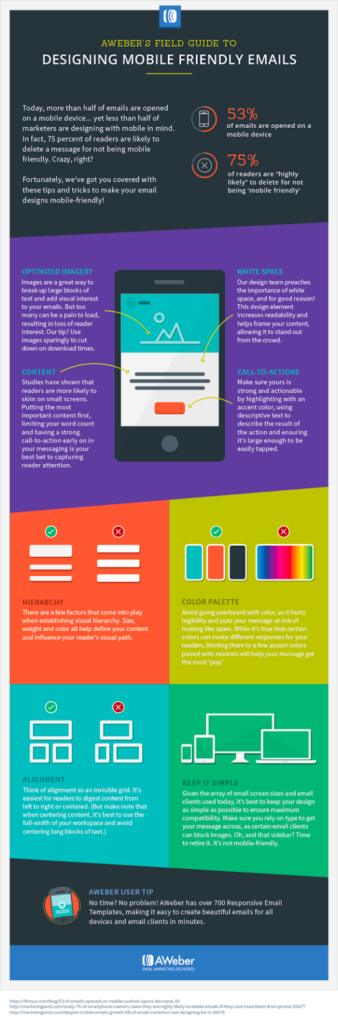
- The minimum font size for the body text should be 14-pt and should not exceed more than 20-pt for the titles. This will make the email readable on smaller devices.
- Place the essential information on the top 25% of the email content. This makes it catchy, and users are likely to click on the link to either buy or learn more.
- Avoid using multiple hyperlinks in a single email. Also, avoid cluttering different hyperlinks together. Instead, use a big and tappable button that is easier for the eyes to detect.
- Use smaller and responsive images (2x for retina screens) and ensure alt tags if the email client doesn’t load the pictures. This is the best practice for accessibility.
- Always test your responsive email before sending it out. You can use services like Email on Acid or Litmus to check how the mail would appear in the user’s mailbox.
So What Are You Waiting For?
Emails remain one of the most sought-after mediums for business communication with users. And they are best used by designing a responsive email template that looks good on any device type – whether it’s a PC, smartphone, or tablet.
One of the most significant benefits of responsive emails is higher click-through rates and improved sales figures.
Don’t let the responsive email design scare you. Responsive emails take time, effort, and resources, but they will ultimately offer the best experience to your customers. Following the guide above, we are confident that you will start implementing responsive emails in your marketing campaigns and let your business soar to new heights.
Key Takeaways
- 80% of emails are opened by people on their smartphone or tablet devices.
- Responsive emails are those email messages that look good on any device type—whether it’s a PC, smartphone, or tablet. The email automatically adapts to the device’s screen resolution, allowing readers to read emails while traveling.
- Here are some key advantages to responsive emails:
- Higher quality user experience and improved conversion rate
- Better response from customers to promotional opportunities
- Few complaints about spam and increased subscribers
- 55% higher click rates and improved sales
- Money saver in contrast to email marketing campaigns
FAQs
A responsive email is a kind of mail that automatically adapts to the screen resolution of a computer device like a mobile, tablet, or PC by offering convenience to the readers to access emails while on the go.
A responsive email should open properly on multiple devices of varying screen sizes and resolutions. In addition, the email should use large fonts, a distinct call to action, and come with a single-column template.
Even if you don’t have a coding background, there is no need to worry. There are free and paid responsive email templates like Litmus and Dyspatch that you can use for your business.
Latest Blogs
Explore how Google’s 2025 AI search updates triggered ranking chaos. Learn actionable strategies to adapt your SEO for AI Overviews, zero-click searches, and SERP volatility. Stay ahead now.
Learn how to rank on AI search engines like ChatGPT, Perplexity, and Gemini by optimizing your content for authority, structure, and relevance. Stay ahead in AI-driven search with this strategic guide.
Explore the best healthcare SEO services for your medical practice. Improve online visibility and effectively reach more patients in need of your services.
Get your hands on the latest news!

Similar Posts

Email Marketing
6 mins read
11 Tips to Design Impactful Email Banners

Design
9 mins read
7 Benefits of a Simple Mailer Design

Email Marketing
7 mins read