
According to the WHO, at least 2.2 billion people are visually impaired worldwide. In today’s digital world, a good brand must always think about all of its subscribers. Emails are the easiest way to keep a subscriber interested in your company. It is the most preferred communication channel to build a long-term connection with your subscribers. Therefore, emails must be easily accessible and comfortably readable to everyone.
Nowadays, there are various adaptive technologies, such as screen readers, magnification applications, text-to-speech synthesizers, alternative keyboards, and sip and puff systems, to assist visually impaired people and make the digital world more accessible to them.
With the evolving technology, the latest “speaking email application has made the community of visually impaired well connected through emails. The multilingual feature of the application makes it the community’s favorite.”
On that note, let’s find out how you can design and create accessible emails for visually impaired subscribers.
Designing Emails for the Visually Impaired
1. Email copy – carefully analyze and revamp
Text is the most integral part of any email. When it comes to marketing effectively, it’s considered important to divide the content into sections with relevant headers. This makes an email more accessible to those using a screen-reader and allows the subscribers to understand the matter at hand quickly.

Many email developers use Microsoft’s Flesch Kincaid Reading Ease Test to check their email readability.
● 90-100: Easily comprehended by an 11-year-old child.
● 60-70: Teenagers aged 13-15 find it simple to grasp.
● 30-50: Simple to comprehend for college students.
● 0-30: College grads have a good understanding of it.
Emails written in simple language, with clarity and focus, resonate with the audience with relative ease.
Relevant images can be added to the email, but the text must be attached for better comprehension. Captions and texts, either written over the images or around, will help the visually impaired to know better as they could be using tools, such as a text-to-speech synthesizer.
2. Email formatting tips – use contrasting features
There must be enough space between the paragraphs to be clearly distinguished. Every line should be left-aligned and have no more than 60-70 characters each. Adequate white space in an email makes it visually appealing and easily readable. Similar information must be grouped with the help of typographic margins (this is highly recommended).
As important as it is to know what to write in an email, it’s more important to know who will be receiving your messages and how they will decode them.
For subscribers with a neurological or an ophthalmic condition, it’s mandatory to follow a visual hierarchy. From the very start of the email, the subject line must depict the main aim and purpose of the email. This shall make it comfortable for the readers to stay connected and understand your message.
While using CSS, the content sometimes gets repositioned. So, it is advised to always check the reading order of your email with the help of the “Web Accessibility Toolbar” or “WAI HTML Table Linearizer.” This would guide you to find any faults with the flow of your email before you send it out.
Fonts used while creating an email must be simple and not calligraphic. Use a font accessible on all device types, be it a desktop, a mobile, or a tablet. “Serif” or “Sans Serif” font types are good options for email developers to incorporate while designing for visually impaired people.

When creating for the visually impaired, text size is the most crucial part to consider. You need to ensure that the font size is 12p or above for better readability. The line height must be at least 1.5x the font size. So, if the font you choose is “Arial” with a font size of 16p, the line height would be 24px.
3. Color choices – use colors strategically
Colors are an integral part of any great marketing. Many companies and brands use emails as an effective tool to connect with their customers and subscribers. And a common feature among them is that they value color schemes.

While considering a visually appealing tone for an email, you must remember that the message and the content of the email have nothing to do with the hues you pick. The colors must not depict the mood of the email. The purpose of selecting the right color scheme for your email must be dependent only on the audience you wish to target.
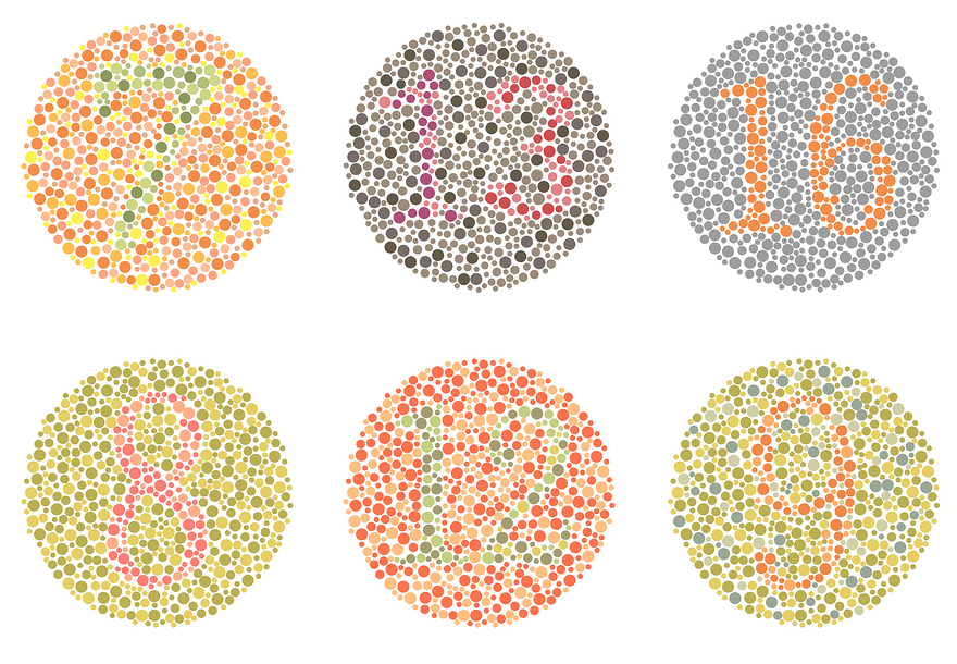
Selecting the correct colors can be challenging. Therefore, it might be good to consider conditions like colorblindness to alter your email designs.
Contrasting shades are more effective than light plain emails, especially for those who are color-blind. Colorblindness is a predominant condition that must not be ruled out while referring to the visually impaired group. Many subscribers fail to find a stark difference in colors, thus, making them feel disinterested in the subject altogether. You can use tools such as a colorblindness simulator to check your emails before finalizing.

The above image clearly represents how a normal person can see vs. a color-blind person. This suggests you be careful while deciding on the color scheme of the email without making it too distracting. By taking this into account, you can avoid hues of blues and reds for subscribers who may be suffering from migraines and light sensitivity.
The email which you design must not have too many colors. This would avoid confusion in the minds of the readers. So, try to stick with a monochrome color scheme, as shown in the image below.

For better accessibility, always use different colors for links and texts. A quick piece of advice, color oracle is a great way to find out how users with colorblindness perceive your email.

4. Coding the email – make it convenient
Coding is a crucial part while creating an accessible email for your subscribers. While writing the code for your email, you must make it convenient for your subscribers to access emails on any device, irrespective of the screen size and even while using a screen reader.
The accountability of your email depends on the quality of the code. The headlines should be in <h1> tags, while the headings should be in <h2> to <h6> tags. The paragraphs should be wrapped in <p> tags.
Apart from the traditional device users, some subscribers may require assistive technology to receive and read emails. For the visually impaired, you must write the code to allow them to navigate through the emails with ease, even while using their keyboards.

“Alt text” is a much-required format for your visually impaired subscribers to understand what your photos denote. Stay relevant while adding pictures to the email. Alt text will be a great aid for those using screen readers or text-to-speech synthesizers as it can facilitate better reading.
5. Test accessibility – optimize accessibility
Before sending out the emails to your subscribers, you must test out the email’s layout on multiple devices. It should be clear and clean, and easily readable to all your audiences. There can sometimes be a rendering issue with the code, which must be resolved beforehand.
While checking the accessibility of the email on a desktop, you must check if the keyboard is fully functional to navigate through the email properly. The “zoom in” and “zoom-out” features using “control +” and “control -” should work efficiently. The links must open in a new tab, and the screen reader must read the email correctly.
The most important accessibility check for an email on mobile is the zoom feature. The entire email must be easily pinched to “zoom in” and out for all the visually impaired subscribers. Also, voice-over commands must function properly to make email marketing more effective.
Key Takeaways
● The text must be split into paragraphs for easy accessibility for those using screen readers.
● The layout of the email must be open with adequate white space along with readable font type and text size.
● Subscribers with colorblindness must be taken into account. The correct color must be chosen to avoid headaches and confusion.
● Recipients must be able to browse through the email with clear directions. Codes must be written with precision and clarity.
● Add “Alt text” with images for visually impaired subscribers.
● Always test the accessibility of the email on various devices.
Conclusion
As subscribers, people wish to connect with a brand or company that understands them and aren’t afraid to bring a change for their comfort and convenience. By creating such accessible emails for visually impaired subscribers, an organization shows a caring and consumer-friendly attitude regardless of who is a part of its email list.
It’s a simple phenomenon; when a person finds it easy to read and relate with any subscription, credibility increases. With more trust, you will elevate your clientage, and who wouldn’t want that?

FAQs
A person who is blind or has a partial vision is considered visually impaired. They may be suffering from near or distant visual impairment.
Braille is a famous and the only writing system that allows the blind and those with low vision to read. It guides them to follow the raised dots and read them with their fingers. Those who aren’t visually impaired can read braille and narrate it to others. This is the most convenient way for the visually impaired to learn and stay connected with the world.
They can use a screen reader to read it out for them. The images can be captioned, and the contrast can be visually acceptable for those with partial vision loss. With adaptive technologies, email usage has become a convenient and quick method to connect.
Textures are important when designing for someone who has a visual impairment. Touch is their strongest sense after hearing. Monochromatic color schemes can work well for a person with impaired vision. It’s better to make the design more readable than decorative.
Use heading and simple language to keep the reader interested. Using “Alt text” for images makes it more accessible for readers with visual impairment. Accessible content can consist of audio and videos with relevant captions and texts to support them. Make your documents accessible on multiple platforms and devices for a greater reach and a better response.
For maintaining basic accessibility requirements, an email must have a logical reading order. There must be a contrast between the text and background color. The images must have text alternatives, while the code must be written specifically to differentiate between the headline and headings.
Latest Blogs
Explore how Google’s 2025 AI search updates triggered ranking chaos. Learn actionable strategies to adapt your SEO for AI Overviews, zero-click searches, and SERP volatility. Stay ahead now.
Learn how to rank on AI search engines like ChatGPT, Perplexity, and Gemini by optimizing your content for authority, structure, and relevance. Stay ahead in AI-driven search with this strategic guide.
Explore the best healthcare SEO services for your medical practice. Improve online visibility and effectively reach more patients in need of your services.
Get your hands on the latest news!

Similar Posts

Design
7 mins read
15 Best Firms Offering Design Services in India

Design
5 mins read
All You Need to Know About Data-Driven Design

Design
6 mins read