Table of Contents
- Relevance of Email Banner Designs
- Create Email Banners That Make a Difference: Do’s & Don’ts
- Tools to Create Email Banner Designs
- Key Takeaways
- Conclusion
- FAQs
Email banner design is a great way to increase your email marketing game and your email click-through rate. However, there is a way to go about it to have a higher chance of success. So, to help you project your messages in an eye-catching way, we have put together a detailed guide and some email banner design ideas.
Relevance of Email Banner Designs
When you think of marketing your product with all the essential details, what is the first medium that comes to mind?
Considering messages and notifications have a word limit and social media is too generic, email is your best bet. And the first thing that would catch the eye of your readers in your email is the banner.
An email banner is something that you add right at the top of the emails. It sets the tone for your marketing and helps the readers assess what the email is about.
Some brands add only their brand name, logo, and tagline to this banner, and this remains constant across all emails. Others like to add a catchy offer or something that will force the receiver to read further.
If you put up a hastily prepared banner on top of your email, do you think anyone would take the pain of going through the rest of your email?
It’s just like a YouTube video. You need to capture the reader’s attention in the first few seconds. Every marketer needs to identify the weak spot of potential customers. What is it that appeals to them? What can you offer to them that they won’t let go of?
In addition, it is also crucial to create a template of the email banner design that can go in multiple emails in the future with minimal or no edits. This automation is required to reduce your work and set the tone of your brand so that it’s easier for your customers to identify it from your marketing collateral.
Create Email Banners that Make a Difference: Do’s & Don’ts
A good email banner design will not just decide whether the receiver reads your entire email but may also be a factor contributing to a sale. Some things will come in handy when you sit to create an email banner. At the same time, you will need to remember to avoid some things. Read on to know more.

Do’s for Email Banner Design
1. Design in sync with your brand
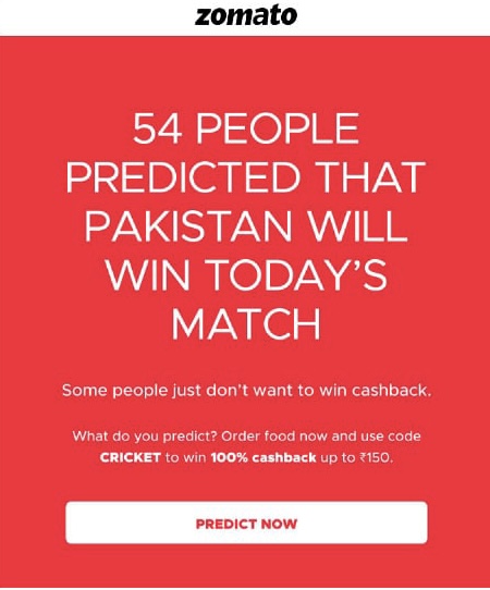
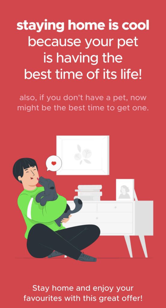
Your brand should be in your subconscious when you create email banners. If you have to breach the boundaries of your brand, the variations must remain subtle. For instance, you should stick to the same logo, business name, and color combination.
2. Create it according to KISS
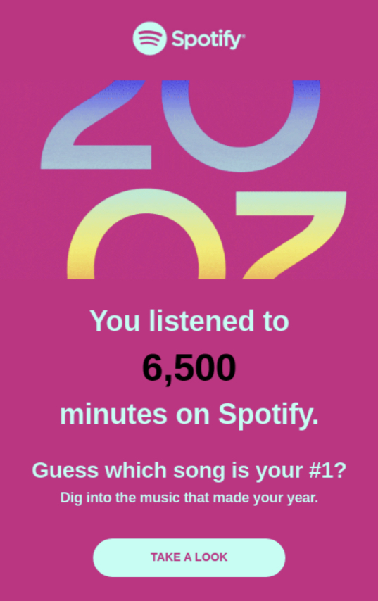
Keep it short and simple (KISS) is the marketing mantra you need to focus on while pondering email banner design ideas. Thus, you should insert images anywhere between 70-200 pixels to keep up with email banner best practices tenets.
Also, it is much easier to work with a simple design than a complicated one when you are trying to design email banners. A short and simple banner also works best in mobile versions.
3. Design email banners that are reusable
Sometimes you would be in a rush, and you would be better off using some templates that are universal and hence reusable. Maybe they contain some generic information about your business and, in a way, you can use them as an electronic visiting card.
As mentioned earlier, many brands add only their names, logos, and taglines to their top email banners. However, if you don’t wish to do the same, you can at least draft a template that can be reused with minimal edits.
4. Customize email banners as per campaigns

You may initially target your prospects with emails containing generic email banners. However, once you are more familiar with your prospects’ business and requirements, you may target them with custom and personalized designs. Email banners are apt to promote new products, introduce offers and discounts, greetings on special occasions, etc.

5. Use sharp and attractive images
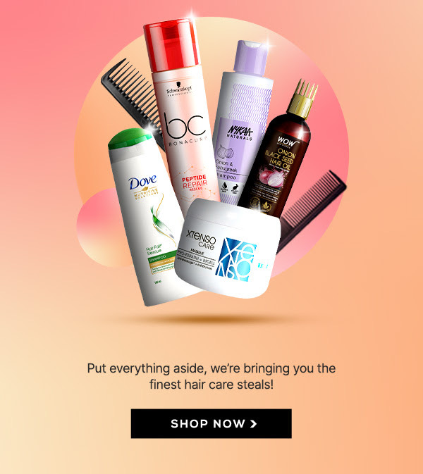
Sometimes what text can’t do is fulfilled by images. If you plan on adding pictures to this banner (and you should), ensure that they are crisp and not pixelated.
If your picture isn’t properly visible to your readers, it’ll set a bad image of your brand. After all, what will the actual product be like is that’s the picture they see.
Don’ts for email banner design
1. Don’t make it too text-heavy
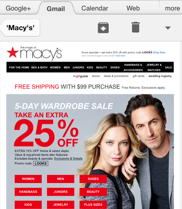
A banner that is filled with text is a big turn-off. In fact, an email with a lot of text looks like a newsletter. We’re sure none of your customers signed up for that. Make sure that the text is short, crisp, and concise. Also, it must never be confined to a single banner. Instead, spread it in all to strike a balance.
2. Don’t make the email banner design too busy
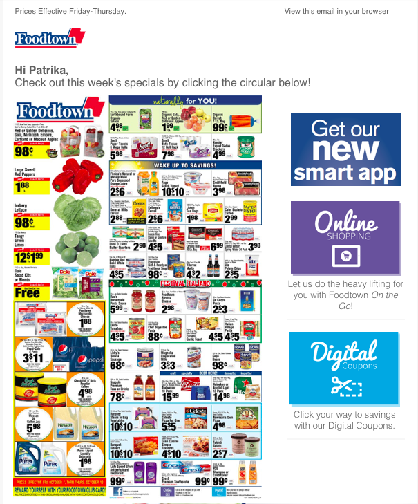
Marketers have researched and thoroughly studied user behavior to understand the kind of designs that appeal to them. One thing common in all of them is that users dislike busy banners and marketing collateral. It easily confuses them. Instead, you must use elements to guide them through the design.
3. Don’t use heavy images in the email banner design
Using heavy images in the email banners may make the emails look super attractive. But, they’ll have one drawback. The images might not load. If the picture that is supposed to speak a thousand words to your customer fails to show itself, it serves no purpose. All the effort of sending the email will go to waste.
4. Don’t use the same or similar shades for text and background
Instead of using similar shades for both text and the email banner’s background, use contrasting shades. This will highlight your message and make the email banner design look more appealing and balanced. Additionally, use a contrasting color for CTA, if any. Contrasting hues are your best bet for highlighting different elements in your email banner design.
5. Don’t change your email banner design templates frequently
If you try being overly ambitious in achieving a level of creativity in your email banner designs, you might miss out on hitting the numbers.
Marketers need to proceed with the same aesthetic in maximum emails. Building consistency for your brand is essential. Be creative all you want, but in a set framework. After all, your customers should be able to identify your brand easily.
Tools to Create Email Banner Designs
You don’t need to be super creative and adept at using design tools. Knowing the basics is a good place to start. As a matter of fact, when you are creating any piece of content for marketing, just know the basics and understand the logic behind what works and why.
That’s all you need to know to hit your numbers. Below are some easy tools that will help you create email banner designs.
1. Canva
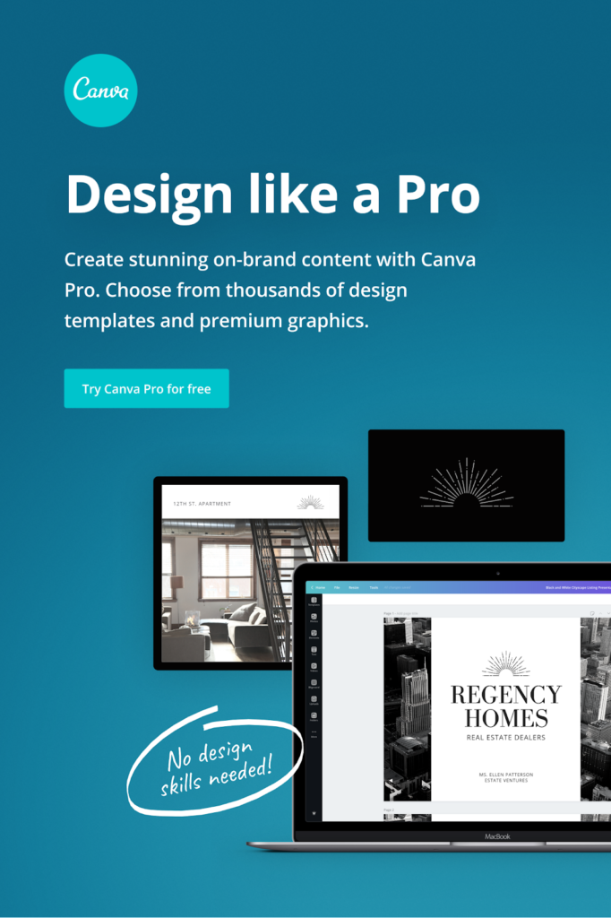
Canva is one of the easiest tools to use for graphic designing. If you are a starter, this should be your go-to option. To stop this, the endless number of templates available makes it easier to use.
When you start your project with Canva, you will easily get the hang of it and enjoy the journey. The best part is that the team keeps on updating it and adding more topical templates.
2. Visme
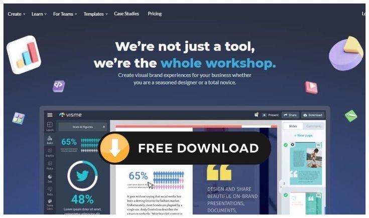
Akin to Canva, Visme is an easy-to-use graphic design tool that helps non-designers create beautiful presentations, emails, banners, and infographics in a few minutes.
It is free, and there’s no time limit till when you can enjoy its free version. There are only some templates and elements that are paid.
3. Adobe Photoshop

One of the more professional and tougher options is Adobe Photoshop. Albeit difficult, the number of features this software has is unmatched. While it’s also expensive, it is the most widely used graphic designing software in the market.
4. Pepper Content Design Services
Assuming you cannot make your own email banner design, there are always Pepper Content’s email design services you can opt for. We offer top-quality designs at affordable prices for all your email template requirements. Our creators make highly responsive email templates so that it engages the readers whether opened in a web browser or smartphone.
Key Takeaways
- Email banner designs are essential elements of any brand’s marketing collateral. It’s critical to ensure that they are designed per the users’ likes and dislikes.
- It’s good to be creative but avoid going overboard. Keep it simple.
- Basic design guidelines such as using contrasting colors and avoiding big fonts must be considered when creating email banners.
- Stick to a template. This will decrease your work and help your customers identify your brand easily.
- Don’t use heavy images as they may never load, leaving a bad impression on your customers.
- If you’re ever confused, please check references from other brands. The internet is filled with some amazing email banner design ideas that will give you that much-needed edge.
Conclusion
Email banner designs can make or break your numbers. If you hire marketers who know the basics of email marketing, make sure to help them learn about your brand and user behavior. This will guide them with an email header and email signature banner design.
One must pay equal attention to both. But, don’t forget that the first few seconds after opening the email will decide your users’ journey. If you succeed in capturing their attention instantly, it may lead to a sale.
FAQs
The guidelines to curate a good email signature banner design are quite similar to the main banner. We like to focus on the basics, so naturally, these are our suggestions:
1. Ensure that the text is legible.
2. Make the content short, crisp, and to the point.
3. The entire piece of content written on the banner must add value. Every single word occupies space on the banner, so make it count.
4. Make it visually appealing. Use colors and fonts that stand out but reflect your brand simultaneously.
5. Use contrasting colors. This will make all the difference.
1. First things first – determine the size of the banner that can go in your email and create the email banner using one of the banner editing apps such as Canva, Photoshop, and the like.
2. Once that is done, upload your email banner design to a web hosting service. You can also use any free-image hosting service like Photobucket and Imageshack.
3. You will then get a unique name for your image file. Copy this link. Now, open the email using a text editor. Type the HTML code, replace the word ‘YOURURL” with your banner’s link.
4. That’s it. Now you can easily apply this to any email template and send it to as many people as you want.
Your email banner must not be bigger than 650px – 700px (width) and 350px – 500px (height).
When it comes to mobile, the size will naturally get smaller. For mobile screens, keep it smaller than 350px (width) and 200px (height).
An email header banner is an image that sits on the very top of your emails. It appears even before the main content begins. Many marketers tend to ignore its importance when, in reality, its look and feel are essential in setting the brand’s marketing collateral tone.
The ideal size of any image you send in an email is 100 KB. If your image exceeds this, there are chances that it won’t load when the internet is not very good.
You may also face issues with email delivery. The third-party websites might also clip your image and disturb the email’s layout.
PNG is a better image format than JPEG in general. This is because it uses a different compression method that works better with photos.
To top it off, it does not reduce the quality of any image. Considering this is an essential factor in determining the format you use for your email banner designs, PNG is a good option.
Latest Blogs
Explore how Google’s 2025 AI search updates triggered ranking chaos. Learn actionable strategies to adapt your SEO for AI Overviews, zero-click searches, and SERP volatility. Stay ahead now.
Learn how to rank on AI search engines like ChatGPT, Perplexity, and Gemini by optimizing your content for authority, structure, and relevance. Stay ahead in AI-driven search with this strategic guide.
Explore the best healthcare SEO services for your medical practice. Improve online visibility and effectively reach more patients in need of your services.
Get your hands on the latest news!
Similar Posts

Design
7 mins read
15 Best Firms Offering Design Services in India

Design
5 mins read
All You Need to Know About Data-Driven Design

Design
6 mins read