
Even if a cool new trend or a modern content marketing approach keeps emerging every day, emails remain one of the most successful ways to engage leads and consumers while also nurturing connections with them. For this, it’s essential that you’re taking researching and taking inspiration from the best email designs out there. So, we’ve compiled a list of some of the best email template designs for you.
15 Best Email Designs
Email design is the process of deliberately planning and designing an email that will resonate with your company’s target audience, especially your present email subscribers and customers.
The best email marketing design is aesthetically appealing and on-brand, besides other things. Email campaigns are a key aspect of inbound marketing, a continuous process in which marketers reach customers at any step of their journey. Let’s get into that with these 15 best email designs.
1. Grammarly
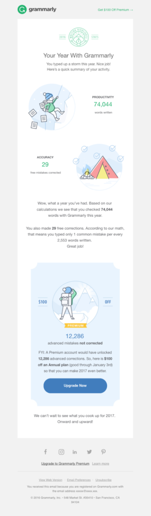
Grammarly’s upselling method is particularly human and appealing. Their “Highlights of Your Year” newsletter sends readers their yearly writing data, generating an instant feeling of familiarity and reliability that only customized email marketing can deliver.
The email campaign adheres to the brand’s design criteria with clear white space and soothing, pastel hues.
Its layout guides the reader through a list of their personal “achievements” along with a CTA button that urges them to upgrade to the Premium account.
2. Apple AirPods Pro
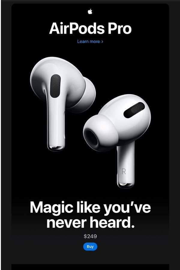
Apple’s email product promotion for the AirPods Pro earbuds is consistent with the brand’s style and visual characteristics – it’s essential, primarily monochromatic, and has a vast, high-quality photo of the product dominating the main page.
This email campaign has a specified character set and table roles in assisting readers in reading it. It also features well-structured headers that aid users in navigating the text.
Contrasting graphics stand out against the dark backdrop, and various calls to action, such as “Learn More,” “Buy,” “Compare models,” and “Find a shop,” direct readers to different phases of the sales funnel, depending on how much more information they require to make a purchase.
3. Shwood & Stanley
In the realm of e-commerce, the quality of images in your emails may have a significant influence on whether receivers stick around to read the entire email or immediately press the “delete” button. Shwood & Stanley’s email emphasizes the importance of high-quality images. We like the textured backdrops and how they play with lists and shadows.
4. BluDot
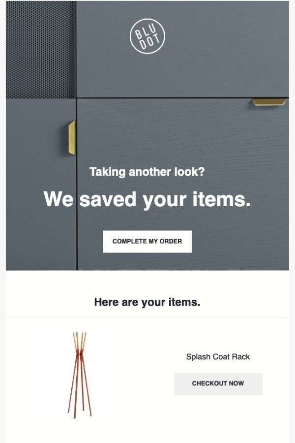
Blu Dot, home décor and furniture firm, sends a brief cart abandonment email campaign to visitors looking at products on their e-commerce site. It comprises a neutral-colored piece of furniture as the backdrop, coupled with simple lines that read, “Taking another look? We stored your items,” coupled with a CTA to “Complete My Order.”
Their email marketing does a good job reminding the reader of the goods they looked at and then abandoned in their carts. The email displays the goods with a direct “Checkout” button just below the CTA.
5. Uber
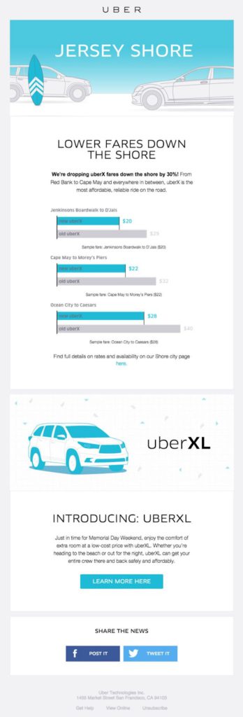
As marketers, we understand that charts and graphs may be an effective method to convey information. But what about embedding graphs in emails?
Uber’s email design expertly displays the potential of data visualization using basic graphs. Because of a vivid blue hue, receivers may quickly grasp how the rates have changed. Uber created a few comparable images rather than relying on words to convey their cheaper charges.
6. Bose
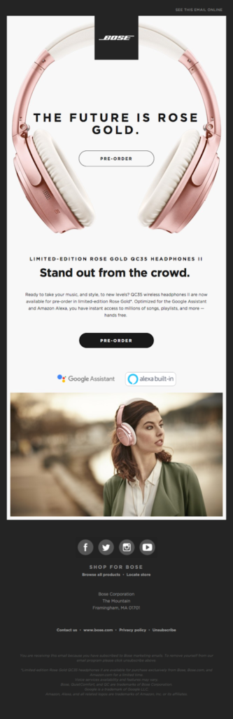
This product upgrade email campaign focuses on Bose’s rose gold QC35 headphones, which promote a limited edition of the product by displaying high-quality photos as soon as the recipient opens their email.
All of this is encased in a clean, one-column design, that centers on two photographs and a piece of content, all framed by a dark background.
The mobile responsive version of the email campaign is identical to the desktop version and is an excellent example of a design successfully adapted to portable devices.
7. Suitcase
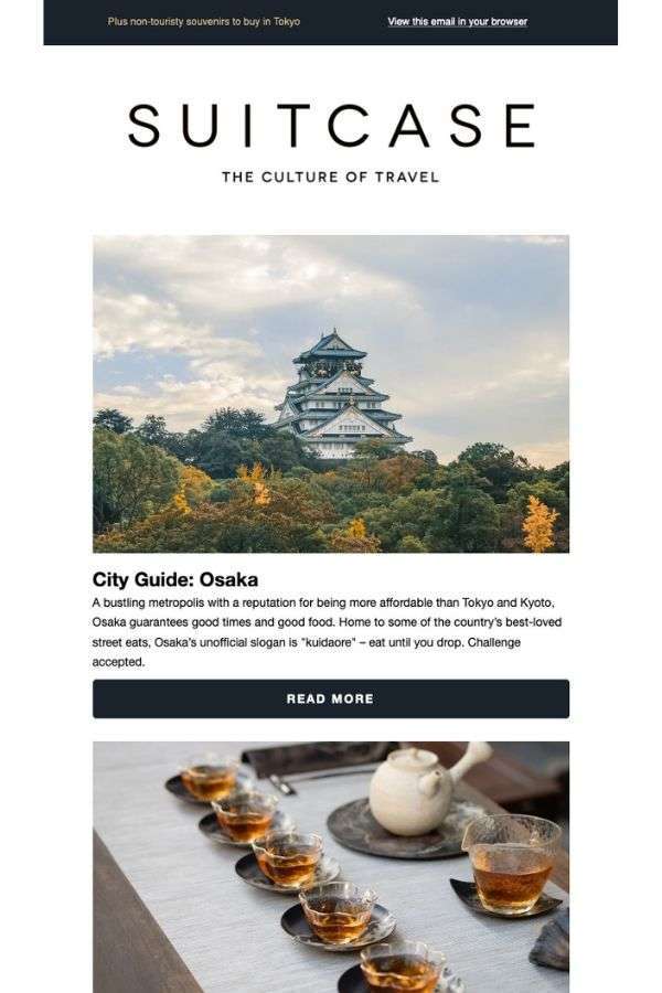
Suitcase’s “The New Japanese Capital of Cool” ad takes an entirely different approach to a travel newsletter. It promotes Osaka’s sights and splendors in a single-column style with huge photographs and snippets of prose, with an invitation to read more. The design is more conservative, relying on the white backdrop to allow the pieces to stand out. The message concludes with a bold “Read More” call-to-action for the brand’s new cities issue.
8. Dosh
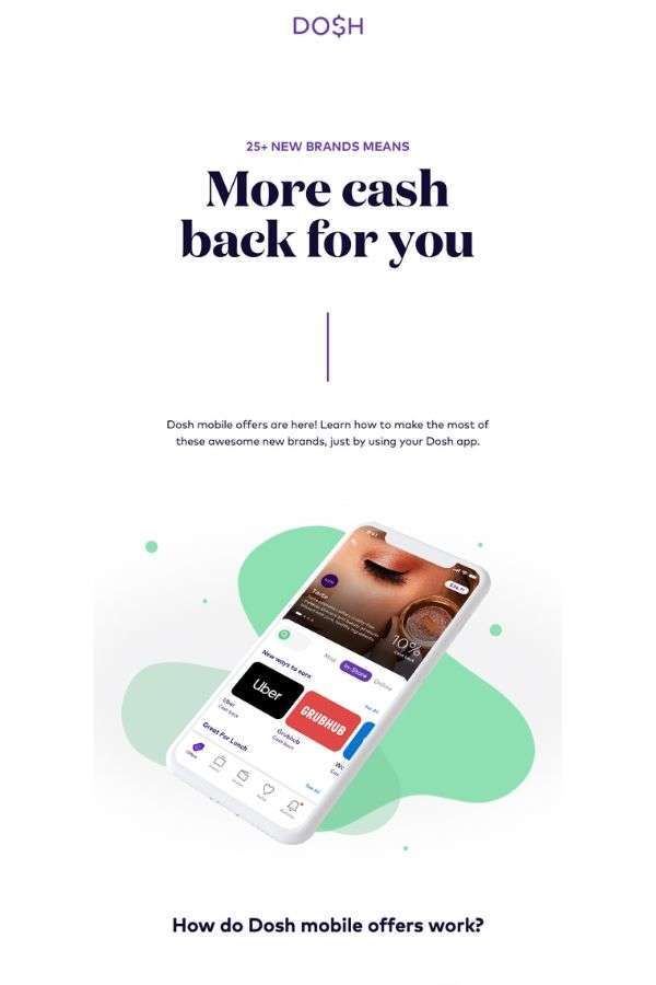
Dosh’s growth of brands inside their retail offering accompanied an email campaign reminding clients that they are eligible for a rebate.
They accomplished this by providing a message in a long-form email with plenty of white space and vibrant colors. The opening graphic is followed by a visual explanation of how their mobile deals operate, as well as a list of stores where clients may earn their cashback.
9. Apple
Apple’s Christmas email combines white space with product displays to offer a unique experience. While the goods all have a similar color palette, their location makes them stand out. Apple generated visual patterns that alternate throughout the email by strategically grouping the items.
10. Union Made Goods
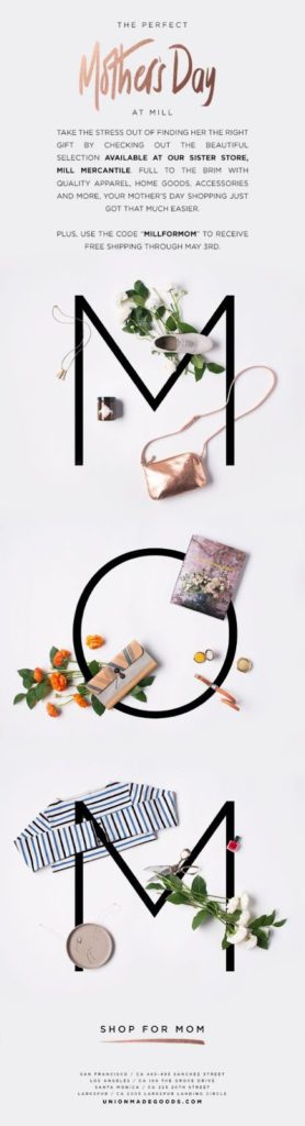
Consumers receive many emails from e-commerce companies highlighting Christmas gift ideas from their websites, and here is an example of one of these letters appropriately done. They went with a basic design that makes good use of both color and white space, letting the writing and photos stand out a little more.
11. Great Western Railway
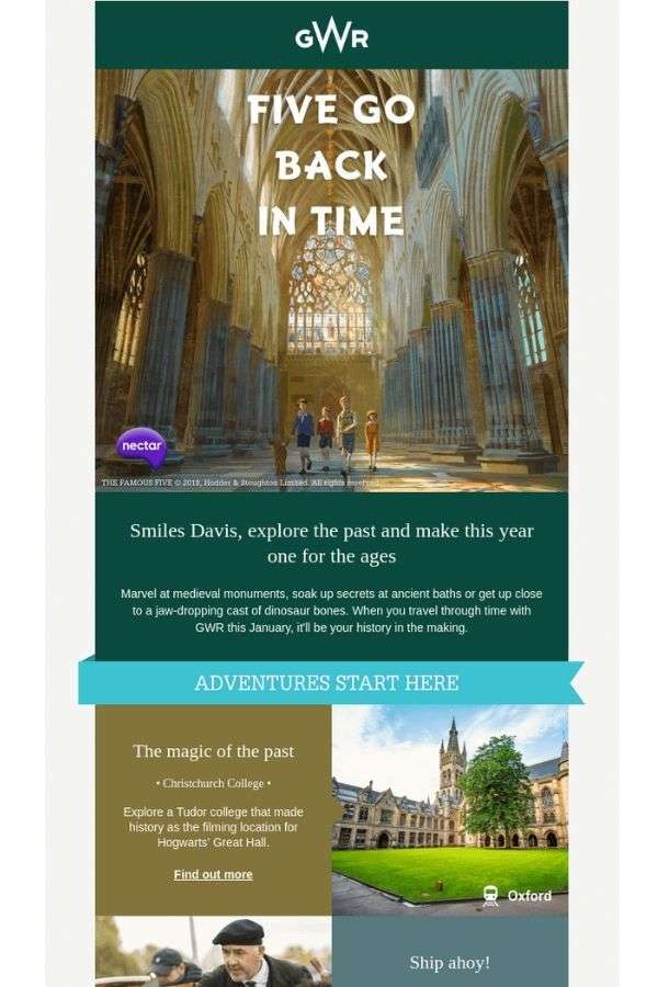
GWR’s lengthy email promotes their particular train route that travels along historic lines. This single newsletter has a lot of information, including images of landmarks and a narrative of the experience from beginning to end.
The email, which employs a single and two-column style interchangeably, includes various graphics and complementary colors, quotations, CTA links, and rates for different bookings. Despite its comprehensiveness, the newsletter does not overwhelm or seem crowded. It takes time to convey its tale, and the layout aids this endeavor.
12. Great Jones’s Salt & Pepper
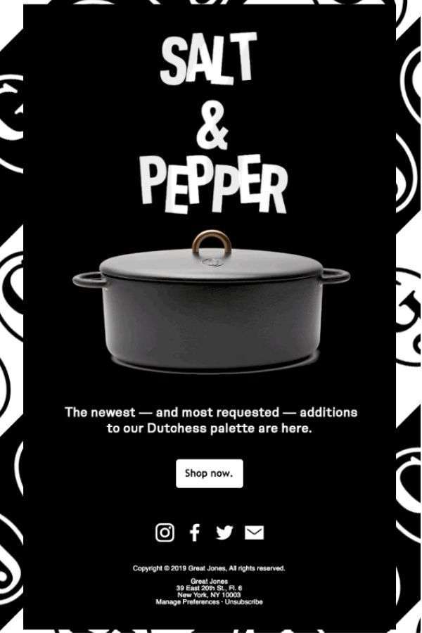
Great Jones focuses on household items such as kitchen appliances and inventories. Their Salt & Pepper product launch ad is based on simplicity and attention-grabbing animation.
The basic email consists of a dancing animation that alternates between the white and black pots –”salt” and “pepper” – a brief proclamation of new product arrival and a “Shop now” CTA.
Great Jones’ email marketing advertises a single product and considers customers’ limited attention span. As a result, their correspondence is shockingly brief and straightforward. Because the promotion is entirely about the product, the item in question has nothing to compete with.
13. Frame.io
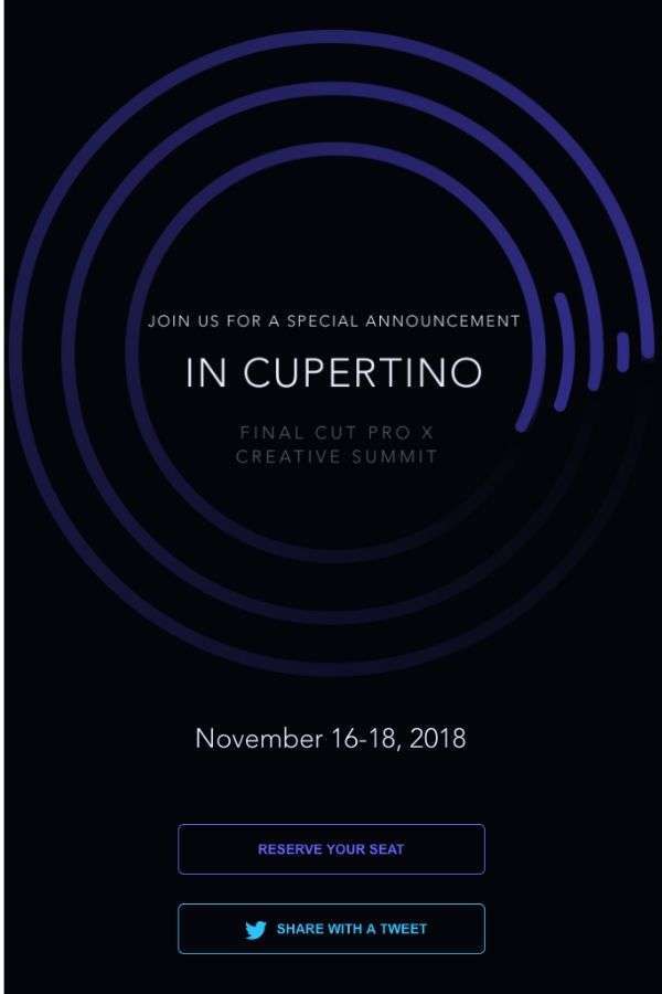
Frame.io’s email campaign about a product launch during a conference is another simple and direct marketing experiment. With a simple CTA, consumers are urged to book their seats. A solid black background serves as a backdrop for a neon blue ring of circles, emphasizing the Final Cut Pro X Creative Summit invitation.
14. WeTransfer
WeTransfer, a file transfer service, upsells its bandwidth plan with a specially crafted email campaign that promotes the WeTransfer Plus subscription.
They provide a little extra – a video wallpaper to sweeten the sale. They sell this using a magazine-style campaign with a lot of white space and a few bold colors to make everything else stand out. A single “call-to-action” button encourages readers to learn more about the bundle and make an educated purchase.
15. Asics
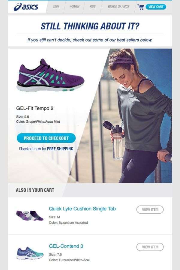
With a brilliantly lighted design and enticing language, ASICS, the exercise, and fitness brand remind customers who have looked at things on their site, placed them in a shopping cart, and abandoned them of their planned purchases.
“Are you still thinking about it?” asks ASICS’ cart abandonment email campaign, highlighting the product the receiver was browsing for as well as CTAs encouraging them to make the purchase. A list of the e-store’s bestsellers is just under it that the brand recommends as acceptable substitutes.
Key Takeaways
- After you’ve determined the outcome and goals you want to achieve, you must deliberate how to deliver value to your buyer personas so that they convert, engage, or take the action you want them to take.
- Clearly define what you want your email recipients to remember about you.
- Marketing emails must be tailored to the reader and offer content that is pertinent to them.
- Keep the design elements minimal but focus on the message being conveyed through the email.
- Including aesthetically pleasing, high-quality images or bold typographic letters will grab the reader’s attention and direct them toward the call to action.
Getting Inspired from these Best Email Designs
Responsive email designs deliver material tailored to the user’s preferred device. An email design with high-quality images, bold CTAs, white or negative space, a minimum amount of copy, and easy-to-read fonts is bound to get noticed by the viewer.
Businesses can use responsive design to send email templates that alter depending on the screen size of the recipient. If you are unsure what content should be included, you can try out our email writing services.
FAQs
The best email marketing design should have strong subject lines, aesthetically pleasing images and illustrations, and a unique way of narrating the story.
Pinterest, Really Good Emails, and Canva are some excellent sources for good email designs.
HubSpot, ZURB ink, Litmus, Canva, and many more companies offer the best email templates depending on your purpose.
Beefree, Unlayer, and Stripo are some of the leading names that provide beautiful email templates for free.
Latest Blogs
Explore how Google’s 2025 AI search updates triggered ranking chaos. Learn actionable strategies to adapt your SEO for AI Overviews, zero-click searches, and SERP volatility. Stay ahead now.
Learn how to rank on AI search engines like ChatGPT, Perplexity, and Gemini by optimizing your content for authority, structure, and relevance. Stay ahead in AI-driven search with this strategic guide.
Explore the best healthcare SEO services for your medical practice. Improve online visibility and effectively reach more patients in need of your services.
Get your hands on the latest news!

Similar Posts

Design
7 mins read
15 Best Firms Offering Design Services in India

Design
5 mins read
All You Need to Know About Data-Driven Design

Design
6 mins read