6 Tips to Create an Eye-Catching Presentation Cover Page

Table of Contents
- What Is a Presentation Cover Page?
- 6 Tips to Create a Winning Presentation Cover Page
- Key Takeaways
- Conclusion
- FAQs
A good presentation cover page is just as important as the content inside it, but a great one will also draw attention and give your presentation an extra lift. By drawing attention to your presentation’s topic upfront, you can compel your audience to want to know more about what you have to say.
The cover page is one of the first things the audience will notice about your presentation. So, you must make a good first impression, and immediately. An effective PowerPoint cover page can set the tone for your entire presentation, and engage the audience from the get-go. And to get better at creating presentation cover page designs, you need to understand what an ideal presentation cover page is.

What Is a Presentation Cover Page?
When it comes to presentations, don’t underestimate the value of a powerful and captivating title slide. It’s one of the easiest and quickest ways to get people’s attention. A sound presentation cover page design helps achieve two crucial goals.
- Clarity in terms of the topic
- A strong introduction to your brand
In a nutshell, your PowerPoint cover page (or any other presentation cover page for that matter) exposes your viewers to the main points of your presentation. It should also pique their interest and make them want to hear more. Now, let’s move on and understand the steps involved in creating a stunning cover page.
6 Tips to Create a Winning Presentation Cover Page
The cover page of the presentation is often the first clue that people get about what you are going to speak about. Therefore, you need to make sure that it’s clear, concise, and compelling. To ensure this, we have put together a few easy tips for you.
1. Come up with a catchy title
It’s ideal to come up with a title that’s plain, descriptive, and easy if you’re delivering a presentation to a bunch of people who don’t know much of what you’re going to say. If you’re having trouble cutting down a long title, you can include a subtitle underneath that explains what you’ll be delivering information on.
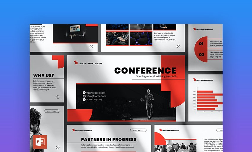
You can get away with anything more intriguing or artistic, depending on the topic of your presentation, but make sure your title is not too obscure or incomprehensible. For example, the title in the below-mentioned slide is easy to understand and captivating as well. Notice how the word “Conference” has been highlighted and is followed by supplementary text underneath.
2. Check the overall tone
Why does the tone of your presentation, specifically the cover page, matter so much?
The cover page paves the way for the rest of your presentation, and audiences are quick enough to decide whether they want to continue watching the presentation judging by its tone. But what do we mean by tone? In this context, tone means the overall style of the presentation.
A presentation cover page must dictate the objective in a professional yet quirky manner to attract and retain your audience’s attention. It should represent the worthiness and quality of your overall content.
Apart from that, recently, aesthetics have become the topmost priority for many marketers. We, as humans, find aesthetics in everything, and easily get attracted to it. That’s why having an informative yet aesthetic cover page can set you apart from your competitors.
Here’s an example of how tone and aesthetics should go together in a presentation cover page design.

3. Humanize your cover page
Humans are emotional beings. A good presentation page can do more than just present the work; it can set an emotional tone for the rest of the site.
You want to be able to wow people with your presentation, but that doesn’t mean you need to be flashy, unemotional, or insensitive. On the contrary, if you create a cover page that uses emotions to get people excited about your work, nothing like it. They will not only know what to expect but will also be able to connect with your presentation on a deeper level.
Let’s look at an example of an emotion-driven approach for presentation cover pages.
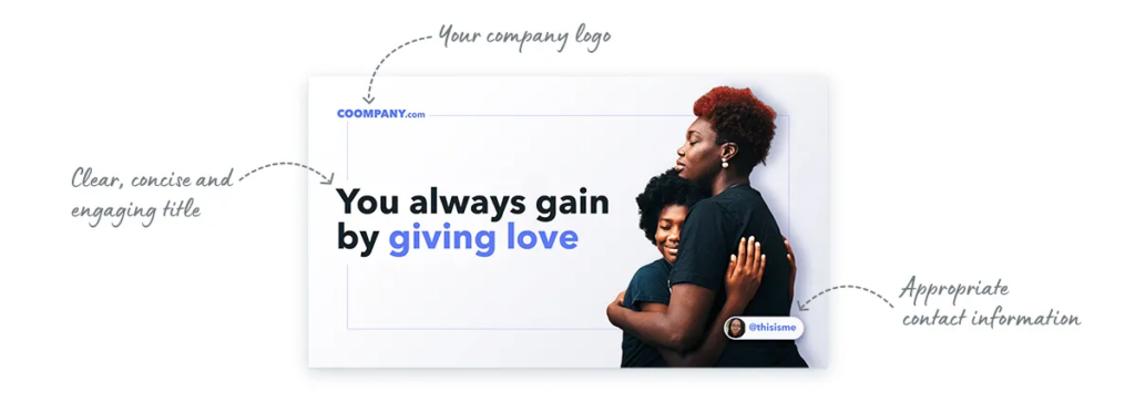
4. Shed some light on your brand
While it’s great to illustrate your objective on the cover page, it is also equally crucial to throw some light on your brand. In general, the opening page of your deck should convey what your company does. After all, it’s the first impression people will have of your company or project.
While you may be tempted to include your own photo and contact information on the cover page, it may be more appropriate to emphasize your team or brand instead.
Here’s a brilliant example.

5. Keep it simple
As a content creator, you must make presentation cover page designs that educate and inform your audiences. You can do so effectively by going minimalistic.
Having too many pictures and words can distract the audience and confuse them. That is why having a minimal background is extremely important. It also lends professional and clarity to your presentation.
Check out this example to get a sense of what a minimalistic cover page should look like.

6. Use bold fonts
Last but not least, you should use bold fonts to display your ideas perfectly on the cover page. Strong fonts that include letters and numbers will attract eyeballs immediately.
Therefore, whenever you’re preparing a presentation cover page design, make sure you’re using bold and simple fonts, and not complex and thin fonts.
Here’s an example of a presentation cover page that has a bold font.

Key Takeaways
- A presentation cover page is a basis on which your audience decides whether to give their attention to the rest of the deck.
- To create a stunning cover page for your presentation, you need to ensure it has a catchy and short title.
- The cover page should go well with your brand’s tonality.
- Ensure you add emotions to attract your readers.
- Add a little about your brand/business as well.
- Follow a coherent tone for the cover page, which can be carried forward to the rest of the presentation.
- Smartly use bold fonts to capture the audience’s attention.
Conclusion
The cover page of your presentation is the first thing your audience will see. So, it’s important to make a great first impression with it. A well-designed presentation cover page can highlight the topics of your presentation and pique the interest of your audience. You’ll want to keep the design simple and clean.
In order to create a stunning cover page for your presentation, there are certain things you need to take care of and implement. For starters, you can keep your title short, and if there’s something more you want to add to the title, you can insert it as a subhead. Next, you should add some emotion to your cover page to gain your viewer’s attention. Apart from this, you should try and experiment with bold fonts, as they catch the viewer’s attention immediately.
You must also add a minimalistic background to your cover pages, as too much information and pictures can confuse the viewers. And lastly, do not forget to add information about your brand or business to get your viewers acquainted with it. Remember, a great cover page can win half of your viewer’s heart, so make sure to make it as stunning as possible.
FAQs
A presentation cover page is the first thing your viewer gets to see. Basically, it is the first slide that informs your viewers about the presentation and its objectives.
An ideal PowerPoint cover page should have a captivating title, engaging imagery, and details about the company.
For the cover page, you should use bold fonts to attract the viewer’s attention and make a lasting impact.
Yes, infographics help give viewers a clearer picture of your message. They may make them proactive listeners as well as responders.
Numbers attract viewers. So if you have statistics to back your claims, and if they’re relevant or fit the title, you should definitely go ahead and use them.
Latest Blogs
In this blog, explore the golden rules of using AI marketing tools so you can leverage the benefits to their maximum potential.
In this blog, you’ll learn how to avoid the pitfalls of SEO over-optimization while enhancing your site’s performance.
In this article, we’ll take a look at what AMP is, its advantages and disadvantages, and how it affects SEO.
Get your hands on the latest news!

Similar Posts

Blogging
10 mins read
How to Start a Successful Food Blog in 2022

Blogging
4 mins read
10 Best Translation Blogs To Follow In 2022

Blogging
11 mins read