10 Before and After Examples of the Best Logo Design
Table of Contents
- Logos and When They Need to Be Changed
- Best Logo Designs: The Before, After, and Its Impact
- Key Takeaways
- Conclusion
- FAQs
A good logo design is more than simply a catchy symbol for a company; it visually represents its fundamental values and principles. Creating a solid brand identity begins with a strong logo, which significantly impacts customers’ minds. As a result, several well-known companies have opted to create the best logo designs by tweaking their logos throughout the years to either enhance brand recognition or provide something new to the market.

The Importance of Logos
A logo is typically one of the most identifiable elements of an organization’s branding. Depending on the kind, a logo may include a character or brandmark, a symbol, or a slogan. It plays a critical part in establishing a company’s brand identity since they create a lasting impact on customers. A good logo design catches the eye, makes an excellent first impression, and leaves a lasting effect on your target audience.
Your potential consumers will be able to instantly recognize your company, product, or service if you use a logo. A popular one conveys your brand’s message while establishing an emotional connection with your target audience.
It expresses ownership, quality, and values to consumers; this is critical for the success of your business. Even though the best logo designs don’t make up the totality of your brand’s recognition, it is undeniably the most visible and instantly recognizable element. A top logo design is an excellent way to create your brand’s identity, foster customer loyalty, and distinguish yourself from the competition.
When Does a Logo Need to Be Redesigned?
In today’s highly competitive marketplace, your logo design is the first impression that people get of your business, and first impressions exist for a reason.
One of the most common reasons for redesigning your logo is to stand out from your competition. You want your logo to be memorable, original, and relevant. However, you also want to express the most important aspects of your brand through it as a business.
Companies and their logos need to evolve with the times to stay relevant. A company’s logo must be redesigned and modified to match current trends to be seen as cutting-edge and relevant. Despite all this, logo rebranding must be done cautiously since a single misstep in the rebranding process might put the company’s survival at risk in the blink of an eye.
There are many reasons you may want to rethink your logo design, and these include:
Your business scope has grown or changed
The alteration in the scope of business might be because you’ve just established a new product line, built up your headquarters, or hired more employees. If your company has grown or altered in any manner, you may want to think about updating your logo as well.
You are addressing a new audience
In addition to an existing client base, you’re eager to reach out to a new generation of customers. Redesigning your logo may be the answer to your branding woes. Your new best logo designs may help you connect with a new audience while maintaining your current consumer base if you use it correctly.
Your brand’s values or mission has changed
Your company may naturally change as it expands. A new and good logo design should represent any changes in your company’s character that you’ve discovered since its inception.
You are fighting a fresh competition
For whatever reason, you’ve suddenly found yourself up against some competition. You may either cower in fear or rise to the occasion and assert yourself. Redesigning your company’s popular logo is a great way to show your current and potential consumers that you’re up-to-date, relevant, and worth their consideration.
Your logo is outdated
If your logo is obsolete, redesign it. Not only is the design outdated, but it’s also unlikely to work with the variety of current gadgets like mobile phones, tablets, and other similar devices that will show your logo.
Best Logo Designs: The Before, After, and Its Impact
The top logo designs we see today have been created in various ways throughout the last several centuries. For many well-known companies, their original logos may no longer be relevant today, which is why these companies have reworked their old logos to keep their brand fresh.
Let’s take a closer look at some of the world’s most recognizable logos, as well as their earliest iterations.
Shell

Shell Logo Before: Source
Back in 1833, Shell started as an antique and oriental shell company. Since they began building their import and export networks, they’ve become one of today’s major energy companies.
The initial idea for their logo was an extraordinarily realistic Pecten shell. The company needed a more professional logo when it first started operating service stations in California in 1915. As a result, the Pecten shell was reimagined as a brighter, more cartoonish form. For this, red and yellow were selected to honor the state’s ties to Spain.
It’s interesting to note that the ridges present in their current logo have their origins in their first logo. As a result of the lines pointing toward the logo’s center, Shell’s brand is given a more dynamic, energetic appearance. After nine revisions to their logo, Shell settled with a more subdued color scheme in 1995, the ninth and last redesign.
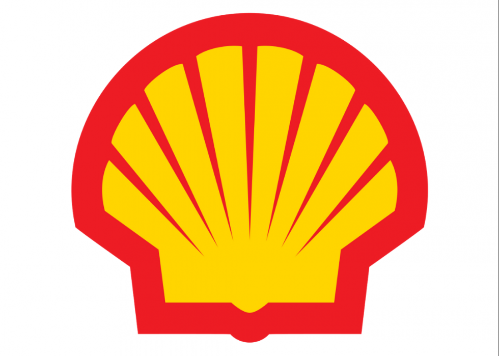
Shell After – Source
The Impact
The new design was more visually pleasing than the previous logos, and the Shell logo symbolizes the corporate quality and brilliance. Since its ninth revision, it has become one of the most recognizable logos globally and continues to engender confidence in the company.
Levi’s
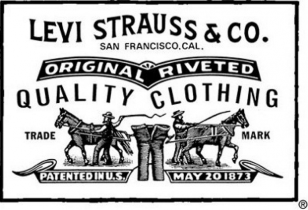
Levis Logo Before – Source
In 1853, Levi Strauss & Co. was the first dry goods wholesale business in California. For the next 20 years, the company’s concentration was on blue jeans, which they patented. A smaller version of their earliest logo in 1886 is still seen sewn onto a few of their most well-known denim items to retain the original logo. When it comes to jeans, two horses failing to tear them in half still conveys their durability, just as it did in 1890.
Today, rated as one of the top logo designs, Levi’s current logo is modest and simple enough to print plainly on a one-centimeter-long label. It has been almost a century since Levi’s first began, and the brand name has been reduced to a minimum.
Because red is one of the most recognizable hues, it’s easily noticeable. In 1967, Levi’s introduced the now-iconic logo that appears on the back pocket of every pair of this brand’s jeans. The new logo, created by Walter Landor and Associates, was intended to communicate a young but ageless sense to the business.
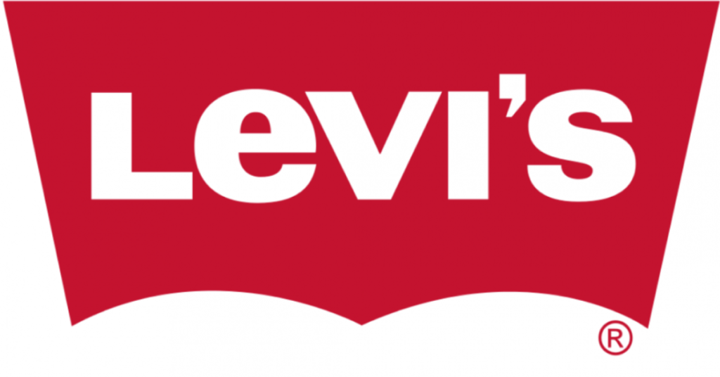
Levi’s Logo After – Source
The Impact
Even without the company’s name, the new Levi’s logo is easily recognizable because of the red batwing motif that acts as a unique identification. Brands may benefit from creatively using trademarks and copyright logos to extend their longevity, as has Levi’s.
Starbucks
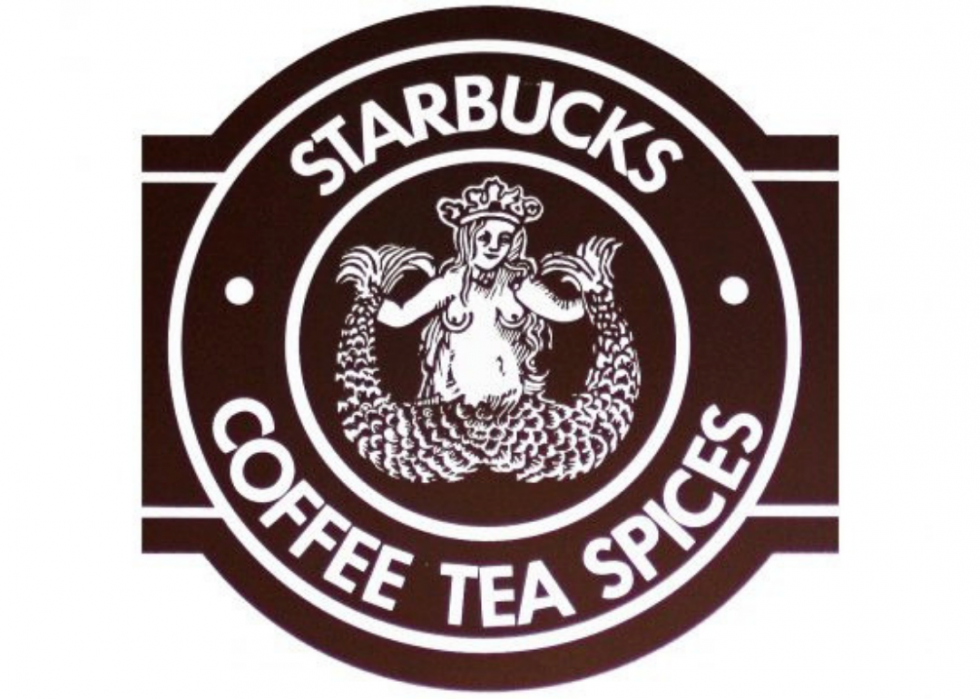
Starbucks Logo Before – Source
Starbucks should always be included when discussing the development of prominent businesses’ logos: no coffee producer or retailer comes close to being as iconic as the 1971-founded company. The logo was inspired by the 16th-century depiction of a two-tailed mermaid by Terry Heckler. It wasn’t until 1987 that designers came up with the notion of covering the mermaid’s breasts with her long hair and introducing their trademark green hue.
The company reduced the size of its logo since it had gained a sufficient following. They deleted their brand name and replaced it with a monotone green color scheme when they decided to rebrand. Although simplified, the original mermaid is still present in the company’s logo and branding.
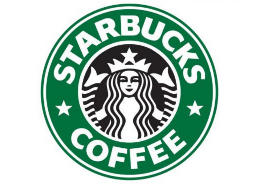
Starbucks Logo After – Source
The Impact
As of 2011, Starbucks had become a household brand, and consumers instantly recognized its distinctive green logo.
Microsoft
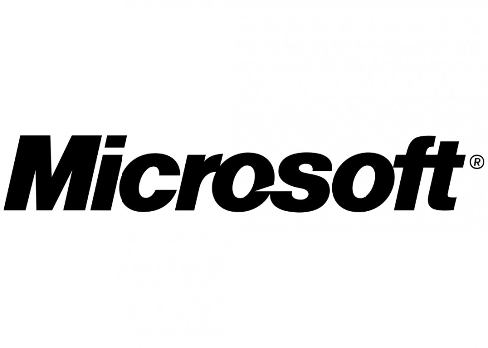
Microsoft Logo Before – Source
In 1975, Paul Allen and Bill Gates were widely believed to have collaborated on Microsoft’s logo design. Since Scott Baker introduced it in 1987, the multinational technology company’s logo has remained primarily unchanged.
The original logo had an arrow positioned between the letters O and S that symbolizes movement and speed in an italic form. Today, Microsoft’s current logo, has four colored squares intended to represent the company’s diverse array of products.
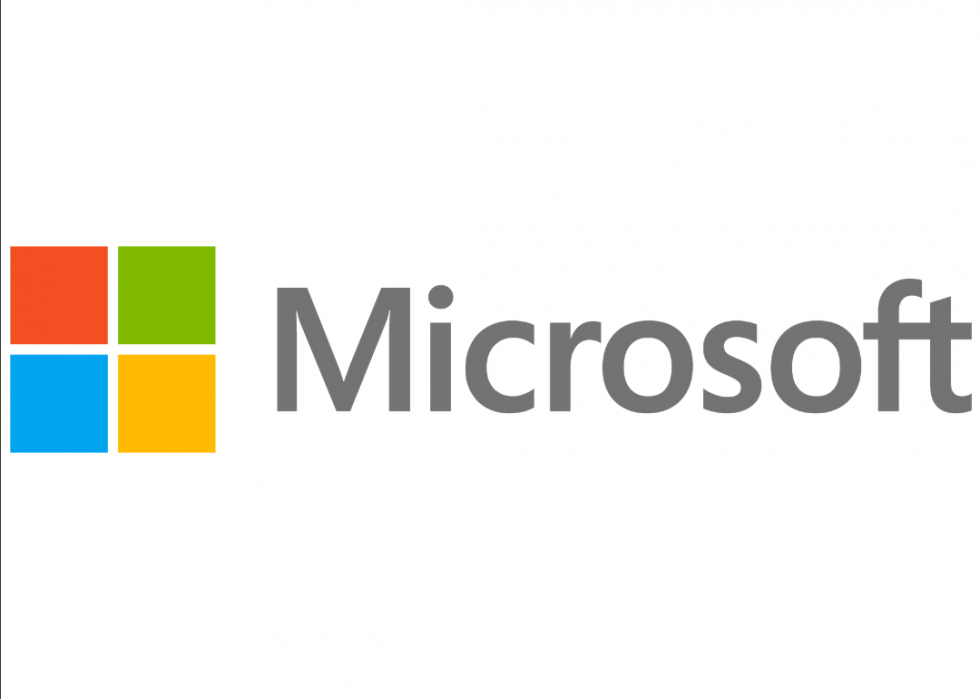
Microsoft Logo After – Source
The Impact
Despite no significant alterations, using the Segoe typeface instead of Helvetica for the Microsoft logo since 2015 has improved the company’s visual identity and the transition from a more traditional interface to a more contemporary one.
Adidas
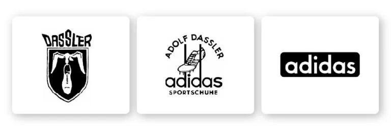
Adidas Logo Before – Source
Adidas logo’s beginnings may be traced back to 1924 when it was first created in Germany. Adolf and Rudolf, the two founders of Adidas, were featured on its initial emblem with a bird carrying a boot displayed beneath it. Although the brothers parted ways in 1949, the firm began using “Adidas” instead.
The three stripes were introduced to the logo in 1971, and they have been there ever since. The renowned “trefoil” emblem was introduced in 1971 when Adidas expanded into clothing. After that, the three bars first appeared in 1997, rotated by 30 degrees to represent a mountain. It was only after 2005 the brand’s three bars were reduced to their most basic and recognizable form.
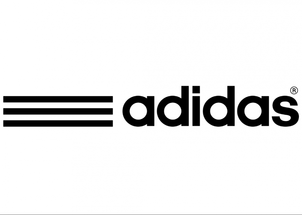
Adidas Logo After – Source
The Impact
Adidas is unquestionably one of the most successful contemporary sports companies. Its success may be attributed to Adidas’ three stripes and associated emblems.
Pepsi
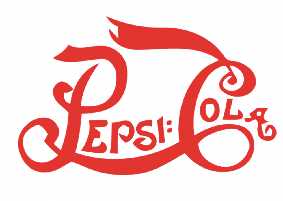
Pepsi Logo Before – Source
All branding specialists know the Pepsi logo evolution history, covering 122 years and 12 redesigns. While employing the wordmark logo from 1898 to 1940, the brand used red to keep its images looking fresh.
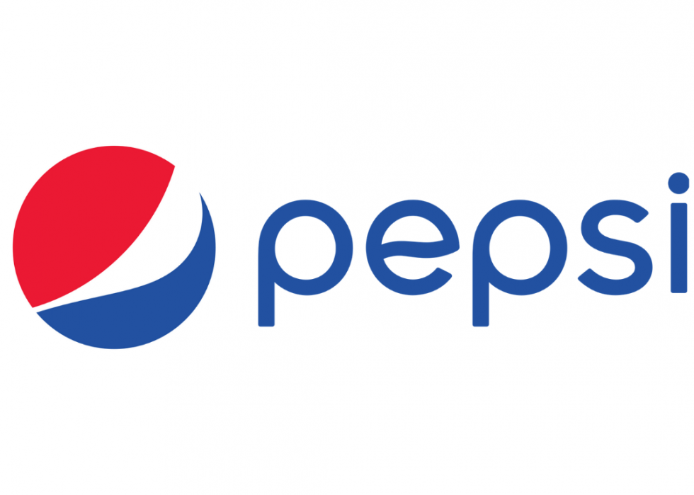
The company’s now-iconic red, white, and navy blue stripes were not introduced until the 1940s. Today, its wavy curves and iconic color scheme are still part of this design. Pepsi’s distinctive logo remained unchanged throughout the second part of the 20th century, despite modifications in the term Pepsi.
With the logo we see now, Pepsi launched one of its most daring redesigns to date in 2008. A new, asymmetrical wave was added to the three-toned wavy line circle emblem to make it seem more contemporary and edgy.
Pepsi Logo After – Source
The Impact
There has been a shift in the Pepsi symbol because of the changing times and new trends, making it more suited to its culture, attitude, and goals. This Pepsi logo evolution has dramatically affected the company’s logo.
Volkswagen
Volkswagen Logo Before – Source
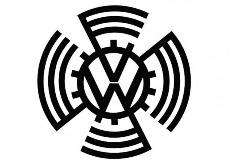
The company’s original logo from 1939 included bumpy teeth around the circle to make it appear like a gear, with long arms that rotated around the ring.
When World War II ended in 1945, the arms and gear bumps were removed from the Volkswagen emblem. In 2000, Volkswagen introduced a blue and silver design logo with three-dimensional geometric forms and more brilliant color mixes.
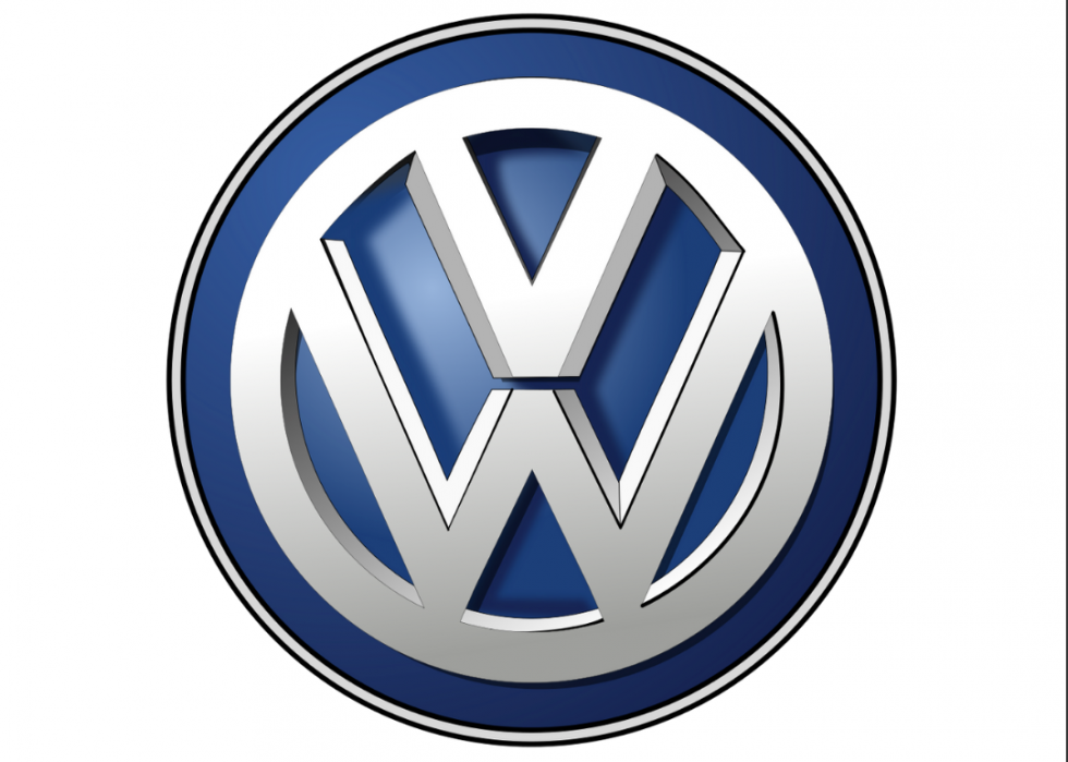
Volkswagen Logo After – Source
The Impact
An updated and digitally friendly version of Volkswagen’s famous logo has been one of the world’s most extensive branding campaigns. As a result, the previous logo has been replaced with a more modern and clear design.
Nike
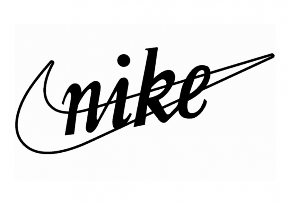
Nike Logo Before – Source
When Nike was founded in 1964, its first logo contained “BRS,” its original name, Blue Ribbon Sports. Before its iconic “swoosh” logo (1971), Nike was mainly recognized outside the athletic community while producing high-quality shoes.
Over the years, Nike’s logo has seen several revisions until it ultimately settled on the “Nike” wordmark with the iconic “swoosh” beneath it in 1978. Phil Knight withdrew the company’s name from the emblem entirely in 1995. It’s appropriate that Nike’s lone swoosh is one of the world’s most known trademarks now.
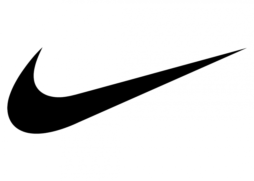
Nike Logo After – Source
The Impact
Nike is one of the most well-known brands in sportswear, with a brand worth of $27 billion just in apparel. Nike’s popular logo is the key to its worldwide dominance in athletic apparel and footwear.
Apple
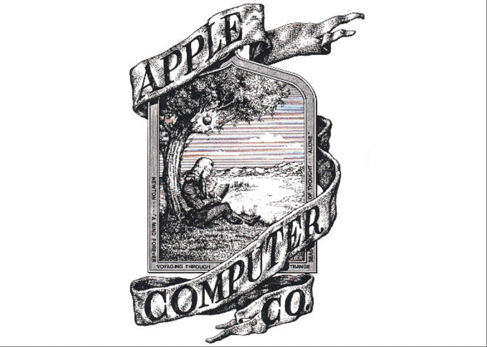
Apple Logo Before – Source
The original logo of Apple was known as the “Newton Crest logo” and featured a scientist beneath an apple tree when it first appeared in 1976. Steve Jobs transformed it to a more contemporary apple logo with rainbow stripes since it looked better as artwork.
Despite a few color and finish tweaks over the last 30 years, the company’s emblem has stayed almost unchanged. When you see the Apple, Inc. logo, you instantly think of Apple goods. This is what makes the logo so effective. As a result, there is no ambiguity as to whether or not what you’re receiving is worth the money.
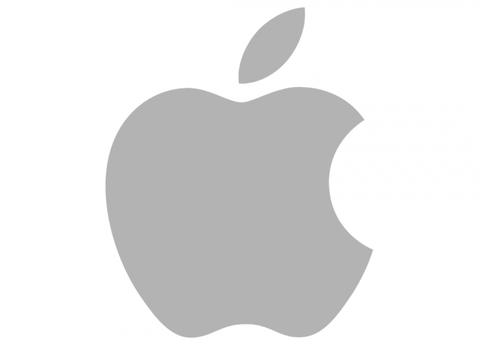
Apple Logo After – Source
The Impact
The logo was recognized for its uniqueness, which showed that a new logo design is possible. The transformation in the logo is widely regarded as one of the best and most recognizable logos in the world.
KFC
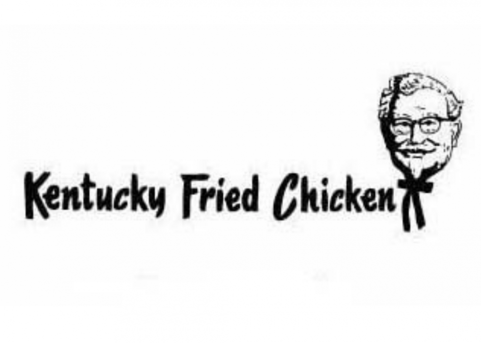
KFC Logo Before – Source
Colonel Sanders’ visage appeared in black and white on the first Kentucky Fried Chicken logo, designed in 1952. As one of the most recognized food logos in the world today, it’s also notable that it has a company’s full name on the badge.
In 1991, the logo was updated to the now-famous KFC. In addition, the red stripes and trademark red hue were added to the emblem. When it comes to its present logo, color psychology suggests that it’s friendly and inviting.
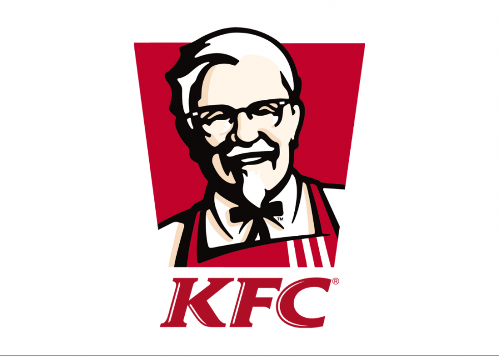
KFC Logo After – Source
The Impact
One glance at the logo is sufficient to inform you about its nature and mission.
Key Takeaways
- It is not always essential to redesign a brand, and choosing to redesign is mostly not a simple option.
- Redesigning takes careful deliberation, and when the situation calls for it, it might seem to be a frightening and challenging assignment for many experts.
- A logo change isn’t something that most businesses prioritize, but it may be well worth it if the results are excellent.
- Great logos have a significant influence on the performance of your business, and a good makeover will almost certainly be worth every penny spent.
- Most iconic logos have only a design and no text.
Conclusion
A logo serves as a silent ambassador for your brand, and the best logo designs elicit emotional responses from the consumer. It’s worth keeping up with the time, people’s taste, and when the circumstances necessitate the acquisition of fresher, more appealing, and eye-catching logos. It is well worth the expense to design a logo for your company that is appropriate and functional while maintaining its distinctive identity.
FAQs
Big businesses continuously adapt to newer methods to keep up with their ambitions and battle the competition in novel ways.
The success of a brand depends on its ability to be recognized. A well-redesigned logo breathes fresh life into your brand and reinforces its reputation.
A logo makeover is a significant alteration to the present design. It can incorporate a new color scheme, font, and design elements like shapes and symbols and alter how their brand’s name is presented. It also necessitates reexamining the core message conveyed by your logo.
A shift in the product line, addressing a new audience, and keeping your business updated necessitates a logo redesign. Redesigning your logo demonstrates your commitment to staying abreast of the latest trends in the industry.
Redesigning your logo is always a custom project and the price would depend on the problem, industry, style, technique, and many other factors.
Latest Blogs
Explore how Google’s 2025 AI search updates triggered ranking chaos. Learn actionable strategies to adapt your SEO for AI Overviews, zero-click searches, and SERP volatility. Stay ahead now.
Learn how to rank on AI search engines like ChatGPT, Perplexity, and Gemini by optimizing your content for authority, structure, and relevance. Stay ahead in AI-driven search with this strategic guide.
Explore the best healthcare SEO services for your medical practice. Improve online visibility and effectively reach more patients in need of your services.
Get your hands on the latest news!

Similar Posts

Design
7 mins read
15 Best Firms Offering Design Services in India

Design
5 mins read
All You Need to Know About Data-Driven Design

Design
6 mins read