Table of Contents
- Logo Design Tips For Beginners
- Key Takeaways
- Conclusion
- FAQs
Five seconds. That’s the attention span of a goldfish. Shorter still is the attention span of human beings. Just one glance and compelling logos should leave a lasting impression. A logo is the visual representation of a brand’s value and identity. And in a digital world cluttered with visuals, logo design tips come in handy.

Logo Design Tips For Beginners
Listed here are some things to keep in mind before and while you’re making a logo(s). You may come across logo-making tips and tricks, but we’d also like you to consider certain things while creating a logo. So, here are some essential guidelines on logos, including logo design tips for beginners
1. Understand business goals
As a person creating the visual representation of a brand, you need to have a clear understanding of the needs and goals of the brand. For this, you might have to conduct extensive research and analysis. Communicate with the client at best; use discovery calls to get the complete idea of the client’s needs and what the business is about. Remember, the logo should reflect all that.
A good logo would convey what the brand wants to say. It should be able to communicate the brand’s values and concept. Once you know the purpose of the logo, it becomes clearer and easier for you to develop a core concept of what the logo would be based on.
2. Don’t skip the basics.
Once you get a good idea of how you want the logo to look, it is best to start with a simple sketch of the basic design idea. If pen(cil) and paper are too archaic for you, go ahead with digital tools, but begin with simple strokes and sketches before other design steps. This sounds simple and could make a difference in how you finalize the idea. Once you start putting down visual ideas into a rough sketch, you’ll notice change requirements and or modifications to your first draft. Try several sketch versions of your core concept. It helps in landing on the perfect one to build upon.
3. Keep it black and white.
Before you decide on a color (or) theme, it’s always good to create a black and white version of your logo. This would come in handy for two main reasons:
One, color selection isn’t necessarily as fun as the colors look. It might take time; you might have to do a dozen rounds of exploration on the color palette before landing on the final one. Plus, overwhelmed with choices, clients could come up with as innumerable a suggestion as possible combinations on a color scheme. And you wouldn’t want too many repeat changes in your color selection, would you?.
Second, black and white and or monochrome logos become necessary when the creative demands it. For times when you need non-color printing of collaterals, for example. Thus, it’s good to have the black and white version ready while deciding on the color version. It’s advisable to get acquainted with color psychology in branding and color emotion in logo making. Big brands across the world apply color science in their logos. For instance, red is energetic and attention-grabbing; yellow is for joy, merriness, happiness. No wonder McDonald’s logo looks the way it looks.
4. Choose typography wisely
Whether you keep the logo consisting only of wordmarks or combined with an icon(s), make sure you use the typography so that it builds up and does not tear down the effectiveness of the visual symbol of the logo. Make sure that the typography matches the style of the visual element. It helps a great deal if you’re acquainted with basic typography concepts. Know serif/sans serif typefaces, typographical hierarchy, scale, kerning, combination principles, etc. The typography choice and the color could break or make the logo. If the color and typeface are too loud, it’s off-putting, too subtle.
Logo design tip: The fewer the typefaces, the better it looks.
5. Simplicity is thy friend.
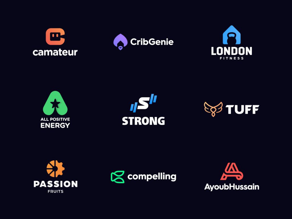
Avoid complexity. A logo should be easy to comprehend, so strive for minimalism. Use only the most relevant elements; remove the rest. Take a look at the likes of Coco Chanel’s, Target’s, Nike’s logos, and you’ll realize that less can do a lot.
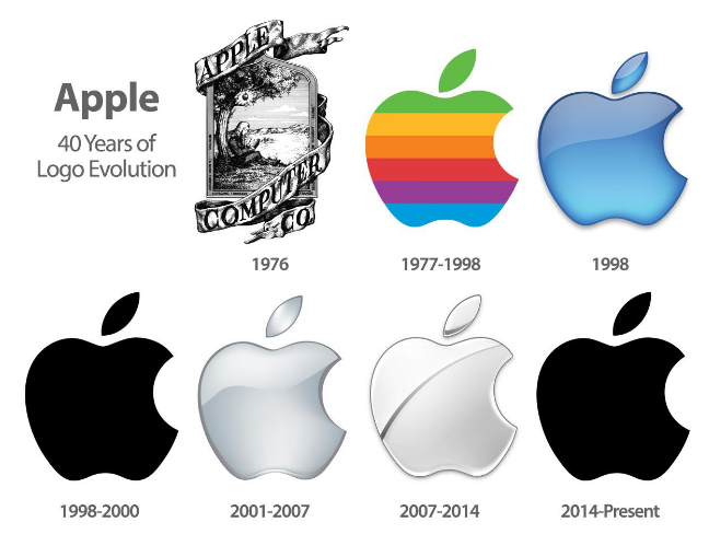
We can’t talk about minimalism in logos without referencing Apple. The tech giant started with a logo that depicts Sir Isaac Newton sitting under an apple tree, reading a book, and, of course, an apple hanging from the tree, right above Newton (and just about to fall on his head, we presume?). The imagery was encased in a frame draped with a massive slab of a ribbon sash with the word face “apple computer” on it. And as though that was not enough, some lines inscribed on the frame read like an homage to Newton, “Newton…a mind forever voyaging through.” Now that’s a lot to take in for a logo.
Cut to their present-day logo – an apple with a bite taken out of it – much more simplified and better. Take a look at logo modifications around you; several biggies are shedding as many elements as possible, going for a minimalistic look. Apple, McDonald’s, Domino’s, Pepsi, Google, Master Card, etc. Should you be taking the cue?
6. Inspiration, not duplication
“You can have moderate success by copying something else, but if you really want to knock it out of the park, you have to do something different and take chances.” – Lee Ann Womack.
It is never okay to copy others’ works when making a logo, just like any other creative work. Creativity is hard to come by at times, but that doesn’t mean we should copy (tweak, and) paste design ideas. Take inspiration from others and let that ignite the creativity in you. Learn from brands and designers, incorporate the learnings in your logo design process.
7. “Not scaling” rhymes with failing
Scalability is something you’ll have to work on while designing a logo. Logos could be used in various things, from a small business card, social media, posters to billboards and banners. Ensure that your logo will work well with any size the event demands.
While having taken care of scalability, you need to be wary of the responsiveness of logo design as well. Responsiveness simply refers to how the logo would adapt (appear) in different sizes/orientations. The logo should look the same – good – in any platform, any format.
8. Dare to do different
You don’t always have to go where the crowd is. There are guidelines but no rule that says a logo should look this way or that way. A logo is a visual representation that can take the shape of whatever and however you want it to be! Don’t be afraid to let your creativity loose. Explore every idea that comes your way. Bend the designing rules if you must; don’t be restrained by such a thing as the conventional safe-way to go about logo making. Still, it’s best to break the rules only after knowing the rules first. It’s your design, and you have the power to make it look any way you want – as long as it does the job it’s meant to do. Whatever wonder you come up with, let the logo speak for Itself. And design away with the core concept and brand identity intact.
9. You can’t forgo testing.
Once you get the first presentable logo draft, start testing it as soon as possible. One of the most important logo-making tips for beginners (and pros alike) is to test the scalability and responsiveness of the design. Check how they perform in different formats, sizes, and platforms.
Say you’ve designed the logo so that its color, icons, fonts, and other elements fit the brand persona, and the file is scalable at best. Now put it to the test. See how the logo would look real-time on different mediums. Are the elements and intricacies (if any) visible on the smallest of display surfaces? Do the color and sharpness remain as good as the original when enlarged? Is the logo responding as per screen size? You might have a really good guess about how the design would look when put to various uses, but that’s still a guess. You can never know the actual result until you test it out and make necessary tweaks as you go.
10. Trends aren’t your friends
We don’t mean to say that you should despise trends; it’s more like you can’t rely on them. Fashion comes and goes, and one trend hardly stays forever. You might come across logo design tips that tell you to check out trends. By all means, be up to date with the logo trends around you, but don’t jump into it for the sake of the fad. It will fade out soon and, along with it, the aesthetic relevancy of your logo.
A good tip for a logo is to keep it classy; one that would age well with time. Just like knowing what style goes best for you, the logo should perfectly fit into the brand sense and accentuate their voice. Remember, the goal and concept of your logo spun together with your very own creativity is always greater than the latest current trend. Good if you could make one that is trendy and would still be considered classy in the years to come, all the while enabling people to see the brand as the brand would want them to see it.
Key Takeaways
- Logos should reflect the brand value and visual identity. Before designing a logo, have a thorough understanding of the brand – what it is, what it does, and how it does it – its ethos and the business goals.
- Learn from others, take inspiration but bring out your own work. The obvious logo-making tip here’s never to copy a design (or any other creative work for that matter).
- Make a black and white version of your logo before deciding on the color(s).
- Ensure that you make a visible, scalable, and responsive logo.
- Designing is supposed to be creative. The rules are there to guide you and are by no means there to restrict you.
- Test and tweak. Testing is the key to knowing how the logo would fit under different mediums.
- You want a logo with a personality that’ll endure the test of time rather than being trendy for a while.
Conclusion
The logo design tips and tricks discussed above are merely suggestions to create a well-designed logo. Besides telling what the brand is about, a good logo would, over time, increase revenue, customer retention, and brand recognition rate. To sum up all the logo design tips shared above, the things to consider when making logos include brand objective, values, concept, scalability, responsiveness, basic design elements, testing, and blindly following trends.
Even with the best-known formula, successful branding isn’t an overnight product. And just like that, you might not immediately start creating great logos despite following logo design tips from professionals, especially if you are a beginner. Just keep at it, keep creating, make mistakes, learn from them and others and enjoy your logo-making process.
FAQs
The first and foremost step is to understand your brand and its core concept and values.
A good logo reflects the brand message, is easy to grasp, has a strong, lasting impression on the audience, and is scalable for any creative requirement.
Go for colors that are relevant to the brand. Learn the basics of color psychology and brand emotion.
Logo simplification has turned out great for many brands but not for all. Minimalism is encouraged but not at the expense of stripping vital brand elements.
They are not the most important. Instead of going with trends, create a logo that represents brand goal and identity, one that’ll stay relevant over time.
You can use software like Adobe, Photoshop, Illustrator, Canva, to name a few.
You can either approach a professional or make it yourself using logo-making apps and websites where logo templates are readily available.
Latest Blogs
Explore how Google’s 2025 AI search updates triggered ranking chaos. Learn actionable strategies to adapt your SEO for AI Overviews, zero-click searches, and SERP volatility. Stay ahead now.
Learn how to rank on AI search engines like ChatGPT, Perplexity, and Gemini by optimizing your content for authority, structure, and relevance. Stay ahead in AI-driven search with this strategic guide.
Explore the best healthcare SEO services for your medical practice. Improve online visibility and effectively reach more patients in need of your services.
Get your hands on the latest news!

Similar Posts

Design
7 mins read
15 Best Firms Offering Design Services in India

Design
5 mins read
All You Need to Know About Data-Driven Design

Design
6 mins read