Addressing Accessibility in Email Marketing: Best Practices for Marketers
Email marketing best practices include email accessibility and making your emails available to as many of your recipients as possible. You must ensure that every recipient receives and understands the message. This is regardless of any disabilities or assistive devices they may be using. Email accessibility also comes in handy when dealing with clients with poor or inadequate support.
There are certain guidelines for email marketing best practices to follow. Before sending any email, analyze the following questions:
• What’s the overall aim of the email?
• What action or follow-up is required from the recipients after reading it?
• What information should they have learned?
• How to create seamlessly, better email accessibility?
• What message or purpose is your email trying to convey?
• How does each one contribute to the goal?
Asking these questions helps you define a basic purpose for sending an email – the bare minimum that needs to be successfully communicated to the recipients.
Benefits of Email Accessibility for Organizations
1. Improves usability
Your content needs to remain easily consumable for people with disabilities. It gives a rich and enjoyable experience for the users or recipients, increasing your return on investment (ROI).
2. Wider access
The wider the access, the easier it will be to reach everyone on your list, including those with permanent disabilities or temporary impairments. When your emails are inaccessible, you automatically exclude a section of your subscribers or recipients.
3. Readable emails
Email marketing best practices include designing emails that are easy to comprehend and read. Tools like Grammarly or Hemingway may improve your writing and readability score and avoid mistakes.
Avoid long sentences, redundant words, and large blocks of text that are hard to comprehend. Using bullet points and lists will make the content easier to read and understand, triggering the recipients to take action or appropriate steps.
E-mail is arguably the best marketing channel. To make it even more effective for your brand image and business, it’s crucial to create accessible emails loved by all your recipients, including people with impairments or disabilities.
4. Customer engagement and retention
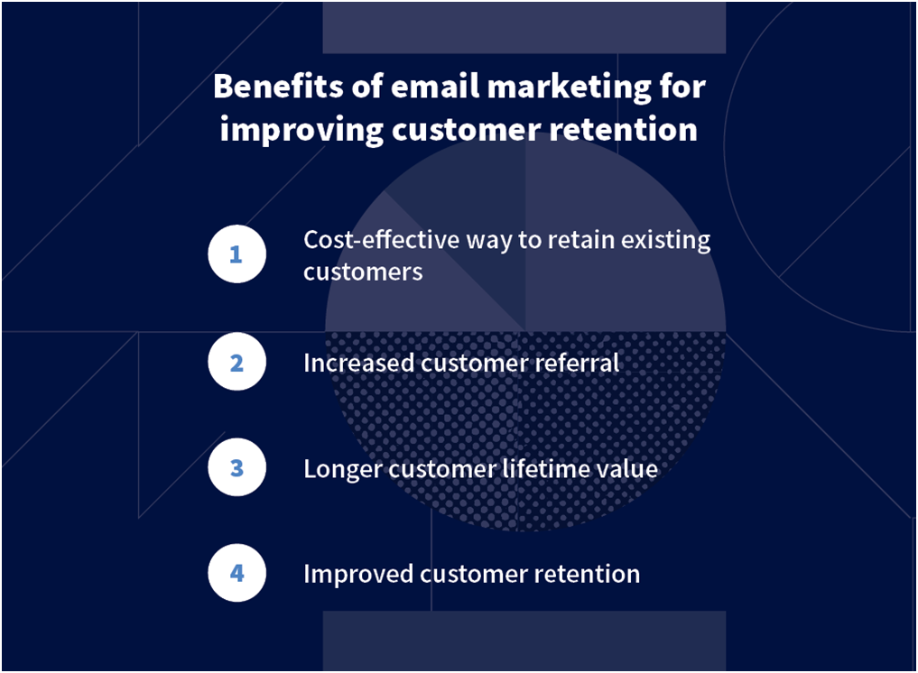
If subscribers can’t read your email content, they literally can’t engage with your emails. Additionally, they are unlikely to respond to future emails. Email marketing best practices like a smart layout, an easy-to-read email, etc., are key to customer engagement and retention.
5. Competitive edge
Email marketing best practices that provide an easier and more informative experience for the recipients will create a competitive edge over others.
6. Brand enhancement
Treating subscribers as people rather than just contacts in a database shows that you care about your customers and subscribers, enhancing your brand value. By making your emails accessible, you can show your audience that you understand them, that you support their beliefs, and that your brand offers more value.
Best Practices for Email Marketers
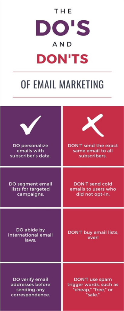
It helps you better represent and know your target audience and is an excellent marketing strategy. Accessible email marketing can help you address and understand their needs and pain points. It only takes a few basic email marketing best practices to ensure your campaign content or email is accessible to all your subscribers or recipients.
- Descriptive subject line
This is the foremost part of your message to your subscribers. Your email subject line should be brief but descriptive and give subscribers an accurate idea of the content and context of your email.
Subscriber engagement tends to increase with effective subject lines, not just for accessibility. It’s an effective subject line that influences or attracts the customers’ attention in the first instance.
- Text alignment
Although it can be aesthetically pleasing to have your text aligned in the center of the body of the email, please ensure that you left-align the text—that is, anything that’s three or more sentences long—to make it comprehendible for your subscribers or recipients.
Center-aligned text may be harder to read for people with dyslexia. You should left-align your text in languages like English that are written left to right.
One of the fundamental principles of email marketing is text alignment. It is a good practice to use simple fonts with minimal decoration. As far as the font size is concerned, a good rule of thumb is that it should be greater than or equal to 14px. Serif and Sans Serif are the most commonly used font categories in emails. While the latter is preferred by many, web-safe fonts that fall in these two categories are considered the best options.
- Logical reading order or sequential flow
Email templates commonly use tables for coding. It is a trustworthy way to make sure the email appears well across different screens including desktop, webmail, and mobile screens. This shows that content sequence is of great importance.
If some of your email recipients are using screen readers to read your email and the table’s content order is not as per left to right and top to bottom reading order, the screen reader will not read out the content the way you want it to reach your recipients. Naturally, the recipient will get confused due to the random content being readout.
- GIFs and Emojis
Flashy GIFs and Emojis can be great fun but distract the recipients from reading the main content. At times, the whole essence of an email may be missed or diluted if the email is loaded with GIFs and Emojis.
Use them sparingly and wisely, wherever required. Avoid using visuals that can cause seizures or other unwanted physical reactions.
- Templates
Subscribers rely upon on-page elements like tables and headers to determine the informational hierarchy of a web page or HTML email. Subscribers scan and navigate your content to access what’s most important to them.
- Contrasting colors
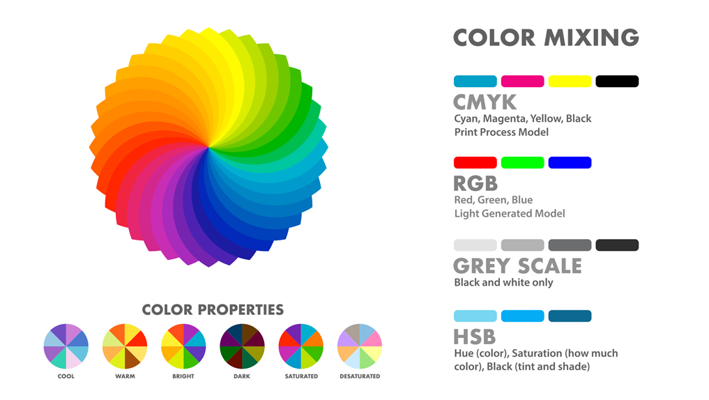
Dark text on a light background color is the easiest to read for most people. In addition to people with light sensitivities, light text on a dark background is also suitable for use with a bright screen in a dark environment.
Avoid low contrast colors that make text harder to read under poor lighting conditions like direct sunlight or brightly lit rooms.
- Plain-text email
Plain-text emails are simple and do not contain images, rich-text formatting, or embedded links. A nice, structured plain-text email is the most preferred communication among many users.
HTML emails can be colorful and attractive but have accessibility issues. However, some email service providers give you the option to auto-generate a plain-text version of your email. While these emails don’t include any fancy design elements, many people who use screen readers prefer them since they provide just the core content of your message and are ideally suitable for mass email campaigns.
Use bold text to highlight important words and phrases. Bold text looks better and makes reading much easier for dyslexic people. Avoid writing in all caps. Words with all capitalized letters may be more difficult to read using magnifying tools. They’re also harder to recognize by shape, and some screen readers may read them as acronyms, letter by letter.
- Content precision
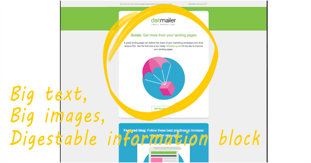
One of the email marketing best practices is to deliver appropriate and accurate content or information that benefits your subscribers and prompts them to act. You need to ensure not only the content they are reading truly adds value, but also the content has to be easy to read and comprehend.
Too much or useless information can trigger a customer to unsubscribe and, even worse, mark your emails as spam. A perfectly written email can build trust and strengthen your relationship with your subscribers or recipients.

- Emphasis on links
Emphasis on links and buttons is vital to successful email marketing campaigns. It is essential to distinguish links and buttons from the regular texts or content on the email. Highlight them in a different font style, size, or color, prompting your subscribers to click them.
On An Ending Note
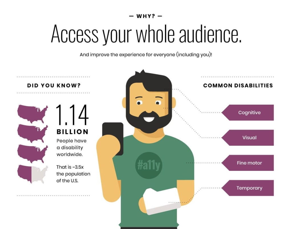
Email accessibility impacts people across all levels, and thus, you must consider easy accessibility each time you create a digital newsletter or an email marketing campaign. Almost 2 billion people worldwide live with some form of impairment or disability, and that’s quite a significant population or market share to overlook.
An inaccessible email design may lead to a disappointed or angry customer. You need to provide your images with ALT texts; else, people whose email readers reject all kinds of visuals by default will avoid seeing your smart pictures, backgrounds, and accompanying material. Therefore, you will lose or ruin your relationships with the contact or customer. Sticking to a successful proven formula and standard email marketing best practices creates trust, customer attention, and retention.
Key Takeaways
• Designing an accessible email starts with leveraging inclusive design principles and understanding how our design decisions affect users with disabilities or impairments.
• Smart color contrast is mandatory between the text and image background.
• Ensure a large enough font size is used so that it augurs well across different sections of people with disabilities or impairments.
• Avoid images of text for important information. Usage of GIFs is not a best practice; it is best to avoid email GIFs. Flashy GIFs or content may be disorienting and distracting to some users with cognitive disabilities
• Most people have a more positive reaction to plain text emails without animated GIFs. Not all GIFs are compatible. Ensure users have enough time to read content, resulting in customer conversion and retention.
FAQs
One of the crucial email marketing best practices you must remember is using descriptive headlines, as it is one of the critical email marketing subject line best practices, as the subject line is what strikes the eye first.
Next, focus on maintaining a logical structure. Use headers at frequent intervals to make the email scannable. Using color contrast is a critical email campaign best practice that makes your email stand out.
According to the World Health Organisation (WHO), over two billion people live with some form of disability like vision impairment, color blindness, and dyslexia. If your emails are not accessible, you are losing such users, creating a poor email experience for them, and leaving out a significant percentage of the population.
• Keep a simple email layout for ease of understanding.
• A left-aligned text email is considered the best for all, including people with disabilities or impairments like Dyslexia.
• Use appropriate color contrast making it more accessible for people with visual impairments like color blindness etc.
• Make links and buttons distinguishable from the rest of the content on the email.
• Make links and buttons bigger so that they are easy to identify.
• Make email content more compatible with different devices. E.g., Mobile, Desktop. Tablets, etc.
• Alternative descriptive text for images by adding alt text for images is easier for people using screen readers to identify what the image is all about
Email accessibility is the most human thing to do to create a brand value and sustainable business. Your audience is at the core of your marketing strategy. By focusing on your audience, Please ensure they can read and access emails without challenges. Such understanding makes them feel heard and valued, enhancing the trust and credibility of the organization. Promotes a positive reputation and gives fair and equitable access to and for everyone
Although the answer is yes, it is not advisable to use tables in your emails. You must use a screen reader to identify a table in your email’s code. The screen reader can tell you how many rows or columns are present in the table and give you details of each column’s positioning and content. As this is a tedious process and the recipients may not understand it fully, it is better not to use tables in your email.
Latest Blogs
Explore how Google’s 2025 AI search updates triggered ranking chaos. Learn actionable strategies to adapt your SEO for AI Overviews, zero-click searches, and SERP volatility. Stay ahead now.
Learn how to rank on AI search engines like ChatGPT, Perplexity, and Gemini by optimizing your content for authority, structure, and relevance. Stay ahead in AI-driven search with this strategic guide.
Explore the best healthcare SEO services for your medical practice. Improve online visibility and effectively reach more patients in need of your services.
Get your hands on the latest news!
Similar Posts

Email Marketing
6 mins read
11 Tips to Design Impactful Email Banners

Design
9 mins read
7 Benefits of a Simple Mailer Design
Email Marketing
7 mins read