35 Best Brand Logos That Can Serve As Design Inspiration

Table of Contents
- What Is a Logo?
- 35 Great Logo Examples to Seek Inspiration From
- Key Takeaways
- Conclusion
- FAQs
Hundreds of brands compete for the attention of customers. Each brand differentiates itself from others through a distinct brand identity design—a collection of elements that combine to create a striking mental image of the brand.
The purpose of adding colors, typography, shapes, and illustrations to a logo is to align it with the overall brand image and story. A logo is the first thing anyone would notice about your brand. Before we discuss the best brand logos, let’s understand the function of logos in a bit more detail.
What Is a Logo?
A logo is a brand stamp, symbol, icon, illustration sign, stylized word, or marking—or a combination of these—used by a company to establish its brand’s identity. A logo serves as the brand’s face, allowing customers to connect with it.
Logos create a mental image of what your business is all about. It assists customers in identifying and remembering the brand’s product and services. Whatever you call it, your logo is an essential part of your brand’s identity and represents who you are. The purpose of the logo is to do the following.
- Establish your identity as a brand
- Inform people about what you do or offer
- Distinguish yourself from competitors
- Help you look professional
- Help you attract the right customers
The term logo is derived from the Greek language and has traditionally been defined as a word, thought, or governing principle. This definition still holds true today. Plus, with the addition of digital tools to the mix, a single symbol that captures the essence of a brand is more important than ever.
So if you’ve just received a brief from a new client and you’re tapping your fingers, asking and answering questions by yourself, or you’re starting a new business, rebranding, or simply looking for logo inspiration, you’ve come to the right place.
You must not expect the perfect logo design to appear in your mind, fully formed. Seeking inspiration necessitates initiative. Every designer aspires to create a memorable, timeless logo. While every brand aims to crash its competition through outstanding branding, designing a unique and simple yet classy logo is not an easy job.
When you absorb several ideas, they will gradually come together to form the logo you desire. Unfortunately, finding logo design inspiration can sometimes be intimidating. The only trick is knowing where to look for inspiration to begin working. We’ll give you the ultimate logo inspiration in the section below.
35 Great Logo Examples to Seek Inspiration From
Let’s discuss some major elements of logo design. From each design, you can take some inspiration and apply it to your own work. As you read on, also look out for examples of some of the best logos ever.
1. Experiment with simple geometric shapes
Geometry is fundamental to human understanding, and geometrical shapes like circles, squares, rectangles, triangles, etc., create a sense of familiarity. This is because we have grown up seeing and studying geometrical shapes. Each of these geometrical shapes has a distinct personality. When incorporated into a logo design, it gets ingrained into your business.
- Squares represent dependability, stability, and order
- Circles embody wholeness and harmony
- Triangles pointing up symbolize power and growth
The symbolism or meaning that geometry imparts to the logo and brand is the most prominent reason for its universal usage in design. Simple, creative logos based on basic shapes benefit from symmetry and a structured look. These figures add an element of foundation and wholesomeness.
Geometric and creative logos can be scaled up or down effortlessly and consistently, and they have the added benefit of directly communicating the fundamental qualities of a business. Geometrical shapes are a perennial favorite and have been incorporated in some of the top brand logos because of these characteristics.
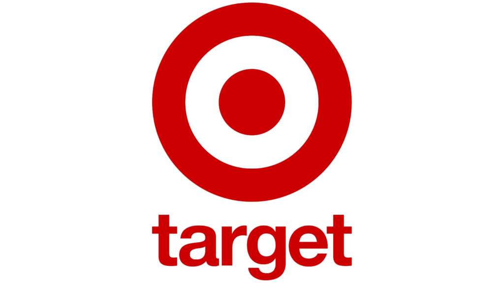
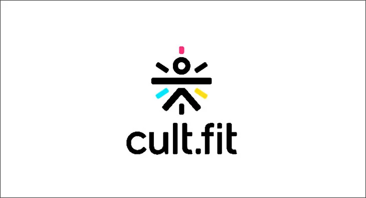
You can use a single shape, merge two different ones, or enclose one in another to create a logo. There is no limit to what you can do with basic shapes. A few simple experiments with form, depth, border thickness, and corner modification can help you generate numerous logo designs. HSBC and Target are two of the best logo examples to ignite a fire in you to experiment with geometrical shapes. National Geographic, cult.fit and Pupstar are a few more popular brand logos in this category.
- HSBC

- Target
- National Geographic

- cult.fit
- Pupstar

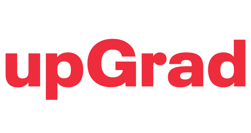
2. Stay classic with typography
One of the primary parts of a popular brand logo is its font and font size; its height, weight, kernel, and style. A clear, legible, and impactful font will not be enough if it does not align with the tone of the logo.
Some understanding of typography is required to design a good logo. The best brand logos in the world use simple typefaces like Helvetica, Univers, Avant-Garde, Gotham, Avenir Next, and Futura. These typefaces are basic and balanced. They help create a neat, modern, and honest personality for your brand.
You can start designing with one of these fonts. While you are starting your design, do adhere to one font family. Do not jump from one to another frequently. Instead, keep testing the look of your logo by varying the font size and thickness. There are different ways to incorporate typography into a logo.
The company name written in a basic font can work well as a logo. Or else, it can be enclosed in a shape. Too much text is not advisable in a logo design. The logo can also evolve as a wordmark or a combination of shapes in a wordmark. Below are a few good logo examples depicting typography.
- upGrad
- postpe
- Absolut
- CleverTap

- Blinkit
3. Embrace simplicity
When you collect different ideas, you may be tempted to cram the design with all of them. However, too many elements, shapes, and colors might seize its universal appeal and application. Your logo must be simple so that a short glimpse of it is enough to capture the image projected through it.
Simple, creative logo designs allow an onlooker to remember it long after they first saw it. Another advantage of simplicity in logo design is that it allows the logo to be used in a variety of applications, from digital to print. If you use a lot of lines, colors, gradients, and fine details in your logo, it will most likely break down and lose its integrity when scaled.
To put your design to the test, try fitting your logo into a one-inch square and judging the results. At times, it might be hard to come up with ideas to use simple shapes like a square, circle, triangle, or hexagon; try to incorporate the principle of balance in your design.
If you want your logo to be memorable and versatile, remember the adage, “Less is more.” Here are a few top brand logos that are alluring in their simplicity.
- Groww

- The Man Company
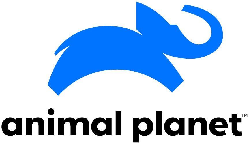
- Animal Planet
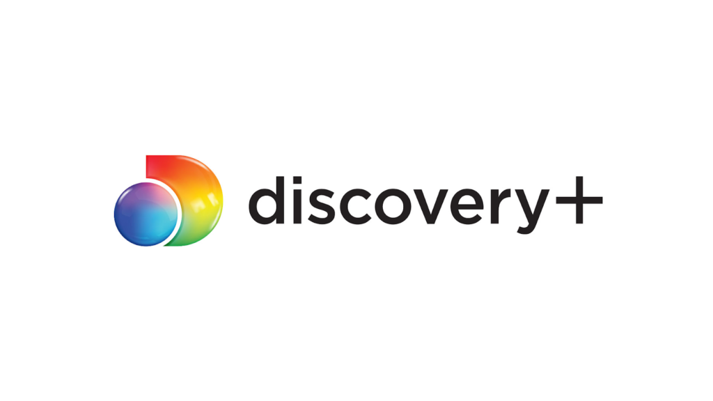
- Discovery+
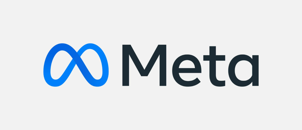
- Meta
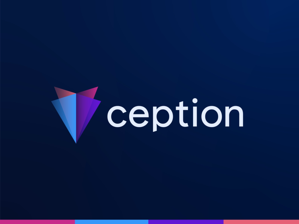
- Ception
4. Create drama with negative space
Each element in a logo design, be it a typeface, basic shape, creative illustration, or border, is placed tactically and creatively. Some space is inevitably created between these objects. Negative space is the blank or empty space in a picture or design.
Basically, negative space is crucial to arranging different elements in a logo design. It can be intentionally left around an object or created cleverly within a drawing. It ultimately helps define or highlight the shape itself.
In layperson’s terms, it’s the “unused” space in the design. When there are too many components and not enough negative space, your logo can become confusing and crowded.
Negative space provides ample opportunity to express your creativity. Additionally, negative space can be used in logo design to add meaning to an existing subject or to create subtle optical illusions in conjunction with other elements.
It draws attention to your logo by adding a unique twist to a standard typographic, geometric, or creative design. You can experiment with letters and shapes to create a logo that sticks in people’s minds by using negative space creatively. A clever logo is more memorable than a generic one, and it can help your company stand out.
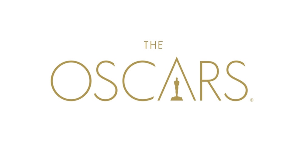
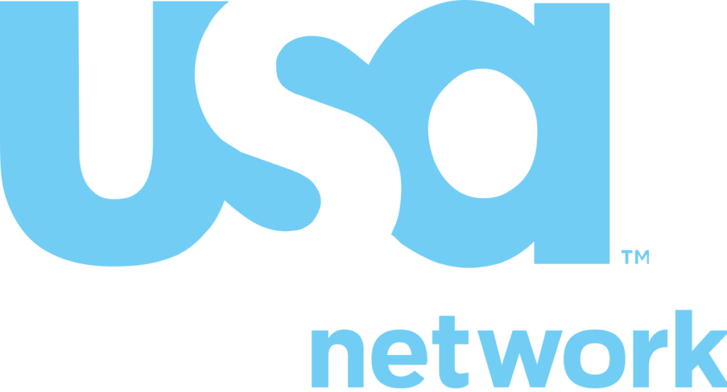
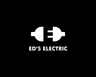
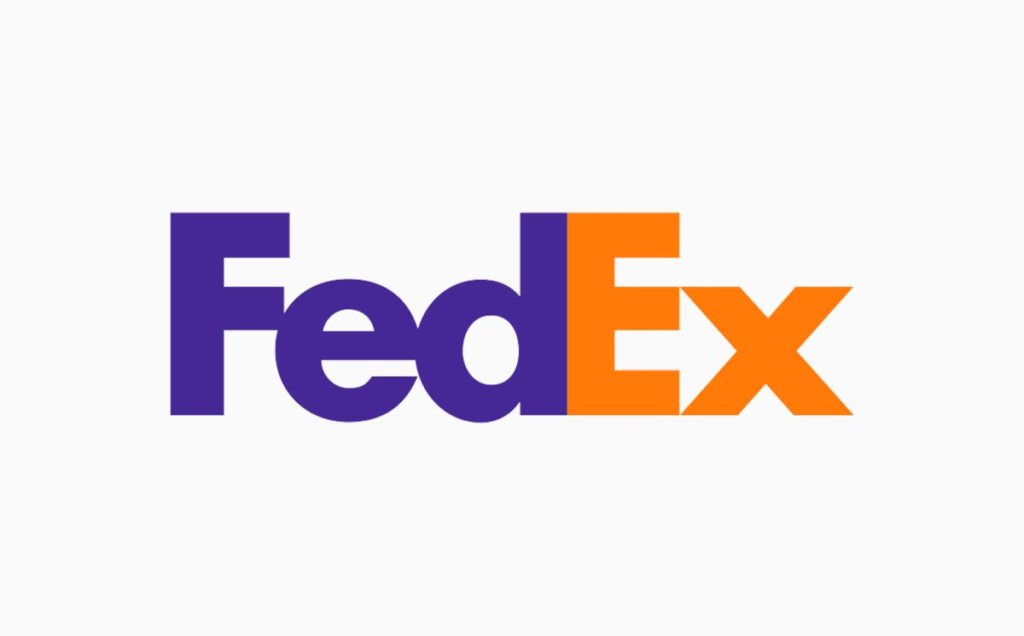
Negative space can create various optical tricks. It is a fun way to build interest in your brand, and connect with your customers and engage with them. You can derive inspiration from the following best logos ever created cleverly using negative space.
- The Oscars
- USA Network
- Batman

- Ed’s Electric
- FedEx
- NBC
5. Portray nostalgia with retro styles
You can design a retro-style logo if you are designing a logo for a brand that has a lineage. For instance, an iconic coffee shop, old bakery, family restaurant, furniture store, perfume brand, liquor company, or an old bar can have a logo set up in a retro style.
One of the first and most obvious advantages of using retro lettering, colors, and objects, is the creation of nostalgia. Making a connection with your customers is what a logo is all about. It reminds your returning customers why they love your products and shows them that they have made a wise decision. You can create a retro-styled or vintage logo design for your business using serif lettering and display fonts.
Hand-drawn logos are perhaps one of the most iconic examples of retro branding. It frequently entails highly detailed floral, curvaceous, hand-sketched shapes that resemble vintage aesthetics. These styles give the design a more authentic look and allow you to show off your artistic abilities. Natural tones, such as brown, beige, olive green, or even pale blue, are often associated with such designs.
These colors are frequently faded to give the overall logo a vintage appearance. To create a vintage logo, you must begin with a serif or slab typeface. Then draw some shapes that match the brand well: for example, you can draw curvaceous stems or petals that can encircle the typography. You can add a rustic, grainy, or rough texture to complement the overall feel of the logo design. Listed below are some great logo examples of vintage design.
- Newstel

- Ladurée
- Jack Daniel’s
6. Play with shapes, colors, and handwritten letters
You can get playful while designing pun-intended logos. It requires some skill to merge basic shapes and create enticing imagery. These logos can be impactful and memorable if they gel well with the brand name and its services.
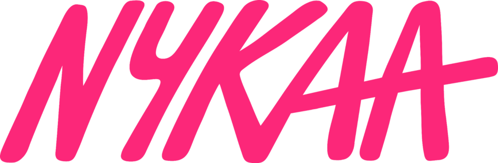
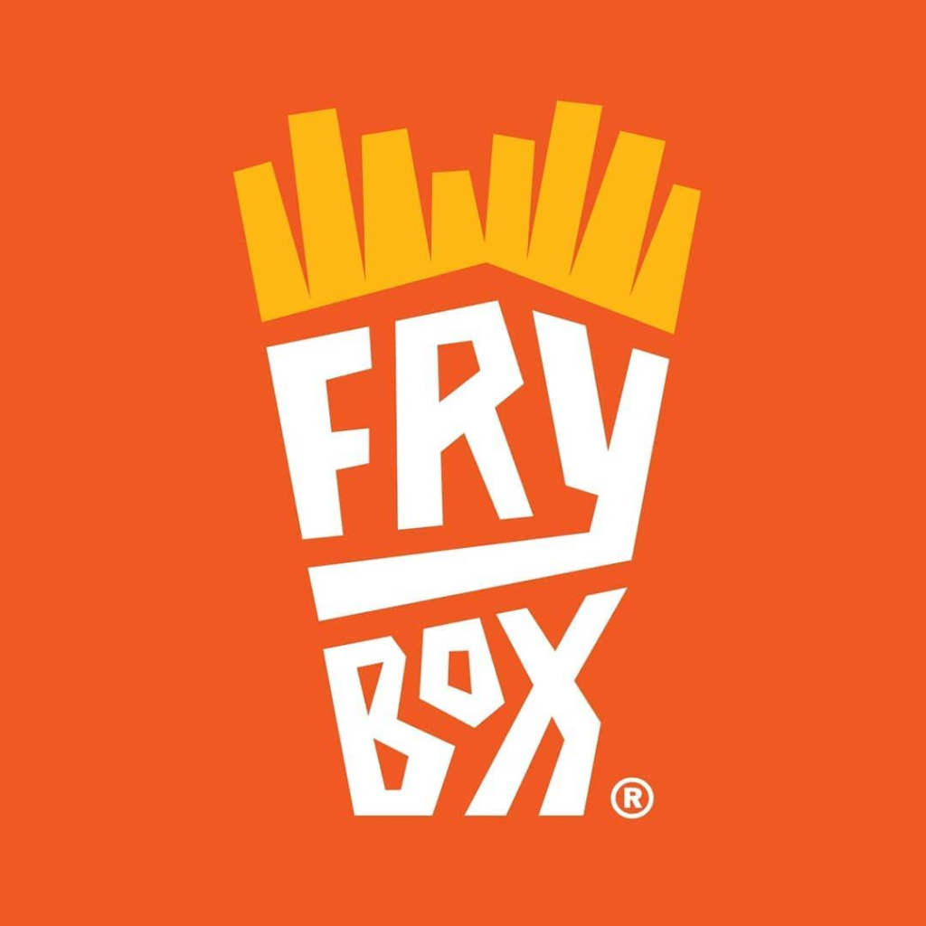
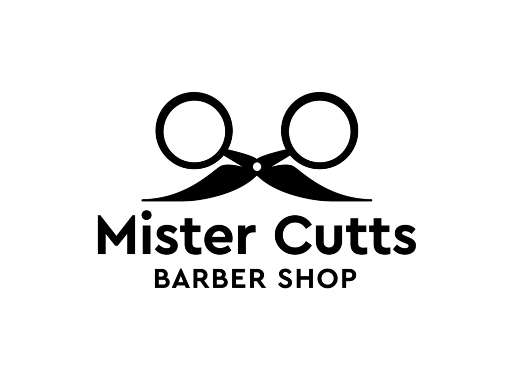
Most brands catering to children incorporate playful logo designs, but creativity has no boundaries. You can notice in the examples of the popular brand logos below that from a children’s brand to a barbershop, anyone can be playful with typefaces, shapes, and colors. These logo designs are delightful and can connect with the customer emotionally.
- FirstCry
- Nykaa
- FryBox
- Mister Cutts
7. Dwell on the initials
If you are still confused about where to start, just write the name of the brand you are working on in basic fonts. If the brand name is too long, limit the logo design to its initials. A long business name may hamper its readability. Just one look at your logo should help your customer understand what you do.
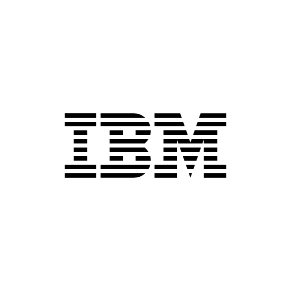
Pick these initials and keep experimenting with their placement in the front, back, left, and right. You can even overlap them. You can design a monogram if the name of your company is more than one word or difficult to pronounce, such as IBM and Hewlett-Packard.
Monograms are best suited for international companies, luxury labels, and brands with long or hard-to-pronounce names. Famous vehicle brands such as Tesla, Hyundai, Mahindra, etc., have their brand initials in their logos. Also, some examples of the best brand logos in this category include big players in the fashion industry, such as Giorgio Armani, Dolce & Gabbana, Louis Vuitton, and Calvin Klein.
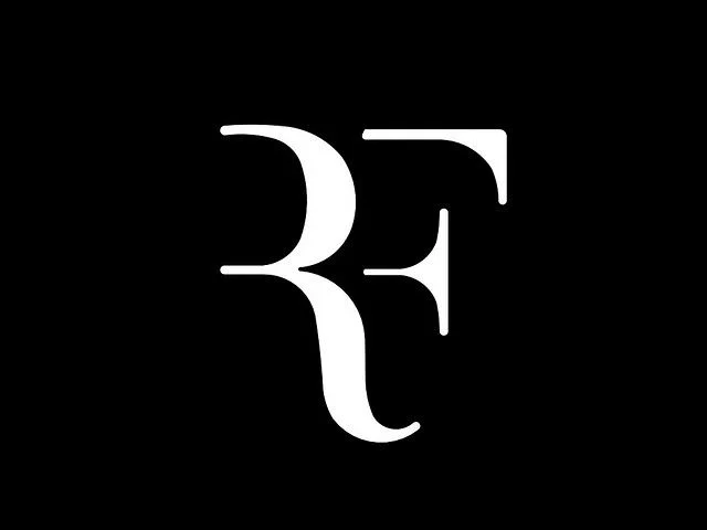
If you have to design a logo for a significant personality or celebrity, sticking to the initials is the best advice. The monogram logo designed for Roger Federer is the most popular and powerful one in the personal branding category. A long business name might put people off. The initials of your business name will cause intrigue, and compel your audience to want to know more about your business.
Additionally, you need to have a logo that is easy to read at a glance, because your audience would not spend too much time staring at it (and therefore, they likely won’t remember who you are).
- Roger Federer
- Tesla

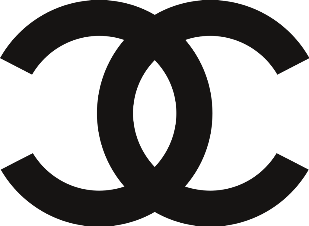
- Chanel
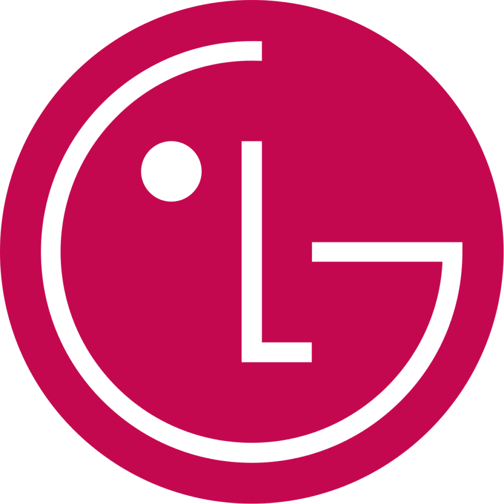
- LG
- IBM
Key Takeaways
- A logo serves as a brand’s face, allowing customers to connect with it.
- When you absorb several ideas, they will gradually come together to form the logo you desire.
- Simple creative logos based on basic shapes benefit from symmetry and a structured look.
- Basic typography helps create a neat, modern, and honest personality for your brand.
- Simplicity in design allows the logo to be used in a variety of applications, from digital to print.
- Negative space can create various optical tricks, and it is a fun way to build interest in your brand.
- Incorporating retro lettering and colors in your logo creates nostalgia.
- You can play with typefaces, shapes, and colors to deliver a delightful design.
- If the brand name is too long, create a monogram logo design using its initials.
Conclusion
The principal purpose of a logo is to establish a brand identity, distinguish a brand from its competitors, and help it attract the right customers. Sometimes you may get stuck with what you or your client exactly want in the logo.
Designing a logo is not a simple task, even for the most accomplished logo designers. When you explore and do your research to get some inspiration, you might find the insight you were searching for. The above-mentioned examples of the best brand logos will help you get some inspiration and direction.
You can explore countless possibilities by playing with shapes, fonts, colors, and combinations. Minimalistic, simple, and clear designs seem to be trending in 2022, so make the most of them.
FAQs
You can hire a creator at Pepper Content to get a logo designed for your business. You can also try some free logo maker tools available on the internet.
No, graphic design is an umbrella term to describe the creation of graphics. A logo is a type of graphic; therefore, it comes under graphic design. But logo design is essentially a part of brand building that requires the development of several graphics.
You can use a single shape like a circle, triangle, and square; merge two different ones; or enclose one in another to create a logo. There is no limit to what you can do with basic shapes. A few simple experiments with form, depth, border thickness, and corner modification can help you generate numerous logo designs.
The five principles of logo design are popularly known as S.M.A.R.T. The letter S stands for simplicity, M for memorable, A for appropriate, R for resizable, and T for timeless.
The process of creating the best logo for your brand begins with clearly knowing what you want. Ask yourself or your client the right questions and take inspiration from popular brand logos. Then visualize the ideas, and experiment with shapes, fonts, and colors.
Latest Blogs
Explore how Google’s 2025 AI search updates triggered ranking chaos. Learn actionable strategies to adapt your SEO for AI Overviews, zero-click searches, and SERP volatility. Stay ahead now.
Learn how to rank on AI search engines like ChatGPT, Perplexity, and Gemini by optimizing your content for authority, structure, and relevance. Stay ahead in AI-driven search with this strategic guide.
Explore the best healthcare SEO services for your medical practice. Improve online visibility and effectively reach more patients in need of your services.
Get your hands on the latest news!

Similar Posts

Design
7 mins read
15 Best Firms Offering Design Services in India

Design
5 mins read
All You Need to Know About Data-Driven Design

Design
6 mins read