Table of Contents
- What are Typefaces?
- What Makes Typography so Critical?
- What’s the Difference Between Typeface and Font?
- What’s in a Typeface?
- 10 Popular Typefaces and When to Use Them
- Key Takeaways
- Conclusion
- FAQs
What is all this hype about typefaces, and what are typefaces, anyway? Typography doesn’t get the importance it should, although it plays a crucial role in giving a brand its unique voice. Moreover, typography helps create curiosity and interest in the brand and gives your marketing message the much-needed thrust.
What are Typefaces?
Most designers flounder when it comes to answering this question. Is it merely any font you find in the dropdown menu to select and get on with your designing gig? There is much more to typeface design than that. Typography is an art, and the flair one poses of positioning typefaces to create a meaningful and impactful piece of text.
It is not merely the designing of letters and characters which is a part of the process, it is a serious artistic business.
With so many types of typefaces to choose from, most designers get floored by the task. There are so many things to consider about a typeface when designing something, like selecting the point size, the spacing, the line length, etc., all of which need to be uniform throughout.
The importance of the arrangement of typefaces was realized by Johannes Gutenberg when he designed his printing press in 1450. That was a period when letters and characters (forged in metal) were arranged in perfect order to create a piece of text.
Fast forward today to a world of computers, and you’ll get a more comprehensive answer to the question “what are typefaces?” There being several types of typefaces and scalable computer typography, there’s a whole range to choose from.
What makes Typography so Critical?
We live in a world dominated by typography. It touches almost every part of our daily life. Be it your phone, electricity bill, the giant billboard in the neighborhood, your Styrofoam coffee cup, or the email or blog post you read recently. Even the slightest change in a font can make a whale of a difference as far as the effect is concerned.
A good example is Facebook, which started using a new font called Geneva. This font is identical to the original Helvetica but thinner and lighter. However, the difference was noticeable. Now we know why minor details matter.
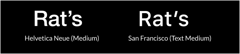
Apple did the same thing by changing its default font, the slim Helvetica Neue, to San Francisco, a font they developed in-house. It may be challenging to detect the difference that is too subtle for an untrained eye. The USP of this font is its legibility on the much smaller phone screens. And with more people using hand-held devices today, it was probably a smart move that helped Apple sell quite a few phones worldwide.
It is worth mentioning that Steve Jobs took a course in calligraphy while at college. It probably gave him the idea of using multiple typefaces (proportionately spaced) for Mac.
What’s the Difference Between Typeface and Font?
Did you know that typeface and font mean two different things? Typographer Nick Sherman makes a subtle comparison between typeface and font. While he compares the former to a song, the latter he associates with an MP3. While one is a work of art, the other is merely a delivery tool.
The same rule applies to typography. When you say typography, you are describing a work of art. It is a design term used to describe the look and feel of a design. A good example is the Helvetica typeface.
On the other hand, a font is a collection of letters and characters represented as a symbol. Hence, while Helvetica is a typeface, Helvetica Bold, Light, Obscure, etc., are fonts. While you can say ‘this typeface adds character to your design,’ you must say ‘use 10pt font size to ensure it fits in the box snugly’.
What’s in a Typeface?
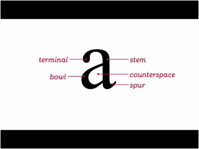
It can be exciting to understand the anatomy of a typeface. A letter has many parts, each denoted by a special term akin to the bones in the human skeletal system.
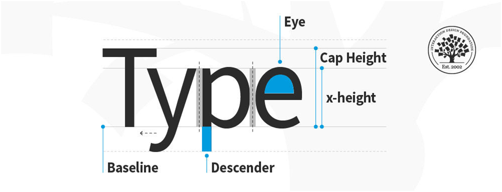
- Baseline is where all the letters sit.
- Cap Height is the distance between the baseline and the top of the letter in caps.
- X-Height is the portion located between the baseline and the cap height; in other words, it is the height of the letter in lower case.
- Bowl (in the first figure ‘a’) is the curve in the letter ‘a’, and in other letters like ‘d’, ‘b’, ’o’ ,’B’, and ‘D’.
- Descender is the point of the letter falling below the baseline
- Ascender is the point of the letter extending beyond the mean line of a font (top portion of ‘h’)
- Terminal or ball terminal is the end of the stroke ending with a circular stroke
- Stem is the vertical stroke found in letters like B, D, H, F, a, etc.
- Spur extends from the curve of a letter, e.g., C and S. They may appear at the top or bottom.
- Eye is the enclosed space in the lowercase ‘e.’
10 Popular Typefaces and When to Use Them
1. Atkinson Hyperlegible
As the name implies, Atkinson Hyperlegible is perfect even for people with myopic eyesight. Viewing letters and text from close quarters will no longer be a problem for the millions of people with myopia, thanks to this extra-legible font. Designers can now create easily-readable text using this font.
Atkinson Hyperlegible was designed by Applied Design Works in collaboration with the Braille Institute, and the name is a befitting tribute to the institute’s owner, Robert J Atkinson.
Not all people studying at the Braille institute are 100% visually challenged; most have a faint vision, enough to get along using Atkinson Hyperlegible. Especially for low-vision readers, Hyperlegible is the perfect answer as it helps them read misinterpreted numbers and letters with consummate ease.
2. Case
Case is good either way, whether it is the upper case or the lower case. This Neo-Grotesque typeface comes in three different optical sizes. Designers prefer it for creating logos and displaying text. There is no other case better than the Case when it comes to readability. The font comes with a higher height and some open shapes, improving readability. Case is consistently preferred over Helvetica or Univers by designers. The trick used to create Case was to shave off whatever was unnecessary in the existing typefaces, and voila, Case was born.
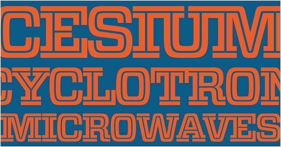
3. Cesium
Cesium probably best answers the query what are typefaces? This typeface is a direct descendent of Vitesse but with a design suitable for almost any application. It is as much at home on a magazine spread (hard copy) as on an online journal (soft copy). Packed with sport and tech flavor, it has comfortable letterspacing, making it all the more versatile. It is a highly responsive typeface maintaining its composure across many moods.
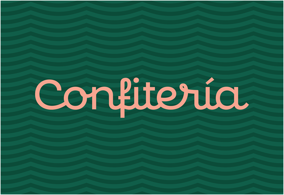
4. Confiteria
It is a Spanish term meaning a shop making and selling sweets and chocolates. Confiteria is an attractive script that lets designers create text with a flourish. It features aesthetic and polished strokes and comes in a range of 18 styles, thin, extra light, light, regular, medium, semibold, bold, and more.
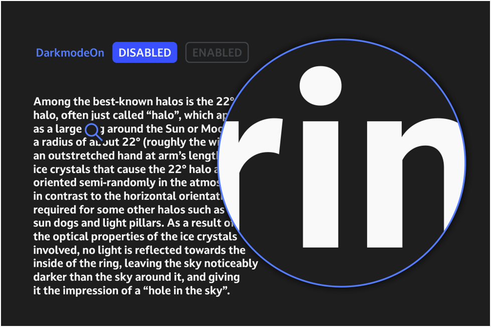
5. Dark Mode
Dark Mode is the personification of legibility and is readable at any time of the day or night. With the first-of-its-kind Dark Mode, white text on a black background will no longer look bulkier. Presented in two options, ‘DarkmodeOn’ and ‘DarkmodeOff,’ each of which comes with eight weights or shades.
The typeface is an optical illusion, though it is barely noticeable to discerning readers. Designers can present it to create an optimum user experience, as adjustment between the modes is seldom required.
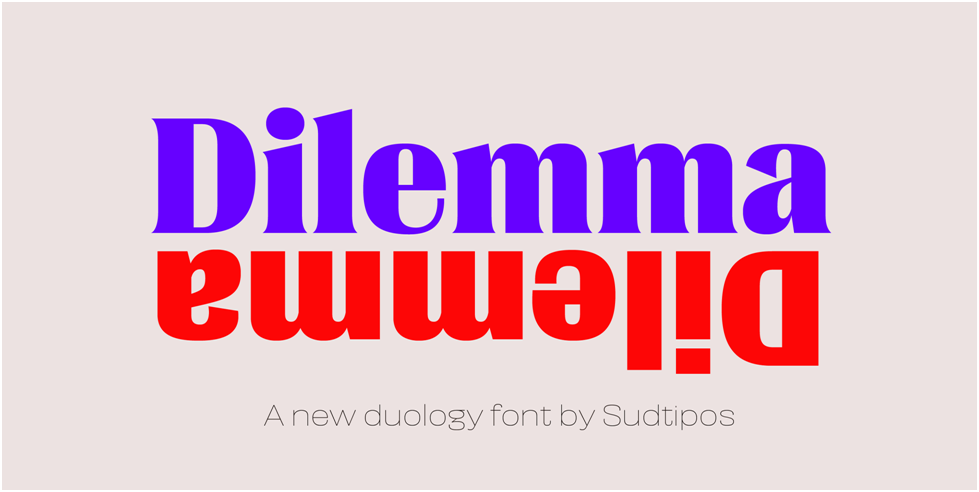
6. Dilemma
Dilemma is inspired by Cyclopean, Extra Condensed, and Polypheme. These typefaces were redesigned and blended into a unique typeface, hence was born Dilemma. It helps designers make a quick decision in tough situations when they are confused about using a particular typeface. It has two alternatives, which function well alone but are better when combined to make sans and serifs work in tandem.
7. Harmattan
Available on Google fonts, Harmattan was originally meant to be suitable for use in Arabic scripts. However, it looks equally stunning on Latin characters. Designers prefer to use Harmattan to make headlines stand out distinctly or whenever a bold copy is required in the text.
8. Torcao
The Torcao typeface is a special combination of half-square and half-circle letters. The uniqueness of this font lies in its robustness and technicality while managing to be light-hearted and easy to use. It is especially preferred by designers to create headlines but is equally consistent and comfortable in long pieces of text. Presented in nine shades, ranging from slender to black, it is the choice of many leading designers.
9. King Basil
King Basil is probably the best option for designers constantly working on flyers and social media images. It is a free brush font available on Behance and is a lighter version of Full King Basil. The swashes and twirls it features and how it connects letters make it the perfect choice for creating a beautiful script-like effect.
10. Merriweather
As the name suggests, it lets readers make merry by its pleasant and easy-to-read presence on screens. Typically, designers will use this typeface to design the homepage of a website or for blogging. It is available on Google Fonts, though it is still emerging and yet to be updated. Currently, four styles are available: Bold, Black, Light, and Regular, all of which are also available in italics.
Conclusion
Today’s typefaces are far from what was available a few years ago in the print space. Designers can sometimes be overwhelmed by the sheer choice of fonts available. However, it is also about having the opportunity to experiment and create unique designs.
FAQs
The best typefaces or the most popular ones include Helvetica Now, Futura PT, FF Meta, Ambit, Arial, Calibri, and Times New Roman. These are popular typefaces because designers and leading brands use them on their websites and marketing collateral.
Leading the pack is probably Futura Now, which boasts 102 styles. Being a definitive version of Futura, it uniquely defines modern typography. FS Renaissance is a renaissance of sorts as it is born through a unique combination of two brilliant minds: Craig Black, a designer and lettering artist, and Pedro Arilla, a creative type director. It is a stencil font with no rigid cuts.
Neue Hans Grotesque is one of the best typefaces that answer the question what are typefaces, or rather what should they look like today? It is the handiwork of one Christian Schwartz and is a modern version of a very old typeface first designed in 1957 and still going great.
Trendy fonts are otherwise known as modern fonts preferred by modern logo designers who endeavor to bring a contemporary look to create a unique brand identity. Trendy fonts help you convey your brand personality with a distinct voice—no wonder leading brands like using a bespoke font that tells its own story. While Proxima Nova can be called a trendy font, it is comparable to TT Norms pro, Nexa, and Mont.
What are typefaces good for if they are not elegant? However, not all of them can be called graceful. Most successful designers seem to prefer Cardinal calligraphy for its elegance and majesty. It is a typeface that designers can play with when planning and designing ornamental text, especially for weddings and other invites. It looks great on any creative typographic composition where a flourish of artistry and a touch of elegance is a must.
Latest Blogs
Explore how Google’s 2025 AI search updates triggered ranking chaos. Learn actionable strategies to adapt your SEO for AI Overviews, zero-click searches, and SERP volatility. Stay ahead now.
Learn how to rank on AI search engines like ChatGPT, Perplexity, and Gemini by optimizing your content for authority, structure, and relevance. Stay ahead in AI-driven search with this strategic guide.
Explore the best healthcare SEO services for your medical practice. Improve online visibility and effectively reach more patients in need of your services.
Get your hands on the latest news!

Similar Posts

Design
7 mins read
15 Best Firms Offering Design Services in India

Design
5 mins read
All You Need to Know About Data-Driven Design

Design
6 mins read