
e-Books can serve many purposes: sales, marketing, and sharing valuable information. In 2022, almost every person who uses the internet has access to e-books. Hence, it’s quite a competitive market. What can make your ebook stand out? This handy guide with the best tips for e-book design comes in.
Designing an e-book can be a daunting task. How do you ensure that your message is communicated in the most effective way possible with so many different apps and devices? This post will walk you through the essential e-book design tips, from formatting to typography to layout.

A good e-book design will complement the content and make it more appealing to readers. The design plays a crucial role in writing and selling an e-book.
We have compiled a list of 10 important e-book design tips to simplify the process. By following all these tips, you’ll be on your way to creating beautiful, user-friendly e-books that engage and convert your readers.
10 Tips for Designing an Effective e-Book
To create an effective e-book, it is important first to understand the different design elements that comprise it. Doing so enables you to better plan and execute your e-book’s layout, ensuring that it is visually appealing and easy to navigate.
Every minor detail matters, from image placement to white space usage. By following these tips, you can create an engaging and visually appealing ebook that will help to promote your brand or increase your influence.
1. Collect the right resources and plan
Once you have decided on your e-book’s killer topic and content, the e-book design must be your top priority. Look up e-books that you like as references.
The chances are that your favorite ebooks have amazing content and stunning design. This includes aspects like fonts, colors, and usage of white space. A tacky design can mess up the reading experience, and that’s why you need these e-book design tips.

You can look up a variety of templates online as well. But always try to be unique to stand out from the market. You can work on the niche based on research and understanding of your target audience.
After planning what your e-book looks like, you should find out the right tools to begin working. And no, you don’t need to find fancy, expensive applications for the same.
Any user-friendly writing application like MS Word or Google Docs can be used to write your e-book content. Presentation software like PowerPoint and Google Slides can also work brilliantly for specific types of content.
Apple’s iBooks Author is a highly recommended tool for e-book creation. Basically, any word processing software can be useful as long as you can use formatting options conveniently.

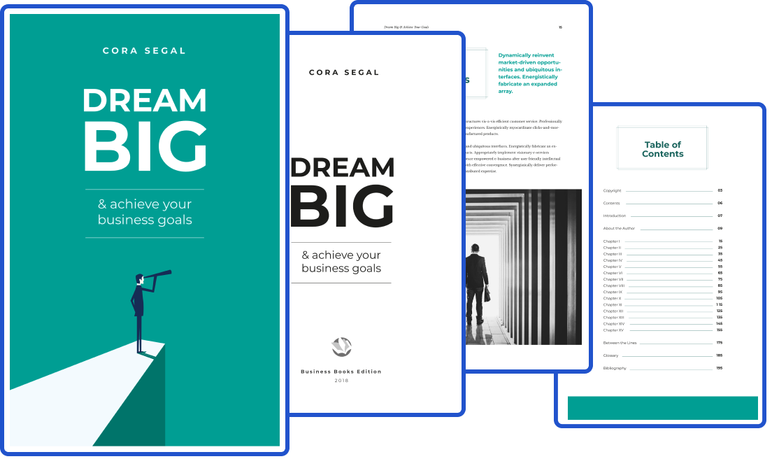
2. Create a catchy cover
Once your content is ready, it’s all about a powerful presentation. They say you should not judge a book by its cover, but in the competitive world of 2022– you cannot miss this important design aspect.
Modern digital design e-books must be appealing to the target audience. The cover will decide their snap judgment about whether they should open the book to look further. The same goes for the e-book thumbnail design that you pick.
While your headline will be the most important aspect of the cover, the right colors and design can also make a difference. Use minimal graphics that are relevant to the content of your e-book. You can play with creative fonts and add subtle graphics. A great photograph can also work brilliantly to create a powerful cover.

Strong and bold colors can make your e-book cover stand out. Create a balanced design and use a contrasting font for a clean, minimalistic look. For example, if you use a light color as the background, go for a bold-colored thick font.
3. Organize your content
No matter how much content you add to your e-book, organizing it properly can be a powerful way to make it readable. Divide your book into chapters, and then the chapters into sections.
Make sure to have a table of contents at the beginning of the e-book and for chapters if necessary. Add the jump links so that your reader can easily access different parts of the book.
The writing should also be skim-friendly and if there is a section that can be better as an infographic, get it done. Customize your graphics as much as possible rather than using stock images.
Organize the content with bullet points, charts, and tables. Add quotes and bubbles in between to reinstate essential messages. All these valuable e-book design tips will help your audience go through your content easily.
4. Follow the brand style guide
A brand style guide or a theme to guide your e-book design can do wonders. The brand style guide is a collection of fonts, colors, and icons specified according to the brand image. Using these design elements already associated with your brand can give an edge to your e-book. Your brand guidelines can help your e-book become easily identifiable to the target audience.
Even if you don’t have one, a theme can be useful. You can come across multiple themes with different colors and fonts in any word software. That said, having a style guide will solve your dilemmas about many design elements. They can cover everything from what font to use for subtitles to the best color for the bullet pointers. You may also customize a few elements if necessary. It’s okay to have fun with some header fonts and footers.
5. Use creative font and colors
A great color palette can be so refreshing for the e-book design. If you are creating an e-book for a brand, use your brand colors. Don’t hesitate to add to the color palette according to the theme of the topic. As creative as you get, make sure that there is enough contrast between the words and the background to make the content readable.
For example, if you are designing an e-book for a branding event, you can use your brand colors for the fonts and logos. But having bold hues of red, blue, or green can give a different spin to the e-book’s appeal. You can use lighter or darker versions of the same shade to create a harmonious look.
Feel free to take inspiration from other e-books, posters, and book covers online. You may also look at online tools for help. Adobe Color and ColourLovers can be fantastic tools to get modern color palettes for your e-book design.
You can also create powerful images and visuals according to your chosen color scheme. Don’t use pictures and photographs just for the sake of it. Use them only if they add value to the given content.

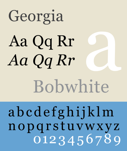
6. Choose your fonts carefully
In 2022, there are so many fun fonts to play with. Fonts can be used to display brands and the tone of your language. We all know how Helvetica can have a different appeal than Georgia. While the Former Sans Serif font is used for a more professional and sharp look, the latter has a more old-school vibe.

Your fonts can complement the overall color palette of the e-book design. Go for playful fonts for headlines and keep them uniform. You can also use creative fonts for quotes and callouts in between texts. Your body text should have a simple font that is easy to read. You can explore font combinations to see which headline fonts can work with text fonts.
7. Don’t compromise with white space
Texts, images, links, and infographics in one e-book can be quite overwhelming. And while you do not want to cut out any detail, it’s best to fill some space.
White space can be your best friend when it comes to organizing your e-book content. A decent amount of white space between words and images can make your content look much better. You can take inspiration from minimalist websites such as Apple. There are many products and features, but they use blank spaces to highlight every image and word.

Having ample white space will make your content easier to process through the screens. Therefore, use them freely to make your ebook more professional and sophisticated.
8. Break the boredom with some fun
Most people find reading more difficult than before. It’s difficult to focus on large chunks of text and words. Writing an e-book is surely a craft, but no one is expecting Shakespeare when they are reading your e-book. And that’s why you have to keep things light and fun so that your readers can get what they need and reach the end of your book.
Images, infographics, callouts, and even white space can help break the monotony. But you can also play with the content a little bit.
For example, add a fun exercise for the reader to practice any important lessons. Or crack a joke that can be relevant to the context of the e-book. You may even add a story in between to create intrigue for the next section. Add as many practical examples as possible to make your content easily palatable for the audience.
9. Fit in your CTAs smartly
Unless your e-book is just a downloadable version of a print book, it is made with a business goal. Whether you want more subscribers for your website, or want to promote a new product, CTAs are necessary for e-books. So, how to add CTAs smartly in between your content without sounding too sales-y?
One of the most straightforward ways is to offer basic information about your brand or product. You can end a chapter with “key takeaways” and add a link to your website for “more information.” Or how about using thumbnails from your videos or blog posts that your readers can click on? You may also add shareable blocks of quotes and statistics.
It’s not necessary to keep the CTAs small and negligible– you may even dedicate one whole page to it if it fits the context. There are many ways to add CTAs, but they work best when your readers feel their need. Therefore, you must build your narrative and content to highlight the problems and then cite your brand as the problem-solver.
10. Make your file accessible
Designing and creating an e-book is hard work. But there are plenty of ways to market your e-books the right way. You can share the e-book in exchange for an email signup or a podcast subscription. You may also sell it for free on your website.
Make sure that you convert the file to a PDF or EPUB version. EPUB is better for longer e-books that people can easily read on their Kindle.

If you are offering your e-book for free download, create a landing page or a sign-up form for the same. Add the link for the same inside the e-book so that readers can share them online on Twitter or LinkedIn.
Key Takeaways
● Begin with a plan: Take inspiration from the best e-book design that you have come across. Plan your content according to your target audience and start working on your favorite word software.
● Use appealing colors and fonts: Bold colors and modern fonts will make your e-book stand out to your target audience. Use your brand style guide or a theme, to begin with.
● Add ample images and infographics: Break the boredom with images and infographics. Add a quote or a fun example. Make the content skim-friendly with a healthy amount of white space.
● Fill in your CTAs wherever possible: CTAs are a must for every business-related e-book. Build the narrative towards your CTA as the solution to the reader’s problems.
● Make your e-book easily shareable: Convert your file to PDF/EPUB and use a landing page to share your ebook. Add the shareable link of the ebook for readers to share as well.
Conclusion
The design of an e-book is one of its most important features. It can make or break readers’ engagement with your content and determine whether they continue reading or give up in frustration. We hope these 10 e-book design tips will help you compellingly design your content.
Whether you want more leads or get podcast subscribers, a well-made e-book can do wonders no matter what purpose you have with your e-book.
A good e-book is not so difficult to make with a decent grasp of language and design. But make sure that you add valuable information for your audience. You will be amazed to see how you get a network of followers who look up to you and your brand. Use these handy e-book design tips to create books to help your brand and your audience.
FAQs
This would depend on which device you expect your audience to read your e-book. Portrait mode can be great for mobile screens, but they also limit the usage of graphics to an extent. Landscape mode can be excellent if you want to add interesting graphics to your e-book. However, it’s best for those reading on laptops or tablets.
Any word or presentation software can be used to create an e-book. Plenty of applications is available for free, including MS Word, Google Docs, Slides, and Apple’s iBooks. Go for any easy-to-use software with a decent amount of formatting options.
Many brands and digital influencers choose to sell e-books for free in return for subscribers, followers, and website traffic.
Anyone can create an e-book for absolutely free. You can work with free tools and use online resources, stock photos, and infographics to create a great e-book at zero cost. Use the above 10 simple e-book design tips above to know more.
You can sell your e-book on any online marketplace or on your website. If you are offering e-books for free, create a landing page and sign-up form to see who is downloading your file.
It’s important to sell your e-books as EPUB or PDF to make the content editable. These file formats are also easy to share without any damage. An EPUB file is better for large e-books so that the readers can comfortably read them on Kindle and book reading apps. After applying all these e-book design tips, make sure that more and more people can access your content.
Latest Blogs
Explore how Google’s 2025 AI search updates triggered ranking chaos. Learn actionable strategies to adapt your SEO for AI Overviews, zero-click searches, and SERP volatility. Stay ahead now.
Learn how to rank on AI search engines like ChatGPT, Perplexity, and Gemini by optimizing your content for authority, structure, and relevance. Stay ahead in AI-driven search with this strategic guide.
Explore the best healthcare SEO services for your medical practice. Improve online visibility and effectively reach more patients in need of your services.
Get your hands on the latest news!

Similar Posts

Design
7 mins read
15 Best Firms Offering Design Services in India

Design
5 mins read
All You Need to Know About Data-Driven Design

Design
6 mins read