Understanding the Link Between SEO & Responsive Web Design

Table of Contents
- What is Responsive Web Design?
- The link between SEO and responsive web design
- Benefits of SEO on responsive web design
With year-on-year increases in mobile internet availability and accessibility, it is apparent that websites must match consumers’ expectations for a seamless and meaningful experience.
Because of the shift in the internet’s focus from desktop to mobile, responsive design is more vital than ever. After learning how a mobile responsive website affects SEO and other digital marketing activities, you’ll see why it’s ridiculous not to focus on your mobile site.
Mobile responsiveness is undoubtedly one of the most important on-page ranking elements, and responsive site design helps SEO in this regard.
Furthermore, 2022 provided valuable insights regarding the importance of portable devices in people’s lives. Still don’t know what SEO and responsive web design are or how responsive web design is helpful to your website’s SEO?
We’ve stated some techniques to increase website performance in Google’s SERPs by combining SEO efforts with flexible web design to dispel your doubts.
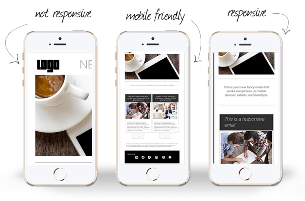
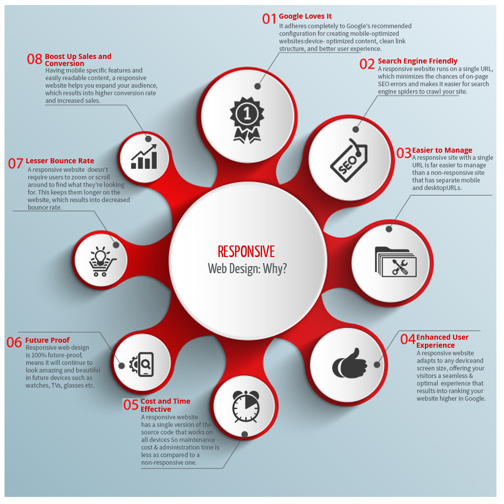
What is Responsive Web Design?
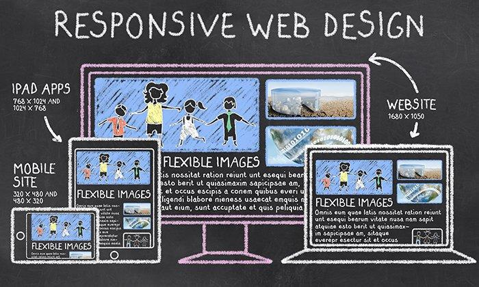
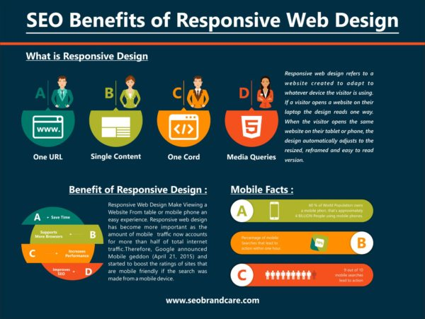
Responsive web design is a web design and development strategy that provides the same HTML on the same URL. It implies that your website can serve all devices using the same code, regardless of screen size. It implies that the site will adjust the screen size to meet the device’s specifications while still displaying the same material as the online view.
Google provides mobile-responsive sites with a higher ranking because they are more likely to be seen correctly on mobile devices. Moreover, Google favors a mobile-friendly website design because it allows visitors to share and connect to your site’s content with only one URL.
Responsive websites require less effort to maintain, which helps Google assign indexing characteristics to your pages more precisely.
Link Between SEO and Responsive Web Design
It’s barely been a few years since Google announced that they were switching to a mobile-first indexing strategy, and the SEO environment has never been the same.
Because having a responsive web design influences your SEO through favorable user behavior signals, that announcement simply demanded the adoption of a responsive web design for an SEO’s mobile website.
Moreover, it signaled that many things were about to change for us. One prospective development that has piqued our interest is that SEOs should concentrate on their desktop and mobile versions.
Society’s mobile-centric mentality has been expanding for some time and is unlikely to change very soon. This means that SEO pros will have to put in more effort.
It will take a lot of time, work, and energy to include a responsive web design into your website, but it will be well worth it.
Benefits of SEO On Responsive Web Design
SEO and responsive web design may give you a competitive advantage over your competitors by vastly increasing your consumer base.
Below are five ways SEO may help you improve your website’s responsiveness and establish a name in the digital world.
1. Improvements to your ranking
A well-structured and accessible website will offer you a substantial ranking boost in mobile and web searches, providing you an edge. These results are prioritized, and almost every high-ranking website has a digital app.
Websites that don’t offer a decent mobile experience are doubtful of scoring well in mobile searches, which means you’re losing out on many prospective customers.
2. Multiple devices for a single website
Responsive web design adapts to digital display’s size and resolution. It lets visitors access the same website from any device. This makes it easier for Google to crawl, index, and organize your material because it doesn’t have to index several copies of your website.
Site owners simply need to modify one website with new content, photos, home pages, and so on, and the changes will be reflected across all mobile, tablet, and desktop versions.
3. Page loading time
Speed tests and loading time are also part of Google’s algorithm. According to extrapolations, you have a problem if your site takes more than three seconds to load. If you don’t meet the requirements, you’ll have to give up your dream of reaching the top.
Customer experience and willingness to return to your site are directly linked to the site’s speed.
As a forward-thinking entrepreneur, you’d want your website compatible with desktops and mobile devices. Make sure that your site is responsive on 3G and 2G phones as well.
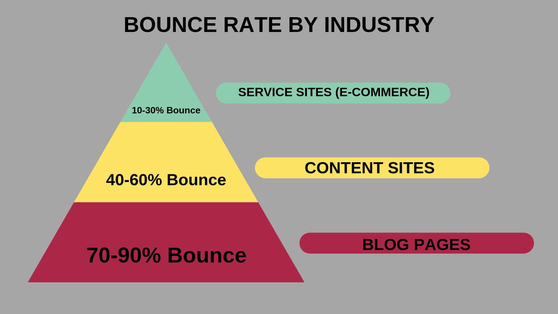
4. Minimum bounce rate

Google uses the bounce rate to measure your website content quality and user experience. Users will be more interested and spend more time on your site if you employ responsive website design.
5. Improvements in user experience
A positive user experience can help visitors find and get what they’re searching for, enhancing Google results. Visitors will have a better experience when they land on your service landing page or homepage if they have a seamless experience.
This allows users to browse more pages on your site in less time.
6. Social media shares
Arguably, while social sharing influences SEO majorly, increasing a page’s exposure on social media may significantly impact its results by amassing even more users, thus exponentially enhancing the page’s relative worth.
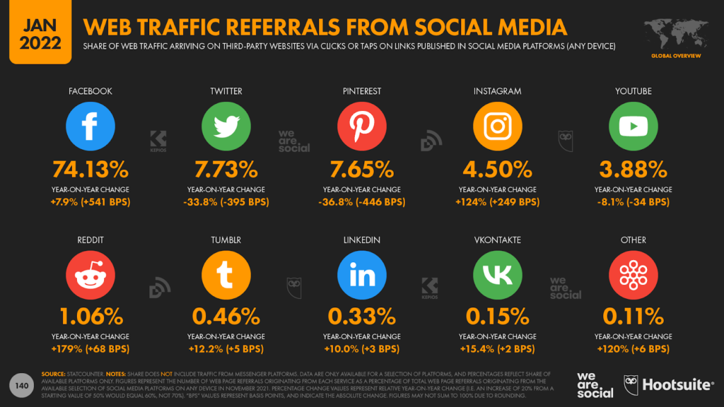
Phones account for most social media activities, such as sharing a website on a mobile is more convenient than a desktop. You may also advertise online, as nearly all Twitter and Facebook ads are displayed on portable devices.
7. Cost-effectiveness

If you own and operate many websites, you simply have to pay for one name, one URL to host, and one website to update. Creating a single responsive website that works on all devices is less expensive.
8. Improved user signals
Several user signals come together to provide a significant ranking component. Having a mobile and tablet version boosts these metrics and has a significant second-hand influence on your rankings.
Here, responsive web design can be a great way to make your high-quality website more accessible, fast, and simple to navigate. As a result, users will have an easier time finding the information they need, encouraging them to stay on your site longer and maybe return in the future.
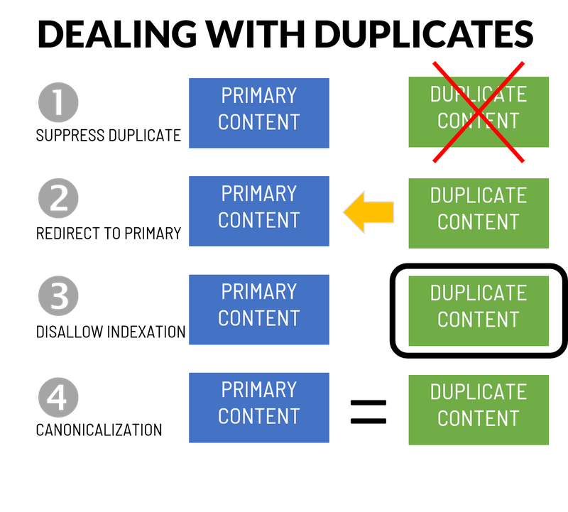
9. Reduced risks of duplicate content

SEO and responsive web designs require only one website to serve all devices. This eliminates content duplication when numerous websites are linked together, which Google interprets as an attempt to influence search results.
10. More traffic from mobile devices
Websites that load quickly and are compatible with mobile devices of all sizes are more likely to attract visitors online. Responsive web designs provide more flexibility and a better site layout at a reduced development cost.
Web admins do what Google says! If Google updates its algorithm, they’ll be the first to know. Google also encourages SEO and responsive web design to transition seamlessly to the mobile-first index, with several advantages for your website’s overall SEO performance.

It all boils down to providing a better user experience on your website, dramatically boosting your SEO and responsive web design score. For the time being, the simplicity and time-saving qualities of responsive website design make it a slightly better choice than the alternatives.
Switching to SEO and responsive web design will be difficult, but given the current state of the market, it will prepare you for the future and put you ahead of your competition.
Key Takeaways
- SEO is the science and art of getting sites to improve search engine rankings like Google.
- The term “responsive web design” refers to a website’s ability to serve all devices with the same code, regardless of screen size.
- Google prefers a mobile-friendly website design because it allows people to share and connect to your site’s content using only one URL.
- SEO and responsive web design are easier to maintain, allowing Google to assign indexing criteria more precisely.
FAQs
Responsive web design adapts to the needs of users and the devices they use. The structure varies depending on the size of the device and the capacity.
These factors are considered in the modern responsive design to provide the best possible experience for everyone.
SEO, or good search engine optimization, involves making changes to your website and online content to improve the quality of your search engine.
These are the functions performed by search engines:
Crawling online to find new web pages and articles
Maintaining that content on a large website
Listing the content in different terms
The benefit of responsive web design is that it provides a better surfing environment. Your website will appear excellent and function properly on a desktop (or laptop), an iPad, and a mobile phone browser.
Most people do not know how well SEO and site design work together.
Here are some examples of how they can be combined:
1. Compatibility with mobile devices
2. Easy-to-read web design
3. Website speed
4. Sitemaps
5. Gaining user confidence
Latest Blogs
Explore how Google’s 2025 AI search updates triggered ranking chaos. Learn actionable strategies to adapt your SEO for AI Overviews, zero-click searches, and SERP volatility. Stay ahead now.
Learn how to rank on AI search engines like ChatGPT, Perplexity, and Gemini by optimizing your content for authority, structure, and relevance. Stay ahead in AI-driven search with this strategic guide.
Explore the best healthcare SEO services for your medical practice. Improve online visibility and effectively reach more patients in need of your services.
Get your hands on the latest news!

Similar Posts

Design
7 mins read
15 Best Firms Offering Design Services in India

Design
5 mins read
All You Need to Know About Data-Driven Design

Design
6 mins read