
Table of Contents
- What is a logo design?
- What do you mean by logo fails?
- 21 Logo Fails in the History of Branding
- Key Takeaways
- FAQs
A good logo design is known for its face value. Its success rides on its capacity to attract attention immediately. But not every logo design that catches the eye is bound to be successful. Sometimes, funny logo design fails are also the top reason why they become so popular. So, here is a look at the 21 most hilarious and epic logo fails in the history of marketing. Compiled for a humorous and yet learning read, in no particular order.
What Is a Logo Design?
In simple terms, a logo is a visual message that conveys the brand’s value. It’s typically presented through images or symbols, along with a text caption that captures the essence of a business. A good logo design will accurately convey what the business is all about and the values that it upholds. LogoCreator.io and GraphicSprings.com great tools for DIY branding.
In this sense, a logo design or logo stories are all about creating a visual brand identity. A good logo helps in the following ways:
- It makes your brand stand out in the crowd
- It conveys the brand message and values
- It’s almost synonymous with brand identity

What Do You Mean By Logo Fails?
A logo fails when your logo design does not carry out the job it is supposed to. It can happen under the following circumstances:
- Use of incorrect graphics
- Use of incorrect texts
- Convoluted messaging
- Contradictory meaning
- Controversial design
21 Logo Fails in the History of Branding
Let’s look at some epic logo fails in history.
1. Zune’s Backward Logo Design
Not everything is wrong with this logo except that it might confuse most viewers and give the wrong impression about the brand name. This is why it features on this list of epic company logo fails.
2. Dodge Viper Logo
Another popular logo design that came to be labeled as one of the worst logo fails is great by design. The only problem is that it almost resembles the famous cartoon character, Daffy Duck which defeats the whole purpose of the brand.
3. The Texas Longhorns Logo
Meant to represent something completely different; the image itself tells you why it is one of the funniest logo design fails.
4. The Office of Government Commerce
Some logo stories are just not meant to be shared. The creators probably had a very different tale to tell than what this logo fail ended up telling the entire world after it was flipped to 90-degrees.
5. Sat An
Meant to be a logo for promoting a satellite and antenna company, this ended up becoming one of the worst logos fails. Not keeping a clear space between the two words ended up making an entirely different name; not one you would want to associate with.
6. London Olympics Logo, 2012
One of the worst logo design fails of all time, no other Olympic logo was received with so much contempt than this one. In fact, 48,000 U.K. citizens signed a petition to scrap this logo because they felt it didn’t represent London and found it to be too radical.
7. A-Style Logo
The logo was designed well ahead of the actual brand launch. The designer’s objective was to attack Italian cities with this kind of yellow sticker. And the marketing industry suddenly developed a liking for this unique logo. Soon, the company was using it to brand their clothing line.
8. Arlington Paediatric Centre
Call it a viral marketing strategy; it still is one of the most epic logos fails of all time. The design successfully contradicts the brand messaging.
9. Pepsi Logo
A brand as popular as Pepsi and yet one of the worst logo designs fails. Customers criticized the logo to look like a fat man. It went without saying people took the liberty to redesign the logo as per their vision, and not in a good way. After looking at this logo design, you would surely want to stay away from Pepsi.
10. Gin Ooo Ng
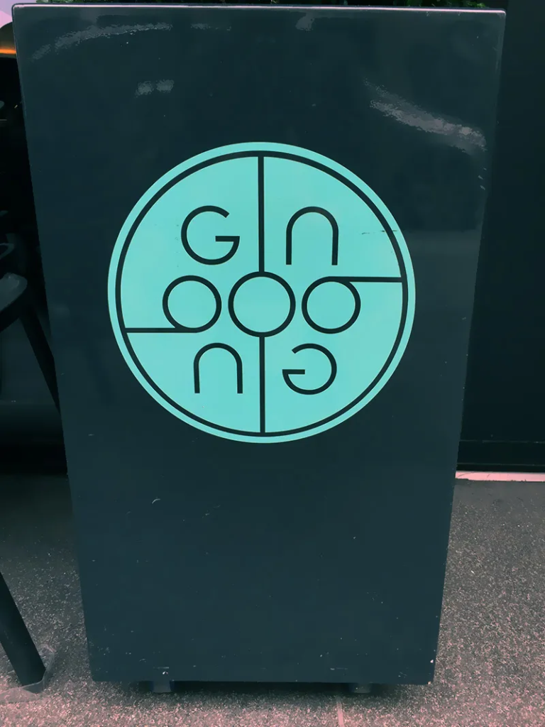
Some of the worst logos fails because they are just difficult to comprehend. The company name on this one is too confusing to read, no matter which angle you choose to look at it from.
11. Clinica Dental
This logo is just wrong in all possible ways. A dental clinic that is supposed to help with people’s oral health problems should not have such misleading logos.
12. Cat Wear
The inappropriate use of the cat to signify the letter “A” just comes across as wrong for the whole logo. Obviously, the logo wasn’t well perceived by the audience.
13. Institute of Oriental Studies
Quite a hilarious logo design fail; this is supposed to be a house under the rising sun – a symbol of orientalism.
14. TGV Logo
TGV is high-speed rail service in France. But their logo and why they have made it to the list of worst design fails in history is because the graphics look nothing like a train. And in fact, it almost looks like a snail, giving out a very contradictory message to what the brand is actually.
15. Japanese Ministry of Education, Culture, Sports, Science, and Technology
What do you think the text says in the logo? Well, it’s difficult, if not impossible, to read. Making yet another company logo fail.
16. Bureau of Health Promotion
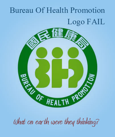
Sometimes, there seems to be a competition for the worst logo fails of all time. And this one sits right at the top of that list. Just like all the logos mentioned above, it has nothing to do with what the brand is about.
17. Catholic Church’s Archdiocesan Youth Commission
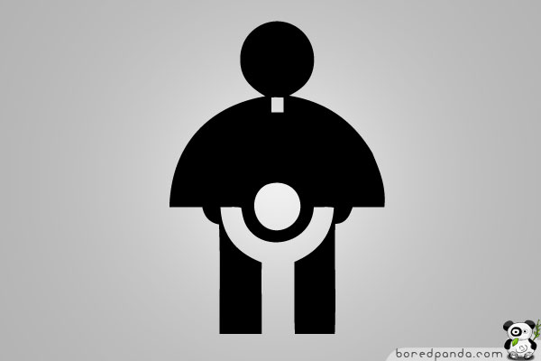
This is one of those logo story examples that will make you cringe. Given the image of the Catholic already being in turmoil over pedophilic reasons, this logo just didn’t age well over time.
18. Kids Exchange

Logo design fails like this one deserve a special mention as they offer so much for future creators by way of learning. And things to keep in mind while designing. It also shows the importance of keeping space between words.
19. Computer Doctors

There is just no explanation for logo fails like this one. It almost makes you wonder if the designer forgot to check the final product before publishing or what was in their mind when they were designing the letter “U” for this logo.
20. Graduate Photography

While the design of this brand was probably to excite fresh graduates to look towards a new light in their lives, the final product is nowhere near the original messaging. Why did they think a student walking on railway tracks facing an oncoming train symbolizes the future makes zero sense. But, this makes a great addition to our list of epic logo fails.
21. Sherwin Williams
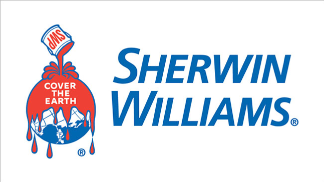
This is an example of a company logo fail that is not thought through. A paint company, Sherwin Williams, came under heavy criticism for its insensitive logo in an age where climate change is one of the world’s biggest crises.
Key Takeaways
- A logo design is supposed to convey the brand identity and values.
- A logo fails to carry out the above if the logo elements are not put in correctly, like graphics, texts, or messaging.
- Logo stories need to be thought through keeping in mind the audience.
- Logo fails can be prevented by checking and rechecking a team’s design, not just the designer alone.
- Logo designs require brainstorming and fresh perspectives to develop the final product.
- Logo designs should sync with the brand messaging and should definitely not contradict it.
- Company logo fails can be avoided if logos are kept simple and in sync with the product or service.
The Logo Disaster You Should Avert
Take these 21 logo fails as a learning lesson and what you avoid doing when you are creating your own logo. If you’re starting a new business with a new logo and you need to start with some interesting blogs, be sure to check out Pepper Content’s web content writing services.
FAQs
A few examples of the worst logo fails to include brands like Pepsi, Olympics, A-Style, Zune, Dodge Viper, Sherwin Williams, and others.
Some logo design fails are due to the size of the logo. They are just illegible or simply confusing to understand.
The A-Style logo was invented and designed in 1989. But it came to be used as the brand logo in 1999.
You can simply withdraw the logo and replace it with a fresh one. Some brands have also tried to clarify the meaning of a logo instead of just completely pulling it out of the market.
Sometimes logo design fails happen because the designs are too forced. This is true mostly for redesigned logos than fresh ones. Bad logo changes may include confusing graphics, illegible fonts, misleading captions, and clumsy designs.
Latest Blogs
Explore how Google’s 2025 AI search updates triggered ranking chaos. Learn actionable strategies to adapt your SEO for AI Overviews, zero-click searches, and SERP volatility. Stay ahead now.
Learn how to rank on AI search engines like ChatGPT, Perplexity, and Gemini by optimizing your content for authority, structure, and relevance. Stay ahead in AI-driven search with this strategic guide.
Explore the best healthcare SEO services for your medical practice. Improve online visibility and effectively reach more patients in need of your services.
Get your hands on the latest news!

Similar Posts

Design
7 mins read
15 Best Firms Offering Design Services in India

Design
5 mins read
All You Need to Know About Data-Driven Design

Design
6 mins read