8 Must-read Resources For Logo Designers (With Logo Design Basics)
Table of Contents
- Why Logo Design is Important for your Brand
- What Makes a Logo Good?
- 8 Must-read Resources for Logo Designers
- Logo Design Basics
- Examples of Best Logo Designs
- Key Takeaways
- Conclusion
- FAQs
Logo designing has limitless possibilities, and the field is fast evolving with new concepts and techniques. Any company that wants to establish its brand identity should start with a professionally designed logo that looks impressive and unique. A logo that stands apart is an effective tool for creating brand awareness. You may want to check a logo manual or look up a few logo design resources available on the web before designing the best logo for your brand.
Why Logo Design is Important for your Brand
A well-designed logo helps establish your credibility and builds trust by endorsing your professionalism. A logo, based on a standard logo style guide, makes people sit up and take notice.
A stunning logo is an excellent way to introduce your brand to potential clients and let them know who you are and what you are capable of. People begin to trust you even before getting to know you intimately, and that’s the power of a well-designed logo. You may have to browse a logo guidelines template or look up a logo style guide before settling for your logo because it is one of the most significant corporate symbols that represents and promotes your brand effortlessly.
It is natural for people to assume that you lack experience if your logo appears to have been designed by a novice. They will hesitate to place their trust in your product or service. People tend to make decisions on the spur of the moment, and a poorly-designed logo prompts people to leave and look elsewhere.
What Makes a Logo Great?
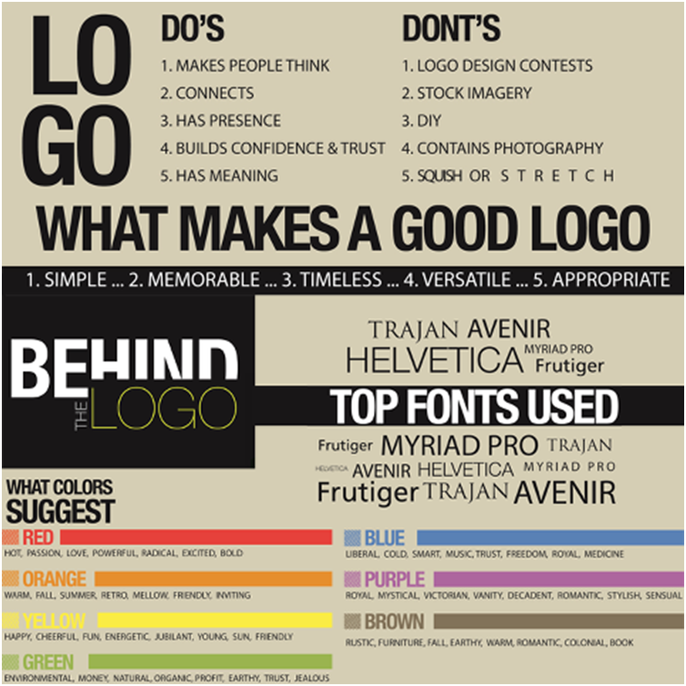
People cannot relate to your business easily if you are a small business with hardly any brand recognition. However, having a well-designed logo speaks volumes about your brand, and people can relate to it instantly. A lot of effort has to go in right from the conception stage to the roll-out, where you create a logo that tells it all. To create a stunning logo, you need to focus on the colour, visual appeal, and appropriate font.
Selecting appropriate typefaces
Choosing the right fonts is as crucial as the colour, images, or graphics in logo designing. People are swayed by how a letter or word sounds and what it conveys. Reputed brands always have an emotional connection with the users, most of whom swear by it. Consider the many logo design resources such brands would have looked up before finalizing their logo.
Typography is crucial for a brand as it conveys the tone of voice and the company’s unique personality. Go for a font that is elegant and exemplifies tradition and quality. If the typography is aesthetically appealing and functional at the same time, it can create the desired brand voice.
Picking the right colors
It is not just the font; your selected colors can make or break a brand. Sometimes, color is the deciding factor that drives people to go for a particular brand. Of course, the colour you choose should match the industry you are in and the target market you are aiming at. Most financial companies go for blue as it denotes security and trust.
Brands spend heavily to find out the psychology behind a specific hue and may even seek the services and advice of psychologists who can predict the outcome of using a particular color. Your brand color can tell a convincing story and communicate your credibility and values. Some brand colors are so unique that they are never confused with lookalikes. Most successful brands have a logo manual that suggests three essential colours, and they prefer the dark versions and avoid the gradients.
Using graphic symbols and icons
72% of the leading brands use words or acronyms that define their brand in their logos. However, you can achieve the same results using icons, symbols and other graphic elements. A logo sporting a visual element grabs the people’s attention instantly and can remain in their memory for long.
Seasoned designers use various logo design resources to create logos featuring an icon or modified text that looks stunning as standalone. Your artwork has to be created painstakingly. Also, ensure that it is original.
8 Must-read Resources for Logo Designers
1. Brand New
Brand New is a part of the graphic design company called Under Construction. They are in the business of developing a brand identity for corporates. You can find interesting case studies on their website. One such case study that stood out is of Saint Kate, an art hotel in Milwaukee, WI. The name signifies St Catherine, patron saint of artists. You can see the influence of art and design in the 219 rooms of this hotel, some of which serve as co-working spaces for small and medium businesses. There were plans to hive off the hotel because of its low occupancy and underperformance. A brilliant idea to convert it into an art-focused hotel paid rich dividends. The logo of the hotel was also redesigned into a simpler but artistic creation. It became a vibrant and memorable brand voice of the hotel.
2. Logoed
This blog showcasing trendy logo designs is probably a first of its kind that went viral. Despite being a single-page site, Logoed has been in business for over ten years and is still doing well. It is a popular resource that designers turn to for inspiration.
This website is a repository of a range of logos housed in its archives. You’ll find the thumbnails of the designs arranges d neatly, and all it takes is a click to get more information.
3. Company Folders
Company Folders has an impressive portfolio where you can find a range of well-designed logos. You’ll come across a wide variety of styles, including simple, flat ones to exotic 3D designs that are pretty stunning. If you’ve been planning to create your logo and don’t have a clear idea of how to go about it, Company Folders is the site to go to for inspiration.
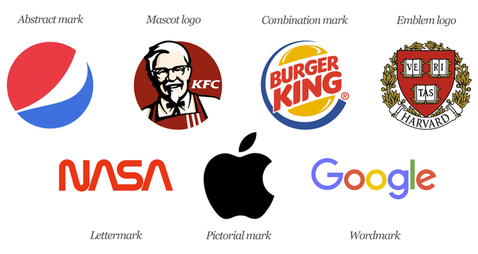
They have an expert logo-designing team with years of experience and are adept at creating brandmarks, letter marks, wordmarks, emblems, and combination marks.
4. Logo Of The Day
Logo of the Day is a project promoted by Jacob Cass, an experienced graphic designer. ‘A design a day’ is the company’s motto. Although the team suggests the designs, Cass is the one who chooses them. The company has been around for five years and has an impressive repository of logos that are not only awe-inspiring but elegant and stunning as well. Designers can make a beeline to the Logo of the Month page to find the best one chosen for the month.
5. LogoLounge
If you want to research some of the best logos, visit LogoLounge, an excellent destination for exchanging ideas on the latest trends in logos. Designers can draw inspiration from this site, one of the best reference destinations featuring material for logos. It has a whopping 175,000 samples to browse before you find what you want. It is a platform for designers to exchange ideas and concepts with fellow designers from across the globe.
6. LogoGala
LogoGala is a one-stop-shop where you can find some of the best logo ideas and intricate details of the logo creating process. It is a design blog that’s read widely because it contains helpful information. It has a fantastic gallery and a news section that gives you the latest trends on the design front. The Featured Logo section offers designers an inside look at what went into designing the logo, including a description of the process.
7. LogoMoose
If you are looking for a well-informed design community to hang out with, LogoMoose is the site you should be heading to. A place where professional designers from all over the world congregate, LogoMoose showcases some of the classic logos you will ever come across. You can also participate in the forum to gain helpful insights, receive tips, and get meaningful feedback on your design piece.
8. Logo Design Love
Designer David Airey’s creation, Logo Design Love, is, as the name suggests, a passionate production of a seasoned graphic designer. It is a portal that aims to exclusively cater to logo design requirements and create distinct brand identities. You get the latest news on the design scenario as the trends are updated twice a week. Logo Design Love lists categories neatly, making it simple for designers to find what they are looking for.
Logo Design Basics
In today’s highly competitive world, your logo must stand out for your brand to get noticed. You have to take on established brands and emerging ones in your niche, and it is not easy without a striking logo to identify your brand. Visuals like logos and other graphic designs help brands connect with their audiences easily.
Did you know that 80% of the start-ups shut down in the first year itself? There is a lot of competition in a niche market where others have already established themselves. And the best way to overcome this challenge is to make your brand noticeable with an attractively designed logo. Only entrepreneurs who take the extra effort to create a long-lasting brand identity manage to survive in the market. As a logo is an essential part of your brand, it is an effective marketing tool that helps your brand gain recognition.
Here are some logo design basics:
1. Understanding your target audience
The fundamental principle of design dictates that you identify and understand your target audience for the products or services you offer. Whether designing a logo for yourself or a client, ask probing questions that help define the customers. Understanding a prospective customer’s background (economic, educational, and social) helps. Such intense research helps you design the perfect logo to attract your target audience.
2. Looking at your competitors’ logos
As a result, you will share your competitors’ audience, and they have already tested their niche and developed suitable logos after doing a lot of research. The same niche applies to you, so why not draw inspiration from your competitors’ logos? Mind you, blind copying of others’ logos doesn’t make any sense. It just gives you the traction you need to create your unique logo that stands apart. You can investigate the type of logos prevalent in your kind of domain, and you’ll notice that each one is unique. You should not use the same colours, fonts, shapes, or even icons.
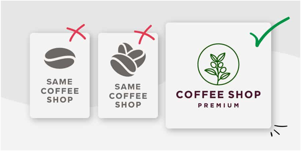
3. Choosing a simple design
If you review any logo guidelines template, you will learn that choosing a simple design that resonates with your target audience is the primary requirement for a successful logo. If you have access to a logo manual, you may as well refer to it to ensure you are on the right track as far as design aspects are concerned. A simple design is more impactful; moreover, no one has the time or inclination to figure out what a complex-looking logo is trying to say. Also, when the design is complicated, the outcome appears different on different platforms, and the very essence of the logo is lost.
A well-designed logo will have a minimum of elements, which can be easily related to, conveying the exact message you want the customer to receive. Try to avoid things that you think will hinder you from creating a great-looking logo.
4. Deploying colours prudently
While ensuring that your logo has an attractive design, you must also focus on using colours prudently to give the logo a unique look and feel. Colours denote various emotions that have psychological reasoning behind them. Red relates to aggression, while pink, its milder form, represents tenderness and is suitable for feminine products. Blue not only denotes royalty, but it also denotes intelligence and charm, and that’s perhaps why it is used more on social media platforms. A yellow stands for hope and renewal, and green is for nature, growth, and prosperity.
There’s a psychology behind every colour, every one of which conveys a different message. Colours play a crucial role in logo design. While some are subtle, others clamour for attention. Hence, choose your logo colours wisely to connect with your target audience.
5. Looking good in black and white
A logo must be stunning not only in colour but also in black and white. After all, you will be advertising in the print media like newspapers, magazines, flyers, etc. Most of the ads in the print media are in black and white, which is the standard. You may have to tweak your logo slightly to make it look good in black and white. Such reworked logos should look good in faxes and Xeroxes as well.
6. Making your logo memorable
Logos of established brands have stood the test of time because of their quality. Nobody knows whether these brands have a standard logo manual they use or if they have unique logo design resources they use. Your endeavour as a logo designer must be to create designs that get entrenched in the memories of your target audiences. The trick lies in developing a unique concept you can express as your logo. Try not to follow in anybody’s footsteps, and think of an innovative idea to present as your logo.
7. Showing movement in stillness

Your best logo design resources will agree with the concept of creating motion in stillness. Take a look at the Twitter logo for inspiration. The bird’s image is sheer poetry in motion, and no wonder it is recognized the world over. Doug Bowman, creative director at Twitter, says: “Twitter is the bird, the bird is Twitter.”
Did you know that the logo was redesigned from a goofy image to today’s sensation? It is 12 years since the logo was redesigned, and it is still one of the most recognized logos that is recognized instantly globally. The image formerly belonged to iStock, and Twitter bought it for $15 in 2006, and the rest is history.
Today, the image of the bird, named Larry, is synonymous with Twitter, and people recognize the logo and relate it to the brand. Although depicting motion in a logo is not defined by any logo manual, it is up to the designer’s creativity and logo design resources to create one with a few brilliant strokes.
8. Striking the right balance
You must create a well-balanced design for your logo to become a hit with your target audience. You may never find such nuances in any logo manual, and it is up to you to strike the right balance by relying on your logo design resources and resourcefulness. It can be tricky to achieve the perfect proportion of the various elements of your logo, such as colours, images, icons, fonts, etc. You must keep checking it for the balance to ensure it looks appealing. However, as a creative designer, you need not be bound by conventions and can defy the rules of symmetry as long as you get the design right.
9. Choosing the design style with care
Remember that your logo represents your brand and should reflect its essential personality. Your design style should match the local culture and sentiments and go with the times. In the West, Victorian and art deco styles were predominant once and slowly turned to popular pop culture, and street art crept in. Designers have a habit of exchanging design ideas with their peers. However, you may use such designs only to get some inspiration but must stand out with your unique design that stands out predominantly in your logo.
Going for a classic style reflects the credibility of your brand, and people begin to trust your logo and brand. Vintage and retro designs have a way of touching people and taking them down memory lane, reminiscing as they go. When you want a simple and effective logo, go for a minimalistic design, where you will use only minimum design elements.
Examples of Best Logo Designs
Did you realise that the most widely used logos have hardly any graphic ingredients to highlight? They are all text-based; examples include Pepsi, Lego, Coca-Cola, FedEx, etc. The simplicity makes a logo memorable, and that’s why most designers endeavour to create simple yet stunning logos.
Here are a few examples of the best logo designs:
1. Lego
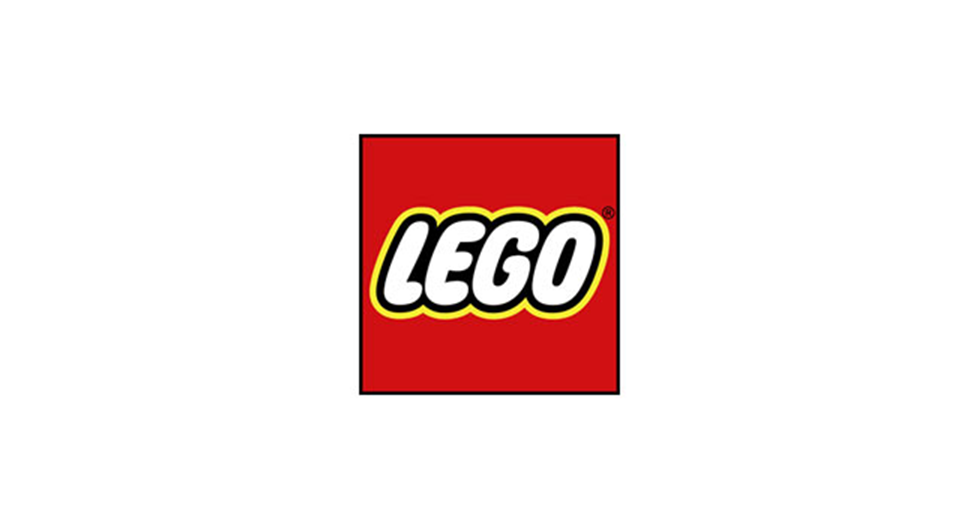
Designed in 1954, this logo created in bubble-writing style changed versions twice (1973 and 1998). Designed by the in-house team at Lego, the logo is synonymous with kids’ toys and has played a role in making Lego an iconic brand.
2. UPS
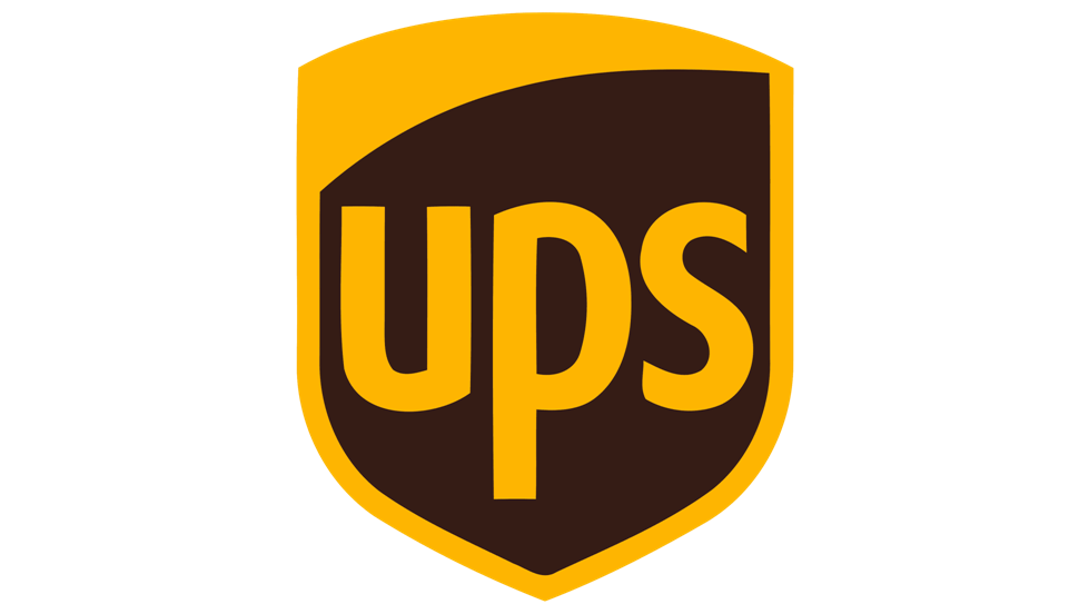
Although the brand goes by the three letters, it does have a bow symbol, which looks more like a knot. Designed by Paul Rand in 1961, it is one of his masterpieces, and he deserves credit for adding the distinctive bow that made the logo recognized throughout the world. However, this version only lasted until 2003 and returned to the original (minus the bow), which is currently in use.
3. Ferrari
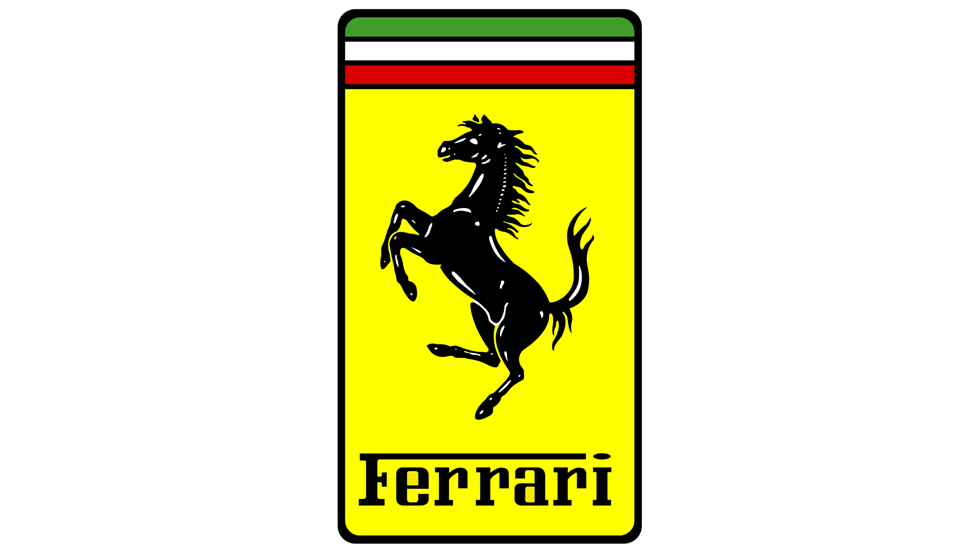
Ferrari’s logo is a combination of lettering and the prancing horse image, a popular image on and off racetracks. This logo was designed in 1947 and was featured on a WW1 fighter plane. After the Italian fighter pilot Francesco Baracca died during combat; his mother wanted the logo to be used in Enzo Ferrari’s cars.
4. FedEx
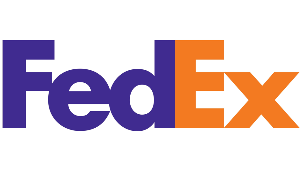
Designed by Lindon Leader in 1994, this logo is still in use. It is a wordmark that was earlier designed in bold Futura by Paul Renner in 1927 and was redesigned by Leader. You have to take a closer look to notice the white arrow that forms naturally between the letters “E” and “x”. This example proves that white spaces are as important as the positive elements in graphic design, and you can show creativity in the smallest space in a logo.
5. McDonald’s
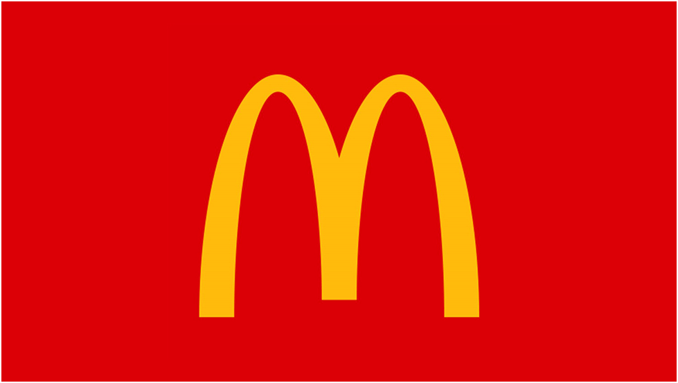
The McDonald’s logo was designed in 1968 by Stanley Clark Meston and his team, and is in use to date. No one knows if Meston referred to a logo manual, or had other logo design resources to help him design this iconic logo that has stood the test of time. In 1952, Richard and Maurice McDonald, the brothers who founded the company, conceived the concept. Like all great logos, McDonald’s is widely recognized, probably because of the distinguishing yellow and red combination, and the popularity of the logo was tested with a just a small part of it that serves as a directional signpost depicted below.

6. Coca-Cola
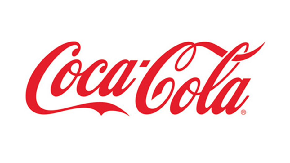
The Coca-Cola logo is probably one of the oldest to survive all these years as it was designed way back in 1886. Surprisingly, this logo was not created by a designer. It was designed by Frank Mason Robinson, a bookkeeper working with John Smith Pemberton, the inventor of Coca-Cola. This Spencerian script, which was popular during those times in the United States was used to design this iconic logo. This logo has weathered all design trends and stands strong today to maintain a unique status.
7. Starbucks
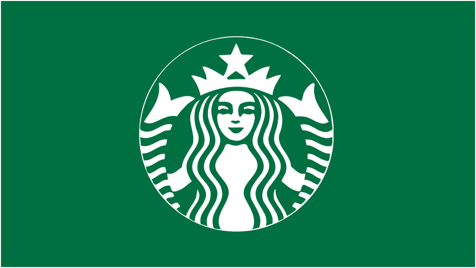
The Starbucks logo was designed by team effort, with many designers contributing their mite to arrive at the final design. Although it was created in 1987, it was conceptualized in 1971. Since it was redone in 1987, it has had a couple of iterations. The last one was in 2011, when all the text was removed, leaving only an iconic circular logo.
8. Woolmark
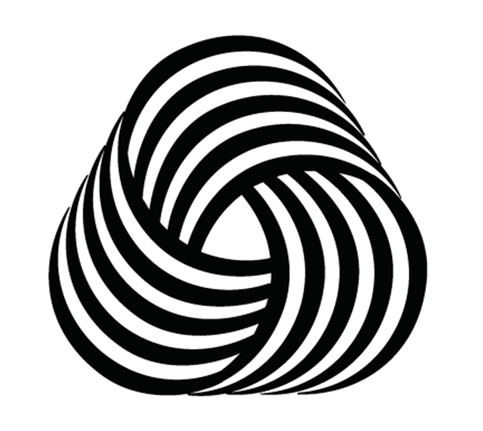
Initially introduced in 1967, the Woolmark logo was more like an IS specification as it denoted that the product is 100% wool. Created by designer Franco Grignani, it won the first prize in a design competition organized by the International Wool Secretariat in 1964. Although Grignani was on the judging panel, he was not happy with the designs he saw. This prompted him to sneak in an entry of his own through a pseudonym. Grignani, staying true to his principles, did not vote for his design; however, quality won out, and all the other judges voted in favour, and the rest is history.
Key Takeaways
Logo designing is a work of art and takes patience and dedication. Some of the resources listed above help designers hone their skills and create masterpieces in their own right. Meeting peers to exchange notes and get the latest updates is the best way to stay ahead of the game.
Conclusion
Logo designing is a skill that requires concentration and dedication, but one can find satisfaction just by looking at their work, which is a labour of love. Logos are intended to tell an entire story in a few letters, sometimes with some added design.
FAQs
Designers usually consult a logo manual they keep or look up logo design resources online. Designers need a never-ending source of stock images, both paid and free, which they draw from to create their designs. Some designers prefer free illustrations or may get their customizable images from Drawkit, one of the most popular sources. You can also get free and paid images from Burst, created by Shopify, specifically to aid graphic designers.
Firstly, you must understand the purpose of the logo. Next, you should focus on defining the brand identity, for which you may seek inspiration on the web, which has many resources. It pays to check what your competitors are up to, but having a unique design style helps you stand apart. One of the best logo-making tips includes creating a style guide template that will come in handy. Pay attention while choosing the typography, and check out many variations before settling for the colour you want to use.
Logo-making tips from experts emphasize the need to select the right software for designing logos. Most professional logo designers rely on Adobe Illustrator, the premium logo design software. If you are looking for free options, you may want to check out Affinity Designer, or Canva. If you are a beginner with limited or no skills, Tailor Brands Logo Maker is an excellent option because it creates your designs, and comes with other handy marketing tools. All you need to do is type in the text you want on the logo, and the software presents some binary font options and creates some sample logos.
If you don’t have a logo manual handy or don’t have time to look up other logo design resources, there are a few paid and free fonts you can use. While Noe Display and GT Super Serif are excellent paid options, you have free ones like Raleway, Cormorant, Poppins, and Eczar, which offer some decent font options. Please keep in mind that the free options always have limited choices, whereas the paid ones provide a better range of options.
Latest Blogs
Explore how Google’s 2025 AI search updates triggered ranking chaos. Learn actionable strategies to adapt your SEO for AI Overviews, zero-click searches, and SERP volatility. Stay ahead now.
Learn how to rank on AI search engines like ChatGPT, Perplexity, and Gemini by optimizing your content for authority, structure, and relevance. Stay ahead in AI-driven search with this strategic guide.
Explore the best healthcare SEO services for your medical practice. Improve online visibility and effectively reach more patients in need of your services.
Get your hands on the latest news!

Similar Posts

Design
7 mins read
15 Best Firms Offering Design Services in India

Design
5 mins read
All You Need to Know About Data-Driven Design

Design
6 mins read