How to Make Your Website Mobile-Friendly in 2022

Table of Contents
- What is a Mobile Friendly Website?
- Why Build a Mobile Friendly Website in 2022 for Your Business?
- How to Check if Your Website is mobile friendly?
- How to build a mobile friendly website?
- Key Takeaways
- FAQs
Wondering how to make the website mobile-friendly amid the ranking competition in 2022? We certainly don’t want to leave you hanging. We’ve listed some of the most efficient ways to get you started on this process.
We aim to help all website owners, whether established or complete newbies. With our strategies, you can design a mobile-friendly website faster. So sit tight and keep scrolling through our quick guide below.

What is a Mobile Friendly Website?
A common question is how to make a website mobile-friendly. A mobile-friendly website is where you build a seamless website viewing experience for visitors using their mobiles. Mobile and tablet websites offer unique user experiences for viewing, interacting, and engaging with content.
Websites will easily fit in a smartphone or tablet’s limited screen size. Different design elements are restructured, reformatted, and rescaled according to the user’s needs.
Why Build a Mobile Friendly Website in 2022 for Your Business?

Let’s set one thing straight: mobiles have made everything accessible for people. They help a consumer view a service faster compared to other devices. They even help consumers arrive at a buying decision hassle-free.
That’s not all. When you make a website mobile-friendly, you increase your chances of ranking well in Google search results. In consequence, Google prefers mobile-friendly, fast-loading, and device-adaptive websites.
These reasons are more than enough to encourage a business to explore different ways to build a mobile-friendly website. Before we do that, let’s understand how you can check if your website is mobile-friendly or not.
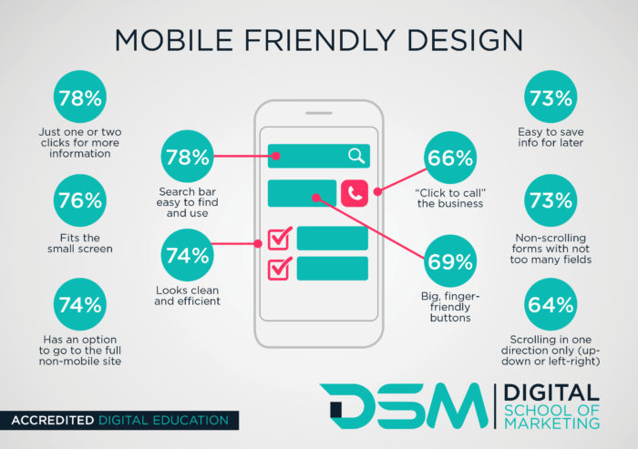
How to Check if Your Website is mobile friendly?
To make your website mobile-friendly with the utmost confidence, you need your website to pass a few tests. Once it has passed seamlessly, you will realize that your brand has designed a mobile-friendly website that will fulfill all your business requirements.
1. Use Google Search Console to test your website
Once you jump into the Google Search Console account linked to your mobile website, the ‘details’ section will display every issue regarding your website. It can point out problems with the website’s UI and UX issues and a range of other factors that could be instrumental in destroying the mobile-friendly nature of the website and its usability.
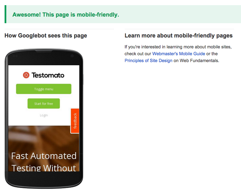
2. Google’s Mobile Friendly Test to check the mobile SEO of the website
If your website does not have a Google Search Console account, you can run a Google mobile-friendly Test. You simply have to enter the website’s URL and hit the ‘Analyze’ button to detect every problem with the website’s pages.
3. Using the Website Auditor Tool
You can check your page’s mobile-friendliness by launching the Website Auditor Tool and then going to Page Audit and finally Technical Audit. Once the requisite URL and relevant keywords are inserted in the respective fields, the tool displays whatever needs improvement in-depth.
4. Employing Google Page Speed Insights
Entering the URL of your website’s pages on Google Page Speed Insights will display several key suggestions in the Opportunities section that will help your web pages load faster. However, the entire process is highly time-consuming.
How to Build a Mobile Friendly Website?
What makes a website mobile friendly? Let’s check out the most important parameters and useful hacks to do the same.
1. Optimizing site loading times
Studies have revealed that the attention span of mobile users is too less when it comes to looking at a particular web page. They hardly look at the screen for 4-8 seconds. So if the page loading time is too much, the website will lose tons of visitors.
When it comes to the search and ranking algorithms of the users, the core web vitals (like interactivity, page load speed, visual stability, etc.) and page experience updates are critical in answering questions like how to build a mobile-friendly website. Google has developed a benchmark of 1 second for optimum page load times for mobile-friendly websites, and it is quite incredible!
2. Check your server response times
If your server takes too long to respond and hampers your page loading times, you need to sort things out with your web hosting provider’s support. Google Page Insights provides all the reports regarding your web hosting server and how its capacity affects your website’s mobile-friendliness.
3. Using too many plugins
When you use a content management system like WordPress, Joomla, etc., to build your site, you should remember that adding too many plugins slows down the website. If you have a WordPress site, using a Query Monitor can help you find out problematic plugins. On another note, you can do a split test using your site with or without plugins and check when it performs the best.
4. Image optimization
Optimizing images is one of the best ways to make your website mobile-friendly. Using proper image formats like JPEG 2000, JPEG XR, AVIF, and WebP is wiser because these formats are lighter than the corresponding JPEG and PNG format images. Hence, they boost site loading times considerably – by 25% to 35% at least!
You can also employ compression tools to reduce and optimize the image sizes on your website.
Another fantastic deal-breaker is leveraging ‘lazy loading’ for your images because it defers the off-screen images and prevents them from loading unless required. If you inquire how to build a mobile-friendly website, you should understand that image optimization plays a significant role.
5. Double-check your codes
Every bit of code used on your website – JavaScript, HTML, CSS, etc., should be checked the time and again for errors to ensure faster-loading speed and creating a mobile-friendly website.
6. Enable web caching for your website
Web caching ensures a good user experience for returning visitors to your mobile website. Enable web caching for all sections and elements of your website, including HTML, CSS, JavaScript, images, text, media files, and all other parts of your site’s content.
7. Use HTML5 to add media to your website
HTML5 is the best option for adding media like videos, animation, etc., to your web pages and delivering the same content seamlessly across all devices. It considerably boosts site loading times across mobile devices like smartphones and tablets. You should avoid Adobe Flash because it won’t help you create a mobile-friendly website.
8. You must use a CDN
A CDN or a content delivery network delivers your site’s content faster as it is a network of servers connected across the globe and loads all the content irrespective of the geographical presence of the websites. You can partner with web hosting providers who offer you a CDN partnership.
Conclusion
Upon understanding how a mobile-friendly website is essential for your business in 2022, there should be conscious efforts from the end of your brand or business to implement a mobile-friendly design for their websites. First, they should check whether their site elements perform according to their expectations. Instead, they should optimize them to render a mobile-friendly website in 2022 and make it the best platform for brands to interact with their customers.
Key Takeaways
- To understand how to develop a mobile friendly website, first, we need to understand what mobile SEO is and how it impacts humans and machines overall.
- With more than 50% of internet traffic coming from mobiles, making a mobile friendly website becomes the primary requirement. Google has adopted mobile-first indexing to rank sites according to their usability and customer experience.
- Building a mobile friendly website ensures your business and brand stay on top of customers and clients, and therefore they should ensure that their websites are mobile friendly.
- One of the most effective ways to build a mobile friendly website is to ensure responsive design for the overall elements of the website. A mobile responsive design is not only mobile friendly or mobile optimized, but it also adjusts itself to multiple screen sizes and reformats its content according to those mobile device screens. Go for some of the best website content services to ensure that all your content requirement is spot-on.
- There is an 8-point checklist to make your website mobile friendly in 2022, including tweaking with many web design elements like the codes, web caching, optimizing image sizes, minimizing page load times, etc.
FAQs
To create an HTML responsive web design for your mobile-friendly website, keep the following pointers in mind:
1. Add a meta tag to all your pages and set the viewpoint from there
2. Use responsive images with alt texts.
3. Use a responsive text size that is visible and clickable on the screens of mobile devices.
4. A responsive HTML web design should contain HTML pages that reformat and restructure themselves according to the mobile device being used to view them.
5. Try to include media queries in your HTML website to make it mobile friendly.
Follow the detailed steps below to build a mobile-friendly website in 2022.
1. Your mobile website should have a responsive design
Place information in places that are easier to find, navigate, and click.
2. Make the overall design simple and easy to follow.
Emphasize website speed and keep testing the optimum page load times
3. The font size should be large, but it should not be placed too close together or cluttered.
4. Your button sizes should be large enough for being clicked quickly
5. Minimize or nullify text-blocking apps and pop-ups that destroy the UX.
If you want to know whether your website is mobile-ready, use the 30-second method. Google offers a website where you can paste the URL of your website and click ‘Analyze.’ It is the site test by Google Webmaster Tools, which will clearly show if your site is mobile friendly and reasons if it isn’t.
You can simply right-click on the file containing the HTML code and inspect by turning on responsive testing. It will enable you to visualize how your HTML-coded web page will render in different kinds of devices.
If you want to find out how your finalized website will look on mobile, there is a simple exercise by which you can find out the mobile version of a website on Chrome.
1. First, click F12 and open DevTools.
2. Then use the ‘Device Toggle Toolbar’ present.
3. In the next step, you have to select the devices from the Android and iOS devices to present where you want to simulate your website and render it on mobile.
4. Once the device is chosen, it represents the mobile view of the website.
A quick tip for finding this out is heading to Google Search Console and then going to Settings. Check the About section. If you find that Googlebot Smartphone is an indexing crawler, you can ensure that your website has switched to mobile-first indexing. All websites that went live after July 1, 2019, are usually on mobile-first indexing.
Latest Blogs
Explore how Google’s 2025 AI search updates triggered ranking chaos. Learn actionable strategies to adapt your SEO for AI Overviews, zero-click searches, and SERP volatility. Stay ahead now.
Learn how to rank on AI search engines like ChatGPT, Perplexity, and Gemini by optimizing your content for authority, structure, and relevance. Stay ahead in AI-driven search with this strategic guide.
Explore the best healthcare SEO services for your medical practice. Improve online visibility and effectively reach more patients in need of your services.
Get your hands on the latest news!

Similar Posts

Design
7 mins read
15 Best Firms Offering Design Services in India

Design
5 mins read
All You Need to Know About Data-Driven Design

Design
6 mins read