Table of Contents
- What is a Landing Page?
- Purpose of a Good Landing Page
- Tips to Make an Effective Landing Page
- 15 Ideal Examples of Landing Pages
- Other Ways to Drive Traffic to your Landing Pages
- Key Takeaways
- Conclusion
- FAQs
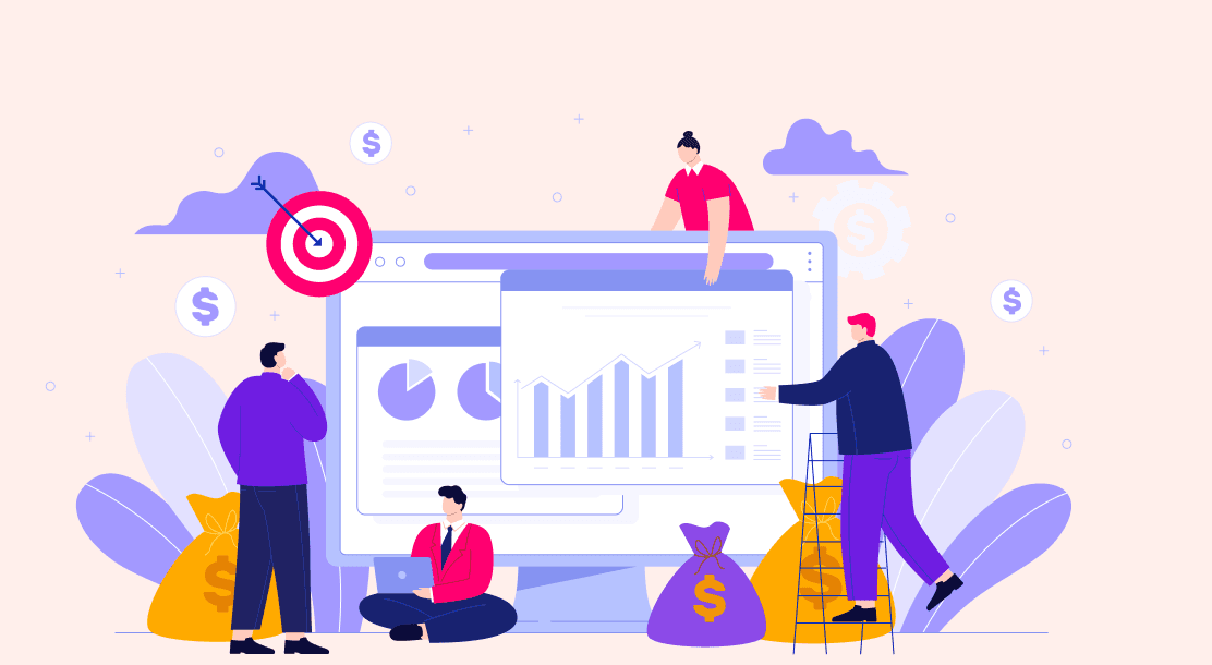
There’s an old saying, “Don’t judge a book by its cover!” While this proverb is valid in almost all aspects of human life, it loses its essence in digital platforms and a company’s brand identity. Today a website conveys that you are a credible source for consumers all over the globe. It, therefore, also becomes even more critical for you to have a decent landing page for your website. This article will list the 15 best examples of landing pages that stand out in terms of both content and skillful look and feel.

What is a Landing Page?
Before “we skip to the good part,” let us understand what a landing page is. According to Wikipedia, a landing page is “A single web page that appears in response to clicking on a search engine optimized search result, marketing promotion, marketing email, or an online advertisement.”
But besides this bookish understanding, a landing page is an independent page that potential clients would be able to “land” on when they navigate from an email, advertisement, or other advanced areas. A homepage is different from a landing page. A homepage has more external/internal links, broader CTAs, and a very diverse audience and purpose than the landing page.

Purpose of a Good Landing Page
A good landing page encourages its users to take one meaningful action like filling out the signup form on the page. Moreover, they also offer the brand/company some sort of tangible incentive like through the download of an asset like a digital book or webinar information.
Due to these multiple benefits, there are two broad categories of landing pages, i.e., lead-generation landing pages and click-through landing pages. However, irrespective of these categories, the primary objective of these pages is to create leads while the business pulls prospects further into the client pipe.
Tips to Make an Effective Landing Page
Before we look at the examples of the best examples of landing page design, one should also know what makes an effective, skillful landing page. All these qualities are shared by the examples we have listed below, making them one of the great landing pages of 2022.
- Write an enticing headline. You can draw consideration with explicit catchphrases like “free” or “presently.” Match your primary headline to the ad your visitor clicked to land on the page. Moreover, backing the title with solid copywriting will earn you brownie points.
- Show your product or service in a discussion. A video or demo can set in the fact that you offer something exceptional. Such visual demonstration will eventually aid potential clients with imagining themselves utilizing your item or administration.
- Include social media proof and testimonials to back up your claims. Have you ever heard of the bandwagon strategy? A good testimonial puts the bandwagon strategy into the client-making process. By showing visitors results on social media, you can convince them to try your product or service themselves.
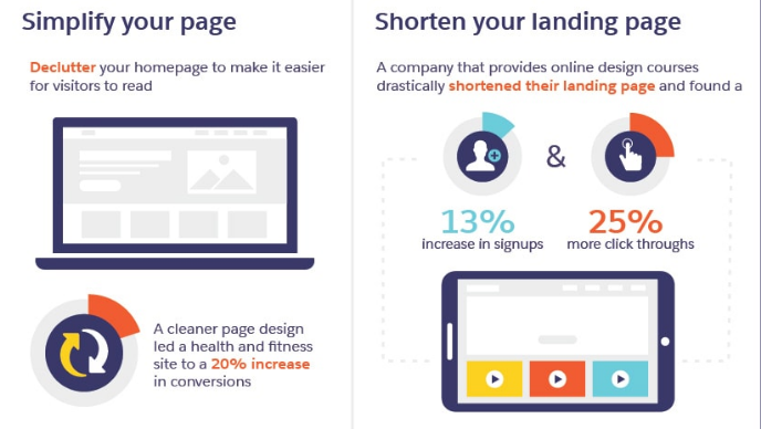
- Onscreen minimalism is a must. By this, we mean to reduce clutter. Avoid packing the screen with floating bars, pop-up windows, or additional menu options unless absolutely necessary. Remember, the job is to easily make the visitor understand your message. Clean and neat work is therefore always appreciated.
Apart from these pointers, here are some tips to make your landing page SEO- friendly.
- Focus on long-tail keywords. As a general practice, it is easier to rank long-tail keywords than short-tail keywords because long-tail keywords are less competitive. And since landing pages feature very specific call-to-actions, it’s easy to place long-tail keywords.
- Earn high authority backlinks. Good backlinks send traffic to your landing pages. Think of these as votes of confidence while ranking on search engines. When these backlinks come from well-established websites, they show search engines that the content on your page is valuable.
- Work on your page loading speed. Clients can be eager and quickly flustered. So if the loading speed of your page is slow, your possibilities of converting that viewer into a promising client becomes more modest. To keep a high transformation rate, landing pages need to load at speed as fast as lightning.
- Always give the option to share the content. This is important because all of your potential leads are connected. When you allow them to share your landing pages, you can use their more extensive network.
- Provide easy to comprehend navigation options. Navigation provisions include links to internal pages of the website of the particular company or business. One should always make sure that these options are visible and well titled.
- Remember to make your page mobile-friendly. While most mobile browsers can view desktop sites, creating a mobile-friendly version of your landing page will fetch you a more positive response. In fact, there is a bulk of online traffic from mobile users. So easing out their experience by minimal use of any kind of auto-playing videos will always be helpful.
15 Ideal Examples of Landing Pages
So, after understanding what makes an effective landing page, let us now have a look at the 15 best landing pages for your design reference and inspiration.
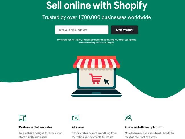
1. Shopify
The sign-up landing page of Shopify is a preliminary greeting page for the visitors. The key to their fantastic page is its simplicity. It is minimalistic in terms of text. It ensures that it talks about central issues about the item that rates best on their website.
The key here is the simple and catchy graphics, snappy and crisp user-friendly headline, and use of short paragraphs to communicate. Also, there are only a few fields one needs to fill out in their sign-up form before one gets started. This makes it easier for the customer to sell online through their platform quickly.
2. Airbnb

One of the most praiseworthy features of Airbnb’s landing page is how personalized its content is. Airbnb offers hosts a projection of how much they can earn weekly on the basis of visitors’ location and home sizes. Their clear call-to-action at the top of the page earns them brownie points.
So if you, a visitor and a potential host, visit their landing page and you will know what you can expect to earn and how much you should charge. Moreover, if you are convinced about hosting but need some doubts clarified, you have the option to contact a seasoned Superhost to answer any questions you have.
3. Uber
Uber’s landing page uses a stark black and white color scheme, which tells the visitor that using uber services is classy. The information reflected is in the form of short and easily-digestible sentences.
Since we know for a fact that the Internet floods with information online. Hence, creating a skim-able landing page is essential. Combining these elements makes it possible for Uber to present itself as a professional and approachable page.
4. Netflix
The landing page of Netflix is in the form of a simple sign-up form. As Netflix has a wide variety of audience appeal, from us to our grandparents, it has made sure that its UI doesn’t scare away folks who aren’t tech-savvy. That’s why their first step is the easiest of all; just enter your email to get started.
To answer the frequent questions of pricing it generally faces, there is a drop-down section of FAQs. Finally, the copy of this page is short, crisp, and simple.
5. Spotify
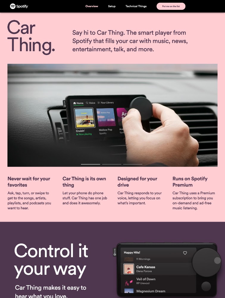
The landing page of Spotify is straightforward and easy to comprehend. The stark color contrast helps one emphasize the text and their call-to-action statement. An interesting feature is how this landing page does not follow Spotify’s classic green and black colors.
To entice the visitors further, it lists down the most played artist, song, album, and podcast of the year. Hence, it is a very creative way to promote its content library and attract visitors to opt for its premium version.
6. Amazon
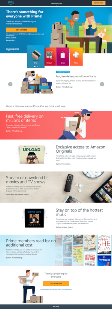
Amazon is one unique example of landing pages. This is because the company blatantly breaks all the rules and somehow manages to get away with it. They know their offer is too good to pass up.
The free shipping service and the service of Prime Video is the key here that lures the visitors to sign up for Prime membership. The rest of the features are just brownie bonuses. Therefore, these extra benefits are presented as wonderful add-ons as one gets further down the page. It’s just a smart move to put the most essential stuff in the top half of the page.
7. Linkedin
The landing page of Linkedin highlights the benefits of upgrading one’s account to Linkedin Premium. However, what is most attractive and valuable for the landing page is jump links. These links will help visitors skip ahead to the parts that interest them most.
8. Wix
Wix, being a website design and development platform, has very creatively turned its landing page into a creative playground. So, a visitor who is aware of Wix’s services will not only expect but also be captivated by the digital illustration that follows one down the page.
And what’s interesting here is the design or illustration. It’s neither overwhelming nor distracting. It is carefully balanced with white space and has simple, clear, and easy-to-understand text. The use of the mountain’s peak in the illustration points to their primary CTA encouraging visitors to use Wix for their website development.
9. Webflow
Just like Wix, Webflow is also a design tool for web developers. However, unlike its competitor, Webflow packs all its features and call-to-action information in just one GIF. This animated GIF is the treat of its landing page. It is visible in the same frame on the website and demonstrates to its users how the product works and sign up without scrolling.
Rather than just talking about it, Webflow shows, giving it an edge to win over its potential customers. It gives them a clear idea of what it does and how their user experience will be. In fact, it also reminds its users that the service is free. There’s no trial period, and they can build their site for free.
10. Canva
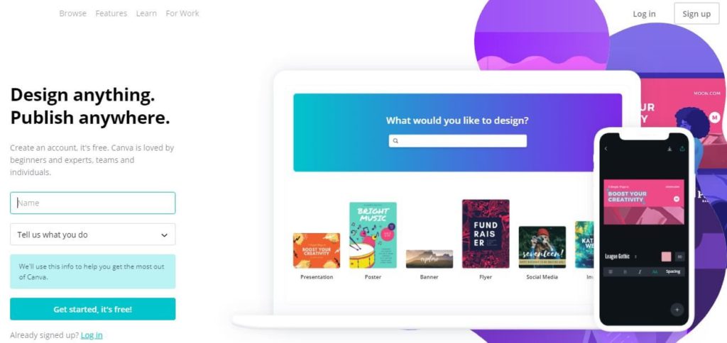
We know that Canva is a design software with multiple design services. Hence, Canva’s landing page does not shy away from reflecting its design capabilities. The design is attractive and straightforward. Like Wix, Canva has an abundance of white space that balances both bright colors and text.
11. Mailchimp
To understand Mailchimp’s landing page, one must first look at that eye catching, bright yellow foundation tone. The color scheme is a strong standpoint and reflects how the brand is different from its competitors.
Moreover, MailChimp has a strong call-to-action. The call-to-sign-up is in the form of a sticky button that is used just once but is reflected throughout the page. This is a strong technique since the CTA works as an entryway in conversion rate.
12. Sundae
The landing page for this real-estate business is a fine example of minimalistic design and personalized copy. This landing page removes almost all of the photography, animations, videos, and distractions that one finds on other pages. It uses lots of white space to give one the breathing room.
13. Vimeo

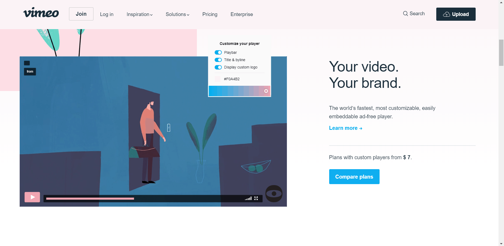
Vimeo’s landing page is a fine example of simple yet interactive. Even though their landing page has less text or copy, it works well for them. The light green call-to-action button is prominent on the page since it contrasts with the light background, hence, making it pop out.
Moreover, and very importantly, as stated earlier, rather than having too much text on its page, it has included an engaging video showcasing its services. They have also added a navigation bar and navigation links that invite visitors to explore the site and spend more time there.
14. Unbounce
Unbounce’s landing page flaunts its heading and subheading, therefore making it stand out. In the very beginning, it also highlights its primary CTA i.e., “See Plans & Pricing.” This is an interesting way to engage with its visitors by sharing its plans and pricing information. In fact, if one goes even further, one can also look at the pricing matrix directly on the page. This tactic effectively decreases their bounce rate since all the valuable information is provided.
15. Loomly
Loomly is a social media automation software. It is also one of the finest examples of a good landing page on the Internet. Many companies often use the tactic of targeting one’s competitors and their keywords so that one can tap into their interested buyers.
Loomly has done something even better and taken it one step ahead. It has created a landing page based explicitly on this tactic. A product video has been placed strategically in the center of the landing page, which makes it easy to grasp Loomly’s service and everything that it has to offer.
Other Ways to Drive Traffic to your Landing Pages
It is also important to understand that initially, the landing page won’t generate traffic by itself. In the initial phase, one would be required to fill that funnel full of visitors for one’s landing page to work. So what are those options? Let’s find out:
- Paid search traffic: By paid search traffic, we mean Google Ads or, in simple terms, “paid advertising.” In marketing terms, pay-per-click ads are prepared and paid for by marketers.
Anyone who clicks on that ad link will be directed towards your landing page. These ads are placed by thorough research of search terms, demographic data, or analyzing browsing history. So linking the ad to a standalone landing page that matches your ad copy can offer a lucid and straightforward call to action.
- Paid social traffic: One of the most common and fruitful ways to drive traffic to your landing pages is by promoting ads on sites like Facebook, Instagram, Twitter, or LinkedIn. This helps you target people and communities who’ll be particularly interested in your brand or work profile.
The most iconic feature of this is that you can connect with your customers even before they begin to look for your products or services. Interestingly, every social media platform has its unique features. For example, Instagram is an apt place for products and lifestyle brands with a strong visual appeal. However, to avail or advertise professional requirements, Linkedin has always proven to be a better platform.
- Email campaigns: Running email campaigns is considered one of the most effective marketing practices. This is simply because emails have a massive reach at very low costs. Therefore, a powerful combination of emails and landing pages can help one attain new traffic to the landing pages and nurture existing relationships with customers.
- Organic search traffic: The term “organic traffic” refers to visitors who come from an unpaid source. By making convincing, authentically helpful content on your landing pages, you can guarantee that your business shows up most of the time in related searches. The higher your content ranks, the better.
Key Takeaways
- A landing page is an independent page that potential clients would “land” on.
- The primary objective of these pages is to create leads while the business pulls prospects further into the client pipe.
- A good landing page encourages its users to take one crucial action such as to sign-up from the page.
- An effective landing page must have a catchy title with solid copywriting.
- Adding some form of visual demonstration will help your potential clients understand the utilization of the product or service you provide. Also, it will help you reduce the bounce rate on your page.
- A landing page should always have reduced on-screen clutter.
- Always remember to make a mobile-friendly version of your landing page.
- If you’re using a landing page template from a hosting service, those templates generally include a mobile version, which will by default display a mobile browser version of your page.
Conclusion
A good landing page helps in developing your client base and expanding changes. Make a page that delights clients with an extraordinary UI, such that they keep on returning to your site and page. Regardless of whether you’re utilizing a landing page builder/template/layout or building one without any preparation, it’s crucial to keep these prescribed procedures foremost. Always focus on decreasing your bounce rate and using videos to increase conversions.
What’s more, make sure to test your pages and analyze their viability. Amazing examples of landing pages, like mentioned above, should always inspire you to create even better pages.
FAQs
A product landing page is a standalone web page created specifically to sell a product.
Unique point of view: A major component of the landing page needs to be distinguishing how you are different from your competition.
Primary headline: The main headline must attract the attention of your target audience.
Effective subheadings.
Visual content.
You can use software such as Ucraft!
1. Create a free account.
2. Select the free landing page option.
3. Pick one of many free landing page templates.
4. Connect your domain.
5. Add and edit your texts, images, and videos.
6. Optimize search engines’ content.
A landing page builder is an instrument that works with the whole course of making, distributing, and sharing points of arrival. These developers frequently give “what you see is what you get,” permitting anybody to control the look and feel of the page’s design, structures, and modules.
According to WordStream, the average landing page conversion rate is 2.35% across industries.
Latest Blogs
Explore how Google’s 2025 AI search updates triggered ranking chaos. Learn actionable strategies to adapt your SEO for AI Overviews, zero-click searches, and SERP volatility. Stay ahead now.
Learn how to rank on AI search engines like ChatGPT, Perplexity, and Gemini by optimizing your content for authority, structure, and relevance. Stay ahead in AI-driven search with this strategic guide.
Explore the best healthcare SEO services for your medical practice. Improve online visibility and effectively reach more patients in need of your services.
Get your hands on the latest news!

Similar Posts

Design
7 mins read
15 Best Firms Offering Design Services in India

Design
5 mins read
All You Need to Know About Data-Driven Design

Design
6 mins read