
Table of Contents
- What is UX Email Design?
- 4 Email UX Design Strategies
- 3 Basic UX Design Principles
Digital marketers have always known the value of email. After all, it has the potential to deliver the highest ROI of all marketing channels. The popularity of email shows no signs of declining. According to reports, the forecast for the number of email users worldwide in 2022 is 4.3 billion.
Among the emerging trends in email marketing are:
- Greater personalization
- Better mobile experience
- Messages with entertainment value
- Increased automation
- Arresting UX email design
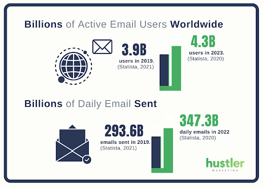
Statistics show that the average person receives over 100 emails a day. That’s a lot! How do you ensure that your messages stand out from the crowd? Let’s look at the last trend mentioned above again. With UX email design, you increase the chances of your email being noticed and read. So you can do a better job of attracting and engaging your target audience.
What is UX Email Design?
User experience design is the process of designing physical or digital products that improve customer satisfaction. The goal is to make customer interactions pain-free and pleasurable. John Amir-Abbassi, User Experience Researcher at Facebook, says that it’s an approach to design that considers all the aspects of a product or service relating to the user. That includes usability, accessibility, and also things like delight and emotion.

Good UX design means simplicity and visual appeal when it comes to email. The content should be easy to process, with appropriate sections and cues. It’s useful to keep Hick’s Law in mind: the more choices you present your users with, the longer it will take them to reach a decision. In an age of multiple messages and distractions, you don’t want to risk confusing and losing consumers.
4 Email UX Design Strategies
Marketers use many UX email templates and guides. This helps with inconsistency as well as saves time. Most UX email templates adhere to basic concepts of UX design. It’s useful to be aware of some common strategies. This lets you choose the right design depending on the nature of your email and the consumer.
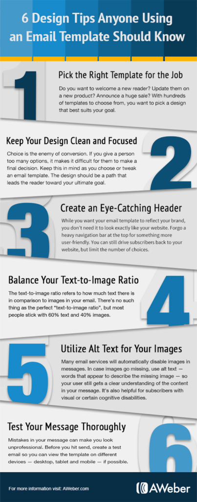
Here are four strategies that have a significant impact.
1. Use unique visual content.
Be it digital and TV advertisements or emails and banners, consumers are attracted to unique visual content. There’s no point stuffing your email with bland images everyone has seen before.
No one will be fascinated by pictures of people in offices, families having a good time at the park, executives in front of laptops, etc. Choose images that are intriguing and engaging.
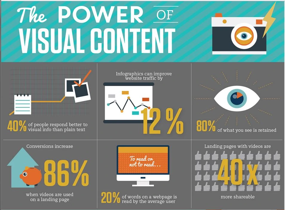
Real people are more engaging than models. It doesn’t only have to be photographed; there are many more visual options. You can use gifs and arresting infographics, for example. Many also use emojis in subject lines to catch attention.
2. Match content to visual
Although we’ve pointed out the importance of unique visual content, this should be matched with the text at all times. There should be a relevant fit between the visual and the copy.
If your email has wonderful images of beaches, for example, and the copy is about office chairs, the consumer will feel cheated. The chances are that they will not read the rest of it and may even ignore future emails. That’s why images need to be on-brand and perfectly aligned with content.
3. Use white space
Often, email marketers feel that they should make full use of in-box real estate. That’s why so many emails are covered with text, illustrations, images, and CTAs. This is not a good UX design strategy. It makes the email look cluttered and confusing.
The consumer’s eye should be guided to significant aspects of the email. This is conveniently done with white space. There can be space between headlines and subheads, between subheads and copy, and around images. It’s also good to surround significant email elements with white space.
This will make them stand out. Remember that many consumers will not read the entire email. The proper use of white space will ensure that they don’t miss the significant parts.
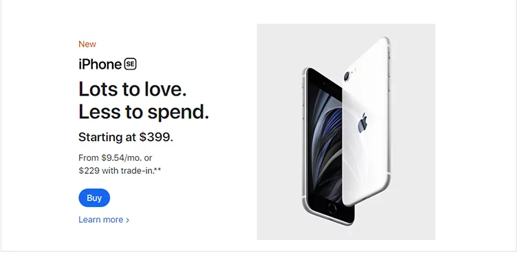
4. Focus on the CTA
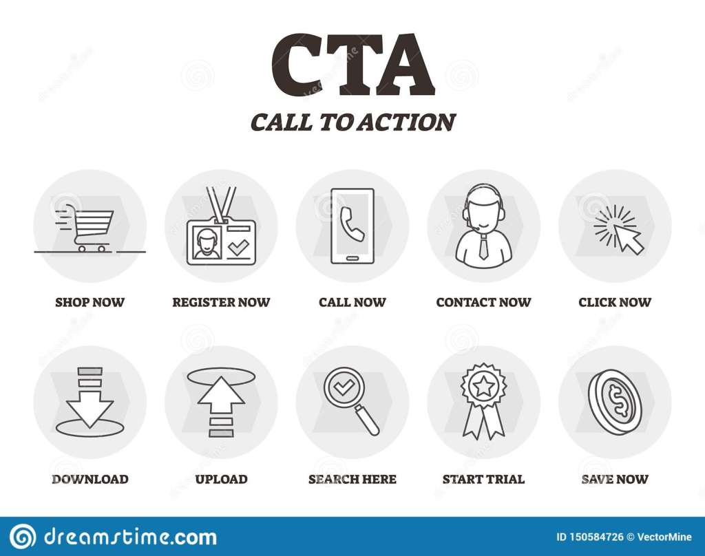
As you probably know, the call to action is a crucial piece of the email. Several studies show that including CTAs in emails boosts click-through and conversion rates. That’s why it’s necessary to design the CTA properly.
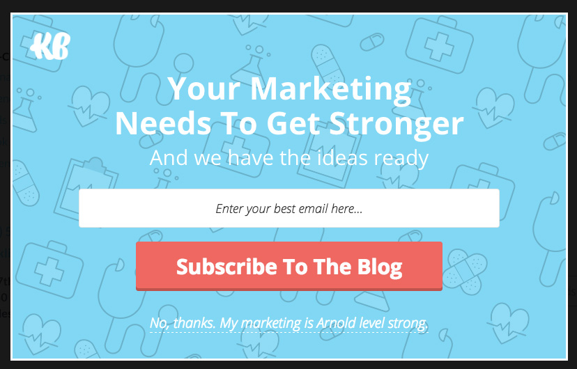
Ideally, it should look like a button with a distinctive geometrical shape. The color of the button should stand out. The text on the button should be clear, and not merge with other elements.
For the sake of clarity, there should be only one CTA button per email. If it’s important to include another CTA, this can be in the form of a text link.
Three Basic Email Design Principles
Emails should look clear and appealing, with content tailored to the target audience. There should be a zero learning curve for the consumer navigating the contents. The design should be responsive and adaptable to different formats, especially mobile phone screens. Another aspect is findability: it should be easy to locate if the consumer is looking for specific information.
In general, three design principles sum up the above.
1. Simplicity
The email should not look stuffed and busy. Include only necessary elements. If there are too many pieces of information, you can consider breaking them up into two or more emails. Not only is simplicity eye-friendly, but it also conveys that the information is accessible and actionable.
If consumers see an email that looks cluttered, the chances are that they will not bother to continue reading it. The best strategy is to understand the core of the user experience and align all necessary elements around it.
2. Clarity
Above all, the email design should be clear. This is more than the simplicity referred to above. It also refers to how the elements are arranged and how they attract the consumer’s eye. In other words, there should be a clear hierarchy in the way the information is presented.
The most important piece of information should be first, followed by supporting information, ending with an unmissable CTA. This means prioritizing elements to achieve a friction-free reading experience. When this is done well, it leads to a functionally efficient and aesthetically pleasing email.
3. Relevance
Most marketers know that personalization is at the heart of effective online communication. The same applies to email design. The visual elements used should be relevant to the consumer’s needs.
They should also match the brand personality. An email from a bank, for example, should look sober and professional. However, an email from a travel agency can be bright and colorful. The relevant design also has to do with the nature of the email. An email to a new prospect should be as attractive as possible, whereas a follow-up inquiry can be brief and minimal.
Final Words
Email marketing can be a rewarding strategy to boost conversions. The chances of this increase with a proper UX experience in email design. Whether a transactional update, a promotional email, or a newsletter, every email can be enhanced with UX email design.
The basic principles of simplicity, clarity, and relevance should be applied consistently across the consumer journey. Think of every email as an opportunity to start a long-term relationship with the consumer. Make sure that your brand’s voice is appealing, clear, and persuasive.
FAQs
It is about making the user experience of reading the email as simple and appealing as possible. With so many other emails and messages, only well-designed and relevant marketing emails will be read and acted upon.
Many UX designers find that it is helpful to break down their tasks into these four elements:
1. Value
2. Usability
3. Adaptability
4. Desirability
These are blueprints that layout information flows and visual elements for general use. Marketers can use them to save time and ensure consistency.
A good email design lets the consumer know what elements to read first and what they should do afterward. It contains appropriate headlines, subheads, and visual elements that promote the main message. It also has a CTA button that is appealing and noticeable.
Latest Blogs
Explore how Google’s 2025 AI search updates triggered ranking chaos. Learn actionable strategies to adapt your SEO for AI Overviews, zero-click searches, and SERP volatility. Stay ahead now.
Learn how to rank on AI search engines like ChatGPT, Perplexity, and Gemini by optimizing your content for authority, structure, and relevance. Stay ahead in AI-driven search with this strategic guide.
Explore the best healthcare SEO services for your medical practice. Improve online visibility and effectively reach more patients in need of your services.
Get your hands on the latest news!
Similar Posts

Design
7 mins read
15 Best Firms Offering Design Services in India

Design
5 mins read
All You Need to Know About Data-Driven Design

Design
6 mins read