
Table of Contents
● What are Opt-In Forms and Their Functionality?
● What Makes an Opt-In Form Great
● Opt-In Form Placement: The “Where” Matters
● Dos & Don’ts While Designing an Effective Opt-In Form
Anyone who has spent significant time online will testify to seeing or interacting with different opt-in forms on various websites. Having a winning marketing strategy coupled with good quality content can often help drive traffic, but opt-in forms are often crucial in assisting the conversion.
What are Opt-In Forms and Their Functionality?
Opt-in forms are the attractive and eye-catching boxes to input information to get something in return, such as a free e-book or download. You put a lot of effort into attracting website visitors, whether it’s through your blog, social media, or paid advertising. But if those visitors leave without taking action, that effort is wasted.

Opt-in forms are one of the tools you can use to keep your visitors on your site and convert them into subscribers. A well-designed opt-in form can be a powerful conversion tool, while a poorly designed one won’t do much good. Also called “conversion forms” or “lead capture forms,” they help you build your email list by asking visitors for their names and addresses.

Key functions of an opt-in form
1. Helps build a mailing list
In its most basic form, an opt-in form helps marketeers or organizations build a mailing list from the visitors who come to their website. It’s simple and often does not require too much information.
2. Helps customize to your audience
An opt-in form often gives you insight into the type of content your audience would be interested in. Thus, it allows you to customize it and offer it in the same style for better reception.
3. Improves email open rates
Since opt-in forms are all about consent, often, the people subscribing to them would be the ones who are interested in knowing about your products, services, and offerings. Hence, it improves email open rates and reduces spam.

4. Creates a lead database effectively.
Opt-in forms serve as your lead generation tool that often captures the contact details of your prospects. Thus, through customized messaging tailored for their needs, you cannot just nudge them to conversion but also follow up on them at regular intervals.
What Makes an Opt-in Form Great
An opt-in form is designed to get a user to take action. In this case, that action gives you their contact information, usually their name and email address. You do this in exchange for something else — usually a valuable piece of content like an e-book or a video course (or just a fabulous newsletter).
If you want people to give you their contact information, then your opt-in form needs to be compelling enough that they do it. That means it needs to look good, sound good, and function correctly.
Here are some things all great opt-in forms have in common:
● They’re simple.
The most important job of an opt-in form is to persuade visitors to take action. A long list of text and complicated fields will only discourage them from taking that action, so make sure that your opt-in forms are focused on delivering value in exchange for the visitor’s information and contact details.
● They stand out from the crowd.
Your opt-in form should stand out from the rest of your page without looking like it doesn’t belong there at all. You want visitors to notice it and interact with it without making it look like a separate element.
● They offer incentives.
Having an opt-in form that only asks for information from your visitors without offering anything in return is barely considered. Ensure you provide attractive incentives like free resources or special access to certain content, and mention their benefit if they spend time and effort interacting and filling your opt-in form—the more enticing the incentive, the greater the chance of getting a response.
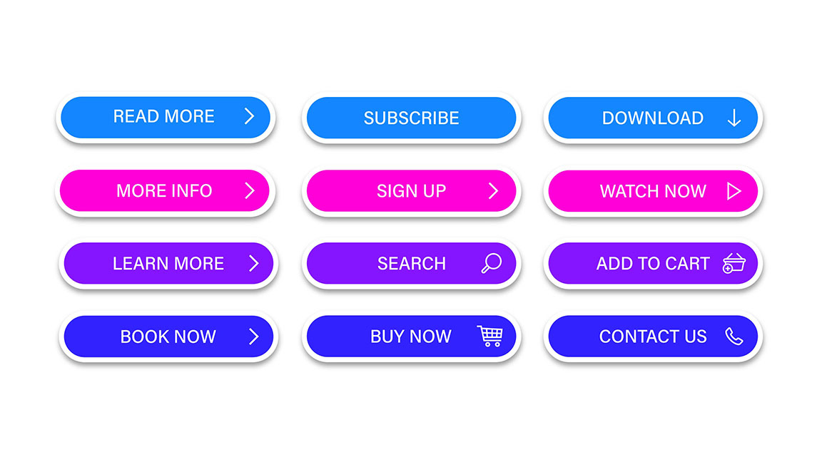
● They have a solid CTA.
A call-to-action (CTA) is crucial in telling your visitors what exactly they need to do to get the desired results. Engage CTAs that are specific and direct. For instance, rather than saying “click here,” having a CTA like “click here to claim your free session” would stand a better chance by offering more clarity on the next step for the visitor.

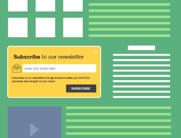
They are easy to close. Do not ever force your visitors to stay longer than they intend to forcefully. If the opt-in form is a pop-up, ensure you have the close button prominently displayed in its default top-right corner. Burying it in your content or design could lead to them being frustrated and adding proxy or incorrect details in your form.
Opt-In Form Placement – The “Where” Matters
Where a user finds an opt-in form is as important because it defines whether they would want to fill it at that time or not. Some of the best examples of this are that websites often add an opt-in form asking for the visitors’ details every time they hover the mouse to close the tab.
This allows them a final chance to interact and keep in touch and just convert traffic to lead.
An opt-in form can be broadly placed in one of two ways:
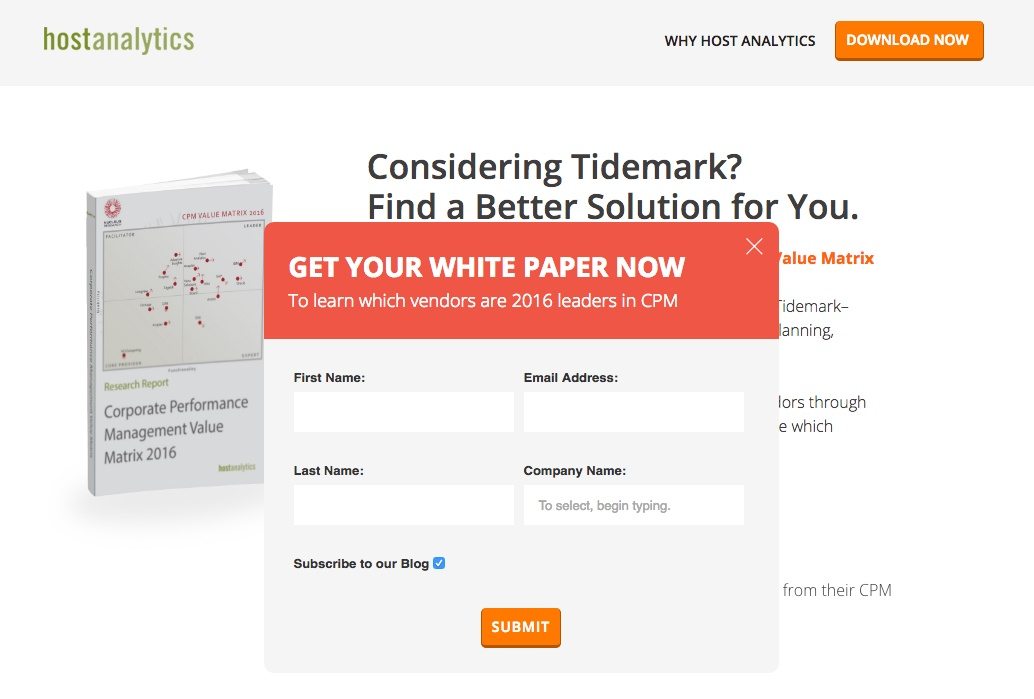
● Embedded opt-in forms: This is often placed with the relevant content of your page. For instance, a section under each service listed on your Services page nudges the visitor to sign-up for a free demo. It follows the same design principle as your overall website but is also prominent enough to be noticed amidst other content.
● Superimposed opt-in forms: Superimposed forms are your go-to option if you intend to be creative and creative with an eye-catching opt-in form that may not necessarily follow your design theme.

These include pop-ups, slide-ups, sticky bars, and more than open up when the visitor does a particular behavior like scrolling to half a page of the content or hovering over a specific section or even going towards exiting your page.
Dos & Don’ts While Designing an Effective Opt-In Form
Designing an effective opt-in form is easy if you follow the basics. Here are some dos and don’ts.
Dos while designing an effective opt-in form
● Use crisp and readable content: Opt-in forms are short by nature. Hence, having a detailed description or making it content-heavy will turn down your visitors from reading the entire thing.
Ensure that the copy is crisp, relevant, high quality, and concise. Do not add too many funky fonts or bright colors that make it difficult to read. The more effort needed to understand the form would reduce the number of responses you get on it.
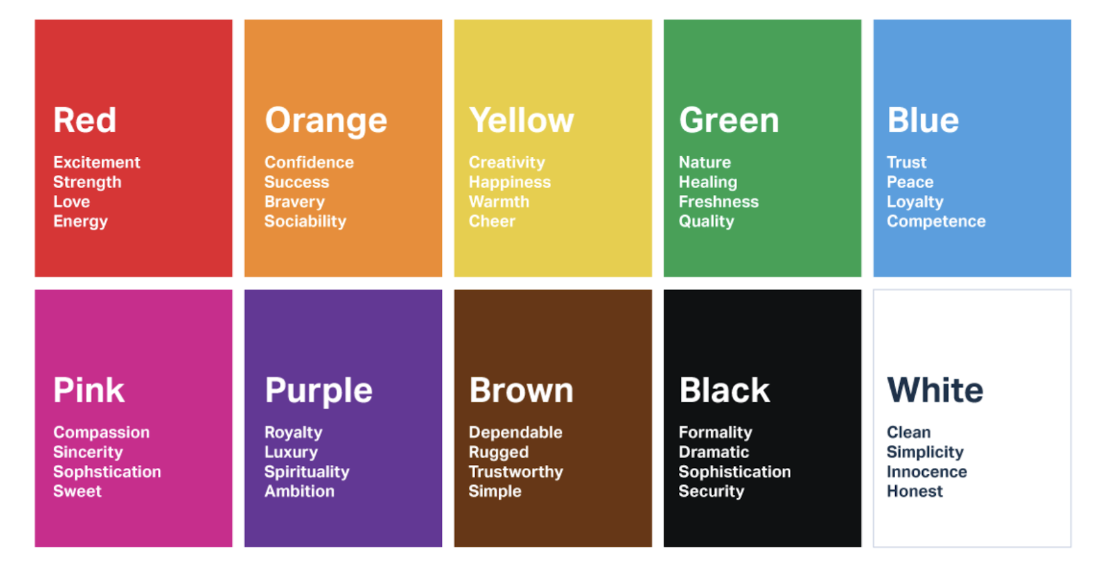
● Use contrast to your advantage: Just having a form with the right content is usually not enough. It should grab the user’s attention and often entice them into filling it. Ensure that you understand the color palette and use it to your advantage when designing the look and feel of your form.

● Keep your opt-ins error-free: Errors in terms of checkboxes overlapping or jumbled chronology, spelling errors, etc., often lead to visitors being put off and not filling the opt-in forms. Also, ensure that your form is optimized for mobile and that visitors can swipe instead of scroll.
Don’ts while designing an effective opt-in form
● Don’t ask for too many details: When visitors see a lengthy form with multiple fields to be filled manually, they often choose to skip it. Make sure you only request essential information.
You can ask for the remaining details later once you have their basic details. Ensure you validate the visitors’ inputs by turning the field green or giving a tick mark once they fill a particular field or section.
● Do not miss out on the tests: A/B type testing ensures you find the correct form for the right audience in the right place at the right time. This also increases the chances of responses significantly as it offers inputs in terms of its size, placement, design, and response time.
● Don’t have a form that takes time to load: The quickest way to avoid a response is the slow response time of your opt-in form. Ensure that it offers options like autofill to save visitors’ time and make them feel their time is valued.
In Summary
Opt-in forms are highly effective tools if used well. Decide on the type of opt-in form you want to use depending on your website and the product/service you provide.
Moreover, ensure that you maintain a solid database for further communication with your visitors to build traction for your product and service using these opt-in forms.
FAQs
Opt-in forms clarify visitors’ interest in the company’s offering and authorize the company to contact them to provide additional information, service, or offers in the future.
Opt-in forms should include the basic details of the visitors, like their name, email ID, and contact number. It should also provide relevant information on what to expect from you once they fill out the form. It is also crucial you mention the frequency of the contact, and it would be ideal to mention that you would keep their details private.
The title clarifies the purpose of the form.
● It explains the goal – offering free service, sending newsletters, etc.
● It asks only specific information
● The CTA is positive and encouraging
● It incentivizes the users once they share their details.
Double opt-in is a strategy that filters the audience and offers leads that are more likely to be converted since they took an extra step to share their information with you. A button often triggers it on the page, which then takes them to the actual form, where they sign-up. This effort shows their interest in the brand and allows you to leverage this to help them in faster conversion.
Checkboxes in opt-in forms are used when you seek consent for more than one thing from the user—for instance, permission to send them the newsletter and contact them with new offers and advertising content. Keep the checkboxes to a minimum, as having to make more decisions could lead to more significant dropouts.
Latest Blogs
Explore how Google’s 2025 AI search updates triggered ranking chaos. Learn actionable strategies to adapt your SEO for AI Overviews, zero-click searches, and SERP volatility. Stay ahead now.
Learn how to rank on AI search engines like ChatGPT, Perplexity, and Gemini by optimizing your content for authority, structure, and relevance. Stay ahead in AI-driven search with this strategic guide.
Explore the best healthcare SEO services for your medical practice. Improve online visibility and effectively reach more patients in need of your services.
Get your hands on the latest news!

Similar Posts

Design
7 mins read
15 Best Firms Offering Design Services in India

Design
5 mins read
All You Need to Know About Data-Driven Design

Design
6 mins read