Table of Contents
- 10 Design Trends to Avoid
- Key Takeaways
- Conclusion
- FAQs
“Good art inspires; Good design motivates.” – Otl Aicher.
Yes, it is very motivating! Otl Aicher, a German graphic designer, compares the influence of art and design on individuals. Design is always a motivator; thus, we should listen to our gut instincts regarding this incentive.
Do some graphic design trends, on the other hand, make you feel uninspired? Do you think they’re becoming too monotonous and pigeonholed into a single design trend? This may be because you’ve gotten good at following some design trends that have been around for a long time in the design business. Having said that, these design trends are likely to have stirred the market at some point in the past, and their influence on your work is as strong as it gets.
As a graphic designer, you would always like to be up-market and gain inspiration from the latest trends each year. On the other side, we have seen that sticking to these trends too tightly may leave you feeling saturated with the same old, boring patterns. A creator’s or graphic designer’s thumb rule is to develop a fresh and unique collection of concepts. This may be accomplished by recreating with hard thinking and intentionally avoiding referencing these design trends. Such design trends would only keep the ball moving for the time being and not create a stir. We’ve compiled a list of 10 design trends that should be avoided entirely in 2022.
10 Design Trends to Avoid
1. Intricate or complex design
We are constantly bombarded with vast information in today’s fast-paced world. Brands have a limited time to stand out from the crowd with their marketing. It’s tough to draw attention to posters with intricate designs. The audience will likely ignore these designs in such circumstances, and your goal will go unfulfilled.
Apart from that, novice designers are prone to succumbing to their need to exercise their creativity and newly acquired design talents. They prefer more sophisticated designs because they want to pay close attention to the details. Focusing too much on intricate graphic design approaches, however, can only make the work seem cluttered and disorganized.
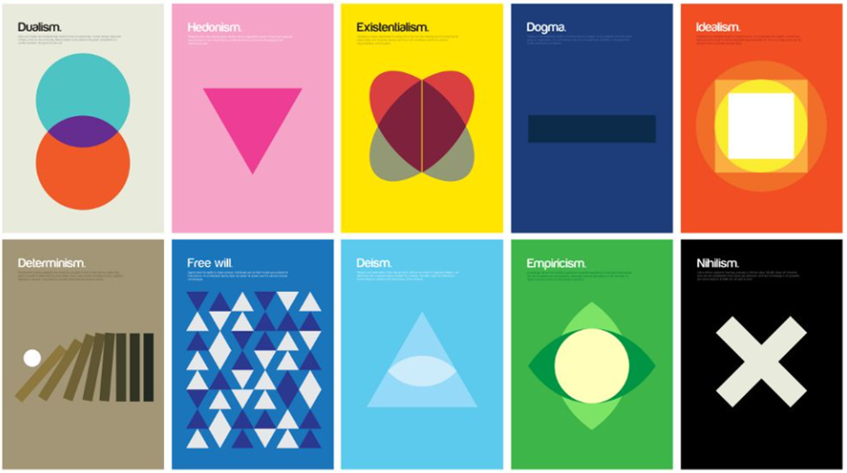
Lawes had once expressed that simplicity and clarity will be on the rise in the design business, while complexity and multi-layered designs will phase out in the near future. Simple designs work best to convey clarity. And we all know that just because something is simple doesn’t mean it isn’t clear.
As we see below, simple design elements can be enough to contribute to your design.
2. Dull color palettes
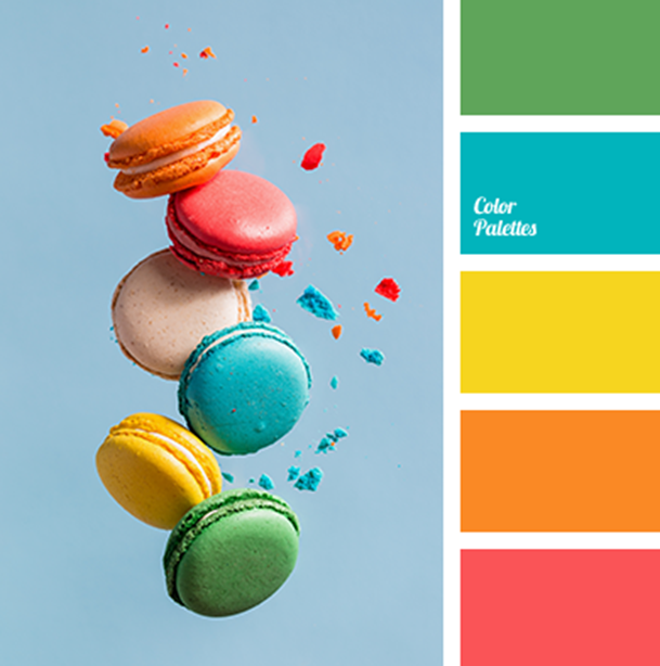
Simplicity is the key, but with more vibrancy. According to several IT site designers, clients have frequently sought bold colors in their branding. They want designs that stand out and are more conversational. Color schemes that are desaturated or have a natural color palette are no longer popular. We can also expect more vibrancy in the designs trending in 2022, which will help them stand out from the crowd.
Sanoj Mohan, a senior team lead at Fingent, predicted that the old trend of utilizing subdued hues would soon be out of fashion. Design trends are leaning more towards the use of bold and vivid colors. He went on to say that many clients are drawn to the vibrant hues of the 1990s. As we see below, bright color schemes should be your go-to scheme in 2022.
3. Varied typography
Some design trends just require body text and no artwork. You must also pay attention to the typography you employ in such instances. Isn’t it always thrilling when that happens?
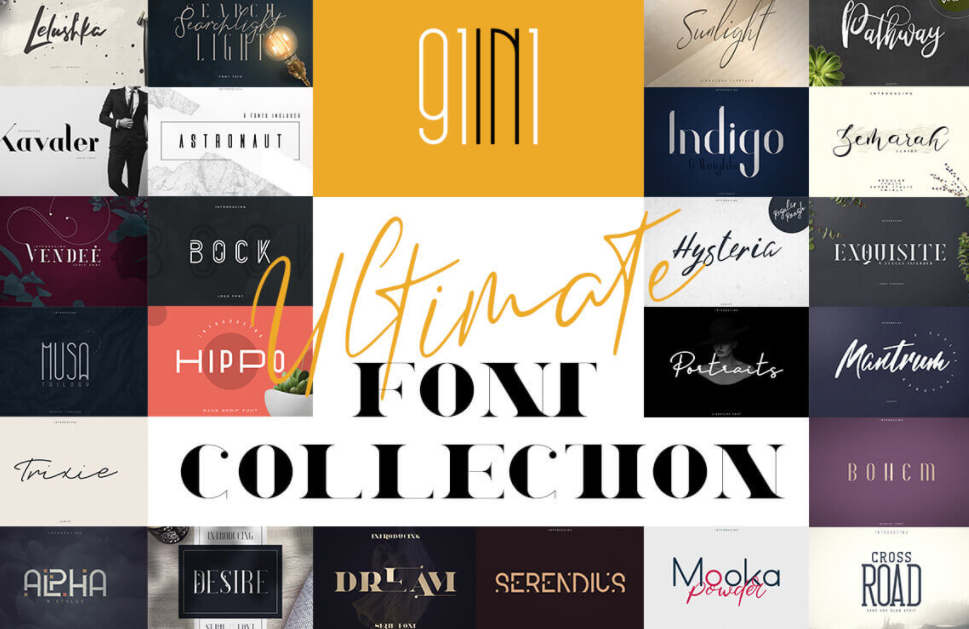
However, similar to the popular social media trend, you can get carried away and utilize many diverse types in your designs. Nonetheless, you should aim to keep the number of styles in your design to a minimum. The less text in the body, the less type is recommended. Uniformity in the font will assist in eliminating confusion and give your projects a more quirky and original appearance in 2022 design trends.
Imagine an amalgamation of all the below typography in one plate. Too much variedness can also spoil the broth.
4. Helvetica
Helvetica is a classic typeface. In fact, a documentary was created to salute Helvetica’s fiftieth anniversary. But, new designers may tend to overuse the typeface. “As much as I adore Helvetica, there appears to be a trend among inexperienced designers to overuse the typeface, particularly for branding work,” says Jason Lawes, owner of Red Sentence. “With Helvetica being used by so many well-known businesses, it seems a pity not to explore the vast array of other excellent types accessible to us as designers.”
5. Overuse of gradients
Major platforms such as Instagram and Tinder often use design trends like gradients. However, as we’ve seen, when simplicity is pursued to its logical conclusion, it transforms into elegance. In the graphic design profession, simplicity has always been at the forefront.
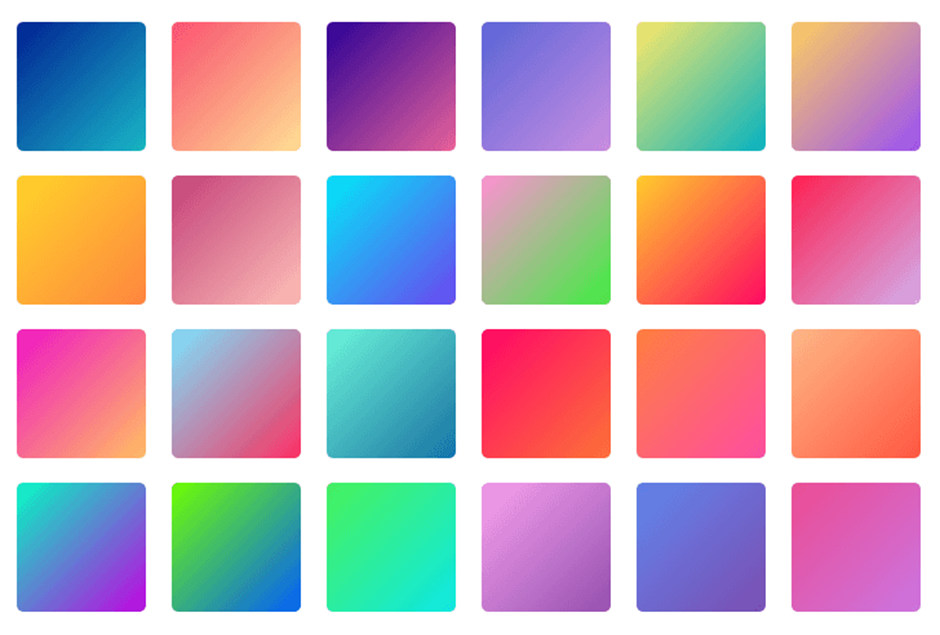
However, we’ve recently seen that some designers overuse gradients and overly-busy features, which might detract from the overall design. Taylor Morris, a motion designer at Company Man Studios, believes that if a designer decides to employ large, strong typefaces, the free space surrounding them should be balanced. He says that gradients may be an excellent method to develop designs but that if they aren’t kept in proportion, they can ruin the beauty of a design.
The below image shows the color gradients collection, which can be kept minimal in 2022.
6. Thriving on stock images
Stock pictures abound in the design trends of rookie designers, making them easy to spot. We understand that stock photos help to bring your concepts to life. However, employing high-quality pictures may surpass your budget or resources. Furthermore, we’ve seen designers use stock images to break up the monotony of their designs. Pre-shot images should only be used as a backup.
You should begin by attempting to ring in your creativity through free-flowing designs. The trick is to be deliberate in your decisions and avoid using the easy path too frequently in your work. Look for visual variety and photos that reflect your quest for authenticity in your design. When using stock photos in a design, keep in mind that not everyone needs to be a perfect model gazing straight into the camera—look for photographs that appear genuine and reflect the target population. This will bring originality and individuality to your design portfolio of 2022.
As we see below, dull designs use stock images to overcome incompatibility for creativity.

7. Using all the white space
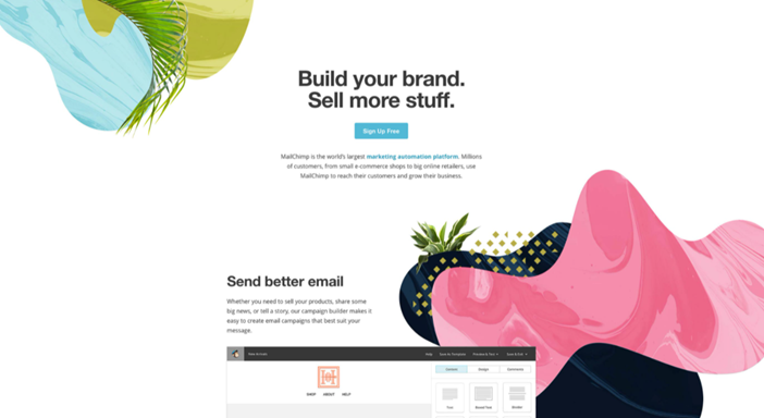
Erstwhile, designers were lauded for filling up all the empty space in a design piece. Designing something with no white spaces was thought to be unique and appealing. If we want to create statement-giving designs in 2022, any piece of graphic design needs to be cluster-free.
Filling in gaps will only make the designs appear crowded and disorganized. Nonetheless, it is worth the risk if you know just how to make it seem unusual and not clustered.
8. Geometric, abstract and organic shapes
Why are rounded edges so popular for buttons and contact forms? Sharp corners and edges are subconsciously associated with danger, which explains this. It improves the click rate by making them more enticing.
Furthermore, organic forms help users in navigating around a website or application. With their gentle and subtle assistance, you can create direct emphasis and appropriately lead visitors through your design.
If you employ this approach too often, though, your entire product may lose its form, which will confuse customers and drive them to leave your page. Our recommendation is to only utilize rounding when you need to grab a potential client’s attention or get them to carry out a specific action.
9. Vector illustrations for showcasing abstract concepts
Vector illustrations have proven to be the go-to option in today’s digitalized marketing world. Quick website loading and increased traffic are significant reasons, popularising their marketing using lightweight visualization illustrations.
IT service companies make the most use of abstract illustrations to showcase their service portfolio. These assist the IT sector in enclosing intangible services on their websites.
What’s the big deal about illustrations in 2022? The issue is that practically every firm in the market currently uses flat icons and 3D drawings. IT service websites look so similar to each other. One design trend gaining traction is personalized and more realistic graphics to offset this uniformity.
10. Dark background themes
A dark backdrop on a website, in a presentation, or for an ad or app is entirely suitable in some design spaces. Many instant messaging and news sites, for example, include an option between “day” and “night” modes, allowing you to avoid disturbing others while checking updates late at night and saving energy for your mobile display.
If you want to display movies or static adverts onto a wall, white lettering on a dark backdrop may be more practical than vice versa. However, this strategy only works for small text; while reading bigger white-colored text, our eyes become weary faster, and consumers are more likely to abandon the website.

Key Takeaways
- Choosing the best design trend can be difficult.
- Simplicity is the key.
- Creating individuality and uniqueness should be your motto.
- Adopt design trends that suit your target audience’s understanding and intellectual background.
- Choose a trend that will be accepted by the masses and easily understood in the first go.
- Take it slow. Don’t succumb to peer pressure.
Conclusion
As a graphic designer flourishing in 2022, you may browse many websites and gain inspiration from other bloggers and designers who can assist you in finishing your own work and producing a final result. However, you must recognize that, regardless of where you get your inspiration from, you must be able to tell whether a design will work just by looking at it. As a graphic designer, go with your gut if you believe that the approaches you’ve utilized have come together to create something worth looking at.
FAQs
Very Peri, a new shade of blue, is Pantone’s Color of the Year for 2022 – it indicates warmth and happiness.
To make your typography easier to read, select clean and contemporary fonts. Don’t use too many typefaces in one design. Don’t include too many pictures in your design. You want to make sure that your design conveys a clear message and that the photos don’t detract from that message.
By combining graphic design with augmented reality and, ultimately, 3D printing, the future of graphic design will be lifted to new heights. As this technology becomes more widely available, the need for high-quality designs will grow, but consumers will want them sooner.
As we step into the year 2022, design conventions will be redefined. This year all norms will be surpassed, and designs will take a new turn towards revolution due to growing digitalization.
Latest Blogs
Explore how Google’s 2025 AI search updates triggered ranking chaos. Learn actionable strategies to adapt your SEO for AI Overviews, zero-click searches, and SERP volatility. Stay ahead now.
Learn how to rank on AI search engines like ChatGPT, Perplexity, and Gemini by optimizing your content for authority, structure, and relevance. Stay ahead in AI-driven search with this strategic guide.
Explore the best healthcare SEO services for your medical practice. Improve online visibility and effectively reach more patients in need of your services.
Get your hands on the latest news!
Similar Posts

Design
7 mins read
15 Best Firms Offering Design Services in India

Design
5 mins read
All You Need to Know About Data-Driven Design

Design
6 mins read