The Ultimate Design Guide: Why Your Company Needs One [+ Tips to Create One]
![The Ultimate Design Guide: Why Your Company Needs One [+ Tips to Create One]](/_next/image/?url=https%3A%2F%2Fwordpress.peppercontent.io%2Fwp-content%2Fuploads%2F2022%2F04%2FWhy-your-company-needs-a-design-guide-tips-to-create-one.png&w=1536&q=75)
A design guide is a document that includes all the rules and guidelines a company must follow in its marketing. These guidelines should be adaptable across different platforms and act as a brand guidebook for creators and designers.
Essentially a design guide dictates how a brand’s marketing material should look and feel—online and offline. Style guides are necessary as they save a lot of time and money, spare the branding agency a good amount of frustration going forward, and make it easier to create and maintain marketing materials.

Why Your Business Needs a Design Guide
It is important for every brand or organization, however big or small, to present a consistent image and a unified brand message. Hence, there are several reasons why your business needs a design guide.
- Since more than one designer handles the creative part of marketing, a proper design brand guide will help them communicate and sync better.
- Style guides also come in handy when a brand is expanding and hiring more people and designers.
Passing on brand guidelines in a document form to new employees will ensure that the work that has already been done for a certain marketing activity is not compromised by a fresh, less-skilled creator who has difficulty in understanding how your design works.
- The last thing that a designer already working on a project wants is for a new designer to use his perfectly-constructed logo in a wrong way, for example, placed highly closer to other elements, ultimately killing the impact of the whole design.

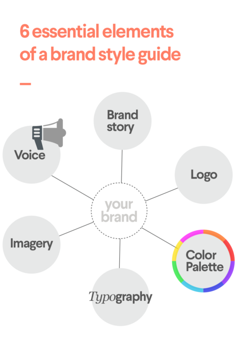
Key Elements of a Design Guide
1. Brand ethos
First and foremost, any design guide should lay down your brand ethos—primarily if you are a large or multinational brand. It helps to provide a bigger picture when you lay down your brand’s mission and vision. It could also be a motto or a short statement defining your goal as an organization.

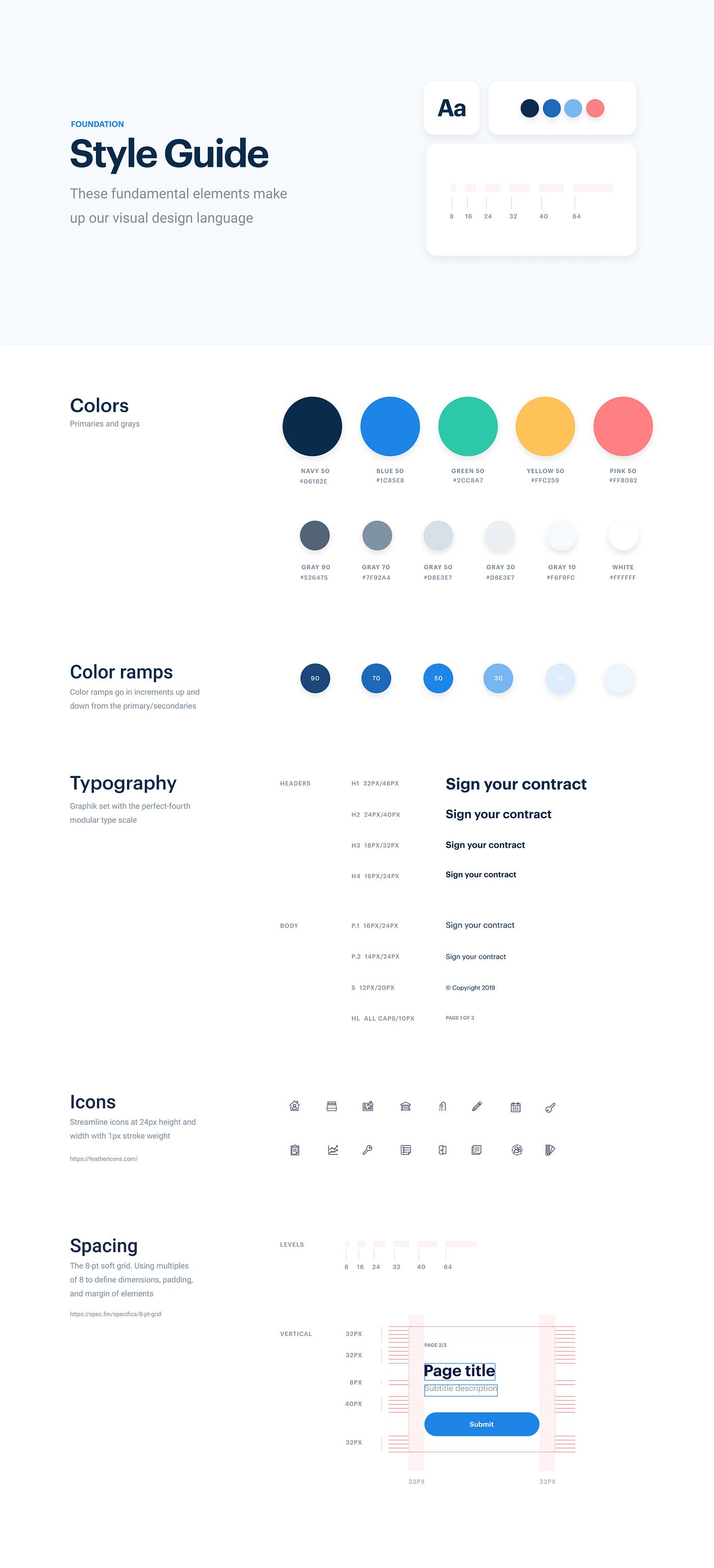
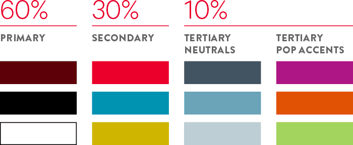
2. Color palette guide
A color palette is a set of colors that must be used in your organization’s branding. A consistent color palette is important to keep your brand’s recognition intact.
A color palette is often divided into three sets: primary palette, secondary palette, and neutrals.
- Principal palette: The core of your brand is made of these colors.
- Secondary palette and neutrals: These colors are used when you need more shades apart from the primary palette, usually while drawing marketing collaterals.

A color palette also must include technical details that help in color identification. In other words, they should include the RGB, HEX, and CMYK codes for all the colors in your primary and secondary brand color palette, so there is consistency in both online and offline applications.
3. Logo style guide
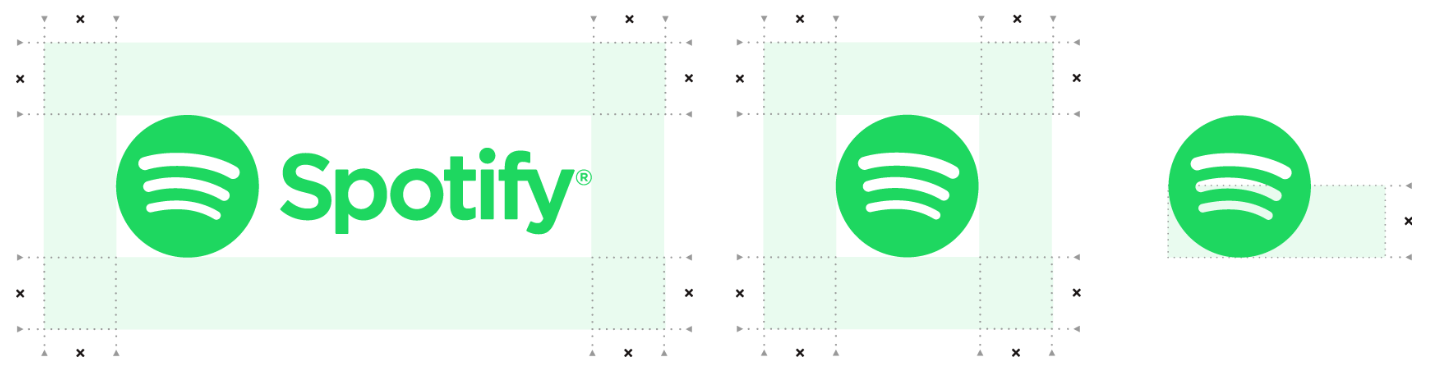
The logo of any company needs to be consistent. Logo style guides outline how logos can be used with precise measurements and dimensions. This is a very detailed guide and often includes trivial dimensions like how much space can be kept in and around the logo.
One such example is below, which denotes the exclusion zone mentioned in Spotify brand guidelines.

A logo guide also includes how a logo should look with different backgrounds, denoting color variations that are allowed. An example of IBM illustrates the same:

This guide also denotes what not to do with the logo or represent what the wrong usage of the logo is. Let us look at the Netflix logo to illustrate the same.

4. Typography
Typography is another important aspect of a design guide that denotes the fonts that are to be used throughout the brand communication and how to access those fonts.

Typography guidelines must consider the following:
- Font names and design: Each usable font should be listed with the style (regular, light, bold, condensed).
- Size specifications: Font sizes should not go haywire in any communication and should not be too big or too small. Therefore, each typeface must be mentioned along with the size limits.
A ratio guideline for the header and body text gives designers more clarity as they design for different platforms.
- Typeface applications: Mention how a certain typeface should be used. If a font is to be used in special cases like only for headings and another font is to be used only for body text, it must be mentioned in the design guide. The usage of each type of font should be precise, along with the context.
5. Imagery
These guidelines are essential, especially if your brand uses a lot of visual representations and guides on what kind of images are to be used. For example, is your brand supposed to use more illustrations or photography?

If the latter is used, are people being photographed supposed to look at each other or the camera? What about the lighting – subtle or brightly lit?
For instance, LinkedIn states in their style guide that “photos capture real people in the real world of work.” Hence, all the imagery used by the Linkedin branding team features people or employees working and engaging with others, as if they are unaware of the placement of the camera.
The following must be kept in mind while listing down the imagery guidelines:
- Different types of images that can be used: Some companies prefer to display original photography only, like Linkedin, while others may just invest in stock photos. Some may be more inclined towards illustrations only, and some may want to go for a mix for different platforms.
- How these images should be displayed: This could mean defining the location of the images on your marketing posters and even defining whether these images’ corners can be rounded or sharp. Specify what effects are okay for such images.
- How logos should be placed over this imagery: Combining imagery with your logos is tricky and must be handled with precision and rules.
- Graphic elements: Some brands might have some extra elements like a texture or a certain pattern that are considered part of the bigger brand. The pieces of those elements should be included in the design guide.
- Icons that relate to the brand: Properly mention the icon family, color, size, etc., of the icons that can be used.
6. Voice
This element has nothing to do with the visual appeal and usually refers to the overall personality that a brand stands for and guides on how to speak or what language to use in brand communication. Here is one such example.

A voice helps people recognize your company even when your logo is not placed alongside a piece of content. If a certain voice is already included in the design guide, it will become as identifiable as the brand’s logo.
It also helps to avoid a random set of voices that might confuse the customer on the receiving end. Carefully set the brand’s tonality.
A good design guide gives clear and concise directions on how one can put that brand into easy-to-remember words and how to avoid ruining the voice.
Key Benefits of a Style Guide
- Ensures consistency in your brand collaterals across platforms.
- Makes communication effective within teams
- Saves time both on the part of the creative agency and the brand
- Reduces redundant work and minimizes reworks
- Helps to deliver a consistent message to customers across geographies to avoid confusion
In the End
In the era of information explosion, It has become imperative for any business to stand out today. Therefore, it is no surprise to see every brand or organization trying to create its own unique visual identity displayed across digital and offline mediums. The aim is to become memorable here so that people remember your brand – simple as that.
What is more important than creating a visual identity is probably how to maintain a consistent image across all the touchpoints with one’s customers. This also means that the brand identity must be easy to remember.
Brand recall is one of the critical aspects of any existing and upcoming brand today, and all the marketing and advertising aim to achieve that. Maintaining this consistency is easier said than done, and therefore, proper documentation is necessary when maintaining a constant brand image across platforms. This is where a brand’s style guide or design guide comes in.
Projecting a “one image” in front of all the demographies is a humongous task and must be taken seriously. Even though brand style guides or design guides are a must for larger teams – smaller teams also benefit from these guides, especially when there is the scope of expanding in the future.

Key Takeaways
- There is no right or wrong for style or design guides. A design guide must present what your brand stands for.
- A brand style guide does not need to be rigid and concrete. It is always beneficial to keep revisiting the guide and updating it now and then, especially whenever the brand expands.
- The brand style guide must include all the important elements and technical specifications related to the brand. These include brand ethos, color palettes, logo guides, typographic details, the kind of imagery to use, and your brand’s voice.
- A brand style guide is a must for larger teams as it saves time and effort and promotes better communication within the teams, apart from maintaining sync between the messages being passed on to the end customer.
FAQs
A style guide or a design guide is a document that includes the guidelines to be followed by a company in its marketing activities.
Brand recall is one of the critical aspects of any existing and upcoming brands today. Maintaining consistency in all the marketing collaterals is easier said than done, and therefore, proper documentation is a must when it comes to maintaining a constant brand image across platforms. This is where a brand’s style guide or design guide comes in.
Latest Blogs
Explore how Google’s 2025 AI search updates triggered ranking chaos. Learn actionable strategies to adapt your SEO for AI Overviews, zero-click searches, and SERP volatility. Stay ahead now.
Learn how to rank on AI search engines like ChatGPT, Perplexity, and Gemini by optimizing your content for authority, structure, and relevance. Stay ahead in AI-driven search with this strategic guide.
Explore the best healthcare SEO services for your medical practice. Improve online visibility and effectively reach more patients in need of your services.
Get your hands on the latest news!

Similar Posts

Design
7 mins read
15 Best Firms Offering Design Services in India

Design
5 mins read
All You Need to Know About Data-Driven Design

Design
6 mins read