Data Visualization in Content Marketing: Turning Insights into Compelling Stories
Data visualization in content marketing is the art of transforming complex data into digestible and engaging information. It goes beyond just presenting data; it’s about using visuals to tell a story, engage the audience, and make the information more accessible and memorable. By using data visualization insights, marketers can capture the attention of their target audience and create a lasting impression.
But why is turning insights into compelling stories so crucial in content marketing? Well, let’s face it – no one wants to read a dry, monotonous report filled with numbers and statistics. People are drawn to stories that captivate their imagination, evoke emotions, and offer valuable knowledge. By weaving together data-driven insights into compelling narratives, content marketers have the power to create visualization content that is not only informative but also engaging and shareable.
In the next section, we’ll delve into some ways in which content marketers can utilize data visualization to find captivating stories within data analysis.
The Power of Data Visualization in Content Marketing
Data visualization is a powerful tool that content marketers can use to captivate and engage their audience. In a world where attention spans are shrinking and information overload is the norm, presenting data in a visually appealing way can make all the difference. Visual content can grab attention, simplify complex information, and tell compelling stories.
Humans are visual creatures by nature. We process visual information 60,000 times faster than text, and 90% of the information transmitted to our brains is visual. When we see a graph or a chart, our brains instantly start making connections and drawing conclusions. This is why data visualization is such an effective technique for conveying information – it allows us to quickly understand patterns, trends, and content marketing insights.
One company that harnesses the power of best data visualization for content marketing is Spotify. Their “Wrapped” feature, released annually, offers users personalized insights into their listening habits over the past year. Through interactive data visualization, Spotify transforms individual listening data into engaging visuals that tell a unique story.
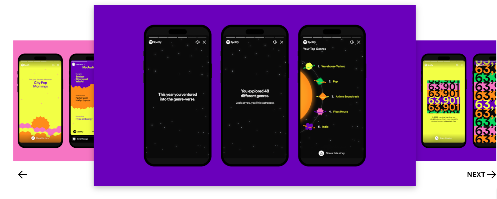
When users access their Wrapped feature, they are greeted with vibrant colors and eye-catching graphics that showcase their top artists, favorite songs, genres, and even how much time they’ve spent listening to music throughout the year. The data is transformed into visually appealing charts, graphs, and infographics that bring the user’s music journey to life.
This interactive experience not only provides users with a fun way to reflect on their musical preferences but also creates an emotional connection with the brand. Users are encouraged to share their Wrapped results on social media platforms, sparking conversations among friends and generating valuable user-generated content for Spotify.
By leveraging data visualization techniques in content marketing, Spotify effectively engages its audience by turning personal music insights into shareable experiences. This not only strengthens the brand-customer relationship but also drives user retention and acquisition as users eagerly anticipate their Wrapped results each year.
Finding Insights in Data: How to uncover interesting stories from data analysis
When it comes to crafting engaging content, data analysis is the key to unlocking valuable content marketing insights that can captivate your audience. But how do you go about finding those interesting stories hidden within the data? Here are some techniques that can help you uncover those gems:
1. Look for patterns and trends: By examining the data for recurring patterns or trends, you can identify interesting narratives that will pique your audience’s curiosity. For example, if you notice a consistent increase in website traffic during certain hours of the day, you could explore why this is happening and create content around it.
2. Dive deep into outliers: Outliers in your data can often hold valuable information that can be turned into compelling stories. These outliers might represent unique customer experiences or unexpected market trends. By delving into the reasons behind these outliers, you can uncover fascinating content marketing insights that will engage your audience.
3. Compare and contrast different data sets: Sometimes, the most interesting stories emerge when you analyze the relationships between different data sets. By comparing and contrasting various variables, you can discover connections and correlations that provide a deeper understanding of your audience’s behavior or preferences.
Airbnb has mastered the art of using data visualization to bring its travel insights to life. Through their interactive data visualizations, they showcase trends and preferences that not only engage their audience but also inform their business decisions.
One example of Airbnb’s effective use of data visualization is its “Travel Trends” feature. By visualizing this information, Airbnb creates a visually appealing experience that not only helps travelers make informed decisions but also sparks their curiosity about new destinations or travel trends.
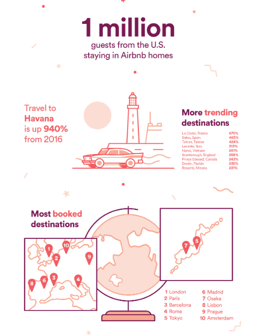
This kind of content visualization not only enhances user engagement but also serves as a powerful marketing tool for Airbnb, showcasing their expertise and understanding of the travel industry.
This highlights the potential of data visualization in content marketing to captivate and inform audiences, making it an essential tool for any marketer looking to create compelling visualization content.
Crafting Compelling Stories with Data Visualization
Understanding the key elements of storytelling through visuals is crucial for creating engaging and captivating content. Data visualization allows marketers to transform complex information into meaningful narratives that resonate with their audience. By presenting data in a visually appealing and accessible way, brands can effectively communicate their message and connect with their target market.
One brand that excels at using data visualization to tell compelling stories is Patagonia. As an outdoor clothing company committed to environmental sustainability, Patagonia leverages data content visualization to highlight its impact on the planet. They present this information in a visually appealing format, emphasizing the progress they have made in their sustainability initiatives. By visualizing these achievements, Patagonia not only educates its audience about its environmental impact but also instills a sense of pride and loyalty in its customers.
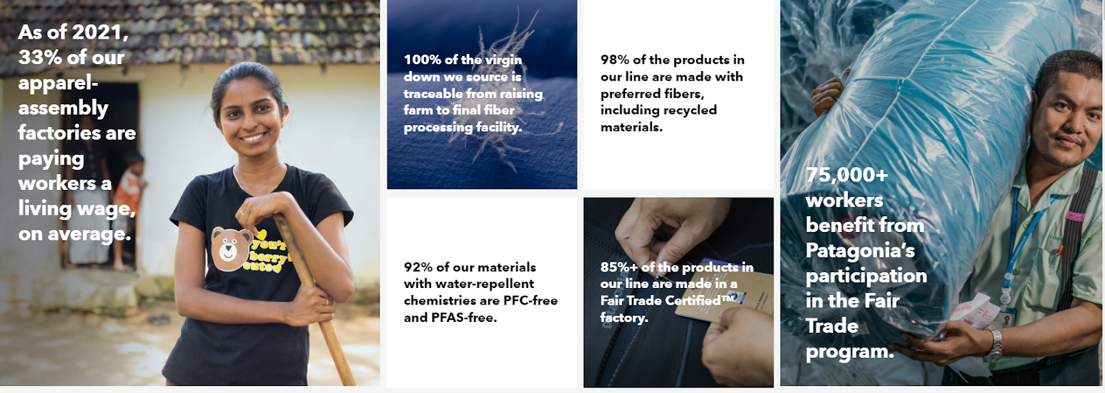
By utilizing data visualization techniques, Patagonia effectively communicates its brand values and mission while engaging its audience on a deeper level. The visual representation of their environmental impact makes it easier for customers to understand the tangible difference they are making in the world. This storytelling approach not only fosters brand loyalty but also inspires others to take action towards a more sustainable future.
Patagonia’s use of data visualization to communicate its environmental impact serves as a powerful example of how data can be transformed into a compelling narrative.
Designing Engaging Visuals for Content Marketing
To create visually captivating content, here are some tips and best practices to keep in mind:
-
Firstly, keep it simple. Visual clutter can be overwhelming and distracting for your audience. Focus on key elements and use whitespace strategically to create a clean and organized design. This will help your content to stand out and be easily digestible.
-
Secondly, choose colors wisely. Colors evoke different emotions and can greatly impact how your content is perceived. Consider the mood and tone you want to convey and select a color palette that aligns with it. Remember to use contrast effectively to make important information pop.
-
Thirdly, use typography strategically. Font choice plays a crucial role in visual storytelling. Each typeface has its own personality, so choose fonts that align with your brand voice and the message you want to convey. Additionally, consider hierarchy and legibility when using different font sizes and styles.
-
Lastly, incorporate visual storytelling techniques. Use imagery that tells a story or evokes emotions related to your content. Infographics, illustrations, and interactive elements can take your visuals to the next level by dynamically engaging your audience.
National Geographic is an excellent example of how stunning visuals can be used to tell impactful stories. Their magazine covers often feature breathtaking images that transport readers to far-off places or immerse them in nature’s wonders. By combining striking visuals with compelling narratives, National Geographic captivates its audience’s attention and sparks curiosity about the world around us.

Conclusion
Throughout this article, we have explored the impact of data content visualization in content marketing and examined how leading brands are leveraging this technique to create compelling stories.
Similarly, by transforming complex data into visually appealing and easily digestible content, marketers can engage their audience on a deeper level and convey powerful insights.
By now, it is clear that data visualization plays a vital role in content marketing. It allows marketers to transform data into engaging narratives that captivate audiences and communicate valuable insights. However, harnessing the power of data visualization requires the right tools and resources.
Looking for high-quality and well-optimized AI+human-led content? Don’t forget to check out Pepper Content’s writing services.
Latest Blogs
Explore how Google’s 2025 AI search updates triggered ranking chaos. Learn actionable strategies to adapt your SEO for AI Overviews, zero-click searches, and SERP volatility. Stay ahead now.
Learn how to rank on AI search engines like ChatGPT, Perplexity, and Gemini by optimizing your content for authority, structure, and relevance. Stay ahead in AI-driven search with this strategic guide.
Explore the best healthcare SEO services for your medical practice. Improve online visibility and effectively reach more patients in need of your services.
Get your hands on the latest news!

Similar Posts

Artificial Intelligence
5 mins read
How Free AI Tools for Content Creation Can Boost Your Content Strategy

Artificial Intelligence
4 mins read
AI Content Generators: Making Content Creation Easier for Businesses

Artificial Intelligence
4 mins read