15 Best Presentation Design Tips For the Perfect Pitch

Table of Contents
- 15 Best Presentation Design Tips
- Key Takeaways
- Conclusion
- FAQs
Presentations are one of the best methods to convey your ideas to people. They are easy to read and understand and have pictures, graphs, charts, and tables that help understand complex data. They also convey many points in a concise and effective manner. However, not all presentation designs are attractive and easy to understand. Not having the best presentation design may dull your presentation and cause your audience to switch off.
This article will help you choose the best presentation design for your presentation, which will make you stand out among your competitors.


15 Best Presentation Design Tips
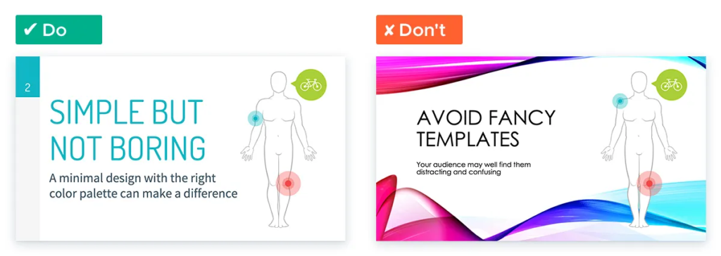
1. Keep your design as simple as possible
One of the most common mistakes people make while designing a presentation is that they make it flashy with multiple designs and colors. The primary purpose of your design is to make your data and information as easy to read as possible and simplify the content so that everyone in the audience can understand it. By overcomplicating your design, you only make the data and information harder to understand.
Also, a flashy design may not be appropriate for a formal presentation as more focus is on the tackiness than the information at hand. Hence, keep the design simple with minimum color combinations, animations, and effects: the sleeker your design, the more attractive and appropriate the presentation.
2. Keep your design pattern consistent
A presentation usually has multiple slides with multiple data points being conveyed. Many people make a common mistake while making a presentation: they include multiple design patterns in a single presentation.
For example, say if you are representing your data through bar graphs, then represent all the data you want to share in the form of a bar graph. Do not use various designs like pie charts, line graphs, etc. This will only complicate your presentation. The same applies to other design patterns like bulletin points, animations, slide design, color schemes, etc. Hence, the simplest way to enhance your presentation is to include uniformity in the design patterns.
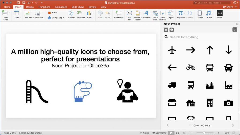
3. Use icons to enhance your presentation visually
Imagine going through a lengthy presentation consisting of only words and numbers. It will be pretty dull, right? People seldom include icons or images in their presentations, resulting in the viewers getting bored quickly.
Visual impact is more powerful than the impact of just plain words and numbers. Include icons and images to visually enhance your presentation to avoid this scenario. Icons are compact animated images that can convey information of multiple words. They enhance your presentation and make it visually appealing. Icons also reduce your presentation’s overall length and complexity as they convey the meaning of various words through one image. Viewers can easily understand the meaning of icons and remember what they represent for a longer period.
You can pick up icons from the Internet, download PowerPoint icons in SVG format, or even create your own.
4. Avoid multiple color schemes for corporate presentations
Corporate presentations can often be the trickiest ones. There is a fine line between professionalism and aesthetics. Try to keep the color schemes to a minimum. A single color scheme or black and white are most preferred. Also, avoid excessive animations and effects.
5. Work on your presentation cover slide
There is an old saying, “Don’t judge a book by its cover.” But people still tend to judge things by the first appearance. The same applies to your presentation. A presentation cover with just words may seem quite dull. Do not hesitate to use images or icons, or multiple color schemes in your cover slide design.
A unique cover slide design will catch the viewers’ attention in the beginning and set the tone for the rest of your presentation.
6. Include beautiful background pictures in your slides
The main point of a presentation is to attract the viewers’ attention. Relevant and subtle background photos do the trick.
Ensure that the picture is aesthetically pleasing and doesn’t overpower the slide content. Remember, adding a background to every single slide is not necessary. Leaving some slides plain offers a pause in the design.
7. There is nothing wrong with some humor
Adding humorous images or icons can break the monotony of the presentation. Of course, you don’t want your presentation to be a stand-up session. Ensure that any humor is minimal, tasteful, and clever.
8. Do not overfill information in one slide
Another common mistake is that people fill their slides with too much information. This clutters the slide and doesn’t convey much. In the bargain, viewers lose interest. To avoid this, always remember the thumb rule of one chart or graph per slide. This keeps the amount of information per slide limited, the presentation clean and tidy, and the information easy to grasp and understand.
9. Engage your audience
Imagine sitting in a long two-hour presentation with only the presenter speaking. No matter how engaging the content may be, you are bound to get bored after some time. The communication is one way, and the audience soon starts to drift away. To avoid this, keep the audience interacting with you.
Add a few questions for the audience in the presentation. Make a few slides solely to interact with the clients or the audience. Again, you can use various icons and images or even animation to ask questions. Keep the audience guessing and interact with them every two to three slides. This will make them listen to you more closely and make your content more engaging.
10. Use the correct font format
You will often be presenting your presentation in a room or a hall. Remember to take stock of the room size while setting your font format. The font must be visible clearly to everyone in the hall or the room. Hence, select the font style and the font size carefully. The font style should be easy to read and big enough for the people sitting at the back.
If you do not know where your presentation will be seen, it is safer to have a bold and large font size, even if it means less content per slide, as your content will be visible from every corner of the room.
11. Use a unique color theme for different data points
In presentations where you can add multiple color schemes, you may use different color themes for various data points. For example, you can use green to portray profits; similarly, red can represent losses. Adding color themes will visually enhance your presentation and make it more engaging. However, remember that once you allow a single color to a particular data point, continue with the same color for the rest of the presentation.
12. Never add more than three presentation layouts to your slide
We often have to compare multiple ideas and data points or contrast multiple objects or concepts in a presentation. Another common mistake people make is dividing the slide layout into more than three divisions for comparison. This makes the slide very complicated, hard to follow, and frankly a pile of data that nobody can go through.
To avoid this, do not add more than three ideas in a slide to avoid. This will keep your slide short and crisp, easy to understand, and engaging to the viewer.
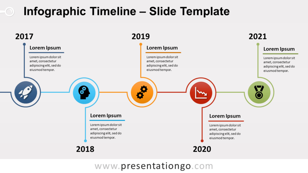
13. Use timelines to improve visualization
Timelines are another essential tool that helps reduce the word count of a presentation and make the content more engaging. Timelines can explain complex events, historical events, or a plan of action for a future project. It is also professional and makes the audience understand the content easily. Most importantly, timelines can reduce the number of words and make your presentation more aesthetically pleasing. Below is an example of using a timeline in your presentation.
14. Use pop culture references
Imagine you are in the audience; you are viewing the 7th slide and wondering when this will end. Suddenly, a pop culture reference of your favorite movie/actor/band is made in a new slide. You suddenly come out of your stupor and are interested in hearing what is said.
Pop culture references are a great way to draw the audience’s attention to the presentation. But be careful. Ensure that the time and place of your presentation are appropriate for pop culture references. It is not wise to use such references in a completely formal platform. In a semi-formal platform, keep them to two or three per presentation.
15. Place your logo on every slide
If you are a start-up and pitching your business to various potential customers or investors, it is a brilliant idea to place your logo on every slide. This adds a touch of professionalism and impacts the viewers’ minds regarding your business. You never know how many people would share your presentation or how many times you will have to present it.
Key Takeaways
- Keep your design as simple as possible. Avoid the use of multiple colors, animations, effects, etc. Keep your design sleek and crisp, and do not overcomplicate the content.
- Keep the design pattern consistent throughout the presentation.
- Use icons to enhance your presentation visually. Icons are compact animated images that can convey information of multiple words.
- For corporate presentations, avoid the use of multiple color themes. A single color or a black and white color scheme will give your presentation the right amount of professionalism.
- Do not be afraid of using images or icons or multiple color schemes in your cover slide design. A unique cover slide design will catch the viewers’ attention and set the tone for the rest of your presentation.
- Include background images in your presentation. The purpose of adding background pictures is to add the overall aesthetic appeal of the presentation and act as a background image of the content in the slide.
Conclusion
Presentations are a great way to convey information and impress an audience. However, to ensure that your presentation gets the results you want, you need to work on designing your presentation in a way that it engages the audience and looks pleasing to the eye.
FAQs
Microsoft PowerPoint is the most widely used presentation platform. It is very user-friendly and compatible with almost all operating systems.
A good presentation design has multiple factors.
1. The content must be short and crisp.
2. You can use various images and animations to reduce the word count and explain the content better.
3. The color themes also play an important role in a good presentation design.
4. Finally, a good presentation design has multiple tools like graphs, charts, animations, timelines, etc., to make the content more engaging.
The 10-20-30 rule is used to reduce the time it takes per presentation. A 10-20-30 rule means that a presentation must have a maximum of 10 slides, should not last more than 20 minutes, and should have a maximum of 30 points. It is most applicable for multiple presentations and limited time.
Timelines are used when explaining a historical event or a plan of action. It makes the content easy to understand and reduces the word count.
Keep the colors to a minimum. In fact, in corporate presentations, do not exceed 2 color themes.
Latest Blogs
Explore how Google’s 2025 AI search updates triggered ranking chaos. Learn actionable strategies to adapt your SEO for AI Overviews, zero-click searches, and SERP volatility. Stay ahead now.
Learn how to rank on AI search engines like ChatGPT, Perplexity, and Gemini by optimizing your content for authority, structure, and relevance. Stay ahead in AI-driven search with this strategic guide.
Explore the best healthcare SEO services for your medical practice. Improve online visibility and effectively reach more patients in need of your services.
Get your hands on the latest news!

Similar Posts

Design
7 mins read
15 Best Firms Offering Design Services in India

Design
5 mins read
All You Need to Know About Data-Driven Design

Design
6 mins read