The 25 Best Infographics To Inspire Every Designer

Table of Contents
- What are Infographics?
- The 25 Best Infographics
- Key Takeaways
- Conclusion
- FAQs
Infographics are a revolutionary way to describe complex pieces of information to someone. People learn better if we use visuals instead of walls of knowledge. That is why infographics are so successful. Moreover, these are designers’ favorites when they represent brands that try to explain their data to regular customers.
However, generating new ideas for great infographics is quite hard, and designers sometimes hit a roadblock. This blog will be discussing 25 of the best infographics to inspire every designer. But first, let us start with the basics for beginners.
What are Infographics?
Ever since the first infographic was created, it has been rising in popularity among students, designers, and the corporate world. It has so many uses that can’t be explained in a few words. But if you are an amateur in the designer industry, the word infographics may sound alien to you.
Infographics are images that are different from conventional images and display a lot of information in an organized manner with interactive visuals. In short, it is a way of displaying complex information simply and attractively. Here are some of the problems that can be solved using infographics:
- Provides a quick overview of complex information
- Even those with no prior knowledge of the topic understand the information.
- Displays research findings or survey data
- Helps summarize a long report
- Easily compares multiple options

The 25 Best Infographics
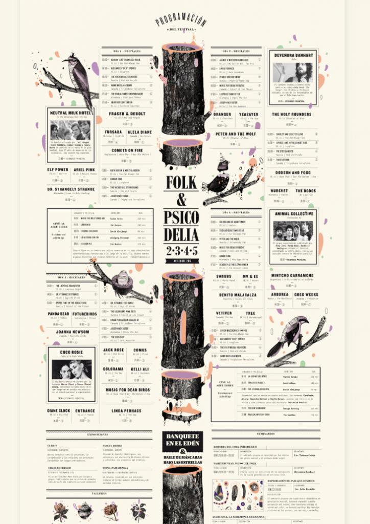
1. EDEN Festival de folk psicodélico
This infographic shows us how to insert vast amounts of information in a single image. Representing the Scottish music festival – EDEN – it explains how nature and humans are connected and how they affect us. This infographic is an excellent example of information that may be too big to read for regular readers, but it made for an interesting read with the clever use of graphics and text.
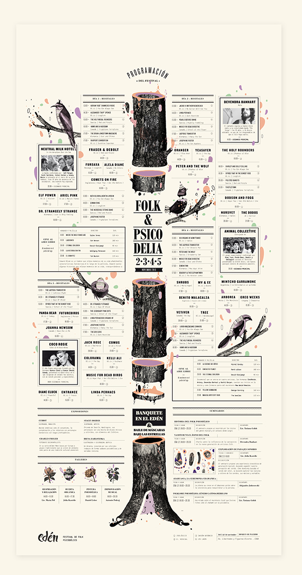
2. History of Life
The History of Life infographic is a great example of information about history and its changes. This image shows us the history of Earth, how it all started, and the present. It depicts the changes in the shape of continents that came to be. It also depicts the wildlife and nature before humans walked the earth and how it changed after humans evolved. Compressing centuries of information into one single infographic is no easy feat!
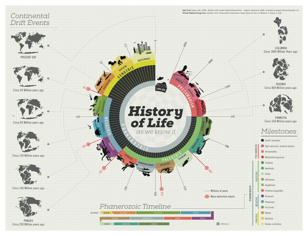
3. Explaining astrophysics
We always treat complex information like it is rocket science. But what if you have to explain it to people who know nothing about it. Well, the fastest way to make them understand would be to make them curious and fascinated. This infographic explains the distance between the earth and the orbit where our satellites revolve around us perfectly in a way that our minds can understand easily.
4. For the love of Chai
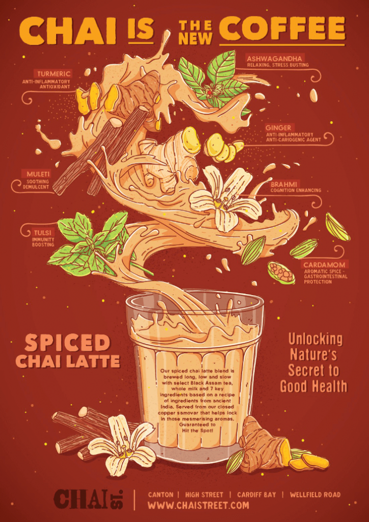
Advertising using infographics is a great way to bring a lot of information to your readers to decide why your product or services are better. This infographic is a great example of an advertisement. This infographic advertises Chai and depicts how it is better than caffeine-filled coffee. Moreover, it describes the health benefits and ingredients you get from drinking the brand’s tea.
5. A cafe menu
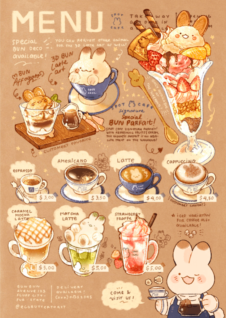
Old menus are boring and can be troublesome to maintain as you need to modernize them to make them look attractive to your customer. So how about you use infographics to modernize your cafe menu. Take a look at the image above; this cafe has intelligently used an infographic to list all their specials with descriptions and a price tag. When customers see what they are ordering, it makes them order more. Using the product image in the infographic menu is brilliant.
6. E-mobility: The better future
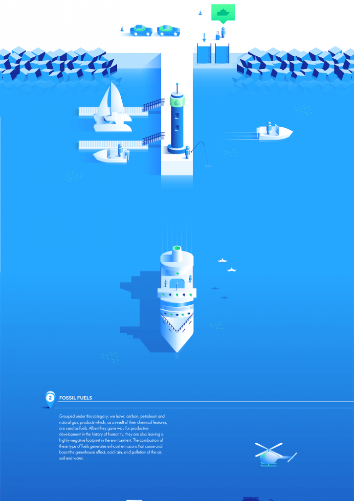
When you look at the above image, it may seem vacant. Almost no text is available for the readers to understand what it’s about. But actually, the placement of pictures here depicts more than words can do. Here the designer has attempted to show the readers the future of e-mobility and a road different from fossil fuels. The creator has also added a little text on the image’s bottom side to elaborate on their idea of the future.
7. Importance of nature around us
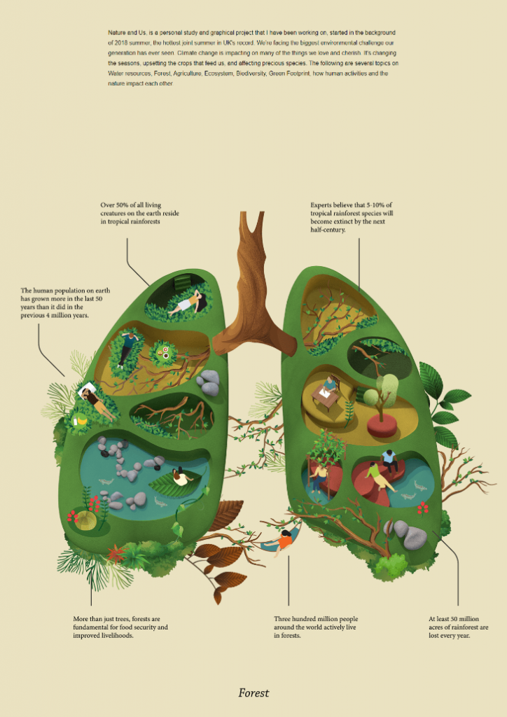
This infographic depicts the biggest issue the world is experiencing. Human lives depend on nature and its byproducts, and we are destroying the very thing that makes life possible on earth. This infographic depicts human lungs and their connection to nature and the ecosystem. This is an excellent way of explaining how we are harming nature – especially to someone who doesn’t know much about climate change and global warming.
8. The Diet of Pirarucu

Pirarucu is one of the world’s largest freshwater fishes considered a delicacy worldwide. This amazing infographic uses this fish’s body to help us understand what the Pirarucu fish eats and in what proportion. This type of infographic can be used to depict complex diet charts in a simple and entertaining manner.
9. Ray Bradbury Achievement Timeline

You might have come across this type of infographic in the past, as it is considered one of the most used types of infographics by beginners. Take a look at the image above. It cleverly depicts the passing of time and the timeline of things related to it. Moreover, it also depicts raw data using lines and color codes for better understanding. This image contains the lifetime achievement of Ray Bradbury.
10. The Modern Resume
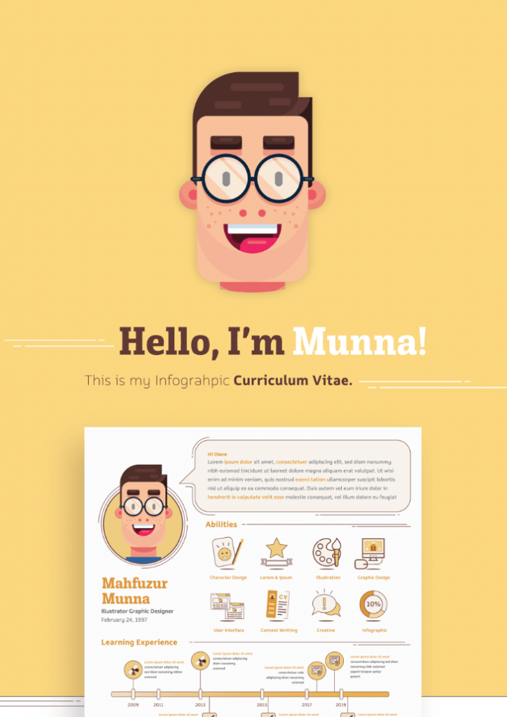
What is a resume? It depicts your achievements and provides information for your recruiter to understand that you are perfect for the job. In addition, we prepare it so that the recruiter will like it at first sight. So why not make it into a fantastic infographic that relays all information and provides good visuals too! That is what you can see in the picture above.
This is an excellent example of showcasing one’s achievements using infographics.
11. Explaining the famous dim sum
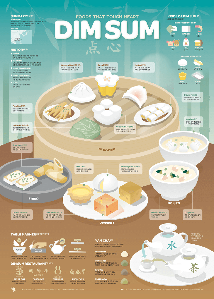
Any food lover would know that dim sum is a popular Chinese dish. And it can be used in several ways. Writing these down would be monotonous for the writer and reader. But, when you use images and a short description in attractive fonts, you can deliver information correctly. The infographic above is doing just that! It depicts how many dishes you can make using dim sum.
12. Boycott plastic
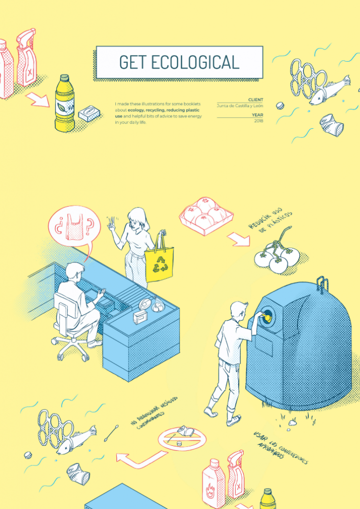
A single piece of plastic will take hundreds of years to disintegrate. It is something we must avoid using to save nature. The infographic depicts how we misuse plastics when they can simply be replaced by other things. For example, we peel a perfectly covered melon only to wrap it again using plastic, which is a complete waste. This type of infographic can be used to depict information that can’t be explained using mere words.
13. An annual report
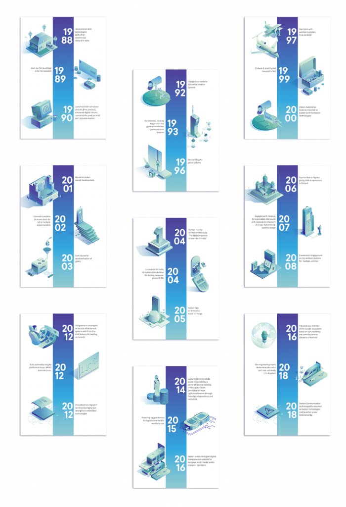
Depicting a lengthy annual report is troublesome because it contains a year’s worth of information. Take a look at the above image. This infographic shows the reader the important topics for each month in a semi-calendar format.
14. The guide: Things around us
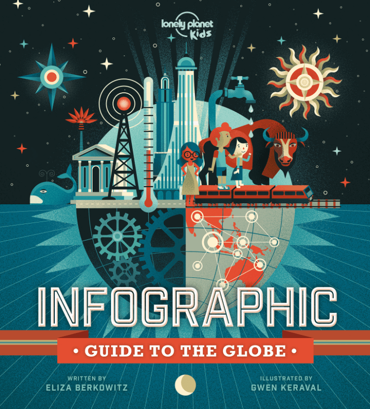
This infographic is quite unique as it depicts an encyclopedia using pictures. The creator used pictures inside a globe-like structure to depict things that run our current world, like technology, connectivity, humans, animals, and more.
15. Work-life balance report by UNICEF
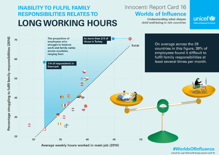
Balancing work and daily life has become quite hard for our generation. People do not have time for their families. The UNICEF researched this phenomenon and cleverly depicted their research results using infographics. They used a scale to show how people balance their lives between work and family. You can use this type of infographic to depict differences and chart data interactively.
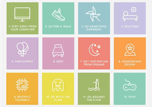
16. Creators’ block
This powerful infographic depicts the steps a creator can take to recover from a creative block. You can use this infographic in various ways, and one of them can be a step-to-step guide. Maybe it can become a name card of a group; the possibilities are infinite with this infographic.
17. Depicting big numbers
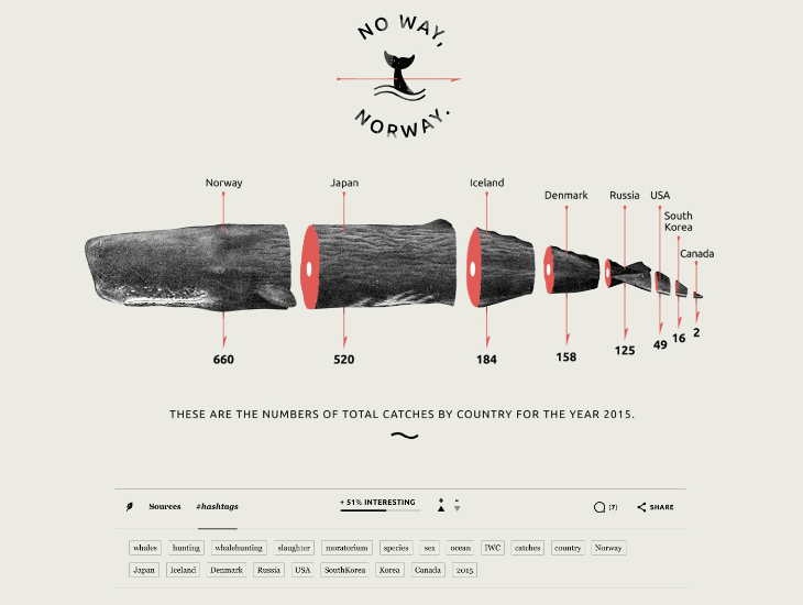
Sometimes the number becomes so absurdly large that it makes the head spin by counting the zeros. Moreover, it is much more challenging to depict these big numbers in an attractive manner using an infographic. If you look at the above image, you can see how smartly the designer has depicted the number of whale catches for 2015. Clearly, a country did not just catch two whales; in reality, the number is bigger, but depicting it as only two is an excellent way of comparing countries.
18. The skyscraper visuals
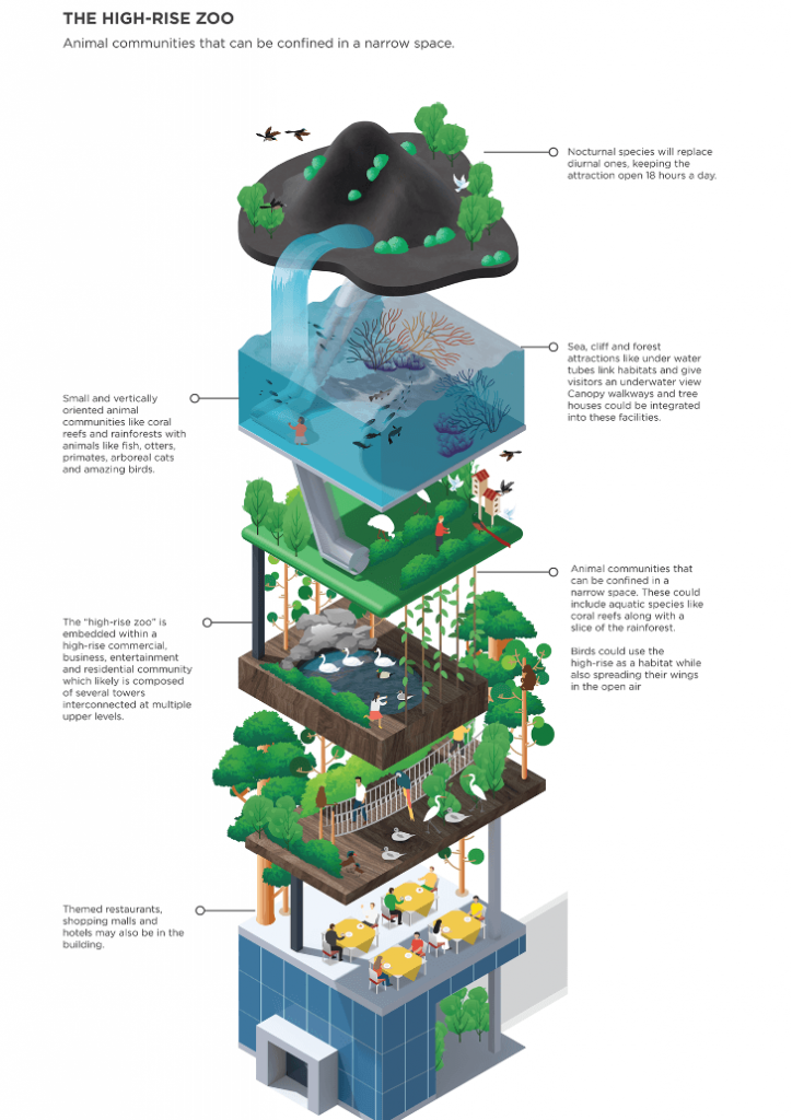
This is yet another powerful and clever infographic that is delightful to see. This image is large, but there is no text wall. All the texts in this infographic are placed strategically, defining each floor of the skyscraper-like structure. This is the best way to define chain-link information, for example, a food chain. Here the creator has described an ecosystem that exists because of one another.
19. Childhood development chart
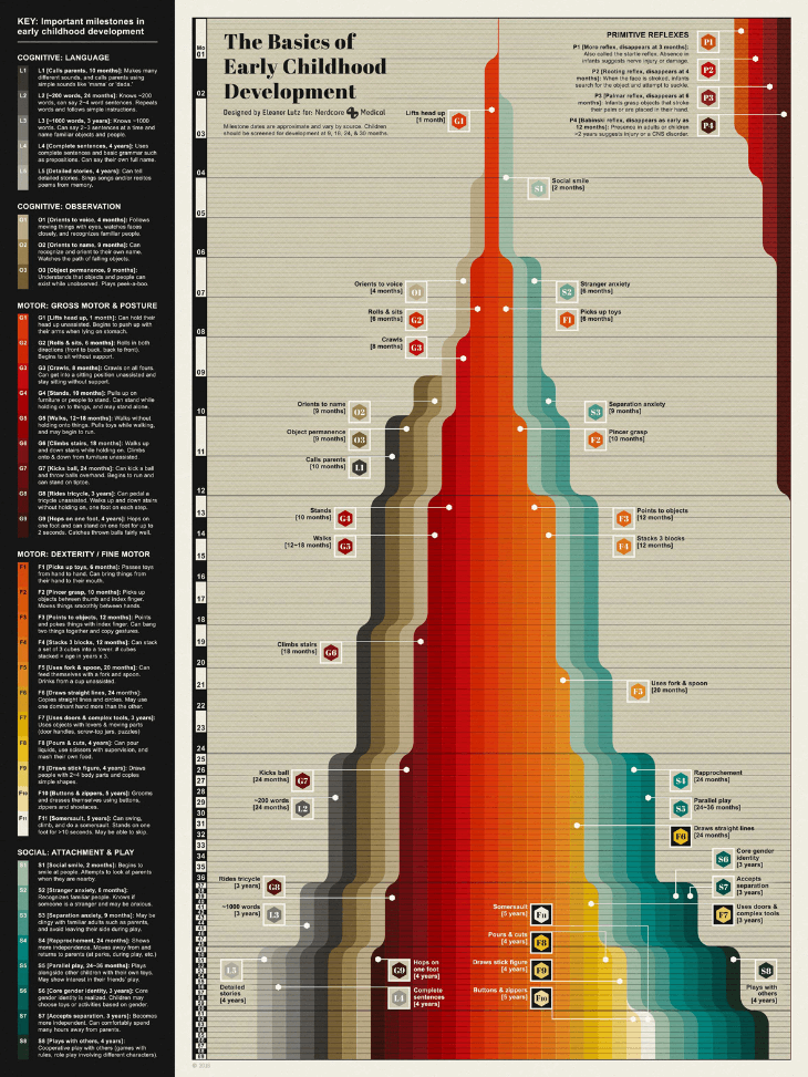
Now, this is quite a unique infographic since it has a lot of information. The image has turned into a blog post itself. But if you look closely, the text included in this image has been categorized and set in a very decorative manner. When you read through that, you will not get bored by the facts and data that come with it. Moreover, the creator has used a building-like structure to depict an informative chart which is quite unique.
20. Comparing scale
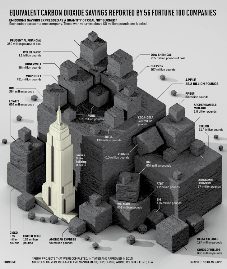
We love comparing, and it is one of the best ways to describe the information to someone. Thus, here the designers have pulled a clever one in this infographic. They decided to use the Empire state building as the measuring scale and piled carbon-like blocks to depict the amount of carbon dioxide emission Fortune-500 companies released.
21. Island of Bears
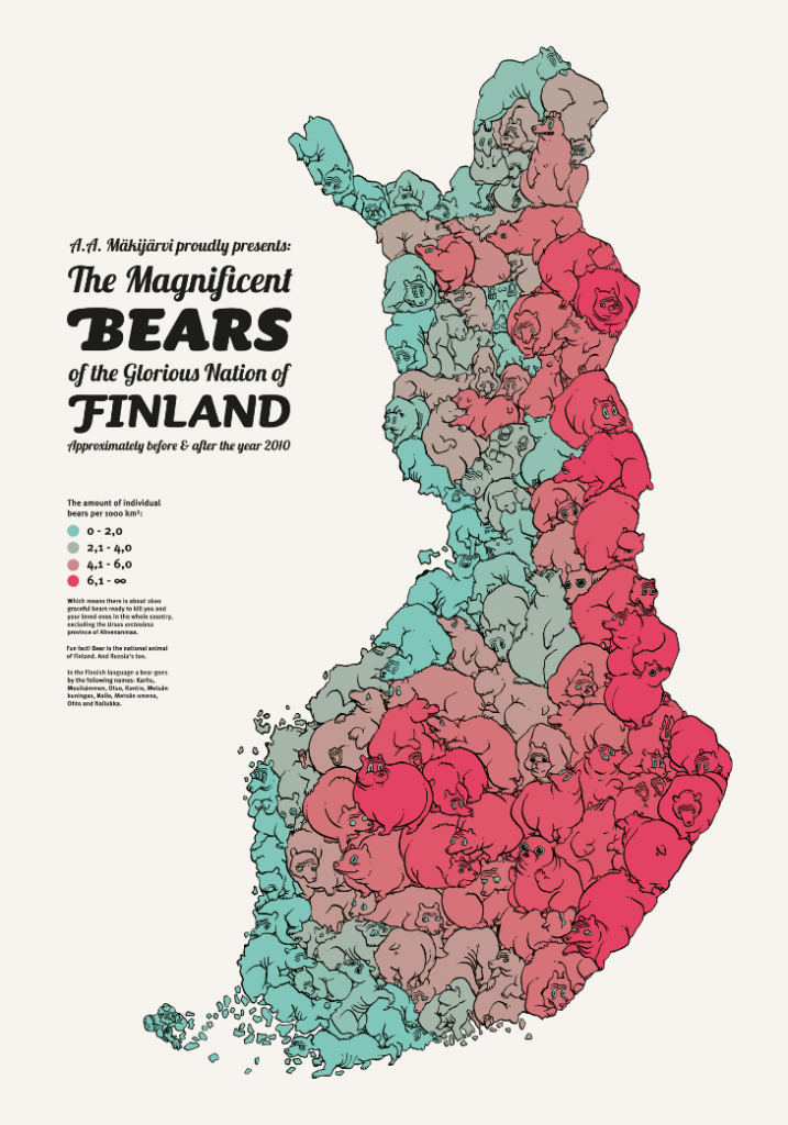
Here is another interesting way of informing readers about the number of bears living in Finland. The creator used the map of Finland and transformed it into a giant island shaped like a hundred bears. Moreover, they also color-coded it according to the chart that depicts the bear population.
22. The palette strategy
This is yet another innovative way of expressing and offering choices to your readers. The creator here depicted different fonts to the readers, and it’s a great way to depict options that a potential buyer is looking for. You can use it to showcase a store’s inventory.
23. The Avengers infographics
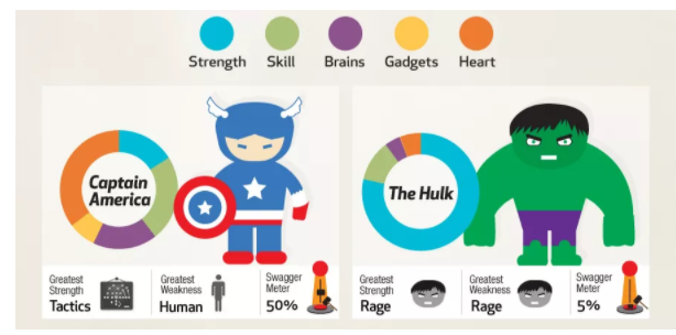
Here is a cool Avengers infographic that can inspire creators and designers. This infographic is very detailed about showcasing the features of each avenger member. This type of infographic can describe the details of an item in great detail while showcasing the object itself. Here you can see how the designer has depicted each Avenger’s race, strength, and swagger meter, which can be defined as the characteristics.
24. Chart inside an infographic

Here is an infographic about house plants and how they are helpful around the house. This is a buyer’s guide to house plants and their uses. Here you can see how cleverly the designer has inserted an information chart that helps the buyer choose the best plant according to their needs. You can also use this infographic to create your own buyer’s guide.
25. The Rubik’s Cube
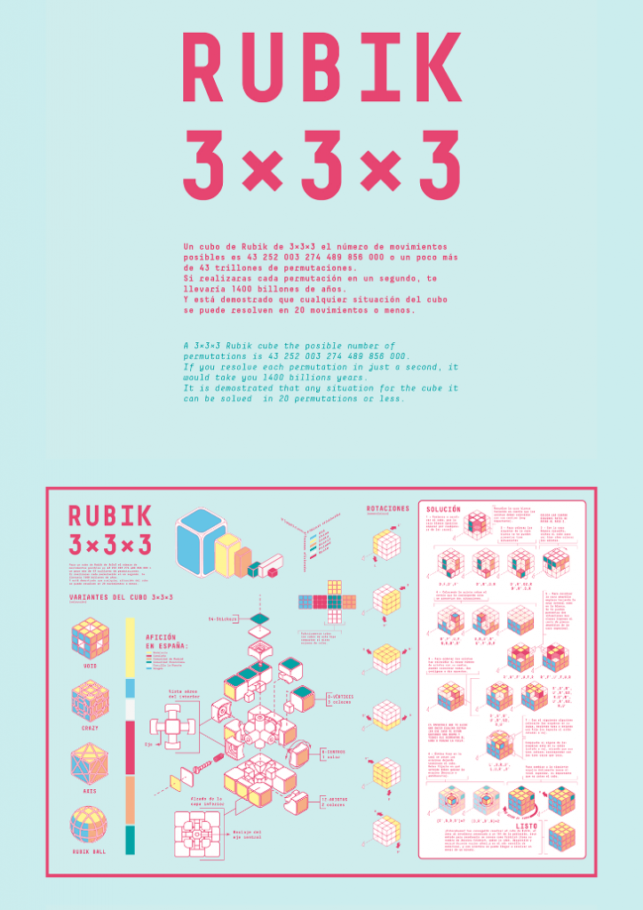
Last but not least is the Rubik’s cube infographic. It is a marvelous creation that clearly depicts the technicality inside an infographic. Here you can see how the creator has described the method of creating a Rubik cube of 3x3x3. You can use this type of infographic to describe instruments and engineering gadgets very easily.
Key Takeaways
- Infographics are a revolutionary way to describe complex pieces of information to someone.
- They are images that are different from conventional images and display a lot of information in an organized manner with interactive visuals.
- Some problems that can be solved using infographics include:
- Depicting complex information easily
- Providing information to people who want to learn about something for the first time
- Compressing research findings or data in one infographic
- Summarizing long reports.
- Use infographics to evoke curiosity in people who may find a topic complex.
- Advertising using infographics is a great way to bring a lot of information to your readers to decide why your product or services are better.
- Resumes presented in the form of infographics give the recruiter a glance at your personality and achievements.
Conclusion
The best infographics mentioned in the article are all tested and used by famous designers. Therefore, you can easily get motivated and get new ideas for representing your complex data to customers using inspirational infographics. We hope we were successful in helping you with your dilemma. If you liked our article on the best infographic design and wish to add something, do let us know in the comments below.
FAQs
Finding inspirational infographics is not an easy task. For that, you have to go through the information you need to relay to your customers. After that, you need to look through the list of the 25 best infographics we listed in this article and find the one that contains the elements that can help you explain all the information you have.
No one wants to read a wall of texts that provides a lot of technical information. Moreover, people understand things better if it comes with good visuals. Something like you like a book with pictures better than a book with no pictures. The same principles apply here. Also, people want to read infographics because it provides complex technical data very attractively.
Yes, you can use almost every social media platform to post infographics. However, you can not post extra long infographics on these social media platforms as they have a set image dimension per post. So you have to choose infographics that can relay all information using smaller dimension images.
You can use complex tools like Photoshop or even easy-to-use mobile apps to create infographics. The only difference is that you have to create an infographic from scratch using Photoshop, but you get the freedom to design it as you like. You can also use Canva. Again, you get a set of preloaded infographics to choose from.
The reason for creating an infographic is to display a lot of detailed information comprehensively, but when the data is too much, it becomes too hard to create an infographic. That is why it is better to create two images instead of one long image. The reason is simple; it will look more attractive. Therefore, the extra-long image will get neglected by many while the two-image systems will be liked and used by many.
Latest Blogs
Explore how Google’s 2025 AI search updates triggered ranking chaos. Learn actionable strategies to adapt your SEO for AI Overviews, zero-click searches, and SERP volatility. Stay ahead now.
Learn how to rank on AI search engines like ChatGPT, Perplexity, and Gemini by optimizing your content for authority, structure, and relevance. Stay ahead in AI-driven search with this strategic guide.
Explore the best healthcare SEO services for your medical practice. Improve online visibility and effectively reach more patients in need of your services.
Get your hands on the latest news!

Similar Posts

Design
7 mins read
15 Best Firms Offering Design Services in India

Design
5 mins read
All You Need to Know About Data-Driven Design

Design
6 mins read