
Mobile-friendly websites are becoming increasingly important. According to research, 91% of mobile phone users have mobile devices within reach. It’s an opportunity for your business to make a positive impression on its prospects.
Well-designed mobile websites can do much more than simply improve the user experience. It can help improve your site’s SEO and rank well in search results due to Google’s mobile-first indexing. In case you want inspiration for mobile website redesigns, here are 18 mobile website examples of companies that nailed their mobile experience.
Best Mobile Website Design Examples
1. Lyft

With large typefaces, Lyft’s mobile site stands out and is easily readable on smaller screens, making it an excellent mobile website example. The user is organically led into the next portion of the website by the vivid, intentional images and symbols.
The mobile menu is also designed uniquely to make it simple for users to categorize themselves as passengers or drivers and browse the sections of the site that are most relevant to them.
2. Nike
Nike never ceases to impress when it comes to design.
The brand used beautiful pictures to let their product do most of the talking. Combining those elements with some killer writing gives you a compelling message that screams, “Buy Me!”
Nike’s mobile website is one of the best mobile website design examples, as they turned the shots of their shoes vertically to suit them better in the small area of a mobile screen to accommodate two shoe pictures in one row.
3. MailChimp
MailChimp is a firm that specializes in email marketing. Its amazing design across their website and email themes are one of the primary attributes.
Good information flows, delivering you what you need to know in both intelligible and entertaining ways.
Expanding a card to learn about each feature is a great concept, especially on mobile screens with restricted pixel space.
4. Dropbox

Dropbox has done a fantastic job of building a website that fits smaller screens, so it is a fantastic mobile site example. The desktop version has a clean look, with complementary grid and picture colors.
Furthermore, the first image turns to match the smaller area on the mobile version. Moreover, several grid colors change for the mobile edition, necessitating a change in font color to keep the page readable.
Another answer to the lack of space on the mobile version is hiding the registration form behind a CTA rather than showing it on the right side of the screen.
5. Google Maps
The Google Maps mobile website offers the same features, aesthetics, and efficiency as the mobile app.
Everyone has a favorite navigation or map program. Our go-to app is Google Maps, which we use whether we’re hiking, riding, biking, or on the bus. Its mobile website is unique and is the best mobile website example that it is pretty much indistinguishable from its downloaded mobile app.
6. Adobe
Adobe’s mobile site prioritizes its products so that consumers may learn about the many sorts of solutions available and whether they are a good fit for them.
This is evident on the mobile menu, where Adobe shows the categories into which their goods fit before getting more specific when you click into each one.

You may learn more about certain features or case studies for that product by clicking through these pages.
Being a good example of mobile websites, Adobe recognizes that you’ll probably want to look at several sites classed under that product, so they created a mobile menu that shows them all and follows you as you scroll.
Instead of being caught working in the main menu, which houses other items, you may simply switch to relevant sites.
7. Etsy
Etsy is a peer-to-peer e-commerce platform specializing in handcrafted and antique things and one-of-a-kind factory-made items.
Its earthy tones make Etsy’s mobile website one of the best mobile website examples. If you like antique and handcrafted products, you will be driven to spend a lot of money on items chosen by their editors or suggested items.
8. Sophie Brittain
Sophie Brittain, a graphic designer, greets visitors to her website with a top fold that is whimsical and basic. She enables a succinct opening text to take up most of the area with a white background and few images.
Sophie’s distinctive usage of microcopy can also be seen at the website’s bottom, where she uses clever words instead of icons to display her social network links. Her Instagram account is labeled “Me, snapping photographs,” while her email address is shown as “You, writing a fan letter.”
9. Threadless
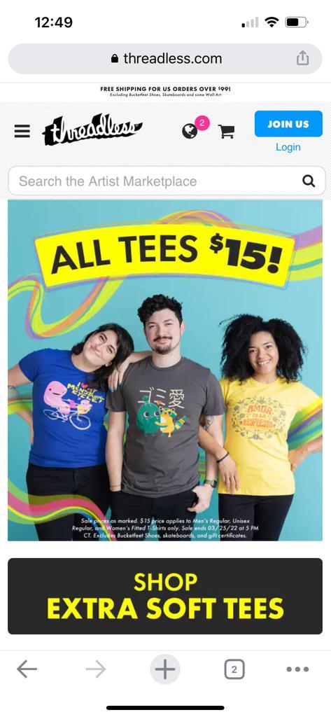
Threadless is a graphic tee retailer that crowdsources. The public selects and crowdsources all T-shirt designs. The designs with the highest public voting scores will be produced and sold.
Threadless is heavily reliant on community feedback. The more people who join the community by contributing designs, voting on them, and scoring them, the better their goods will be.
With their unlimited scrolling voting screen, voting and rating designs are a breeze. On their mobile website, it’s easy to lose track of time when ranking designs after designs, making it an excellent example of mobile websites.
10. Typeform
To provide a better user experience, Type Form simplified its mobile website, making it an excellent mobile site example.
Typeform is a digital startup located in Barcelona with a single goal: to “make forms awesome.” Their desktop website is elegantly built, with brief language, appropriate animations, and other advanced design elements greeting users.
The mobile site is a stripped-down version of the desktop site, but it’s still attractive. However, Typeform understood that this complicated design might significantly impact page load speed, among other issues, for mobile visitors. That’s why they got rid of many of them, streamlining the site and making it easier to use on mobile.
11. Apple India
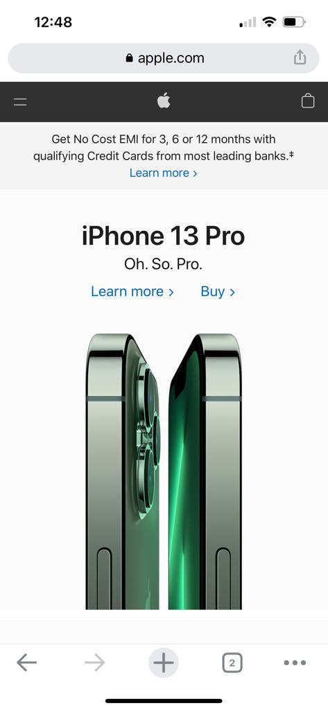
As a good example of mobile websites, Apple has established a mobile website that facilitates customer learning about their products.
A basic yet ordered graphic design consisting of a header, subheader, and picture is used on most of their pages with sections. The dynamic product photographs take on the hierarchy due to their minimalism, drawing you into their elegant design.
12. Airbnb India
Airbnb is a website where users can advertise, find, and rent accommodation. Airbnb’s founders are design grads, and their website demonstrates that they have placed a strong focus on user interface and user experience.
Airbnb is clever in that it uses huge folds to accommodate appealing photos of trip places to pique people’s attention. Airbnb is remarkably simple and intuitive for a mobile website and is one of the best mobile website examples with many options and complexity.
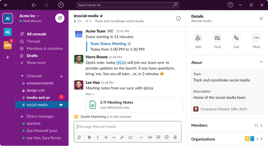
13. Slack
Slack arranges its menu items for tablet and mobile versions of its website into a hamburger menu. There is also a decrease in CTAs that say “Try for Free.” Instead of two CTAs above the fold, one huge button takes up nearly the whole width of the screen in the mobile and tablet versions.

On mobile, the content of their homepage is compressed into one column, with text paragraphs following photos, and even the line of corporate logos that employ their services is compressed into three lines.
14. KISSmetrics
Color is used by KISSmetrics to distinguish content sections and to generate bold CTAs that stand out even on small mobile devices, which is a great mobile site example.
KISSmetrics is a company that sells business analytics software. There’s a lot of material outlining what the program does on their web page and a testimonial.
On the other hand, their mobile site looks a little different: Their site’s information is shown as a list with dark and light options on a mobile device. Users may easily skim the website without getting lost in the material as a result of this.
15. Warby Parker
Like many other e-commerce sites, Warby Parker does a fantastic job listing their items without a lot of unnecessary information.
This allows customers to explore with an emphasis on style (which we all know is crucial when shopping for eyeglasses) while still being able to click on a product for more information.
Their smartphone menu follows the same pattern, with only three main menu choices (Try-on, Eyeglasses, and Sunglasses) with striking graphics to emphasize their importance.
16. Lego
Lego is the most famous toy globally, with both children and adults enjoying it. They must balance appealing to both ends of the age spectrum as their target audience.
It is mobile-friendly and one of the greatest mobile website design examples.
17. Weight Watchers
Weight Watchers is a firm that provides a variety of products and services to help people lose weight and keep it off.

Each fold is distinguished by a colorful or simple background on their mobile website. The headlines are large and clear, making them easy to read on small mobile displays.
18. Strava
Strava is a social network for runners and cyclists that allows them to track their runs and rides.
Their mobile website is never dull and consistently successful and an excellent mobile website example, combining full-fold graphics with a card-style structure.
A mobile-friendly website is no longer an option; it’s a necessity if you want to be seen in search results.
We hope one of these mobile website examples gave you some ideas for developing or modifying your mobile website. Remember to keep things simple while designing your website.

Key Takeaways
- A simple website to use on a mobile device, particularly on smartphones’ tiny screens, is a mobile-friendly website.
- Mobile-friendly websites are becoming increasingly essential.
- Mobile devices account for 57% of global internet traffic.
- A well-designed mobile website can do much more than enhance the user experience.
- It has the potential to improve your site’s SEO and search engine ranking performance.
FAQs
Mobile websites are responsive websites that automatically scale to match the screen size of the device being used by your visitors. The benefits of having an app include sending push alerts to your consumers (with their consent, of course) and the ability to use it offline.
Following are the five best mobile website examples –
1. Shutterfly
2. Google Maps
3. Typeform.
4. Etsy
5. Adrian Zumbrunnen
Large, fixed-width items should be avoided. Use CSS media queries to apply various aesthetics to different displays. Don’t make content that only looks good at a specific browser width. Sites that require visitors to scroll horizontally fail the Google Mobile-Friendly Test, which might hurt their search rankings.
Here are the top 5 mobile website design examples:
1. Koox
2. MA True cannabis
3. Nixon
4. Red Edition
5. Cuberto
In 2022, all the rage should be fewer words, calming colors, great images, and straightforward calls to action. Page design will trend toward lighter-weight experiences that entice visitors to browse farther rather than to put everything upfront on one page.
Latest Blogs
Explore how Google’s 2025 AI search updates triggered ranking chaos. Learn actionable strategies to adapt your SEO for AI Overviews, zero-click searches, and SERP volatility. Stay ahead now.
Learn how to rank on AI search engines like ChatGPT, Perplexity, and Gemini by optimizing your content for authority, structure, and relevance. Stay ahead in AI-driven search with this strategic guide.
Explore the best healthcare SEO services for your medical practice. Improve online visibility and effectively reach more patients in need of your services.
Get your hands on the latest news!

Similar Posts

Design
7 mins read
15 Best Firms Offering Design Services in India

Design
5 mins read
All You Need to Know About Data-Driven Design

Design
6 mins read