
Table of Contents
- Introduction
- What Is Banner Advertising?
- What Makes an Advertising Banner Successful?
- What Elements Help Increase Impressions or Clicks?
- How to Create Banner Design?
- Examples of Banner Design
- Key Takeaways
- Conclusion
- FAQs
Advertising is an essential aspect of every company’s marketing strategy. Banners, however, are the most prolific form of advertising that can be seen every day and almost everywhere. While traditional banners are a redundant concept by now, we still get to see several banner ads on the internet when scrolling through websites.
It’s not uncommon for uninteresting and mundane banners to go unnoticed. In some cases, it might even come off as annoying. Banners that are creative and interesting serve their actual purpose: to drive the visitors to click.
Banner ads do have a purpose to fulfill and are an important asset of display advertising. Before we take a look at the best banner designs, let’s learn more about what banner advertising is.
What is Banner Advertising?
Gone are the days when the best flex designs would be seen on large boards across highways. Though they are still used today, their redundancy led to the emergence of banner advertising on the Internet, also known as digital banner advertising.
A web banner or a banner ad online is a form of advertising on the web, delivered by an ad server. In simpler terms, it is the process of embedding an ad into a web page or a website.
Banner ads are used to promote a new product or service or increase the brand’s awareness through the visual medium. The best banner designs have the potential of grabbing the audience’s attention instantly. Even if the audience does not make a purchase, its visuals and message stay in their mind.
Compared to TV ads, press releases, and newspaper ads, digital banner advertising is far more cost-effective and simpler. It is undoubtedly a faster way of advertising in today’s digital landscape. Moreover, with the availability of graphics and animation, banner ads are no longer restricted to static advertisement pieces. Banner graphics are a fast-growing niche in the field of animation and design.
What Makes an Advertising Banner Successful?
Banner ads are designed keeping in mind two primary purposes – impressions and clicks.
‘Impressions’ is the term used for the number of views a banner ad gets. On the other hand, clicks (also called click-throughs) refer to the number of people who clicked through the website or the landing page the ad was placed on.
There can be several other goals behind creating a banner ad, such as capturing email sign-ups, increasing sales, generating leads, other specific brand-related goals.
A banner ad that can scale up the impressions or increase the click-through count significantly has successfully fulfilled its purpose. Successful banner ads have the potential to convert visitors into actual customers. That being said, the exact parameter of success is defined as per the brand’s aim behind creating a particular banner ad.
A lot of brands create banner ads specifically for just retargeting. This is the process of targeting a customer who is already engaged with your website or has interacted with your brand in the past. Retargeting draws this warm lead and aims to add them to the brand’s existing customer base.
What Elements Help Increase Impressions or Clicks?
There are several elements that a brand can use while designing a banner ad, but some elements need to be kept in mind specifically. Several examples of banner designs prove that the following elements can make a banner ad stand out and fulfill its purpose if used effectively.
1. Visual Elements
There should be a lot of emphasis on the color scheme used in a banner ad. It should adhere to the mood and tone of the website, and the ad has to be displayed on it. Else, it may come as a boring visual placed in the middle of an aesthetic page layout.
Similarly, the other visual elements to be included in the banner ad have to go hand-in-hand with the brand’s taste, and style, specifically the website the ad will be a part of.
Eye-catching elements are a great choice, but they should come off as attractive, not overt and repulsive.
2. Bold Text
Bold text is a common practice in banner ad designs. But if everything in the advertisement has bold text, it takes away the appeal of the entire message. The human eye favors different stylish fonts and a certain uniformity of look when reading a textual advertisement. Hence, it’s important to be creative and bold but try not to break the harmony of the website or the brand’s commonly used color palette and font style.
Images
Images and photographs are at the core of designing a banner ad. This is the most important aspect of display advertising. The images should draw the visitors in and, at the same time, focus their attention on the ad’s message. In case it is a banner ad for a product, the obvious image choice would be to have a clear, high-quality image of the product in the ad.
If it’s a service, the brand can creatively communicate what the service is about. A crucial point to keep in mind while selecting images for a banner ad is that the image needs to be clear and simple for the visitors to understand. This is regardless of how innovative and ambitious you want to be with it. An overly complicated image can kill the purpose of the digital advert.
Clear Call to Action
A short, crisp, and clear call to action is the heart of a banner ad. The CTA informs the viewers as to what action they should take on seeing the ad. Usually, words like ‘Buy’, ‘Shop’, ‘Find out more’ etc., are used as CTAs in digital banner ads. This helps the visitors know where exactly they are headed if they click on the particular banner ad.
How to Create Banner Design?
To create a banner ad, there are a few steps that you will have to follow:
- Firstly, you will have to find a display network with whom you can create a banner ad.
- Once the network has been decided, the ad’s parameters, such as money to be paid per click, time, scale, etc., have to be finalized.
- A relevant link is designated to your brand’s banner ad.
- The brand and the network work in tandem to create and design the digital ad.
- The display network then distributes the ad to relevant websites, and the brand pays the network.
- The network collects and shares insights about the ad’s performance with the brand.
While creating the images for the ad, the brand needs to work closely with the display network, keeping in mind the dimensions of the banner.
Examples of Banner Design
Here are some top banner designs you can take inspiration from.
1. Disney+
One of the best banner designs that exist is created by Disney+. Their banner ad is effective and appealing and can be best explained as an exclusive idea. With limited text in an interesting font and a clear image, Disney+ has also included a clear call to action button that directs the viewer to Disney’s subscription page.
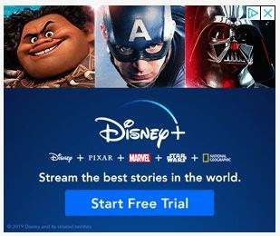
The element of exclusivity is the best sales pitch that can be digitally made. Since Disney+ has shows and films that are available exclusively on their platform, they make this loud and clear in their banner ad. Moreover, the CTA button includes a free trial offer, making it more enticing. Even if a person does not click on it, they will certainly not forget about the offer anytime soon.
2. Amazon Web Services
Amazon Web smartly establishes its authority as the best cloud to run windows in its banner ad. It knows that it is a reliable cloud provider, and the USP is what attracts the viewers to the simple message on the banner ad of AWS. This is also known as the cold, or hard stats approach in sales and marketing.
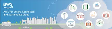
While not every brand can effectively pitch itself or its services using this method, AWS does so ingeniously. With the use of a pleasant background and a consistent color palette, Amazon Web Services integrates small colored icons and pairs them up with minimal text in a clear and simple font. Undoubtedly AWS has some of the best banner designs for digital marketing.
3. Staples
Another on the list of best banner designs is the Staples banner ad. This is one of the simplest and barebones digital banner ads out there. It has a plain and simple approach and does not aim at memorability or even creativity. However, they have made sure that there is a clear CTA button within the banner ad.
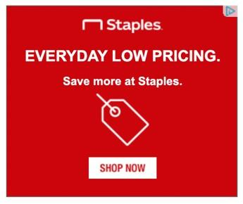
While Staples’ banner ad might not be the hippest and coolest banner ad you might have ever seen, it still fulfills its purpose. That is, to convey a clear message without employing any unnecessary effort. The USP of the ad is that it acts as a reminder to shoppers that Staples is their go-to place if they want to save a few extra bucks.
The banner ad has a uniform red background with the Staples logo at the top and everything else in white font, as well. It is an all-text banner ad with just a tag icon, making it truly minimalistic.
If your perception of this Staples’ banner ad is that it is just extremely lazy in terms of its design, you are highly mistaken. The reason behind the all red-no images-plain white text-simple design creative is that the viewer’s attention is directly diverted to the ‘Shop Now’ CTA button. This increases the chance of click-throughs on this banner ad.
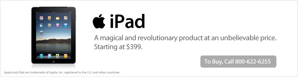
4. Apple
Apple is one of those brands that surely knows what they are doing and which part of their strategy will work without fail. In its banner ad for the iPad, they convey a clear message using a single image and limited text. The background is completely plain, and the white contrasts well with the black color of the product image. The bold black font further complements the image.
This banner ad effectively combines all the basic elements of digital design: bold text, minimal background, clear, high-quality image, and a clear CTA.
Even though the CTA button is in gray, it’s not a distraction and, at the same time, is visible and does not disturb the harmony of the palette used in the ad. Moreover, the clarity in the message is worth appreciating as the viewer is bound to remember the product name, the price, and the image even after they have exited the site.
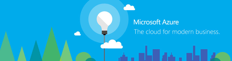
5. Microsoft
Microsoft is a great example of the best banner designs that combine the simplicity of visual elements along with the clarity of the text. This banner ad is an excellent example of how sometimes a message can be conveyed without complete sentences and even a call to action button.
The Microsoft Azure banner uses a blue and green palette with interesting icons that greatly enhance the visual aspect of the banner. The service name is visible, and the phrase under it aptly defines what the service is all about. This is a great break from the generic style of banner ads for services. It is subtle yet brilliantly designed.
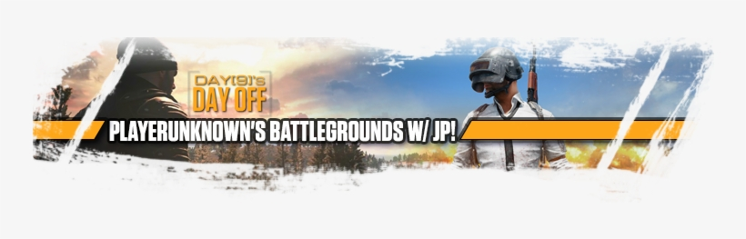
6. Players Unknown Battlegrounds
Now, this banner ad might come across as a little too much of all the visual elements poured into a limited area, but it suits the purpose it is meant for. With a game as chaotic as PUBG, a simple visual ad would not appeal to the target audience. Hence this banner ad uses relevant imagery and highlights the game’s action.
7. Invisalign
Invisalign is creative at its best, right from the product to the brand name to its banner ads. The banner design approach used by Invisalign is also known as the curiosity gap.
The brand includes a clear CTA in a visibly bright blue color, but the twist here is that the CTA will not lead the visitors to a mundane product page or company website promoting itself. Instead, it is rather aimed at directing them to a smile assessment page (a quiz designed to help people find out about the health of their teeth).
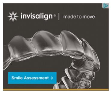
A free online quiz- who doesn’t love that, right?
This is the best approach to reach out to people who are at the beginning of the brand’s marketing funnel. This banner ad entices visitors to engage with the brand with a quiz.
8. Geico
Geico not only makes use of bright colors and a fun image that visually tells a story, but it also changes the traditional size and scale of digital banner ads. This digital banner by Geico, called the skyscraper ad, promotes the company’s new offer on a multi-policy.
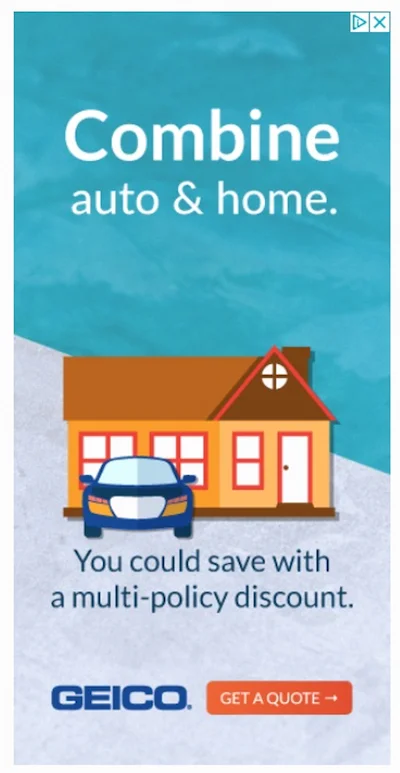
There is limited text, the brand’s name is visible, and a clear CTA can be seen popping out of the background. Icons have been smartly used in this banner. Even though the ad uses multiple visual elements and various colors, it balances them well.
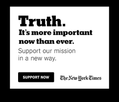
9. The New York Times
Since it is a news provider, The New York Times sticks to its promise and style. Its banner ad is simplistic and in a black and white palette. There is absolutely no imagery used. What’s remarkable about this banner design is how it plays with font sizes and styles in a limited space and color. The CTA is also in complete harmony with the overall palette of the banner.
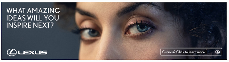
10. Lexus
Lexus is one of the best banner designs that uses the human face effectively to convey a message. Though a car brand, the banner is not directly aimed at promoting the car. Instead, it aims to market the brand’s latest innovation, the new speaker system in the Lexus ES model.
Key Takeaways
- Banner ads are the most widely viewed form of display advertising.
- Banner advertising is the process of embedding an ad into a web page or a website.
- Compared to TV ads, press releases, and newspaper ads, digital banner advertising is cost-effective, quick, and simple.
- Banner ads are designed keeping in mind two primary purposes- impressions and click-through numbers.
- Many brands create banner ads specifically for just retargeting, which is the process of targeting a customer who is already engaged with the website or has interacted with the brand in the past.
- There are several elements that a brand can use while designing a banner ad; this includes- visual elements, bold text, images, graphics, and a clear call to action.
- The color scheme used in a banner ad should adhere to the mood and tone of the web page the ad has to be displayed on.
- In case it is a banner ad for a product, the ideal choice would be to have a clear, high-quality image of the product in the banner ad. Images should be hi-res and neat. An overly complicated image can kill the purpose of the advert.
- A short, crisp, and clear call to action (CTA) informs the viewers as to what action they should take on seeing the ad. It helps the visitors know where exactly they are headed if they click on the particular banner ad.
Conclusion
Banners are paid advertisements and are usually seen lingering on the top or bottom of a web page or near the margins. While banners have earned quite a bad reputation in the last few years, and people generally find them as a disruption in the process of viewing a website, this perception can be turned around with well-designed, thoughtful, and the best banner designs.
FAQs
There are several advantages of using banner ads, which include: cost-effectiveness, easy creation, they are highly targetable, can be used as a remarketing tool, guarantee more visibility to the brand, etc.
The cost of banner ads is usually directly in proportion to the size and scale of the advertisement. On average, an experienced company charges between $20 CPM to $80 CPM for a banner ad.
There are various types of banner ads used in digital advertising. Some are static banners (images, text, no motion), flash banners, and animated GIFs (use of graphics and animation). Banner ads can also be differentiated based on formats and layouts, and presentation styles.
A web banner, also called a banner ad, is used for online advertising. The digital banner is intended to attract traffic to the website or a particular web page by linking the site to the advertiser.
The format of advertising that conveys a commercial message through the use of visual elements is known as display advertising. Display advertising includes- text, logos, videos, images, photographs, animations, and graphics.
A typical banner ad would be a long rectangle that is vertical or horizontal. These ads are typically found horizontally at the top or bottom of a web page or found vertically on either side of the web page.
Latest Blogs
Explore how Google’s 2025 AI search updates triggered ranking chaos. Learn actionable strategies to adapt your SEO for AI Overviews, zero-click searches, and SERP volatility. Stay ahead now.
Learn how to rank on AI search engines like ChatGPT, Perplexity, and Gemini by optimizing your content for authority, structure, and relevance. Stay ahead in AI-driven search with this strategic guide.
Explore the best healthcare SEO services for your medical practice. Improve online visibility and effectively reach more patients in need of your services.
Get your hands on the latest news!

Similar Posts

Design
7 mins read
15 Best Firms Offering Design Services in India

Design
5 mins read
All You Need to Know About Data-Driven Design

Design
6 mins read