13 Essential Slide Deck Tips, Tricks, and Features for Maximum Impact (With Examples)

Table of Contents
- What is a Slide Deck?
- Why are Slide Decks Important?
- 13 Essential Slide Deck Presentation Tips, Tricks, and Features
- Sales Deck Examples
- Key Takeaways
- Conclusion
- FAQs
After you have connected with a potential client and their response indicates that they are ready to make a decision, it is time to get them to close the deal with a remarkable sales presentation that has the potential to convert. To convince them to buy your solution, you need to present your sales narrative in an appealing manner. One of the most crucial tools for this is a PowerPoint presentation. With the constant advancement in the digital realm, you need to up your sales game with new and improved slide deck tips and tricks.
If you have been wondering why your clients have been showing a marked disinterest, especially at the stage of the sales presentation, then they are probably bored out of their wits by the bullet points lining your presentation slides, followed by a plain explanation of precisely the same written content. Today, no one appreciates a boring slide with the presenter reading out the text. The world has moved way past that style, whether it is in the field of education, business or sales.


What is a Slide Deck?
A slide deck is a collection of slides used as a storytelling tool or a visual aid while explaining or elaborating a concept. The terms “slide deck” and “presentation” are often used interchangeably. A slide deck can be compared to a deck of cards that make up a pack. Therefore, each slide in a slide deck has an important and unique role in the presentation. When making a sales pitch using a slide deck, it is important to remember that the presentation is meant to be read and understood by the receiver and not explained or presented by the sender.
Slidedecks contain more text than images, as compared to a regular PowerPoint presentation. But lesser text than a traditional written report. Therefore slide decks are more inviting to read. Due to their effective visual communication ability, slidedecks are increasingly used by businesses worldwide to organize, summarize, and present information.
Why Are Slide Decks Important?
While there are several slide deck presentation tips and tricks and presentation guidelines that need to be kept in mind, it is crucial to understand why they are required in the first place.
- Slide decks are a quick and easy way to present information in a format that is short, accessible, and easy to read. They can be used as a pre-meeting document that imparts information to the attendees in advance.
- Slidedecks are primarily used for independent reading. When a presentation is going on, it often becomes difficult for the viewers/listeners to follow through with each piece of information being shared. Hence, the receivers can view and understand the information at their own pace with a slide deck.
- With the help of the visual elements of a slide deck, it is much easier to communicate complex information to the audience. The very goal of a slide deck is to aid audience understanding.
Therefore including slide decks in your sales pitch can help you truly engage your audience and communicate more in less time.
13 Essential Slide Deck Tips, Tricks, and Features
A sales pitch requires you to send your clients a presentation in the form of a stand-alone file that they can read at leisure. This presentation needs to be visually striking, not dull, and convey the strengths of what you are selling. Let’s look at the best slide deck tips, tricks, and features.
1. Use icons for bullet points
This is one of the timeless slide deck tips. By iconizing the bullet points using small vectors or images, the style quotient of the slide deck improves, but it increases the viewers’ visual interest in the presentation. One can also customize the shape of the icons.
2. Add SmartArt
Powerpoint’s built-in SmartArt feature can convert text into appealing graphics. Instead of explaining processes using bullet points, SmartArt presents it as professional graphics that combine lines, shapes, illustrations, and much more. It is easier to show interdependencies and flow of information using SmartArt.
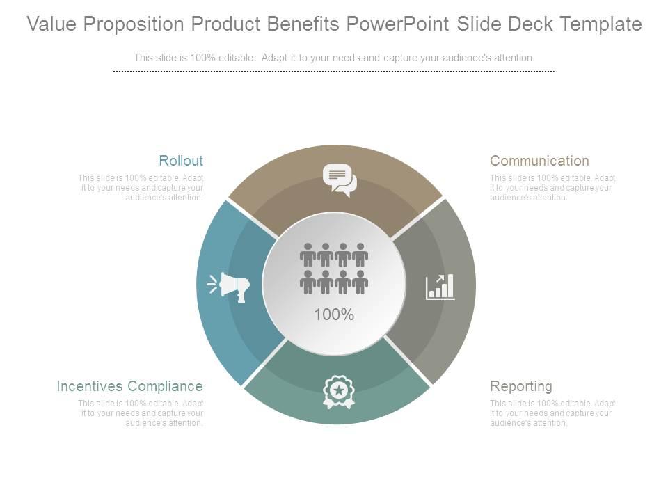
3. Use circular templates
Circular templates look elegant and are not overused like square and rectangular templates. With the help of the SmartArt graphics feature, one can convert the template of the slides into a circular one, giving it a more eye-catching edge. These templates are entirely editable. You have to paste the text into the placeholders and change the colors as per your choice. In a circular template, the distribution of content is perfect, and with the “Appear” animation tool, each aspect of the circle can be emphasized one after the other.
4. Split the bullet points
There is a fresh and interesting way if you want to use bullets to list down the points. One of the best slide deck presentation tips and tricks is to split the bullets into left and right. This can be done in two separate columns on each side of the slide. A more elegant way of using bullets is to create a timeline/roadmap or a signboard-like structure. A straight line in the center could branch out into bullet points on the left and right. Easy to create, this gives your slide deck an extremely professional look.
5. Create grids
Another one on the list of important slide deck presentation tips and tricks is arranging the text using grids. Grids provide a neat look and make text-heavy slide decks easy to navigate through. Grids can be created using the “line” shape from the “shapes” menu. Make sure that each section of the grid is visible. Alternate the colors of the sections within it. This increases visibility and impact.
6. At least one visual element in each slide
Adding a visual element in each slide helps summarize the main idea of the slide. The visual component or icon also increases the recall value of each slide in the slide deck. If you do not want to add an image, use an icon or illustration that sums up the text or is relevant to the text in a particular slide.
7. Add professionally designed diagrams.
For a slide deck that really stands out, ready-to-use templates are the best choice. There are several readymade presentation templates available for purchase that have placeholders to simply add text. Professional diagrams are unique, and there are fewer chances of repetition. Several applications and design software can help you create professional and edgy diagrams all by yourself in a few easy steps. One of the deck tips that will help you close a deal successfully is making efficient use of professional diagrams that convey information effortlessly in an engaging manner.
8. Modify graph formats
Charts and graphs are effective visual elements in a presentation. But while designing graphs, it is crucial to keep in mind that the viewers will not sit and try to understand all the data points in a graph. Optimize and modify the format of graphs. Remove unnecessary grid lines, use different colors for different lines, and add data labels in clear, bold text, wherever needed—highlight segments or lines in the graph that need to stand out. Avoid using 3D graphs; they tend to be misleading.
9. Make the proper use of white space.
While creating a slide deck, white space, also called negative space, is generally avoided. But it can be used to increase the readability of the text on the slides. Use this space wisely in the slide margins. Add a little space between the various elements in a slide, making each element visible and more noticeable.
10. Pay attention to the slide ratio.
An effective slide deck is designed keeping in mind the context of the slide. The context of your slide is what determines the slide ratio. A 4:3 ratio is helpful for presentations that have to be viewed on devices like cell phones, tablets, laptops, etc., while a 16:9 ratio is ideal for a conference room.
11. Use altered images
Another essential slide deck presentation tip is to alter images as needed. Change its opacity if an image is not what you want the audience to pay attention to. If the image is crucial in converting a message, make it more pronounced. Highlight, use arrows, pan images as and when needed in the slide deck.
12. Add video and audio clips.
The ultimate tool to engage the client is to add a video clip or an audio clip to the slide deck. Audio and video elements introduce a change of pace and enhance the viewer’s understanding of the message. Make sure the audio and video bytes are relevant, short, and fit well into the presentation structure.
13. Consistent slides
The most important lesson for creating a slide deck with maximum impact is ensuring that all the slides in the deck are consistent. A consistent design, color scheme, and font style help the viewer navigate smoothly across the slide deck. Inconsistency in colors, font, slide design can lead to frustration and disengagement from the message.

Sales Deck Examples
While it is important to keep these slide deck presentation tips and tricks in mind, learning from existing sales deck examples is equally crucial. Some of the brilliant examples of winning sales decks are as follows.
Reddit ad sales deck
Reddit’s ad sales contain hilarious memes and customized images and prove the brand’s worth as a worthy contender in advertising alongside successes like Google and Facebook.

Grindr sales deck
Another great sales deck example is Grindr’s sharp and unique modern-themed deck. It combines the power of short and precise text with smart infographics, making it neat and extremely easy to read.

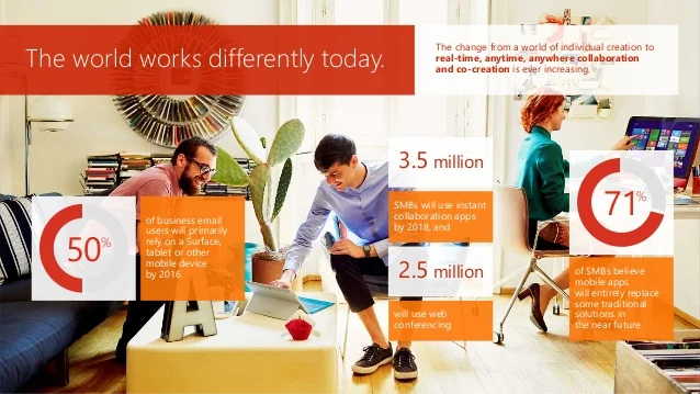
Office 365 sales deck
If we are discussing the best sales deck examples, Microsoft Office 365 undoubtedly tops the list. With a vivid color scheme and well-distributed graphics, Office 365 sums up productivity in pictures and icons. The pictogram used in this deck makes the data easily interpretable by the audience and conveys the message. Slidedecks contain more text than images, as compared to a regular PowerPoint presentation.
Key Takeaways
- A slide deck is a collection of slides used as a storytelling tool or a visual aid while explaining or elaborating a concept.
- As they are more inviting to read and easier to understand, slide decks are increasingly used by businesses worldwide to organize, summarize, and present information.
- Iconizing the bullet points increases the viewers’ interest in the presentation.
- With the help of SmartArt and editable templates, it is easier to show interdependencies and flow of information.
- Grids provide a neat look and make text-heavy slide decks easy to navigate through. They also increase the visibility and impact of the message.
- A 4:3 ratio is useful for presentations that have to be viewed on devices like cell phones, tablets, laptops, etc., while a 16:9 ratio is ideal for conference room presentations.
- Short and relevant audio and video elements introduce a change of pace and enhance the viewer’s understanding of the message.
Conclusion
A winning sales deck should be designed keeping in mind that the meeting is for the prospect and not you. With the help of images, vectors, infographics, graphs, and charts, the deck should help the client clearly understand the message. Tailor the presentation as per the client’s interests and keep it brief and relevant. Add social proof that validates your solution or what your company is selling. With the right amount of all these elements, your slide deck is guaranteed to have a maximum impact.
FAQs
A slide deck is a group of slides collectively put together to create a presentation, while Powerpoint is a presentation design software. It is a program that can be used to design slides and make presentations.
The 10-20-30 slideshow rule is a principle the venture capital community follows in designing and creating presentations. As per this rule, a presentation should have ten slides, a duration not more than 20 minutes, and the font size should be no smaller than 30 pt.
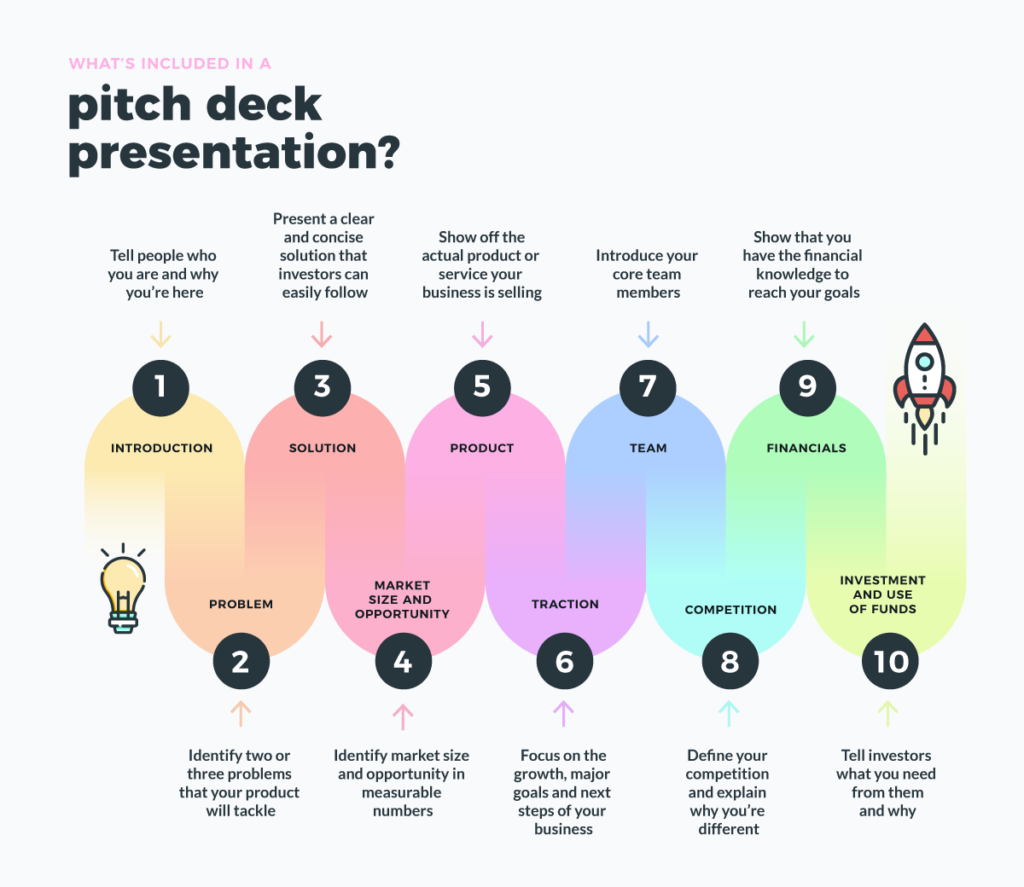
A pitch deck can be broken down and understood in 10 stages. The sequence of slides in a pitch deck is problem, solution, market, product, traction, team, financials, investment, amount, and appendix.
White or beige on a dark background or black on a very light background are the ideal combinations for creating a presentation that has a more professional appearance. Gradients in the text should be avoided.
Some widely used applications for creating slides are Google Slides, Slidebean, Visme, Prezi, Canva, Renderforest, FlowVella, etc.
Latest Blogs
Explore how Google’s 2025 AI search updates triggered ranking chaos. Learn actionable strategies to adapt your SEO for AI Overviews, zero-click searches, and SERP volatility. Stay ahead now.
Learn how to rank on AI search engines like ChatGPT, Perplexity, and Gemini by optimizing your content for authority, structure, and relevance. Stay ahead in AI-driven search with this strategic guide.
Explore the best healthcare SEO services for your medical practice. Improve online visibility and effectively reach more patients in need of your services.
Get your hands on the latest news!

Similar Posts

B2C Marketing
5 mins read
Top Choices for Best Content Marketing Services in B2B Industries

Artificial Intelligence
5 mins read
How A Lead Generation Specialist Can Use AI-Powered Content Funnels to Drive Conversions

Artificial Intelligence
4 mins read